
Personal Investigative Study
Initial Research
The History of The Political Broadcasting
With my final major project being a local election campaign video, what relates heavily to this is party/political broadcasts.
The first broadcast was aired by the BBC for the 1924 General Election Campaign with the three main leaders. Stanley Baldwin of the Conservative Party, Herbert Asquith of the Liberal Party and Ramsey MacDonald of the Labour Party. They made a public speech to the public which lasted twenty minutes. By 1947 they had to regulate the number of slots for broadcasting, The BBC created a committee which comprised representatives from the three main parties to help establish a regulation system.
Following the rise of television broadcasting, for the 1951 General Election Campaign, the first televised one was made by the Liberal Party’s representative Lord Viscount Samuel. At the time this television broadcast was seen as farse because it was seen as he was reading from a prepared script like if he was on the radio. On the same evening, the Conservatives produced a more professional broadcast with Anthony Eden who was interviewed by Leslie Mitchel who was a pre-war television veteran. On the same evening the Labour Party’s broadcast followed the same rhythm with the interviews where Christopher Mayhew asked Sir Hartley Shawcross “Why a man so well educated, well off as he should support the Labour Party”. Back in the 50s, fifteen minutes for each broadcast was very normal. Presumably would get boring afterwards if it was longer and due to the fact of slot allocation for political broadcasts.

The first televised political broadcast was on the 15th October 1951 by Viscount Samuel.
A new type of political broadcasting started in the 1970s were advertising started featuring with more formal public addresses. Producers and Directors from Hollywood offered and showed their support to help their favoured party and at the same time the involvement of celebrities were support was taken out by all the main parties as I would presume it got really controversial. Today - A lot of broadcasts featuring political parties are now usually lasting around 5 minutes; some are even around 2 minutes. Apart from party political broadcasts which usually take place around when a General Election happens, these usually happen on a seasonal basis i.e. autumn, Party conferences usually happen around winter or spring.
Local Level Campaigns
Save Southport Pier Campaign

Southport Pier in 2016
A campaign which has been heavily close to my heart with the recent years is the closure of Southport Pier because it has been deemed to be unsafe by the council. The Pier was restored back in 2002 for £7.2 million it took 2 years to complete; with that in mind, it should last another 100 years like it did when it was first built by the Victorians in August of 1860. So this tells me that it wasn’t properly done in the first place, with the latest surveys have not been not been released by council to find out the real estimate cost of the a full restoration. Deemed to be around £10 to 13 million.
The people have said you could build a new pier for amount that the council has quoted. They say If the council can find funds to buy Bootle New Strand Shopping Centre for £32 million (which by the way is empty), then they can definitely find funds to restore the pier.
With the social and economical differences between Southport and Bootle, which has been subject to debate over the past 50 years since the two areas joined forces to create Sefton in 1974, their has been a lot of scrutiny in the council and with the leaders of the council being from Liverpool and in this case bias towards Bootle, this has created hatred towards Bootle by the local Sandgrounders in Southport because of instances like the Pier. The reasons why this campaign has meant a lot to me as Southport is going to be my future and of course mainly this is Southport’s heritage - being what was the longest pier in the country, now only the second due to how many fires it has head the the end and it is the oldest iron structured pier in the whole country. And with the way things of going in my personal opinion the town is being eroded away bit by bit; from what I can see the council is taking bits away from the town, almost robbing us blind.
National Level Campaigns
Britain’s Withdrawal From The European Union - Brexit

I was only 11 years old when there was a referendum on Britain’s withdrawal from the EU and I remember at the time it was a huge campaign which was setup primarily by the “Former Prime Minister David Cameron; now Lord Cameron” who wanted to negotiate a deal with the EU on mass immigration. The EU didn’t want to make a deal so he called for a referendum for the British Public to decide whether we wanted to be in the EU or not. On the 23rd June 2016 51.9% out of 48.9% of people chosen to leave and on that Cameron resigned and stepped down as Prime Minister on the basis of that the thought he wasn’t the right person to lead the country out of the EU.
The main history behind the European Project started back in 1975 when the British Public voted in a referendum to join what was a common market called the “European Economic Community” and that entailed in a few words a free trade agreement across all the European countries. 17 years later the first stage of European Integration commenced with 12 Member States signing the “Maastricht Treaty” which started to finish off the amalgamation of three main European Communities; the “Economic Community”, “Coal & Steel Community” and the “Atomic Energy Community”. This treaty also confirms the merger of common currency i.e. “the Euro” (The UK wasn’t included) and the introduction of a citizenship of the Union which formed free movement of people across Europe.
With the signing of the “Maastricht Treaty” this caused the rise of political figures such as “Nigel Farage” who is Eurosceptic and who was one of the biggest campaigners for “Brexit”. He became famous across the UK for his speeches in the “European Parliament”; with the ability to hold the room and his charisma has made him well liked across the country.
Farage left trade commodities at the “London Metal Exchange” to pursue something which not only he believed was right, but what the country wanted and with all the integration from the EU, he fought for the people of the UK and protested as much as he could to make sure that we were not going to go down the rabbit hole of what he believed to it become a United States of Europe - in so many words and in a nutshell this is why Britain voted to leave the European Union.
Reflect On Your Own Work
Southport Town Deal
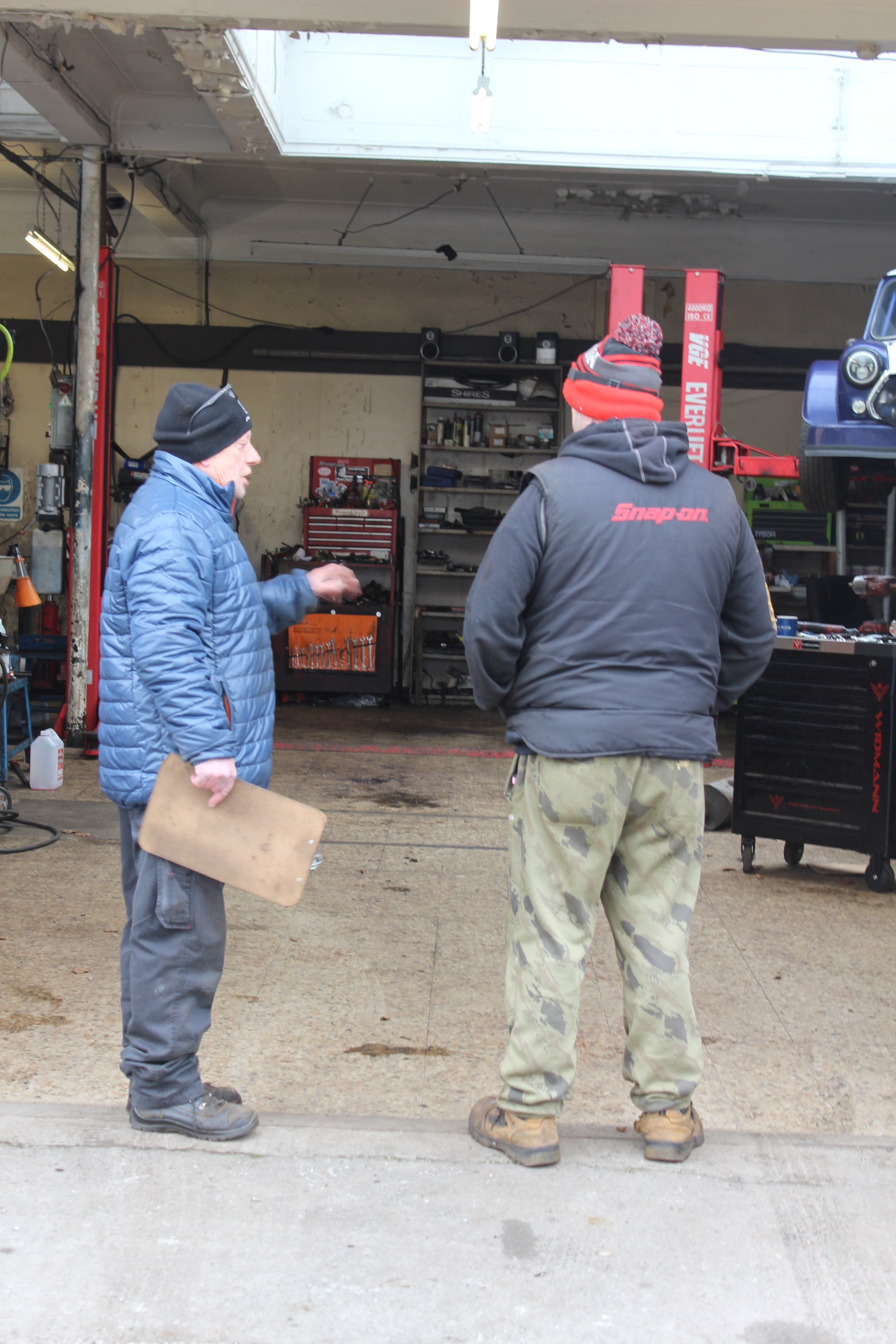
A campaign which I was part of was the Southport Town Deal, we comprised a board together which had a wide range of public and private sectors, including some of the most successful business owners through out Southport. A Shadow Youth Board was created which I was part of and I became in charge of Consultation which was a campaign in itself to encourage the younger generation to come up with ideas for the actual Town Deal fund. As my role of being “Leader of Consultation” I thought about creating a video which was around about 5 minutes long maximum and I nicknamed it the “Southport Town Deal "OVERLOAD"” as a catchy title would get their brains working and produce some ideas. At the time I couldn’t create this video fully as I didn’t have the right editing software so I joined forces with the Sefton Council’s Media department to edit it to how I would like it. A guy called “Ollie Cowan” helped me out with the editing side and the end result of what we come up with is below; All this happened during Summer and Autumn of 2020.
I gathered over 7,000 consultation engagements with more than 1,000 from school/college students.
In-Depth Investigation
What Makes a Video Campaign Successful?
In the world of campaign videos, it is a powerful marketing tool which can be used to capture attention, create emotion and motivate action. Video is one unique way because you are incorporating sound and motion together and can be much more productive way in the terms of gathering an audiences attention. This is included with the increased level of engagement, there is a handful of things which should take place in order for a campaign video to be seen successful.
Having a content strategy is the main part because the video needs to be able to stand out with companies or people needing to invest any sort of time into what they want their video to say or show before they start to create it. Not even making an attempt to create such video shows a lack of promotion that will not catch anyone’s attention as it was intended. This is where the content strategy comes into the video as it will end up helping us pick out the main message and the story which is being told so it fits with the brand’s aim and budget.
Another way which helps with a campaign video being really successful is that knowing who you are targeting with the promotional efforts. You should not assume one type of person will respond well to it, having different demographics may react differently is based on several different things such as age, gender, culture etc. It is also a good thing to understand what people expect out of campaign videos from different groups so that you can create a video meeting those criteria’s. This could become really difficult if you start looking at smaller audiences; such as people who engage with a specific YouTube channel. It is also very important understand probably from the beginning that not everyone is going to respond positively, but it is the matter of finding the right people who are using these strategies above to engage them.
It is also very easy to get overwhelmed by every kind of possibility that a campaign video can bring. Firstly you need to set realistic goals, which then need to be broken down into bite size chunks to secure success. These also should align with the goals set for any ongoing campaign video if there is any. After these have been rectified for each stage, then this should move on from the planning and to start creating content for the promotional efforts.
Analyse x2 Campaign Videos
Southport Pier Campaign Update W/ Damien Moore MP
Adobe Stock Graphic - The Beginning
To start with from the right beginning, this campaign video starts off with a a graphic at the start of the video which gets people enticed and interested in to see the latest progress of Save the Pier campaign. It looks as if they have used Adobe Stock to create the intro graphic. The text which is being used for Damien’s name is in bold letters with a border around it and then at the top the border breaks off with the lettering which says “Member of Parliament for Southport” which shows it is an update from the local MP, this text is set to the bottom left. To title the campaign video, in the top it still uses bold letters to make it really easy to read; with Southport Pier being blue which contrasts well with the graphic behind and then Campaign Update is in white. Another artistic creation which is basically part of the graphic, all the text flickers and transitions with the audio used and then transitions into the actual video.

Video Footage - The Middle
The video footage which is used is very generic, the shot type which is being used is a mid shot as it is only showing from the waist up, the shot angle used is a mixture between eye level and over the shoulder because it is showing the subject as if the any other person would have a conversation with that person and also it is slightly elevated above the subject so you can see the Pier which is leading off into the distance which is showing leading of lines; the camera movement is stationary. There are bold captions being displayed on the bottom which are really easy to read and are set in line with when the subject is talking. The aspect ratio which is being used is a 1:1 which is a square mainly because this is a targeted advert for Facebook and Instagram.

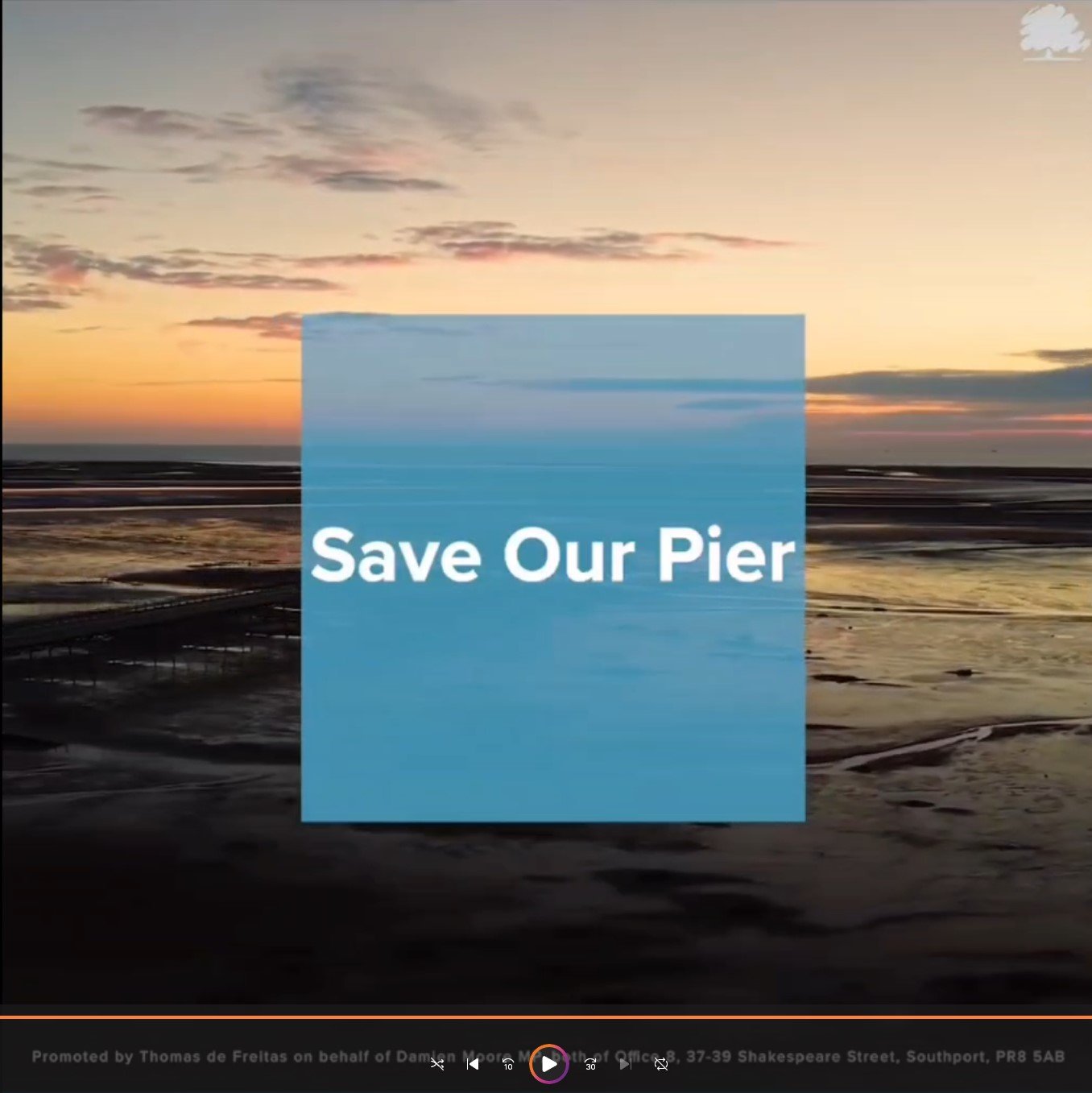
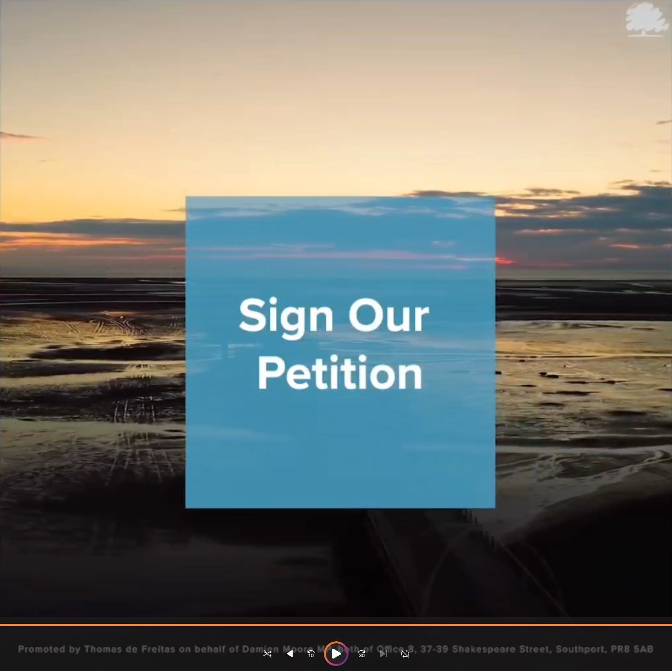
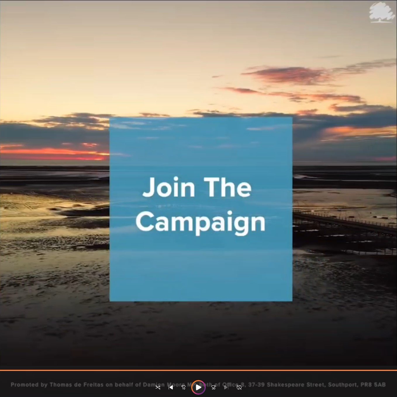
The Drone Shot - The Ending
For the last scene of the video uses a wide shot with a birds eye view shot paired with a panning camera movement to capture the Pier and the landscape surrounding it. As the camera pans around, a blue see through square is put in the centre of the screen which white bold text has been placed in the centre of it; the text changes three times as the camera pans around from “Save Our Pier” - “Sign Our Petition” - “Join The Campaign”. Lastly, their is an imprint on the infographic which you have to compulsory put somewhere in the video to show who actually promotes and runs the social media pages etc. So for this, it uses simple white bold lettering which says “Promoted By: Thomas de Freitas on behalf of Damien Moore MP” etc.
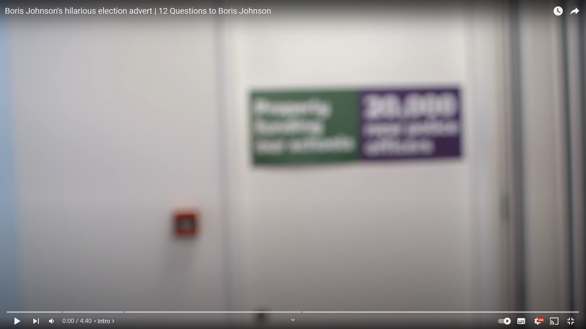
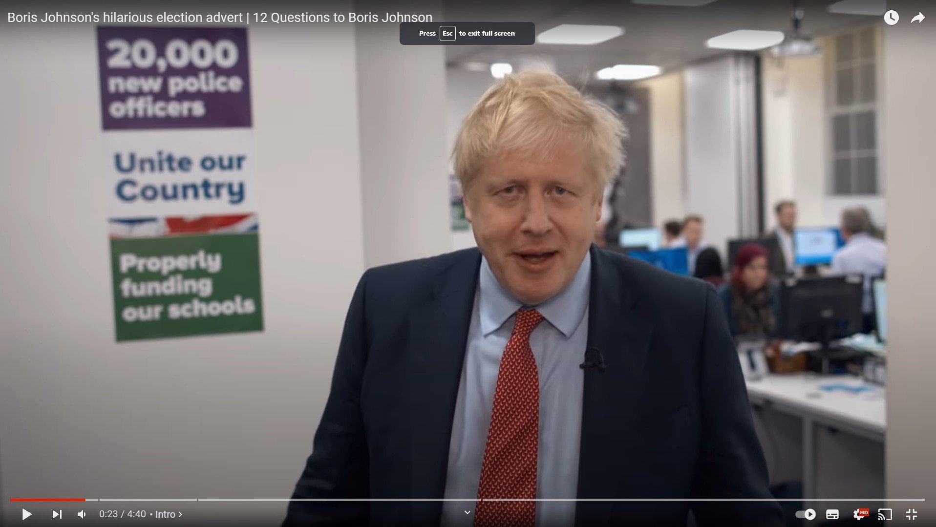
Boris Johnson’s 12 Questions General Election Advert
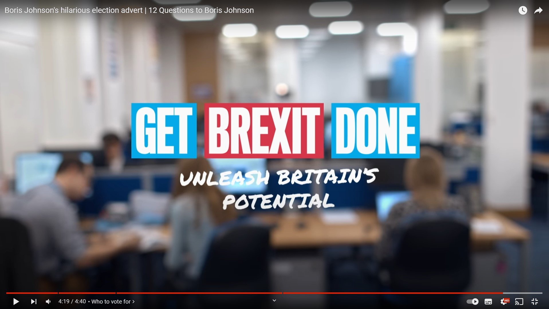
To start with the the video fades in to a blurred camera and as the subject walks out of the door and the video becomes unblurred. As the video plays we can see the shot type which is being used is a medium shot type with the camera angle being at eye level and the camera movement is called a follow. This shot list stays constant through out and hardly changes. The context behind this advert was to create something which was funny and witty as this seemed to fit with the subject’s personality, creating something like this twelve questions was to try and entice viewer into see what he does in his daily life, favourite bands and among other things questions about why he should be the next Prime Minister; There is no captions through out the video showing you the questions, all the questions are being asked by the cameraman himself. To create videos like this is supposed to show a different side and make people believe that he is not what people thought he was; all this is down to a funny personality and it worked well hence why he won a landslide majority. At the same time as he is walking through his office building, their is small little posters on the wall dotted around the office which were manifesto promises, they were trying to keep you on your toes as the subject spoken so that you looked and listened. The most artistic thing I can see which was created was at the end of the video was where the video blurred and then the famous words came up which said Get Brexit Done - Unleash Britain’s Potential and then the background changed to white with the colour changes on the for the slogan.
Presentation
A Video Presentation
Critically Evaluate
My Chosen Practice and Research Study - Evaluate & Reflect
What discipline have you chosen to look at in detail?
Why does this interest you?
I have chosen to do a local political campaign video mainly because I have a huge interest in the local area and to try and make it better for the future and our future kids who will be growing up in Southport. I also don’t think their is many young people who are getting involved or even interested, I want to be able to be that voice who is almost speaking for my generation and the generations after me and at the end of the day this is our future. I really would like to reiterate that. I will either be making a full candidate campaign video or I will be creating one for me as I am standing in the next Local Election; Things will need to be approved by the association before I can go ahead with any plans, I will keep a diary/step by step process on how things are getting on and whether or not I will be changing any sort of proposal for the Final Major Project.
How will your research inform your own practice?
By looking at the historic examples of political broadcasts, this shows how I can adapt that to create my campaign video and this will help me create my own practice because this shows how everything is done, filmed and scripted; even right down to how to make a campaign video really compelling. As I have researched into what makes a successful campaign video, I will adapt that knowledge to my own practice by; looking into a good content strategy which will help me make a video which gets people engaged and invest their time in the video, knowing who your target audience is key as you need to cater to everyone and their different demographics and having a realistic goals set to make sure that it is successful.
What type of research have you looked at?
Primary / Secondary / Surveys / Case Studies / Questionnaires
The type of research I have looked into is secondary meaning I have mainly used the internet to research everything for my final practice. I have looked into the history of political broadcasts which shows the stages of development of how things used to be produced and I have looked into a local and nation campaigns which are very good examples; I have gone into detail on each one.
What original ideas and concepts have you come up with to do your own chosen theme moving forward?
My idea for my video is originally going to be based off an existing campaign video, but I will put forward my own campaign in the video and my own Adobe Stock Graphics and ending credits. I have chosen this mainly because it is standard practice for who I am creating the campaign video for and of course this is a genuine and real campaign video which will be used for the forthcoming Local Elections on the 2nd May. As of writing this out, We are still looking into how we are going to create the campaign video because we don’t want it to infringe on anyone’s candidate expenditure and of course not breaking any Electoral Law.
What have you found the most challenging with this project?
To find out exactly what to research in relation to campaign videos as they seemed to be too of a narrow field to look into. So instead I looked into the history of political broadcasts which helped extensively because this takes you back in time to when it wasn’t common place to have a recorded or filmed broadcast and this took me through the stages of when it was a radio broadcast to a television broadcast. This also took us through the campaign speeches by the three main parties of yesteryear.
Presentation - Evaluate & Reflect
How effectively did you present your findings? PowerPoint / Screen Recording; How did this go and how could you have improved?
I chosen to do a screen recording for my presentation as I thought that was the best and comfortable medium for me. In terms of how did I present my findings, I completely read off what I personally written down in my blog and did my best to read it as much as I could without stuttering. As I listened back to my recording, I did stutter a lot and I read directly off the cuff and personally I could of read my blog a few more times to familiarise myself with what I was saying. I think if I did a PowerPoint, I could of at least shortened presentation because it did eventually go over the 10 minute mark and was more or less close to 15 minutes. I also think I should of been a little bit more impartial as it seemed I was a little bit bias towards the local council on the Save the Pier local campaign. In terms of the production and recording of the presentation, I couldn’t really fault it as it was recorded on OBS Studios which is a open source program; in other words free and I could add all kinds of add-ons and even a face cam which I could size to sort what I was doing. All in all I don’t think I did too bad, but it could of been better.
Authentication Document


Self Promotion
Showreel
Career Action Plan
|
|
My Profile |
Personal
characteristics
|
My current
skills and abilities (Things that I can do well, e.g., time
management, teamwork, problem-solving) |
Teamwork – Problem Solving –
Articulate |
|
My values (Things that are important to me, e.g., honest,
hard-working) |
Determined - hard-working –
honesty |
|
My interests |
Keen interest in the local
area and it’s politics, Cars & Motorbikes. |
Educational
background
|
Current course details |
UAL (University of Arts
London) Level 3 Extended Diploma in
Creative Media Production |
|
List of units studied on the course |
U1
Introduction to Media Processes & Technical Skills U2
Introduction to Design & Research Skills in Creative Media Production U3 Introduction
to Professional Practice in Creative Media Production U4
Critical & Contextual Awareness in Creative Media Production U5
Investigating Audio Production U6
Investigating Visual Production & Technology U7
Investigating Interactive Media Production & Technology U8
Extended Project in Creative Media Production U9
Characteristics & Contexts in Media & Communication U10
Engaging with an Audience U11
Preparing for Progression U12
Specialist Study U13
Extended project in Creative Media Production |
|
Completed certificates/statements of attainment (GCSE) |
Subject Grade Maths U English Language 4 English Literature 3 Creative Imedia P2 Enterprise M1 Geography 2 Computer Science 2 Combined Science 2 |
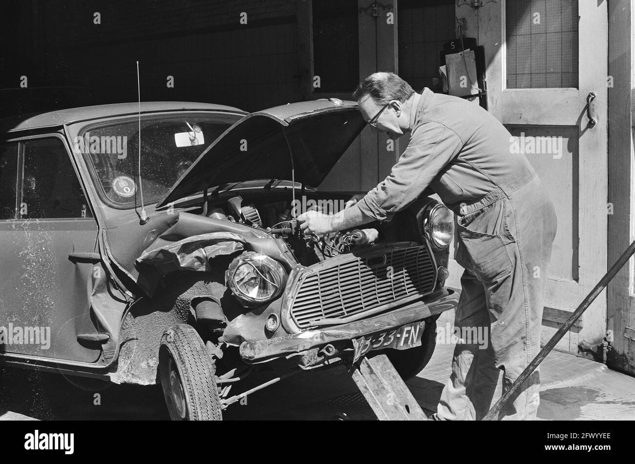
Employment achievements
|
Employer/Organisation
name |
Type of tasks undertaken |
|
Krakajak – Liverpool Road,
Southport, UK |
Motor Mechanic Assistant |
|
|
|
Community Volunteer involvement
|
Organisation
name |
Type of tasks undertaken |
|
Sefton Council |
The helping of the creation
of the Southport Town Deal schools’ video in 2020 |
|
Sefton Council |
Launching the Southport
Town Deal in 2020. |
|
My Future |
My Career Choice
|
University or Employment |
University |
|
Personal Qualities required |
Punctual - determination – commitment |
|
Skills required |
Teamwork – Collaboration – Time
management & Planning |
|
University Choices and Course requirements and prerequisites |
1. SAE Institute Liverpool 2. University of Central
Lancashire 3. Edge Hill University |
|
University only - Provider open days and important dates for
progression courses |
UCLAN in May 2023 SAE Institute Liverpool on
16th January 2024 |
|
Potential Employers |
1. Freelance /
Self-Employed 2. Working for a company or
organisation 3. Apprenticeship 4. Teaching in a College |
1.
My Personal Statement Outline
From a young age I have always been into
creating films and videos, this started off in high school when I got my first
gaming computer with a capture card to record gameplay off an Xbox. Then, I
would use Windows Movie Maker to drag and cut clips together to make a simple
video which would gather probably about 40 to 50 views per video, at the time I
thought that was amazing. This was where I first found my passion in the
creative media process.
During my time in high school, I dipped my toe into many things but most notably local politics. At the age of 15, I wrote an article for Stand Up for Southport talking about what the town could spend the £25 million government grant on. This sparked huge debate in Sefton Council, Southport Town Deal, and the Southport BID. As a result, this put me front and centre of the Town Deal with some help from my Headmaster at Meols Cop High School. During this time, I had to utilise and develop my leadership skills in order to create change within my community.
To promote the Town Deal the Council funded a video to introduce the Town Deal and during the creation of the video; this made me fall back in love with video editing and filming. There was a video that was sent around local schools with me at the forefront encouraging younger people to submit ideas into the Town Deal. All the campaigning and promoting caused a landslide of ideas, and this also gave me the opportunity to influence the younger generations which was inspiring.
As a result of falling back in love with Creative Media, I enrolled on a course at Southport College to start studying whether it was photography or film making in 2021. My interests tailored towards film making and this became apparent when working on other projects. As I started to focus more on filmmaking, I’d always push myself to improve every time whether it was on the editing side using Premier Pro or using a dedicated DSLR video camera with a gimbal. I would also self-reflect on my work and talk about the mistakes and having good time management for hitting deadlines is very important as there will be many in the future and adapting to this early on is very vital and important to me.
I feel as though going to university would be massively beneficial decision for myself since realising that I could extend my educational career and I can develop as a person as well as my knowledge. I also want to learn a lot more things part of the film making world but on a bigger scale. There are many units I have enjoyed at college, but the one I mostly enjoyed was the TV Commercial Production where I photographed my car from different angles and then put it together in a moving image format using post-production lighting techniques.
Throughout the past couple of years whether it is at college studying Creative Media or local politics; the passion for each of these things have been high, the willingness to learn is always a key factor.
|
My Plan |
Goals
I achieved last year
|
1.
Completed the first year of my course (UAL Level 3 Creative Media Production
& Technology) 2. Leant
how to use and assemble a DSLR video camera gimbal. 3. Leant
how to use a dedicated film camera ie. Lumix GH5 4. Learnt
how to use post-production lighting techniques in Premier Pro. |
New Education and Training
Goals
|
What is my goal? |
How will I do it? |
Why is it important? |
When will I do it by? |
|
1.To start my FMP |
Plan and Film it as early
as possible. |
It is important because I
learned that being prepared will give me more chance of submitting my best
work. |
12th June 2024 |
|
2.To complete all the
assignments in the second year. |
Stay focused with the work
being set. |
It is important because I
want to get a decent grade at the end – Better then a pass. |
12th June 2024 |
New
Employment Goals
|
What is my goal? |
How will I do it? |
Why is it important? |
When will I do it by? |
|
1.To find another part time
job. |
Indeed or any job searching
website or app. |
To help with finance. |
Ongoing |
Areas I need to develop to
achieve my career choice
|
|
|
Achievement Date |
|
Attributes* (e.g., personal characteristics such as personal
presentation and motivation) |
1.Convidence. |
Ongoing |
|
2.Self-Belief. |
Ongoing |
|
|
Skills* (e.g., academic skills and employability skills
such as organising, learning and teamwork) |
1. The knowledge and the use
of equipment. |
Ongoing |
|
2.Interview skills. |
Ongoing |
Updated Canva CV

Mock Interview
Can you describe a project where you had to work under tight deadlines? How did you manage your time and still deliver quality work? I jointly made a video for schools for the consultation process of the Southport Town Deal in 2020 and back then we had a quick turn around time for Sefton Council; having a well thought out plan before hand helps us meet the tight deadlines. With that thought out plan, this helps us deliver good quality work in the time scale set.
What video editing software are you most comfortable using, and can you provide examples of projects where you utilised it effectively? Most of my projects I have done I have edited with Adobe Premier Pro, for example when I did my TV Commercial for my College course, I knew where the specific menus are to use post-production lighting techniques and how the time stamps work. Even right down to which type of technique to use for that specific part of that video; it all takes practice to learn it, but when you know you don’t forget it.
How do you handle constructive criticism, and what steps do you take to improve your skills based on feedback? I wouldn’t’ say I have steps I’d take, but all I would do is take it as a pinch of salt and then check back at my own work to see where I could improve on from the feedback given. Their isn’t a mental process I’d take because I don’t get offended easily by other peoples criticism.
Cover Letter
Owen Phillips
42 Scarisbrick New Road
SOUTHPORT, Lancashire
PR8 6QE
07486 684852
26th
February 2024
Dear
Sir/Madam
Photographer
& Videographer for Cleartwo in Stockport, SK1 3GB
I would
appreciate it if you would consider me for this role as a photographer and
videographer for your company.
Ever since I
was a student at Southport College, I have garnered experience in editing using
Premier Pro and have extensive knowledge into the program. I also have good
experience in using Lightroom for photo editing. I gained a lot of experience
when campaigning through the Youth Southport Town Deal board where I was
involved with the campaign for the new Multi-Conventional Events Centre.
I have good public speaking and communication
skills for speaking in-front of the camera or to people and all this comes with
the ability of using strong English skills. I would value collaborative working
and new learning opportunities and I believe that your company can help me to
achieve this.
If you
require further information, please get in touch.
Evaluation & Reflection
Reviewing the Showreel - What are the strengths of what you did but also how can this be improved?
The main strengths of the showreel were how the footage from all the videos that I have created were in sync with the music. From the past few projects, I have worked hard on trying to keep everything in time with the bass or the precautions. It’s easier said then done. The next strength is how the music is very tense and has an element of suspense, the soundtrack gives you the time to take in what you’re watching and analyse the type of videos that I have created and recorded.
One of the few things I could have done to improve this showreel is making more of an effort to incorporate my photographic images into the reel as it seems as if they have been thrown in without any care to how they fit in with the rest of the videography. I also think some of the transitions on the video were out of place.
Authentication Document


Industry Knowledge

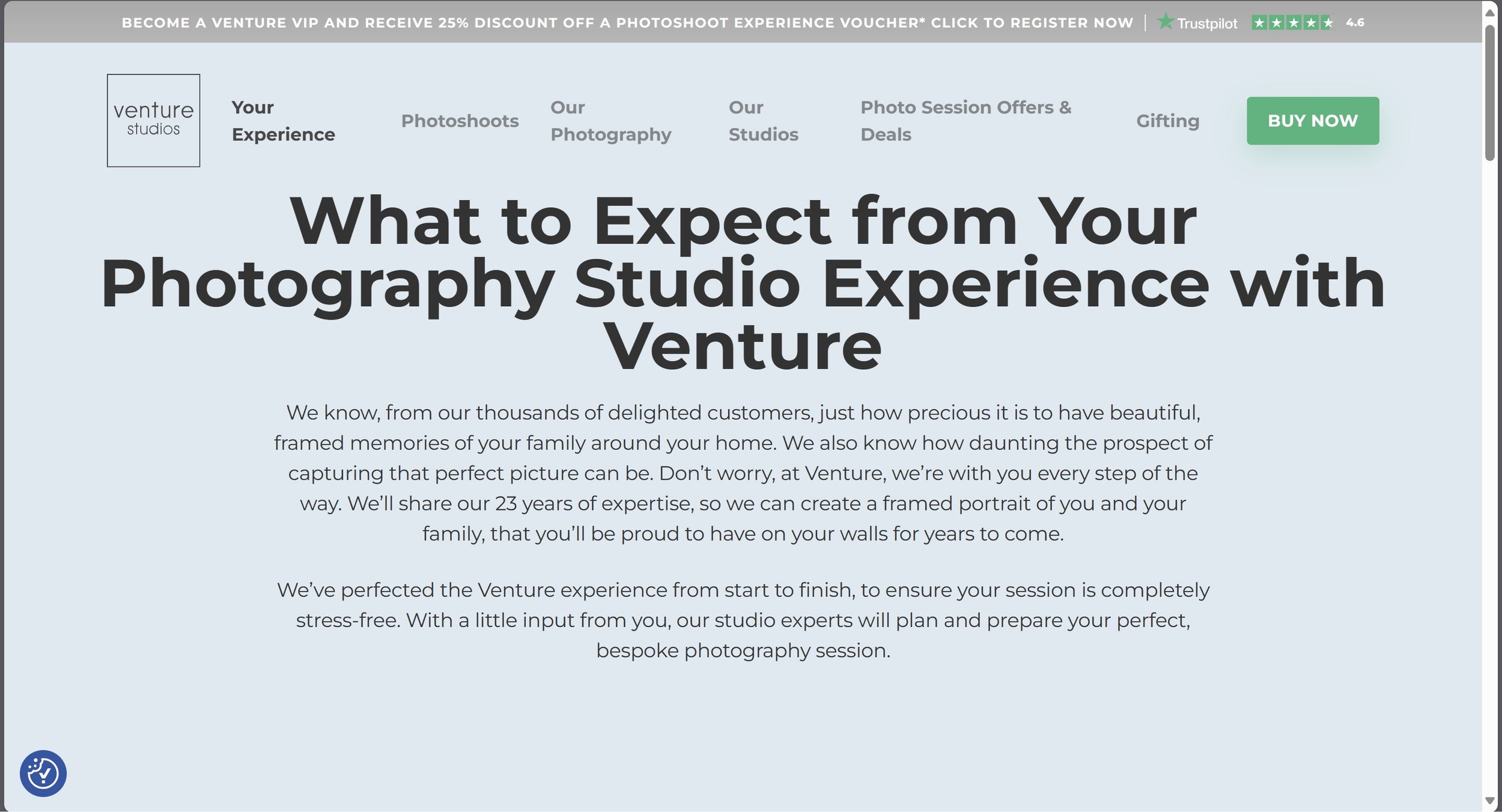
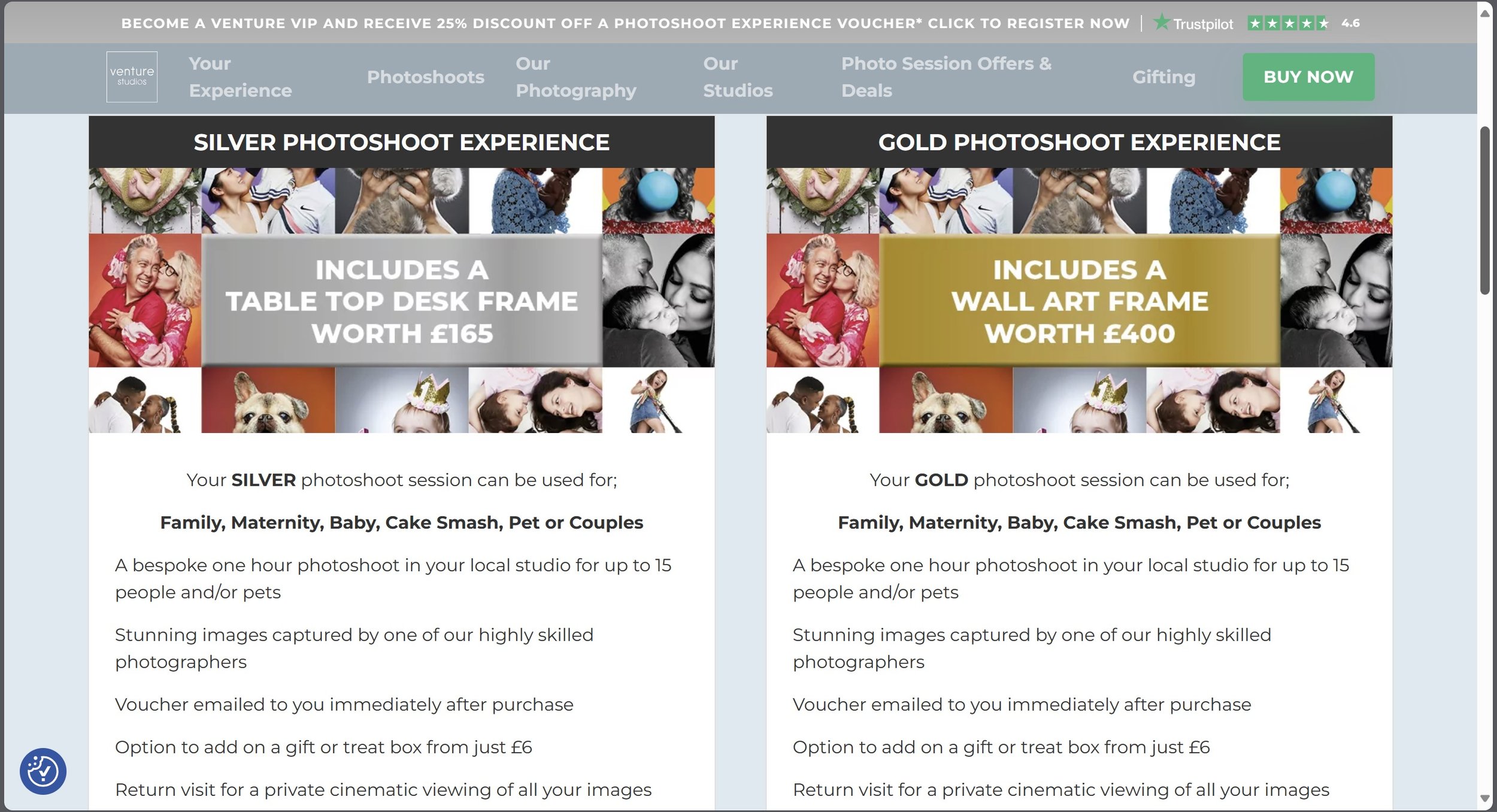
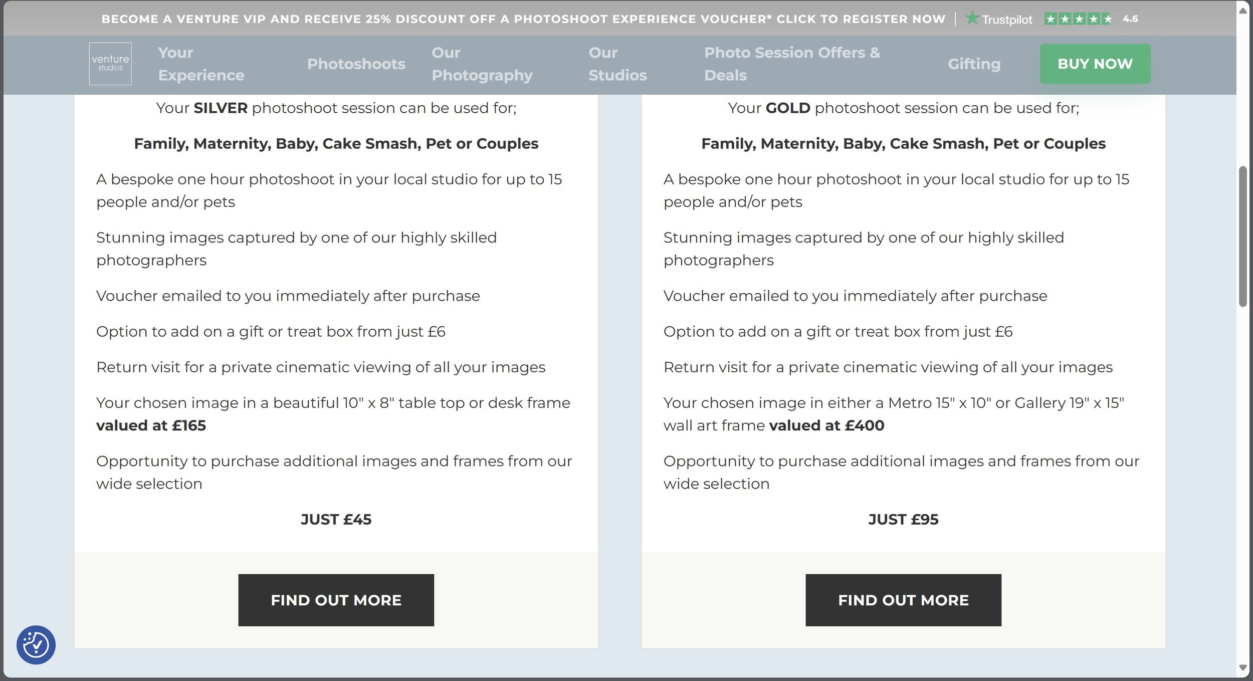
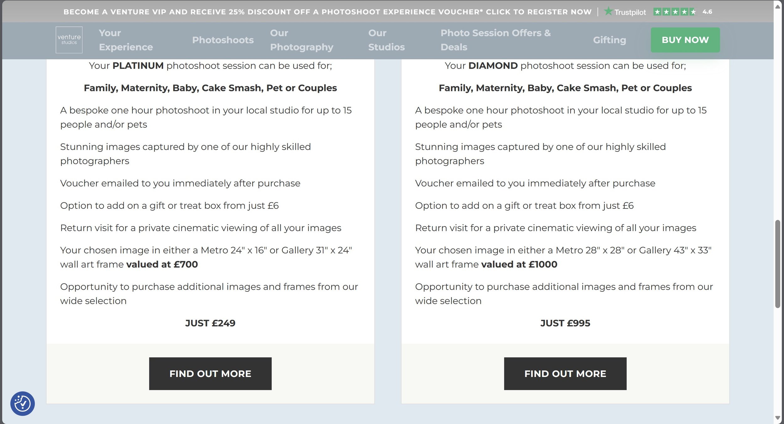
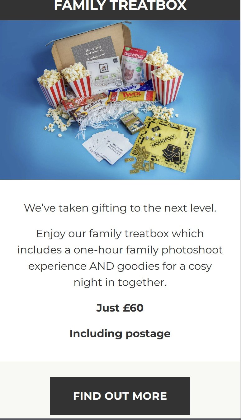
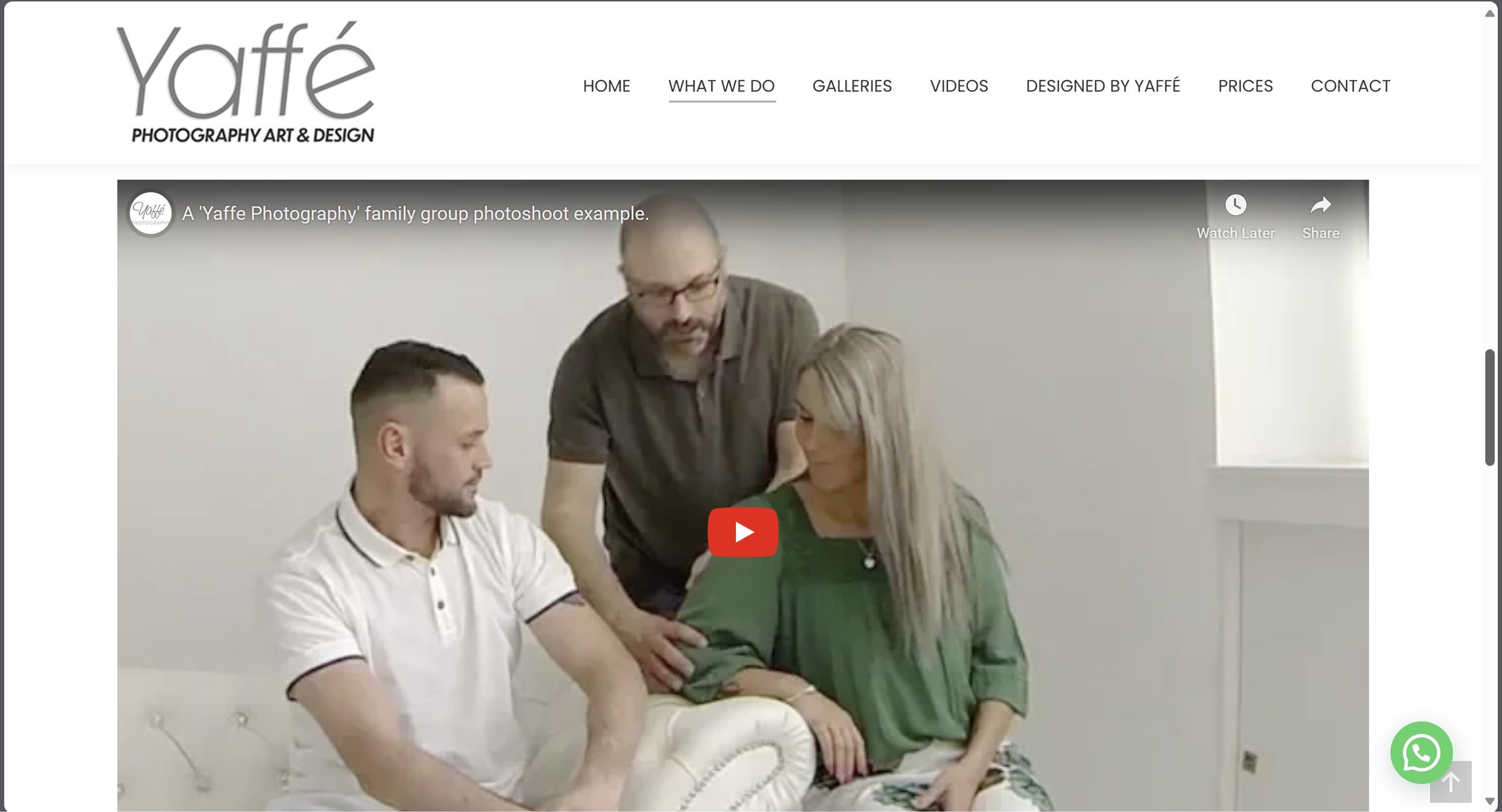
This website seems to be well thought out, Venture seems to use bold letters to make it really clear to read, they offer discounts for “VIP Venture” members, they also put a trust pilot to show what kind of rating they are. They mainly offer a experience which is probably their biggest selling point, they also show a pricing structure under the “Buy Now” section which shows different levels of experience that they offer. I think the colour scheme they have used on the website is nice and peaceful, it isn’t bright and colourful. The target audience they are trying to attract are the rich and wealthy families because of how expensive they are; this is all tied into the marketing strategy. On the basis of value for money, I’d consider Bartley Studios as the better option because when looking at the pricing structure it was £10 cheaper and I think that makes a huge amount of difference as I wouldn’t be going to the studio because of its experience or pricing. The only thing I can see that they offer is what they call a “Family Treat box” which is a box full of chocolates and sweets which also gives you alongside a one hour family photoshoot experience.

This website is very well layed out, everything is very spacious and using bold letters to make it really clear to read. The business model is very different from Venture or Bartleys as they don’t have the same type experience that they take their customers through, although they have a customer experience where you come in a bit early and they will put the kettle on or have a glass of wine or two. In other words they are not really treating it as a day out like the other two do.
The pricing structure is very clear and easy to read and from what I can see they are cheaper by far then the other photography studios. The target audience for this studio is a mixture between upper to middle class, because the pricing isn’t too expensive and I can see people paying the price for type of photographs that are being taken. One of Yaffe’s selling points is the that they have their own in house Frame with in a frame approach where you have a photograph and then you print something around the outside of the image, Yaffe was one of the first people to do this. This studio also has created videos to show you the experience inside the studio which shows you with the photographer and of course what it would feel like if you were in the studio.
One of the cons I have seen with this studio is that they don’t sell/offer anything alongside your photographs, for example a USB in a box etc.
My Hypothetical Business Plan
Find a Location
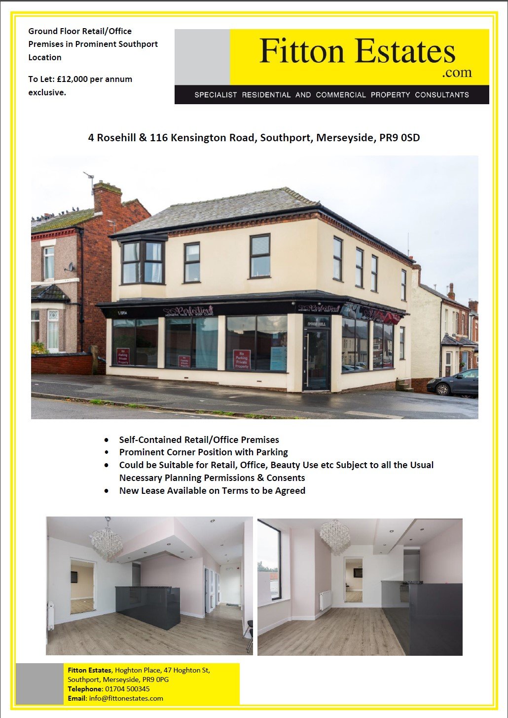
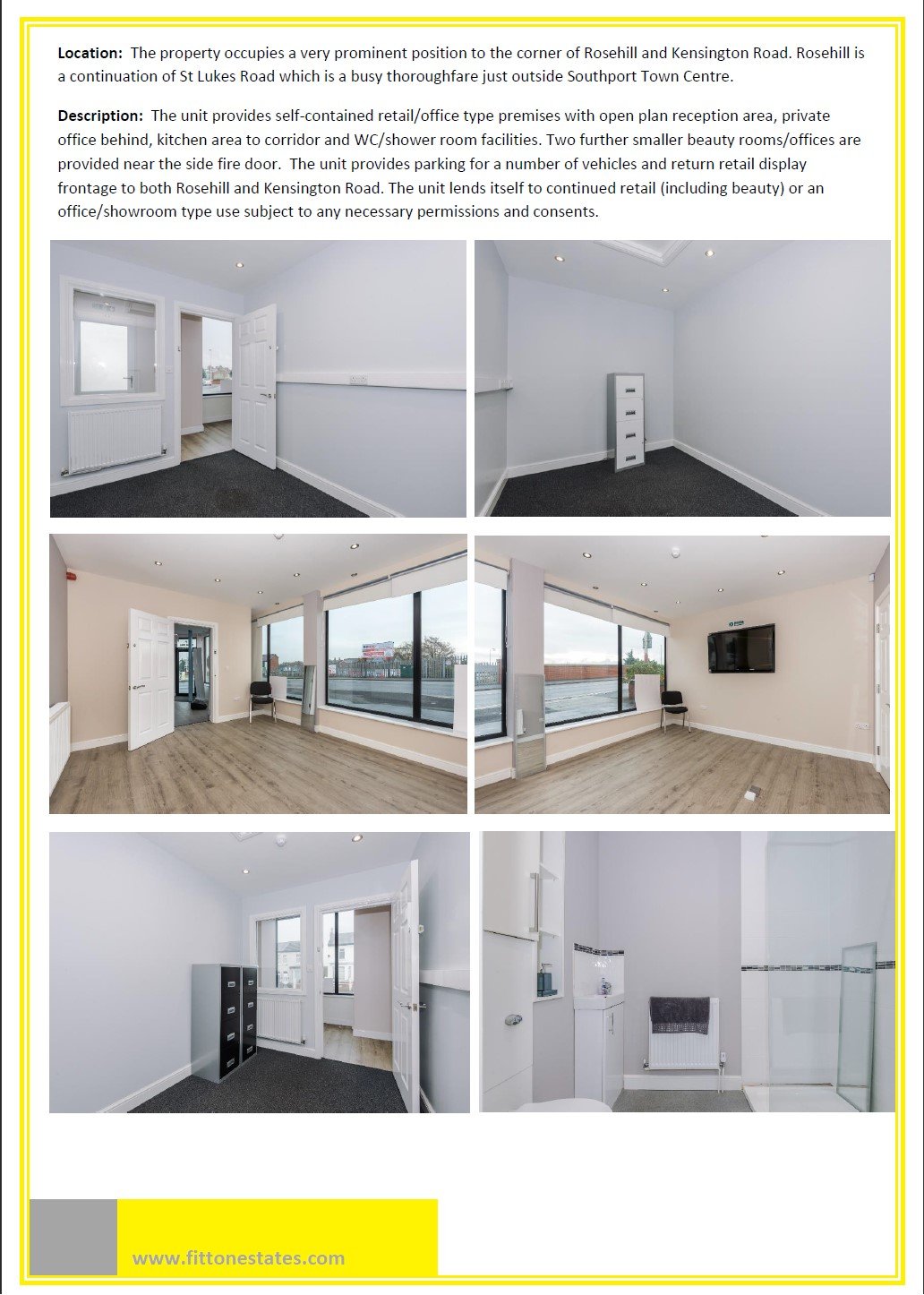
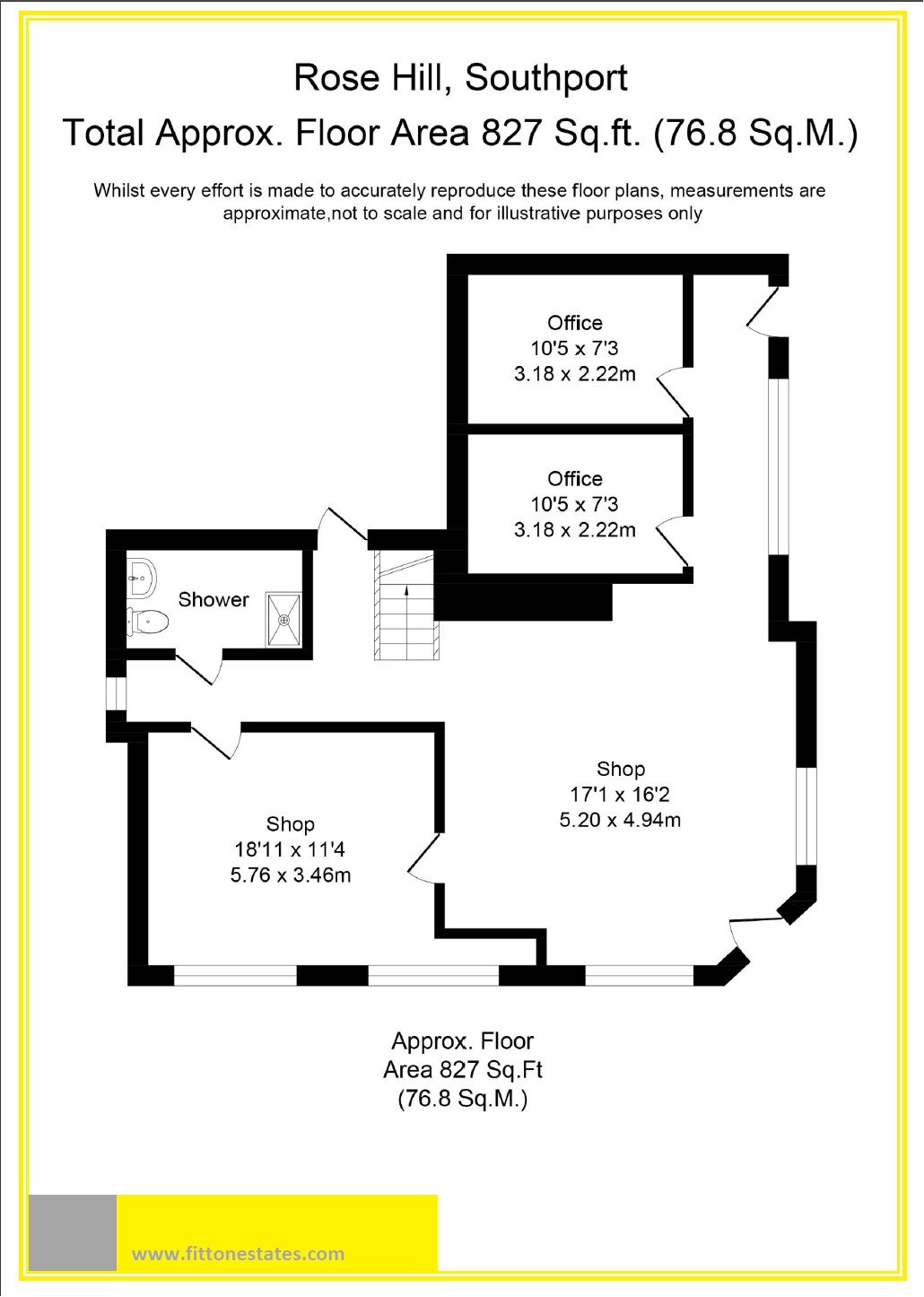
The reason why I have picked this location is because it is in the middle of town, good access to bus and train links and most importantly it has a forecourt to park customers cars. I have picked this one with ground floor space only because if anyone has any disabilities i.e., has a wheel chair then it needs to have good access for those type of individuals. The street also has good street lighting meaning that it will be well lit in the winter months compared to for example if I chosen a light industrial estate with next to no lights on, people might not choose to go down their for that reason. The location I have picked is very out the way and no where near any other competition, and this will draw in customers as they might not want to travel far to get a photo taken with their family. Signage is key to success as it needs to be well read and attached to the building properly, you don’t want it looking like it’s held on by a pieces of string or ropes as that isn’t very inviting for the customer who is coming to your shop.
Start Up Costs - are the expenses that are spent during the process of starting a new business. This could include a business plan, research expenses, borrowing costs and expenses for technology. The post-opening costs could include things like, employee expenses (if your employing anyone), adverting and promotion.
|
Item Description |
Cost |
Cost Saving Potential (different supplier or Ebay) |
|
Insurance / Furniture / Office Equipment |
|
|
|
Deposit on Property |
£1000 |
None |
|
Rent (1st month in advance) |
£1000 |
None |
|
Public Liability and Equipment Insurance (1
year) |
£ 250 |
£21 (monthly direct debit) |
|
Reception desk |
£ 300 |
£150 |
|
Reception L-shaped sofa (x2) - £600 each |
£1200 |
£800 |
|
Reception display prints (x12) - £25 each |
£ 300 |
None |
|
Signage (Shop Front) |
£1000 |
£600 |
|
Decorating budget |
£ 400 |
Free DIY – Do it with family and friends |
|
3 fold brochures size a4 (X1000) - Vistaprint |
£ 240 |
£120 Square format instead of A4 |
|
Business cards (x1000) - Vistaprint |
£ 28 |
None |
|
Pre-opening Advertising campaign – leaflet
drop / local press |
£ 500 |
Free Use social media and networking contacts |
|
Photo Studio Equipment |
|
|
|
Backgrounds (x3) & Support System |
£ 420 |
£100 DIY infinite curve like our photo studio |
|
Studio Flash Heads & light stands (x5) -
£329 each |
£1645 |
£987 Just have x3 to start with |
|
Nikon D850 DSLR Camera Bodies (x2) - £1850
each |
£3700 |
£932 Nikon D7100 @£466 each |
|
Flash attachments – Octobox,
beauty dish, snoots, spotlight, gel set etc) |
£ 760 |
£400 Used on ebay |
|
Wind machine |
£ 280 |
Free use white card |
|
Camera lenses – 12mm-24mm f4(£689), 24-70mm
(£1579) & 80mm-200mm f2.8 (£830)– all deemed fast lenses but more
expensive |
£3098 |
£948 Two 24mm-120mm Zoom @f4 -£474 each |
|
Mac computer plus adobe Lightroom software
package |
£1500 |
£800 High Spec PC (8GB RAM) + Adobe Lightroom
Keyboard |
|
Preview Sales Room |
|
|
|
Coffee Machine (bean to cup) |
£364 |
£28 Standard coffee machine |
|
4K Projector and screen |
£1100 |
£400 (HDR 4K 50inch Smart TV) |
|
A3 Epson SureColor
SC-P600 Inkjet printer |
£578 |
£230 Epson Expression Photo XP-960 |
|
Viewing Room Seating |
£600 |
£400 |
|
Viewing Room Wall Products and sample Frames |
£500 |
None |
|
Emergency Slush Fund |
£1000 |
None – arrange a business overdraft |
|
Grand Total |
£21,763 |
£9,473 |
Operational Costs - are the expenses incurred by a business that uses to run its operations. This may include payroll, rent, insurance premiums, utilities and equipment maintenance. This does not include capital expenditures and depreciation.
|
Item Description |
Cost |
|
Rent Insurance Business Rates (if appropriate) Service Charges (if appropriate Light
Industrial Estate Property – security/garden maintenance) |
£1000 £21 £0
(currently zero) £0 |
|
Office Supplies |
£100 |
|
Utilities (gas, electric, water) |
£100 |
|
Website Hosting / Internet |
£85 |
|
Wages (additional staff member/photographer..£15K per year) |
|
|
Total (Monthly) |
£1306 |
Yearly operational costs (monthly x 12 months) = £1306
x 12
= £15672
Profit wanted
= £30,000
Total Sales required (Operating Costs + Profit)
= £45,672
If the
studio was open x6 days a week that would give 288 days of trading in a year.
This allows for x4 weeks holiday a year. (6 days x48 weeks)
Daily Sales - To work out the daily
sales divide total sales required by 288 working days = £158.58
Total = £951 per week (over 6
days)
Working Schedule
|
Trading Day |
Potential Work Undertaken |
Hours Required |
|
Monday (Closed) |
|
|
|
Tuesday (2pm-8pm) EDITING DAY |
· Editing x4 studio sessions from Saturday · Administration Day |
6 |
|
Wednesday (2pm-8pm) EDITING & VIEWING |
EDITING & VIEWING · Editing x4 studio sessions from Sunday · Viewing the x4 sessions from Saturday |
6 |
|
Thursday (2pm- 8pm) VIEWING DAY |
· Viewing the x4 sessions from Sunday · Ready all orders for Photo lab |
6 |
|
Friday (2pm-8pm) SHOOTING & EDITING |
· Photo shoot x2 · Editing x2 from today ready for Sunday
viewing |
6 |
|
Saturday (12am-6pm) SHOOTING DAY |
· Photo shoot x4 |
6 |
|
Sunday (12am-7pm) SHOOTING & VIEWING |
· Photo shoot x4 · Viewing x2 sessions from Friday |
7 |
37 hours working week
Editing time per session 45 minutes
Viewing time per session 45 – 60 minutes
Media Associations & Agencies
British Institute of Professional Photographers

One of the main reasons why you’d join a photography agency such as the “British Institute of Professional Photographers” this one is because you can get all kinds of benefits from having dedicated insurance which gives you liability and peace of mind for if anything goes wrong, you also get free legal advice which is by either professional or accredited partner. You also get trade discounts with all different partners, they even give you business advice on how to start a business and how to run it. Their is many other perks you get, but I have evidenced screenshots below about their membership list.
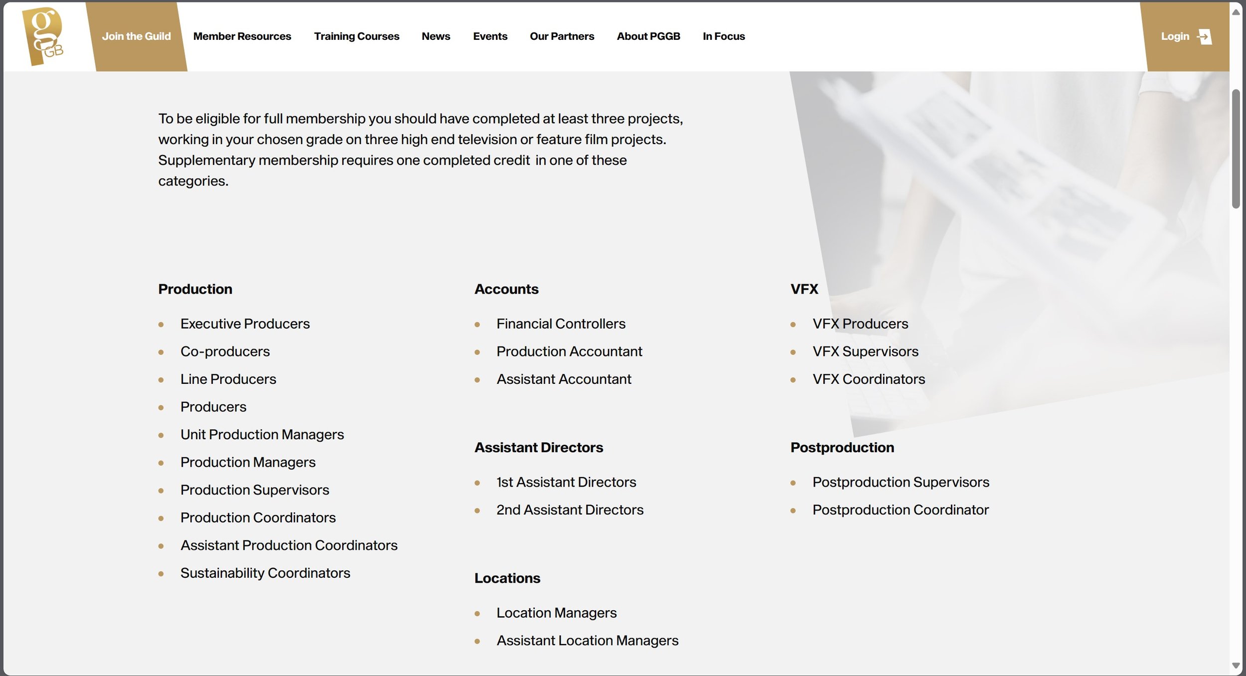
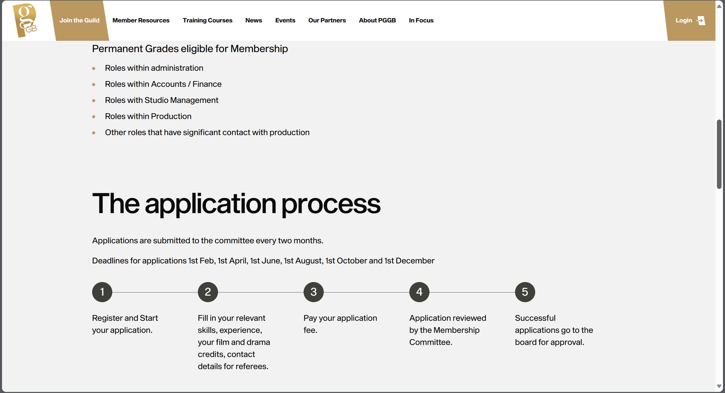
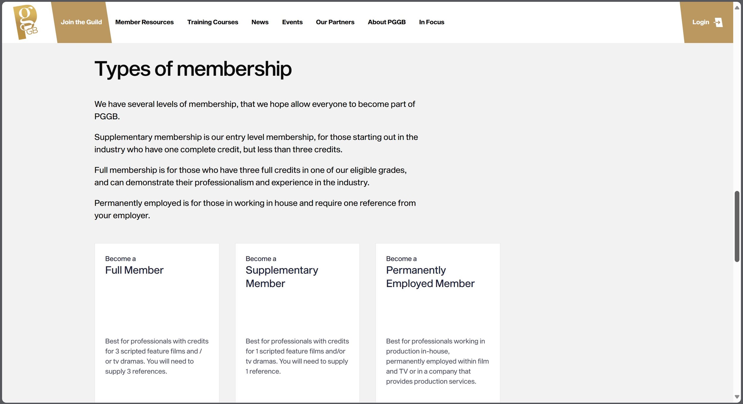
Production Guild - UK Film & TV Drama Production

To join this film making agency you need to have completed three projects in your chosen grade either high end television or feature film project, but for a supplementary membership you will need to complete one project in a credited category. - When you join you get access to all contacts in the industry such as, roles in administration, accounts & finance, studio management and even roles in the production side. With this agency you also become part of the PGGB which helps you start out in the industry but with one less credit but less then three - Their is also three different types of membership depending on what part of the employment you are situated in.
A lot of what I am talking about is evidenced in screenshots below.
Evaluation & Reflection
What do you now understand about business planning?
To understand business planning, you need to understand the industry trends and research the market. This helps you set specific and measurable goals which help you develop a clear strategy to create a well sorted and thought-out plan that includes financial projections with marketing strategies. It is also vital to review and change the proposals regularly to make sure it stays as relevant as possible in the changing climate.
What did you learn from your research into media associates and agencies? I learnt that there are different types of agencies which deal with different parts of the industry i.e. film, TV, photography and even sound. The beneficial parts of being part of an agency is to have the membership perks which you wouldn’t have if you weren’t part of the club. For example, you will get legal advice from an accredited partner, dedicated insurance liability, trade discounts and you may even get employment advice.
Authentication Document


Documentary Photography
Contest & Research
Documentary Photography Research
Analyse x3 Photographers
Sir Donald McCullin MBE aka Don McCullin was born on the 9th October 1935, He grew up in Finsbury Park in London. From an early age he was called up for National Service in the RAF, after returning from his postings he bought home a twin reflex Rolleicord camera and began photographing a local gang named “The Guv’nors” they also happen to be his friends. More by accident then anything else, McCullin persuaded the “Observer” to show them the picture editor in 1959, this started his career off.

He has won various awards such as the “British Press Award” for his essay of the construction of the Berlin Wall in 1961. He also won the “World Press Photo Award” where he covered the armed eruption of the ethnic and nationalistic tension in Cyprus in 1964 and lastly he was awarded the “Commander of the Order of the British Empire” (CBE) award, he was the first photojournalist to be awarded this specific award in 1993.

Limassol, Cyprus in 1964 - The Cyprus Civil War
From having a look at the visual elements and analysing the image, from the start I can tell that rule of thirds is being used used here as two thirds of this image is empty compared the other third has the man walking out the door and the soldier run towards battle. The lighting techniques used are natural but with the way the sun is facing, it has cast a shadow on the wall. Frame within a frame is also being used with the man standing in the door way. The storytelling aspect of this image is telling us that as their is a war going on, other people are living their normal lives as you can see somebody is walking out of the door while the soldier is running into battle.

Londonderry, Northern Ireland in 1971
From having a look at the visual elements of this image, I can see that it it uses the leading of lines composition as when you look at the image your drawn to the curb and it leads you to where the soldier is. This also uses a rule of thirds because the young man is in the first three squares of the image and the soldier is in the last two squares at the bottom of the image. The lighting techniques are natural and as you can see their is no shadows being cast in this one - so the light must be shining from above these two subjects. The storytelling aspect of this image is telling us that it feels like a normal day to a few in Northern Ireland even when their is a war being fought, you can see this by the young man is walking with a parcel in his hand and the soldier on the floor is holding a gun aiming/shooting.

Gang of Boys Escaping CS Gas, Londonderry, N.Ireland in 1971
From having a look at the visual elements of image, I can see that it is using leading of lines because when you look at the image the kids are jumping off this huge concrete wall and your eyes are lead to following them down the wall and where their running to. This image also uses rule of thirds with the last 2 segments of the third is showing the kids on the wall and then the first third is showing them running on the floor. The lighting techniques seem very generic and natural. The smoke that is in the air sets the atmosphere and creates a special effect which suggests poisoners gas has been set off and this shows the storytelling of the image because all the kids are running away and getting to safety.

Hue, Vietnam in 1968
To start with this image shows frame within a frame because the image is shot between two posts. Rule of thirds is also being used in this shot as well because most of the action is using the middle three boxes of the image. What makes this photograph really interesting is the fact that you can see the soldier is throwing a grenade in the battle field and at the same time he has lost his balance when throwing. The lighting techniques used in this image is generic and is using the natural daylight to generate the image.

The Christian Youth Celebrating the Death of a Young Palestinian Girl, Beirut in 1976
From a storytelling point of view I can see that these 6 people are celebrating the death of a Palestinian Girl, but from the facial expressions and actions I can see one of them is holding a gun pointing it towards the dead body suggesting that he could of killed her and the other kids seem to be laughing and joking about death and thinking it is a normal event when really it isn’t. The visual effects shown in the image where their is plenty of smoke being show, this suggests that this is residue from a grenade or gas. The lighting techniques used is generic and relaying on natural light. Rule of thirds is being shown in this video with the middle third of the image is where the young kids are and the bottom middle third is showing the dead Palestinian Girl.
Sebastiao Riberio Salgado Junior was born 8th February 1944, he grew up in Aimores, Minas Gerais, Brazil. By trade Salagardo is a Economist after earning a “BA Degree” from UFES and a “Master’s Degree” from University of Sao Paulo. He also earned a PhD from the University of Paris. As a first job as an economist, he worked in Africa at the “International Coffee Organisation” - He would often be travelling on missions for the World Bank.

On his travels around Africa he started getting into taking photographs, He eventually abandoned his career as an economist and became a photographer in 1973. Sebastiao has worked for many photography firms; most notably “Sygma, Gamma and Magnum Photos”. After working for many firms he started his own Agency in Paris called “Amazonas Images” to help represent his own work a lot more. He has won many awards - to name a few, in 1992 he one a “Centenary Medal” from the “Royal Photographic Society” and the “Crystal Award” from the “World Economic Forum”

Serra Pelada, Gold Mine, Brazil in 1986
From the storytelling point of view I can see that these people are climbing up a big hill using wooden ladders out of a gold mine and of course as you can tell by the clothes they are wearing, they are old and worn out. On one side of the image you can see their carrying a bag of gold from the mine and the other side they are carrying nothing. From a composition point of view it uses leading of lines because your eyes are focused up to the top of hill. The lighting techniques used in the this image are very generic a relays on natural light to generate the image.

Serra Pelada, Gold Mine, Brazil in 1986
From a storytelling point of view I can see that these people are climbing up a big hill using wooden ladders, but in this image it is more of wide shot of the hill, but with a close up of somebodies back and it is looking very sweaty and muddy as it all seems really hard work. The wide shot of the image above shows the vast scale of the gold mine and the whole complex. As you can see all the climbers are carrying up bags of gold and it seems they are leaving a few behind as they can’t carry them all up. From the composition side, the image uses leading of lines because your eyes are following towards the ladder and up it. Lighting techniques used are very generic and is relaying on natural light to generate the image.

Refugee Camp, Benako, Tanzania in 1994
From a storytelling point of view, this is showing a very depressing and poor atmosphere. One of the saddest parts is where their is a baby and its mother on the floor, but the baby’s expression is suggesting that the comfort they are receiving from their mother seems good, but in a very depressing situation. Apart from that the image suggests poverty and everyone seems to be struggling. The lighting techniques used are are very generic and relaying on natural lighting. The composition used in this image is rule of thirds because every third has something happening in it, for example the middle bottom third has the mother and baby.

Yanomami Indigenous Territory, State of Amazonas, Brazil in 2014
From a storytelling stand point, this image is so ambiguous; meaning it could be open to interpretation by anyone who looks at it, but from what I can tell he is either surrendering or he is saying stop. I think the guys behind him and presumably surrendering as they are not fighting. From a composition point of view it is almost as if it is using frame within a frame with all the branches overshadowing the images. Lighting techniques which are being used are very generic and relaying on natural light to generate the image shown.

The Oil Fields, Kuwait in 1991.
From a storytelling point of view, you can see that this is showing a firefighter trying to put out the flames in the oil fields, I believe it took them nine months to put it all out properly. From a composition point of view I can see the contrast has been cranked up really high to showcase the fire in its best light. Rule of thirds has been used as each third has something happening in it. So far most of the images have been shot in the daytime, but with this one, It has been shot at night time and rather then relaying on the daylight, he is depending on the light from the fire to bring out the image.
Practical Skills
Pre-Production
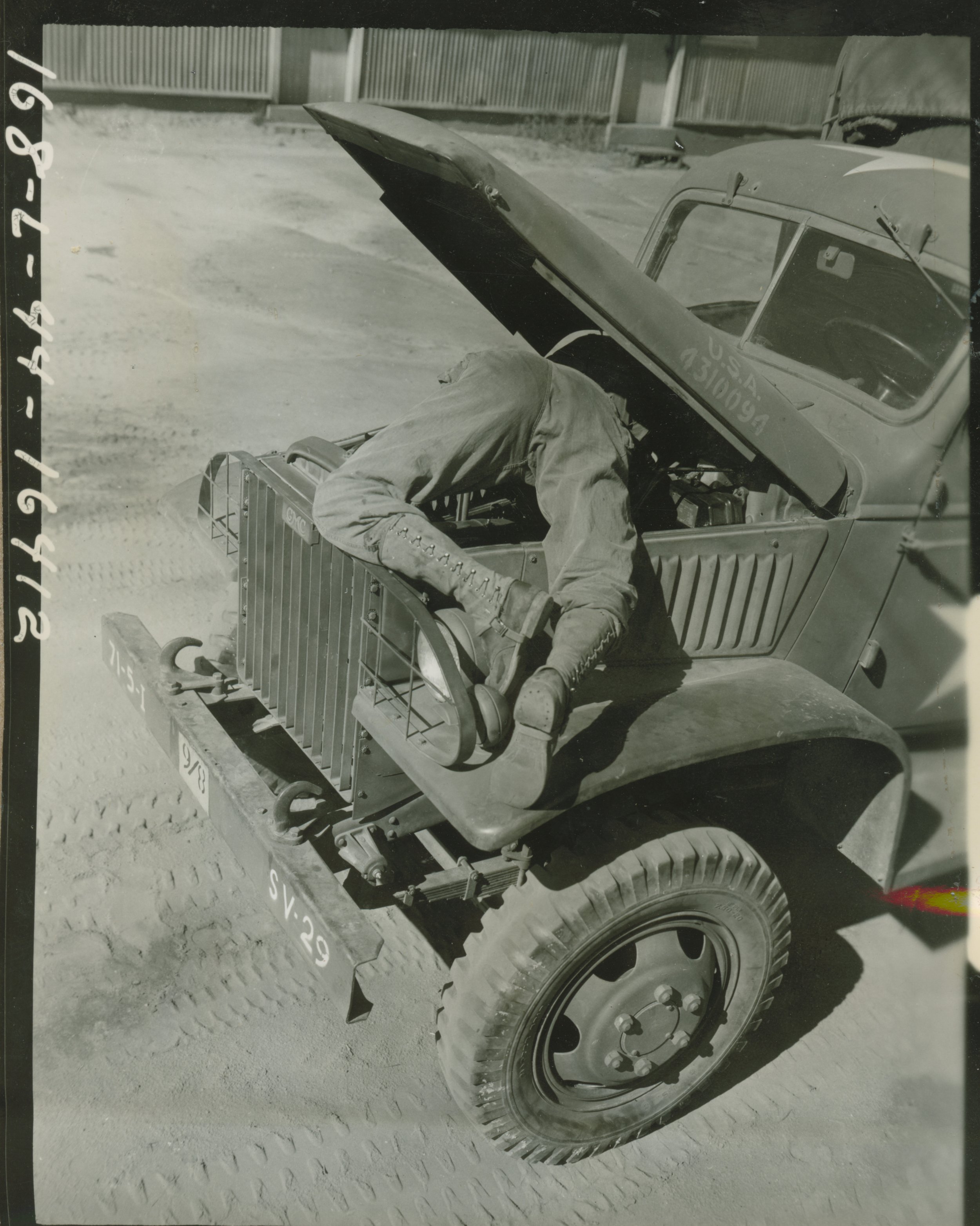
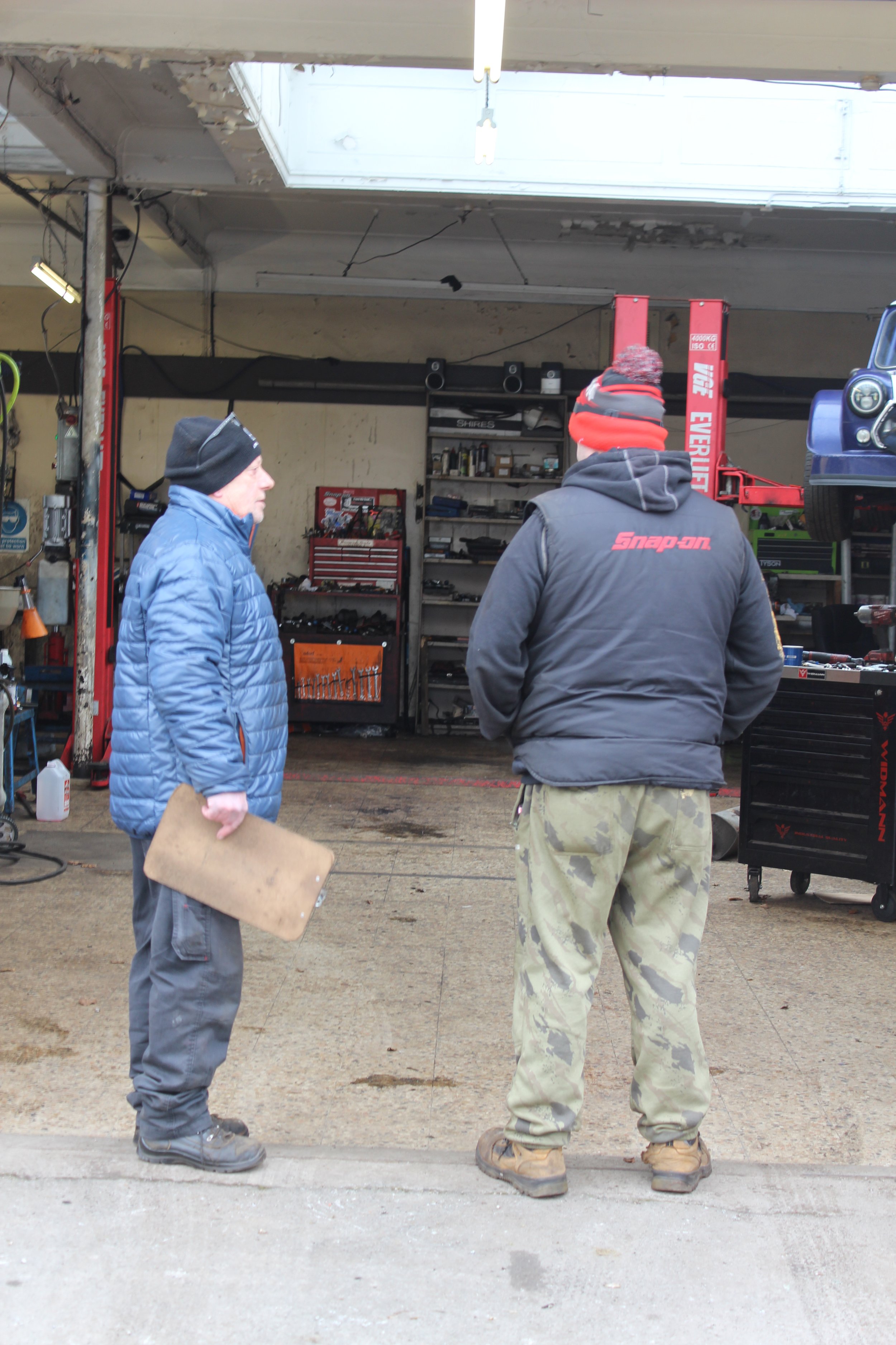
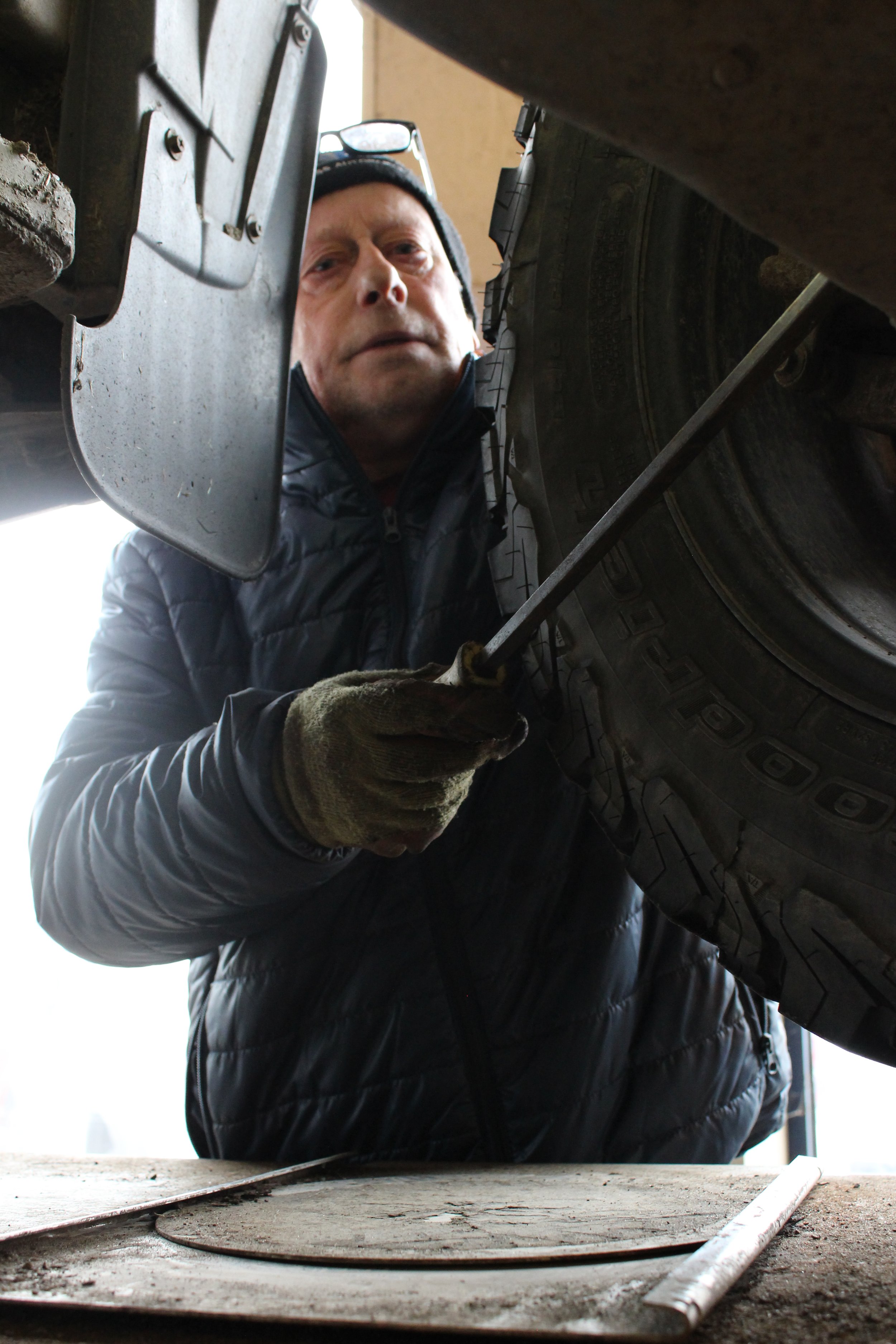
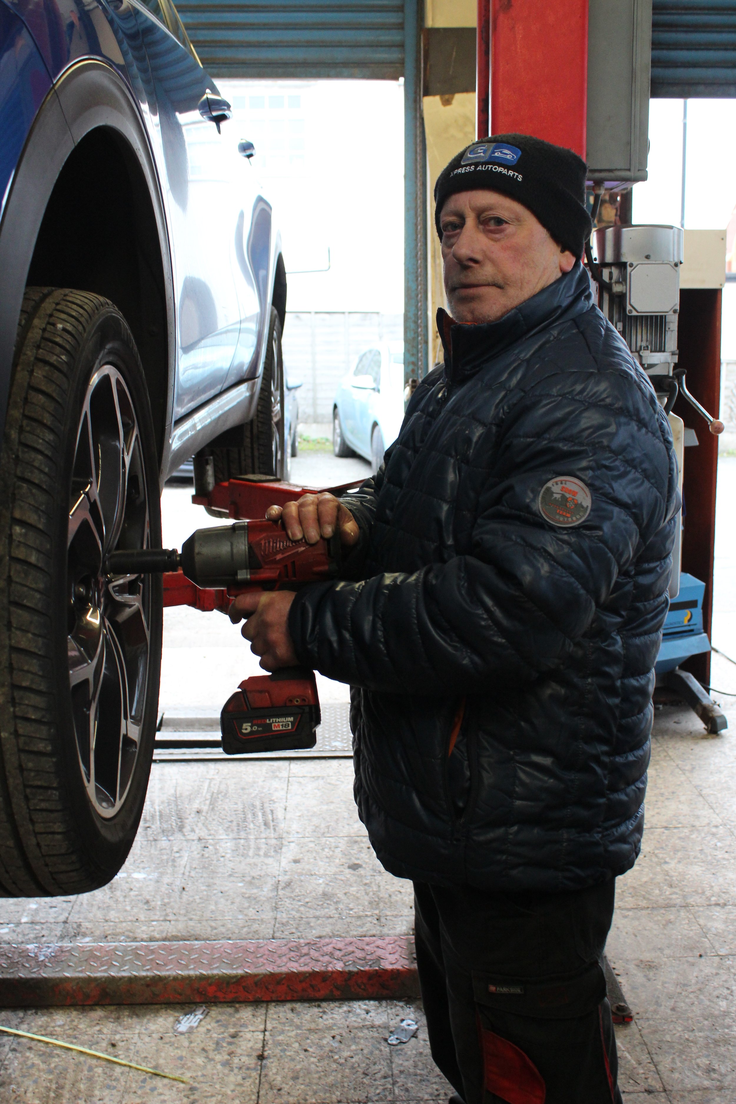
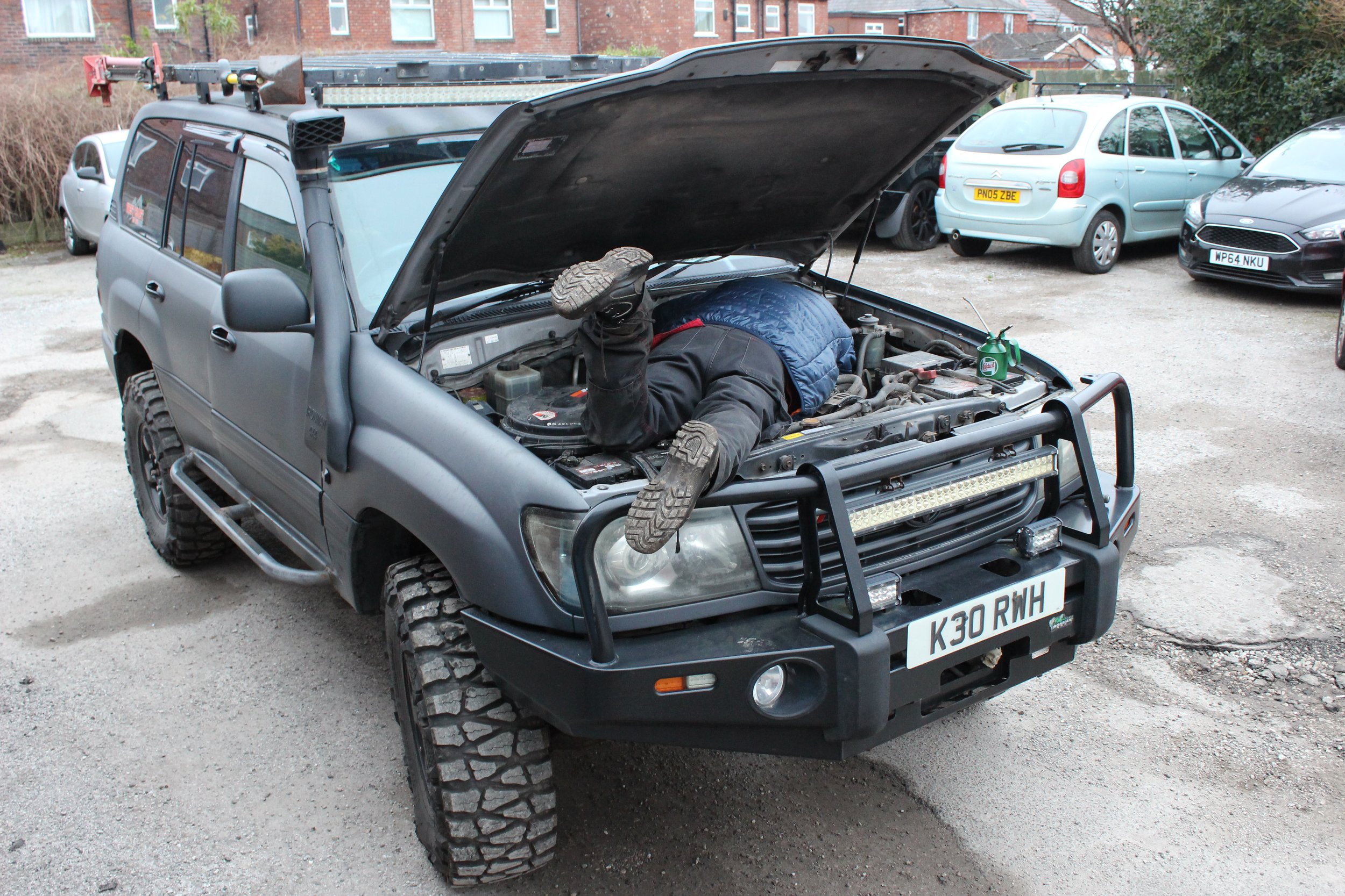
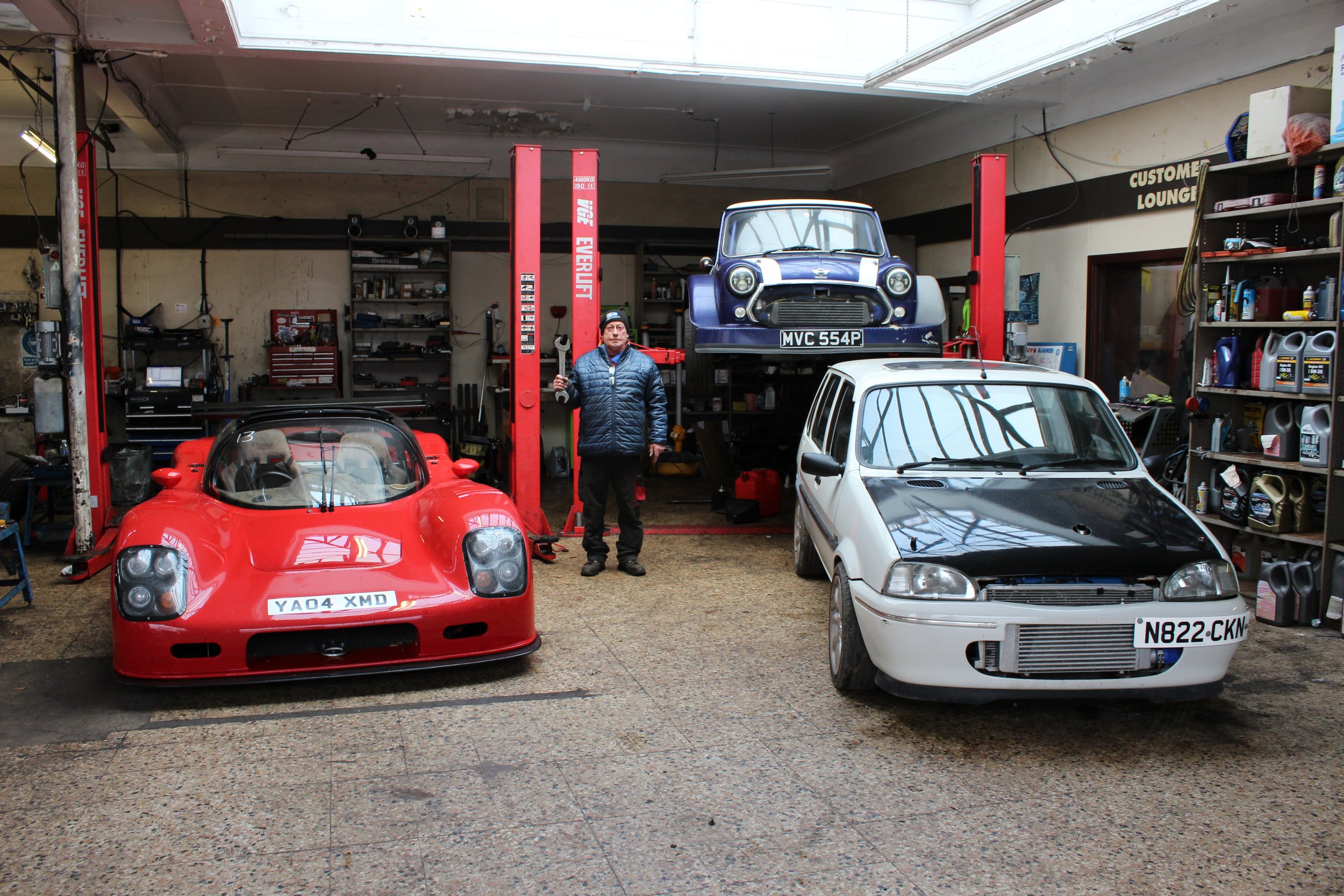
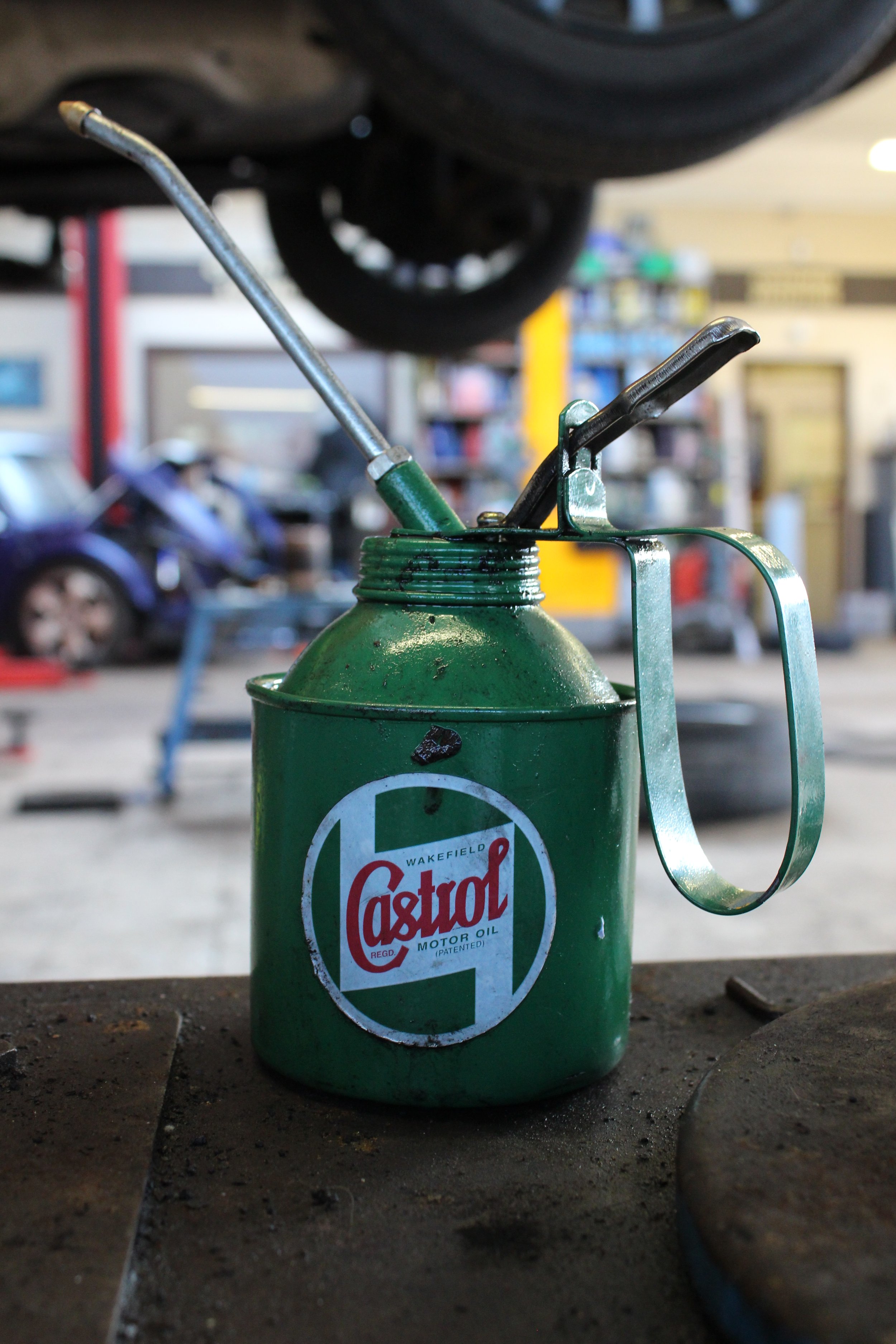
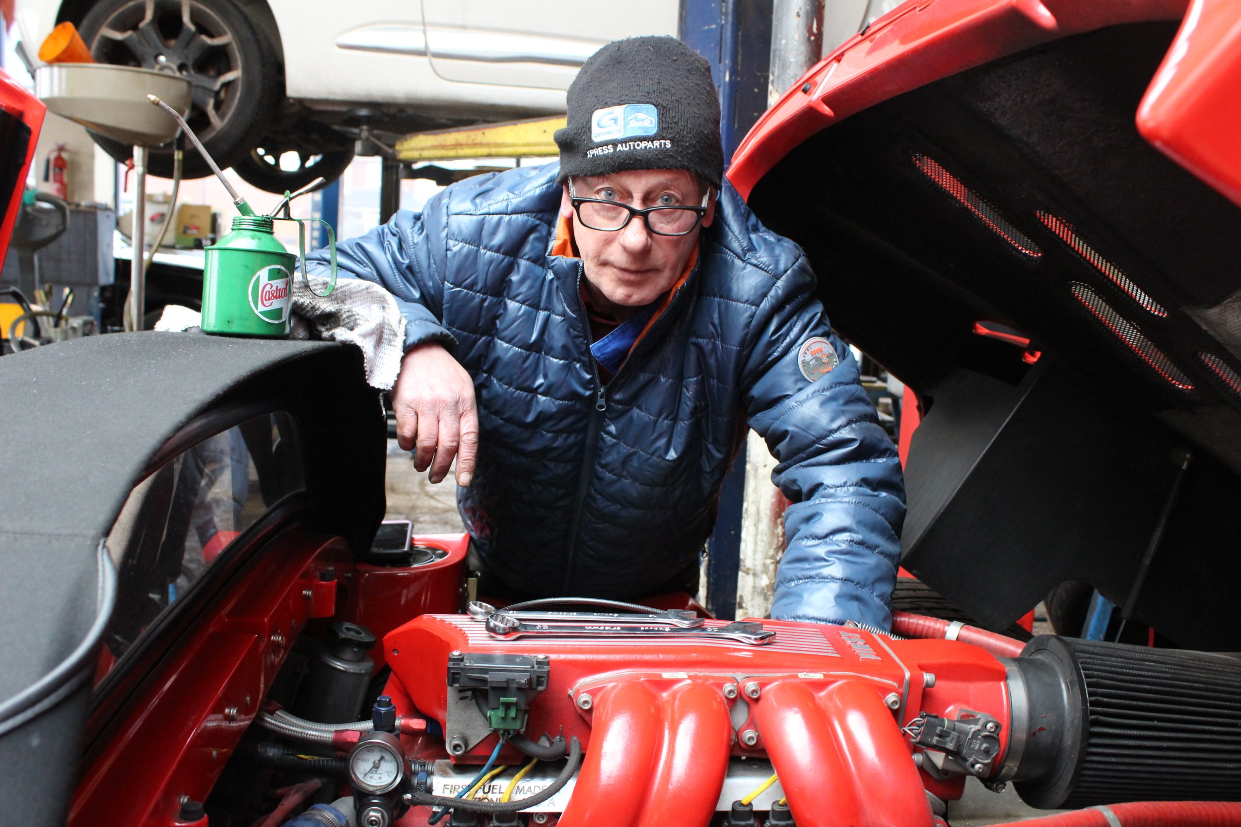
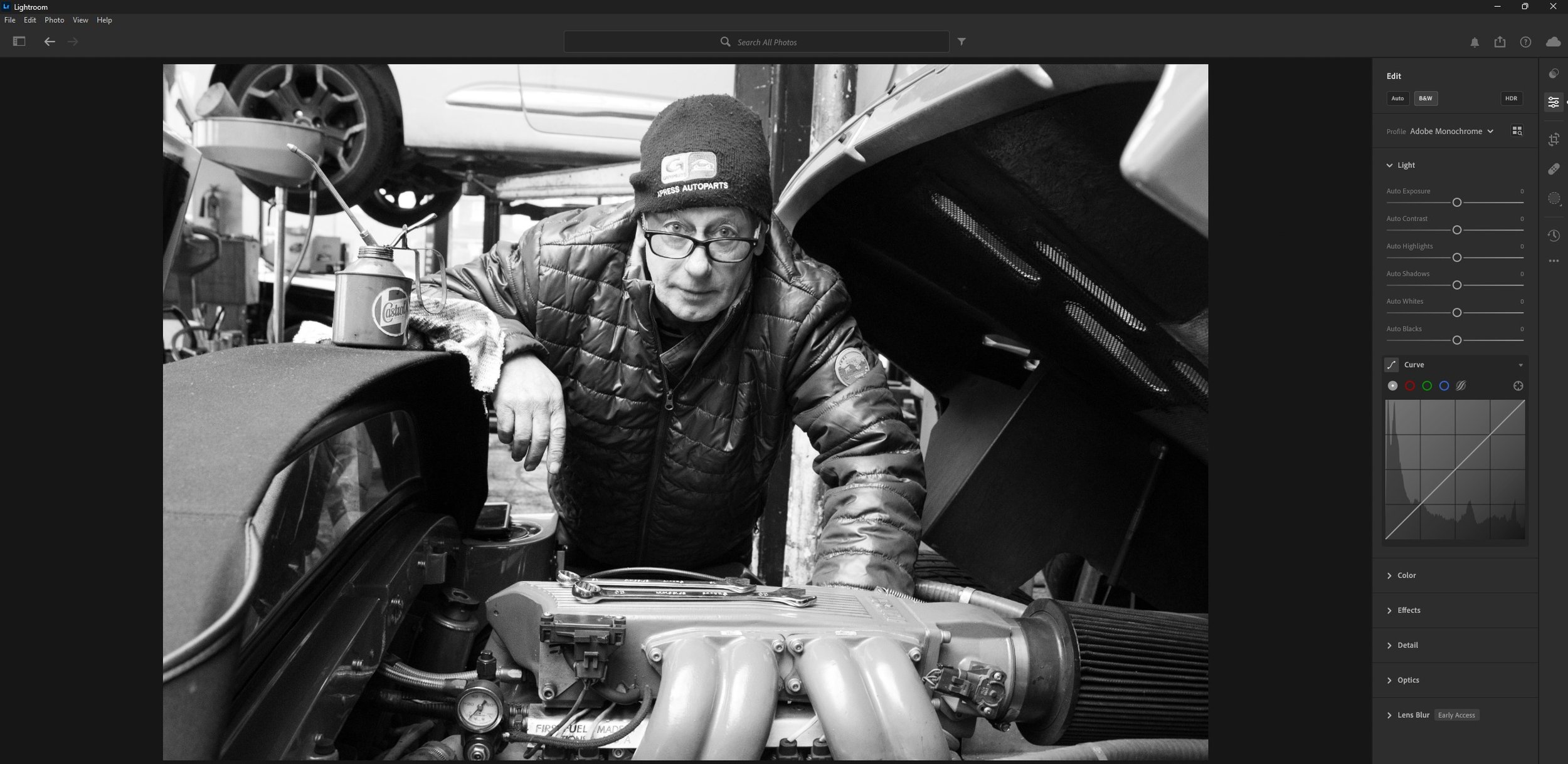
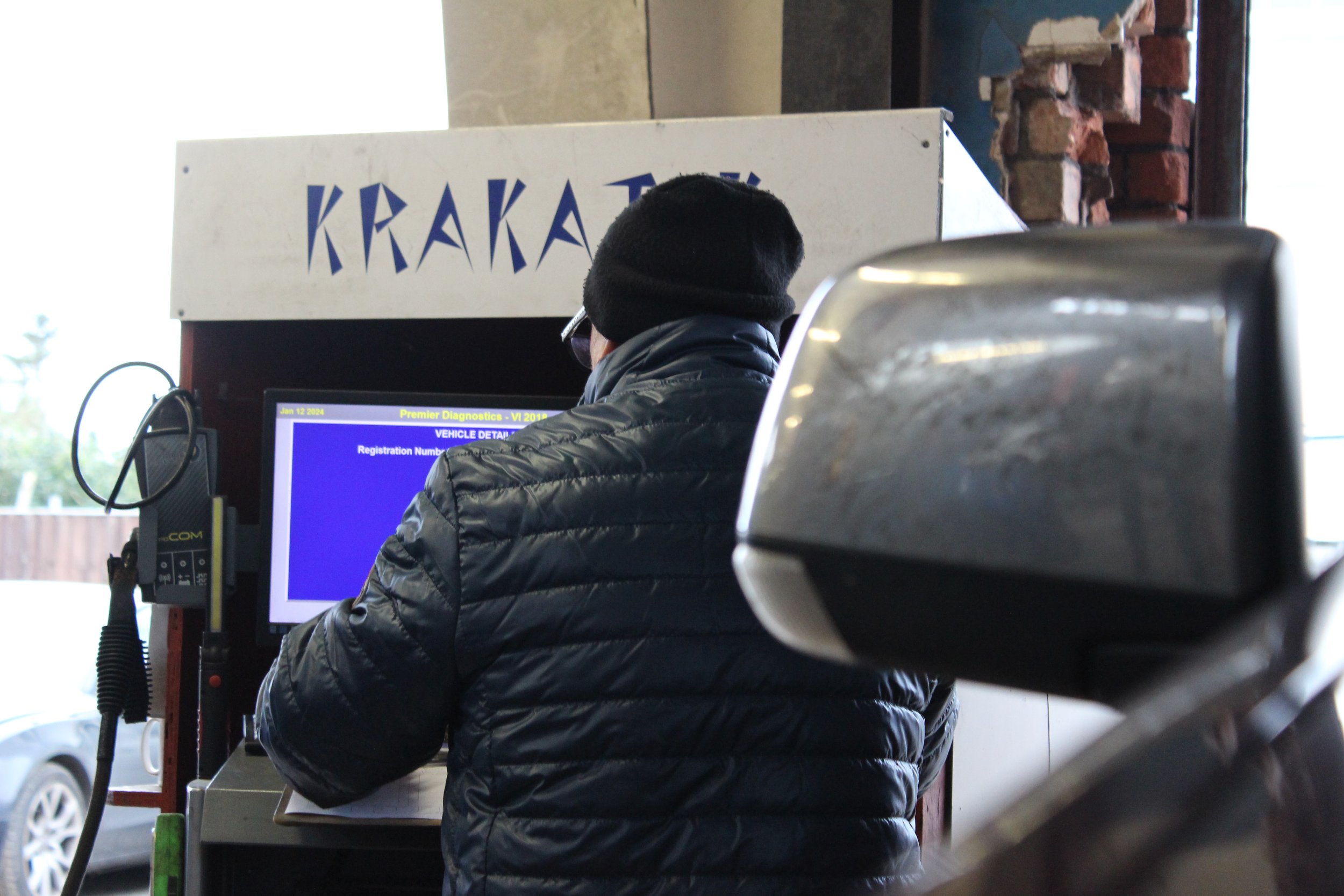
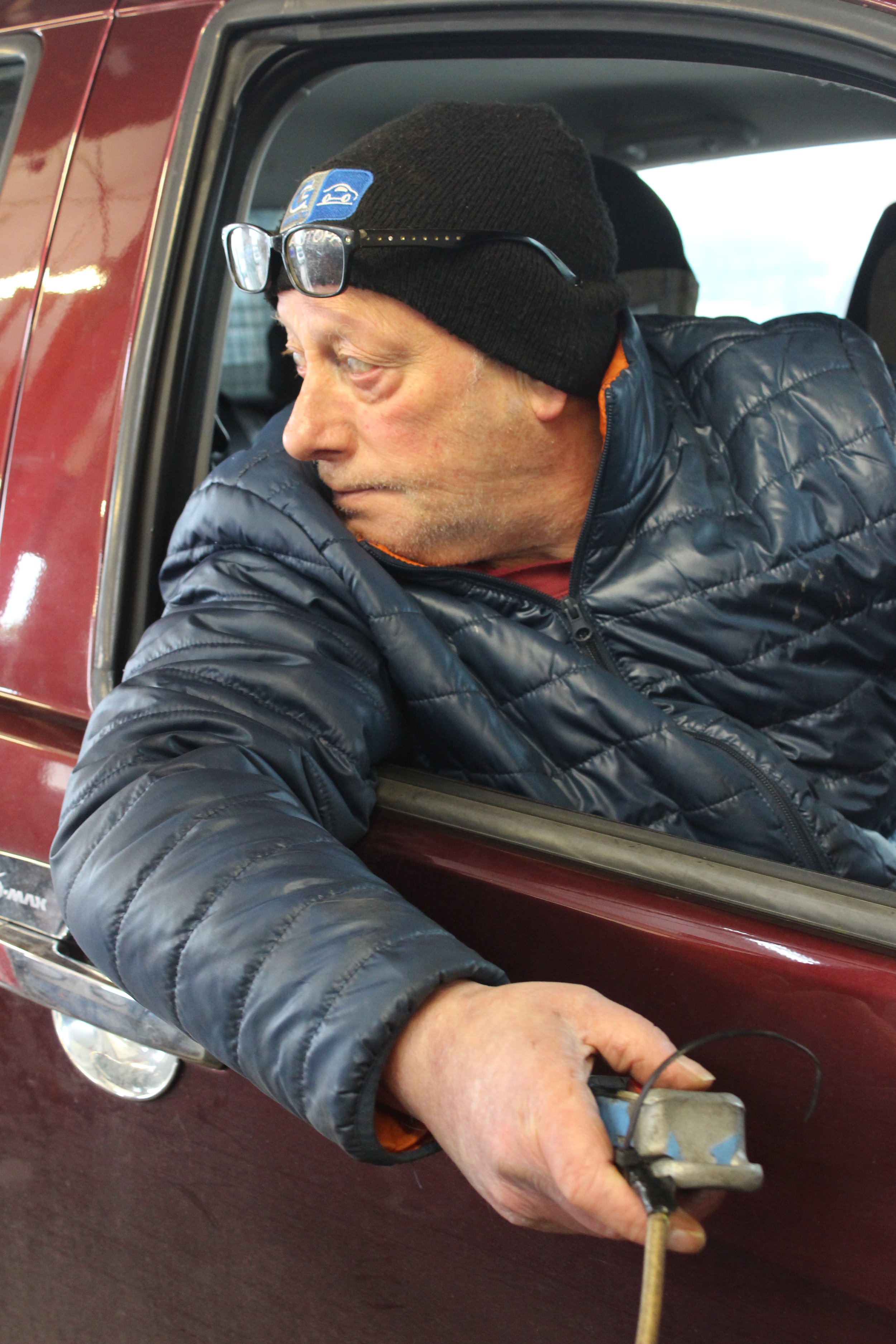
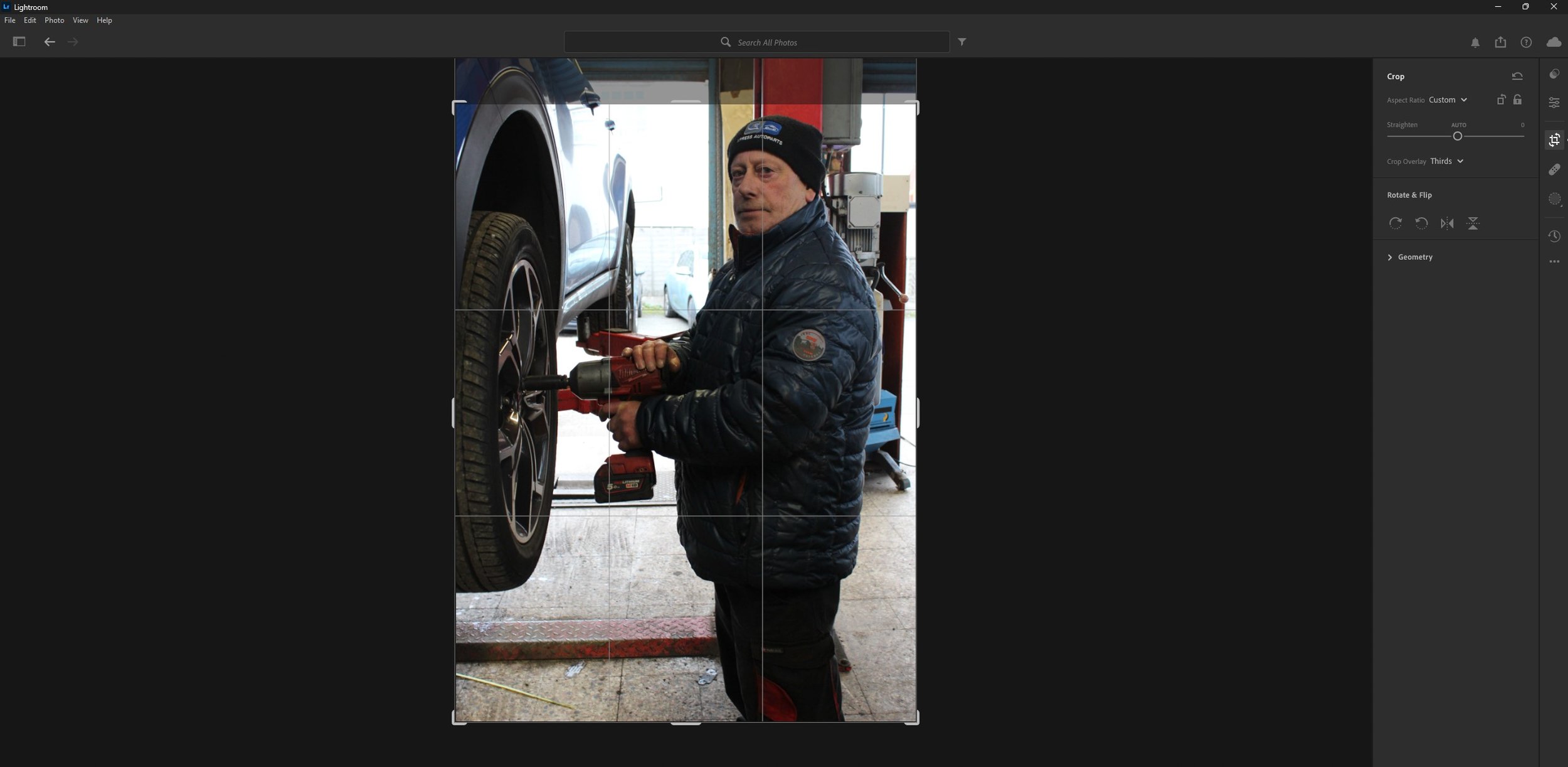
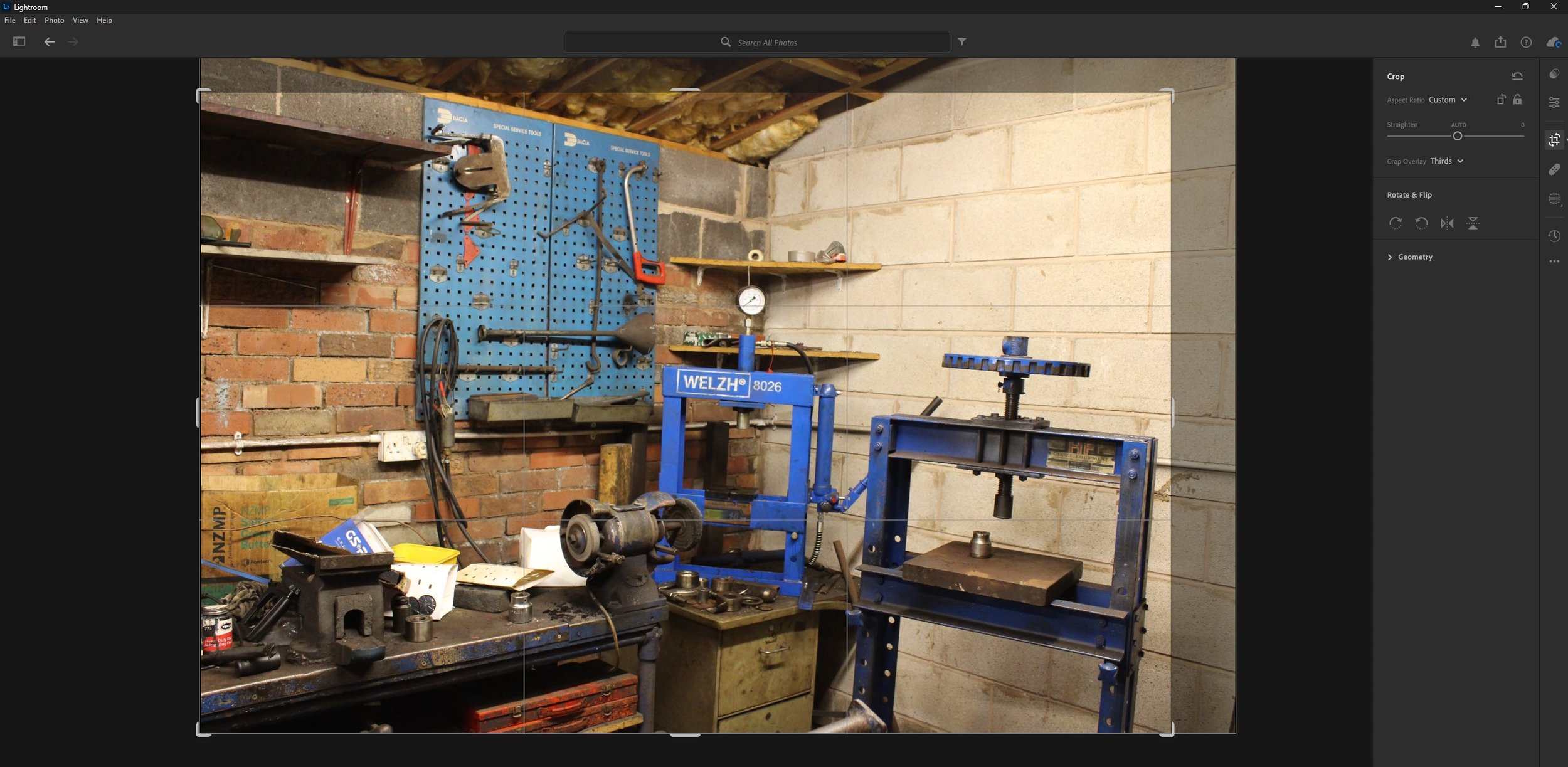
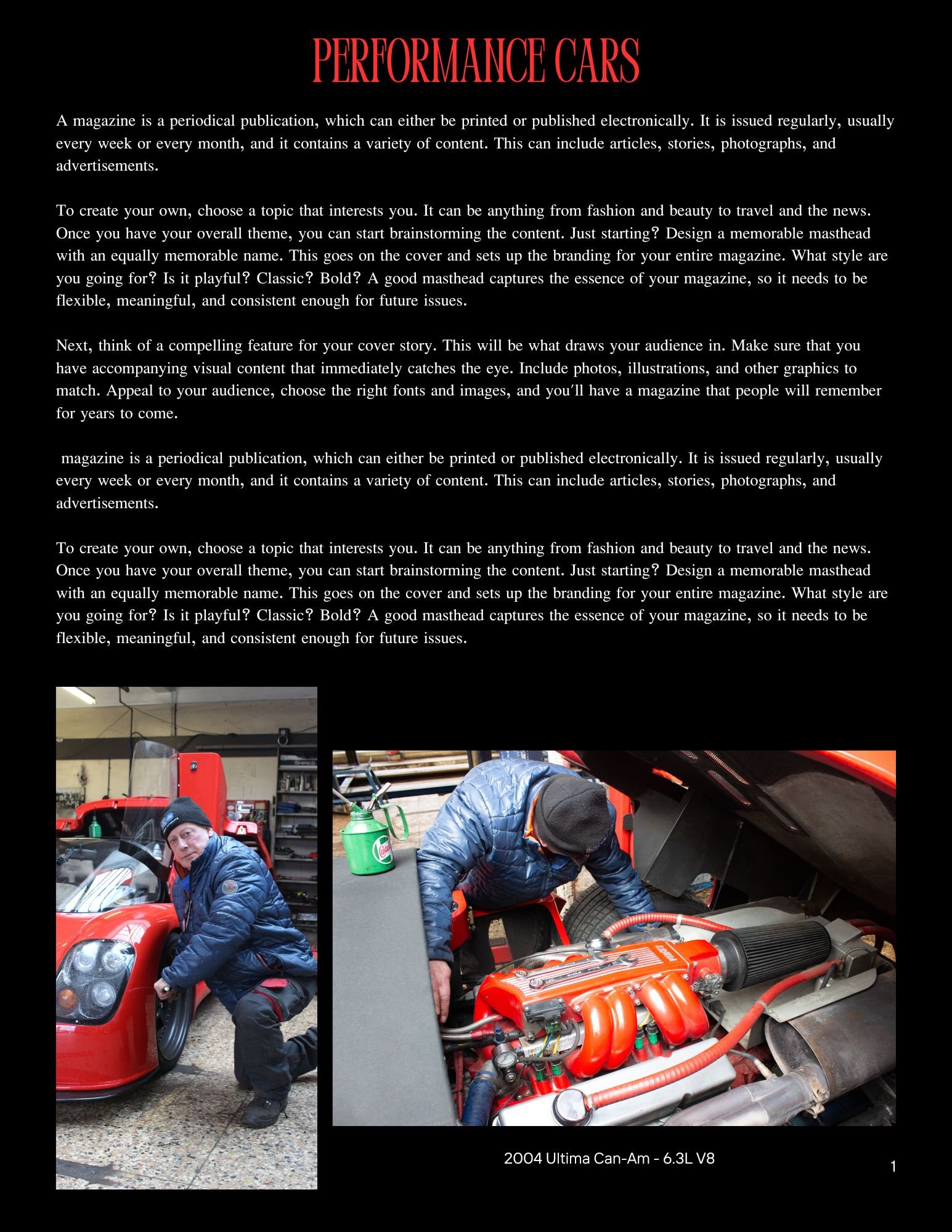
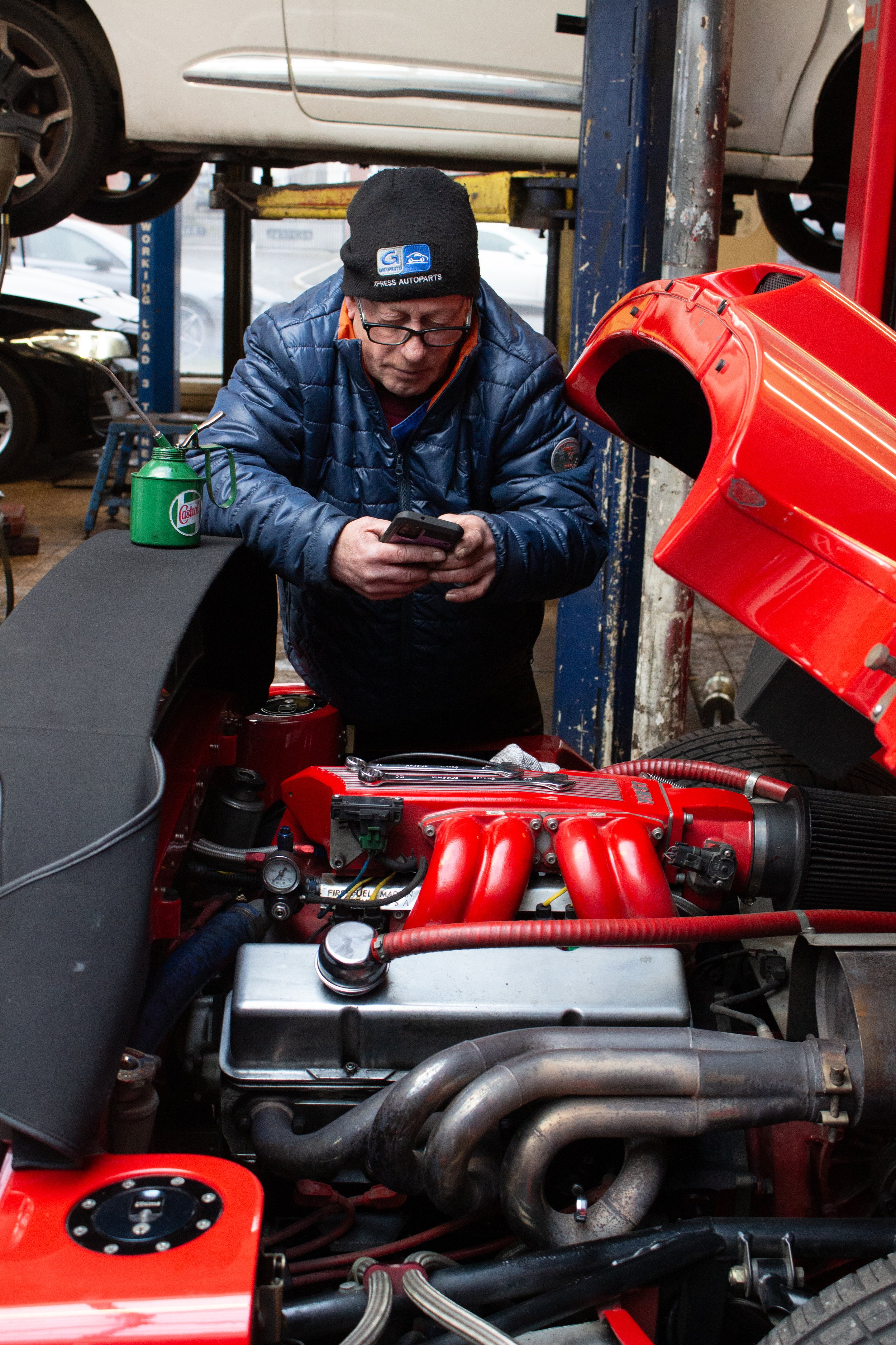
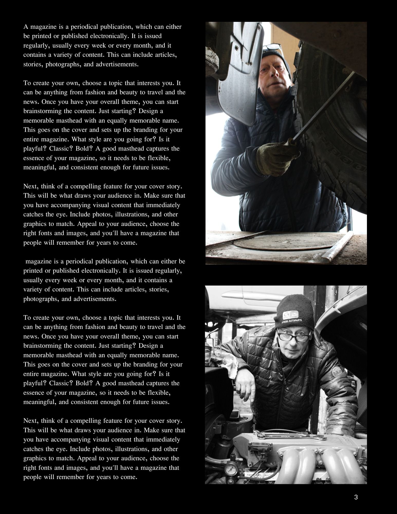
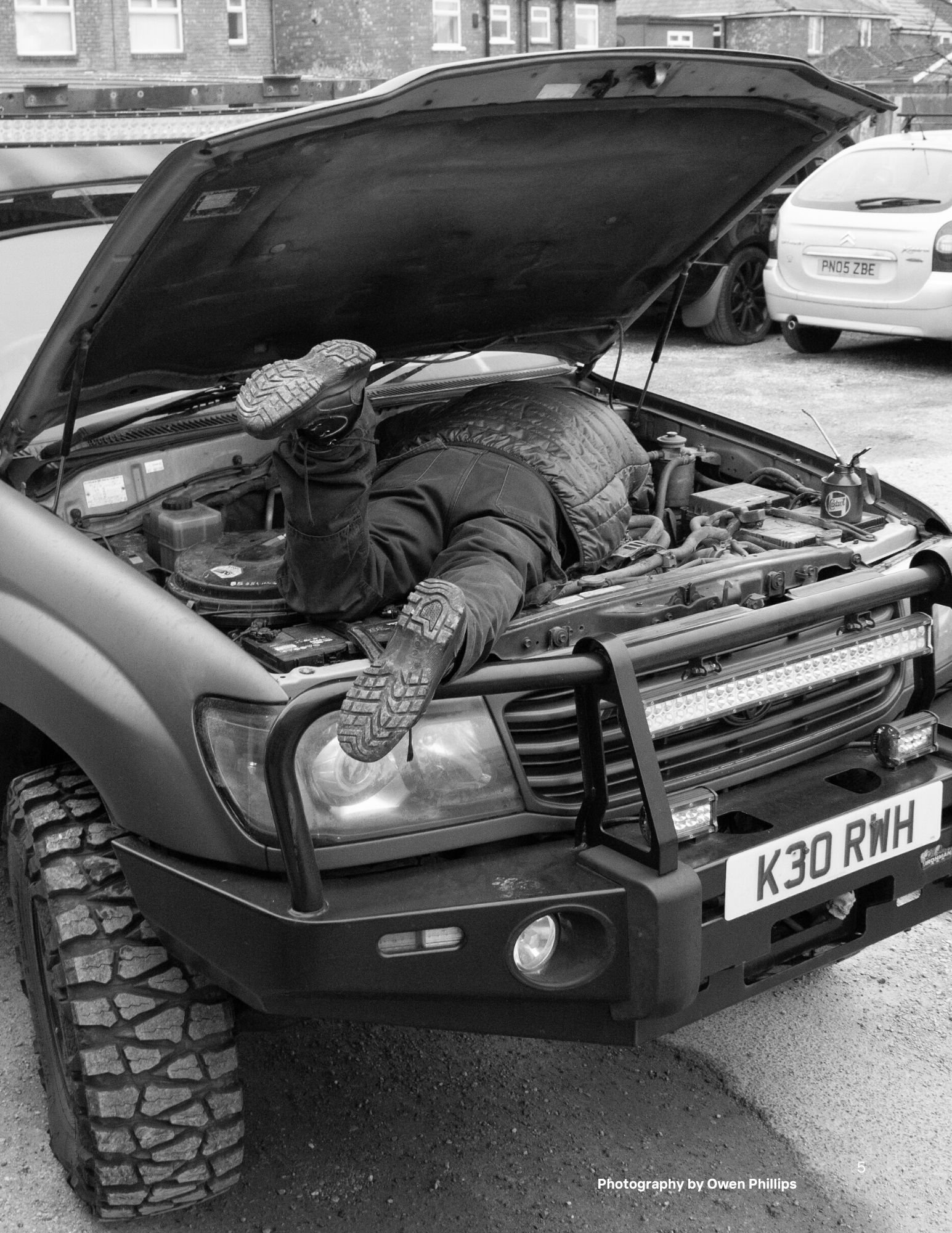
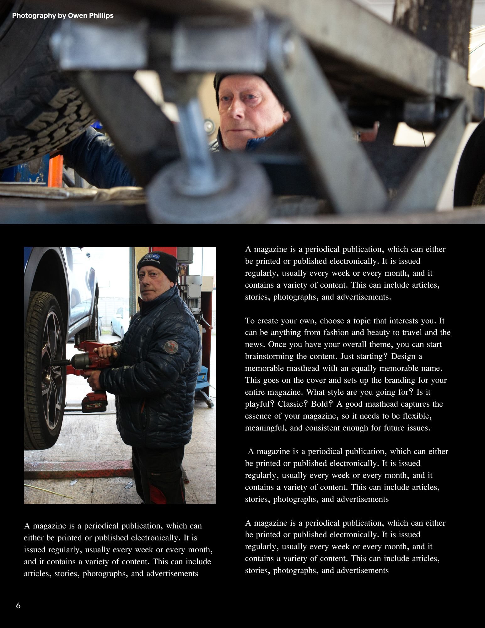
The main idea for this documentary photography unit is I am going to photograph a day in a life of my Dad in his work environment in a garage as he is a motor mechanic. My mood board of ideas below features shots that I would like you to emulate and take for my project. I will also create a magazine layout with a front cover, back cover and pages inside with a minimum of 15 images to be placed inside. As the brief suggests this is a good way to feature the photographs taken and as human beings we seem to be more curious about other peoples lives and by creating a zine it makes people feel more connected to the people were are reading about whether it is a magazine, newspaper or even generally an online news article/blog about them specifically.
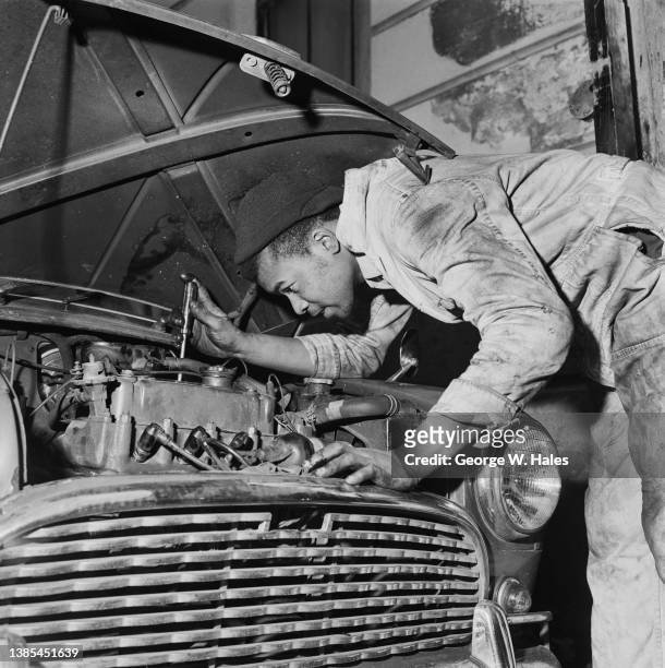
Production

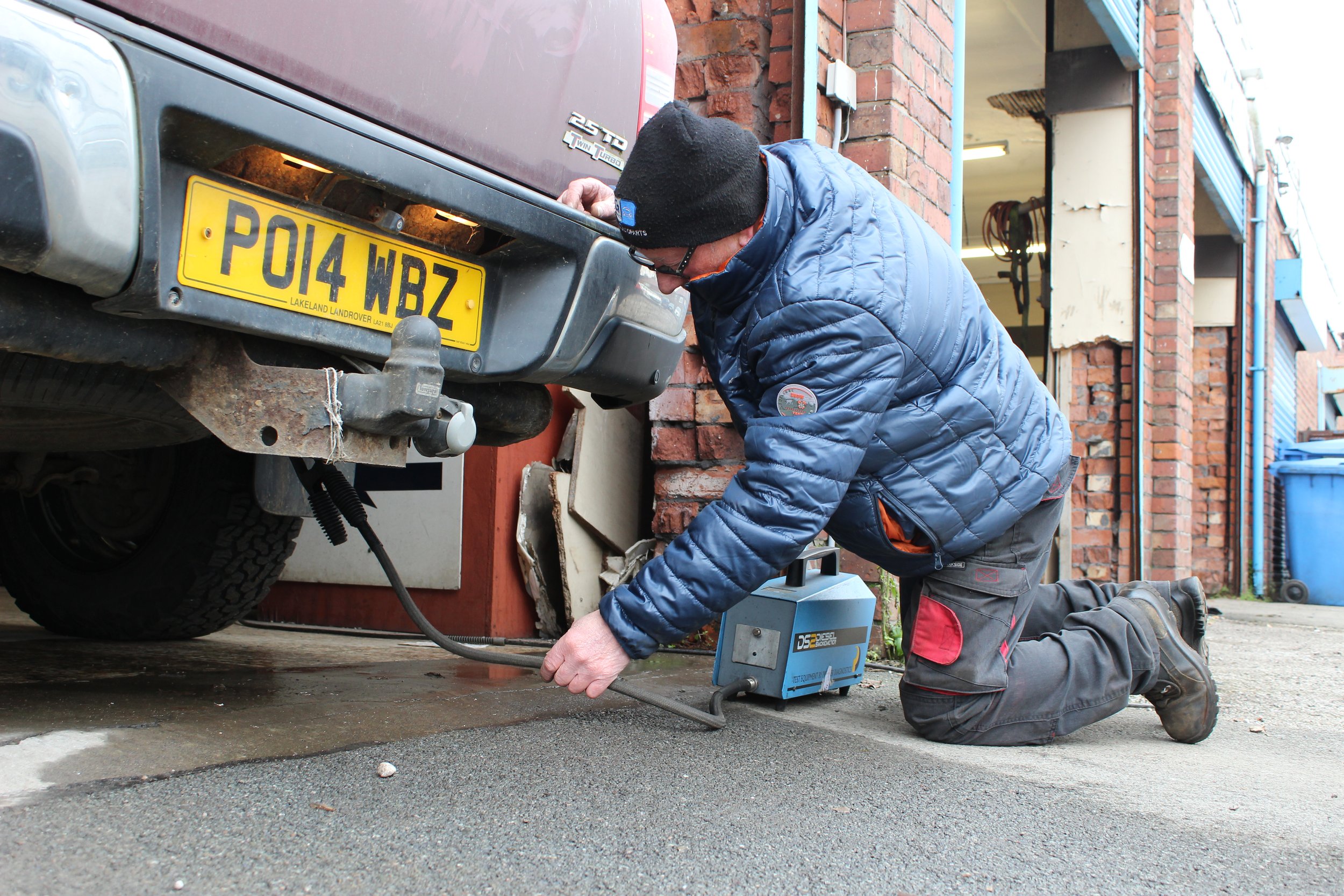
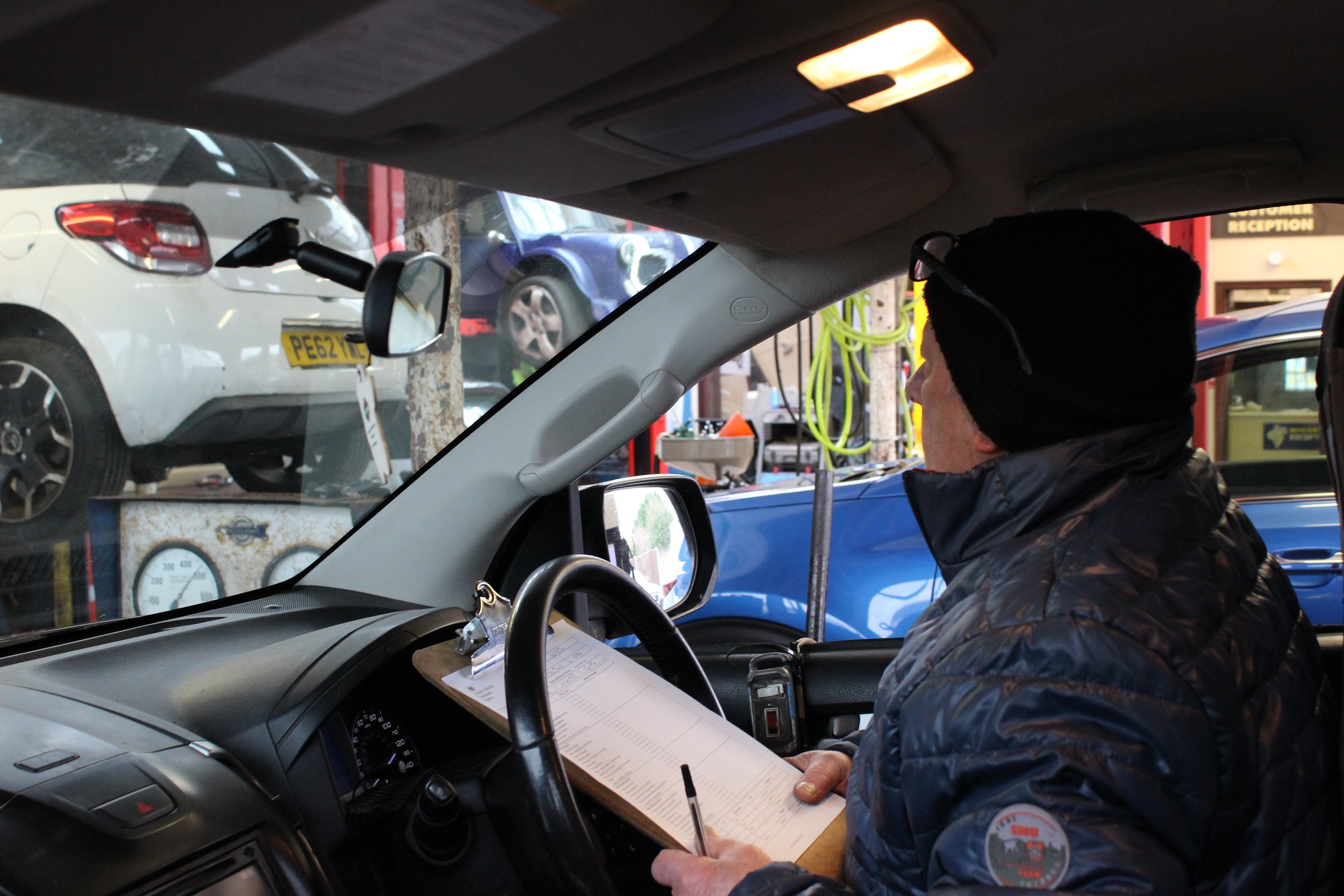

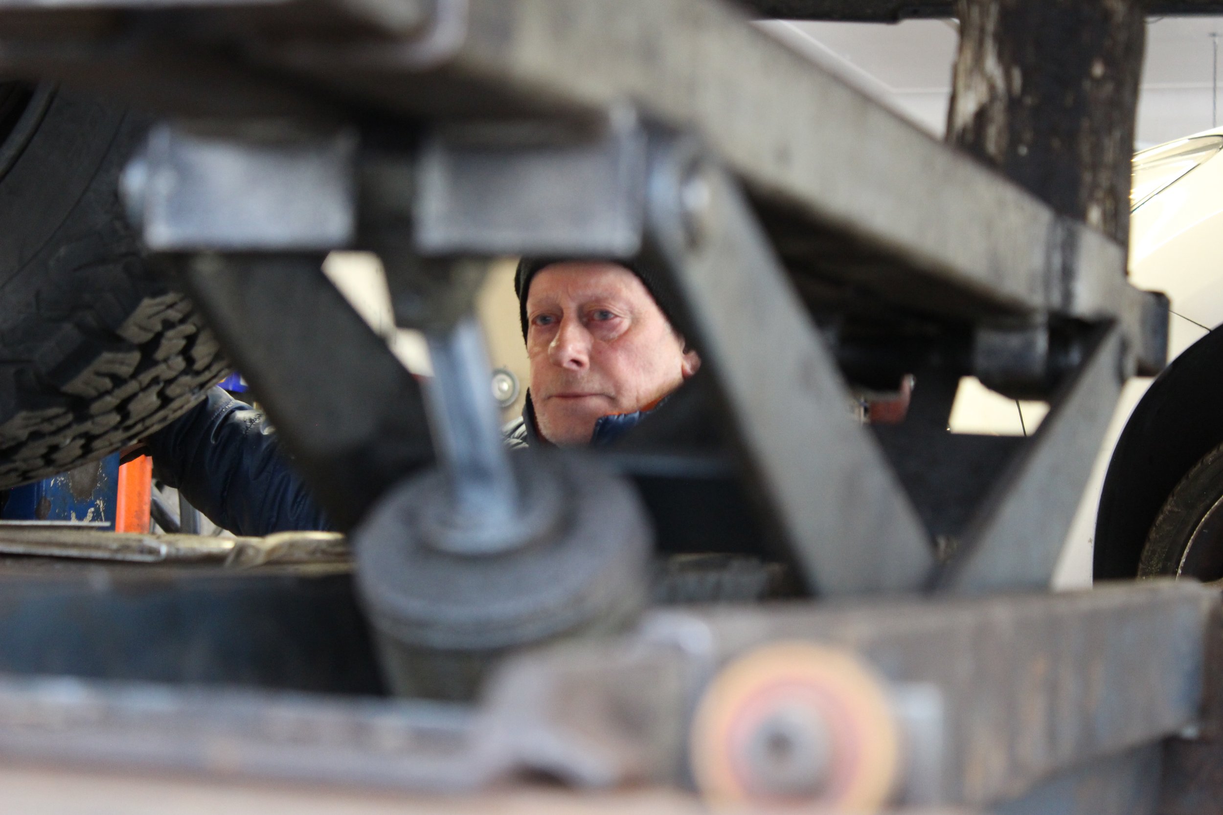

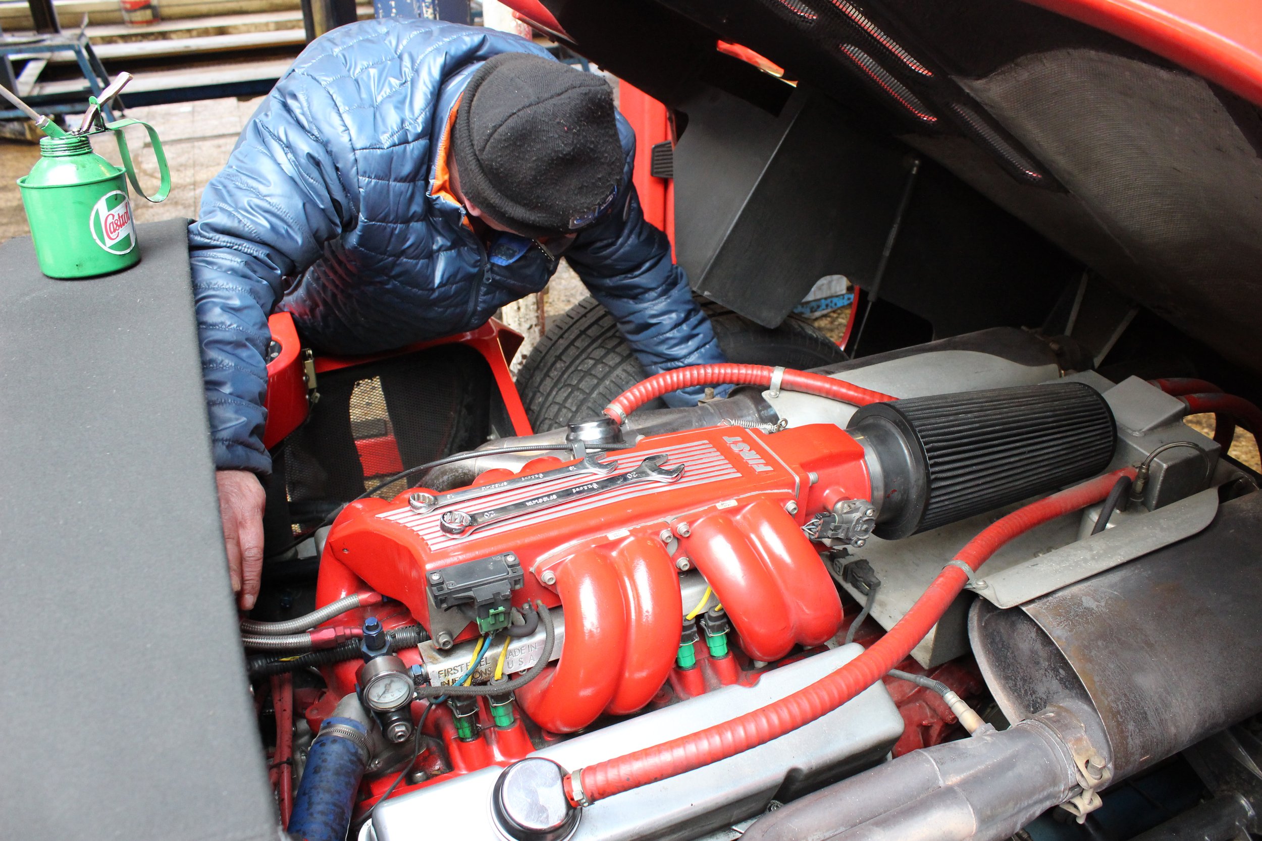
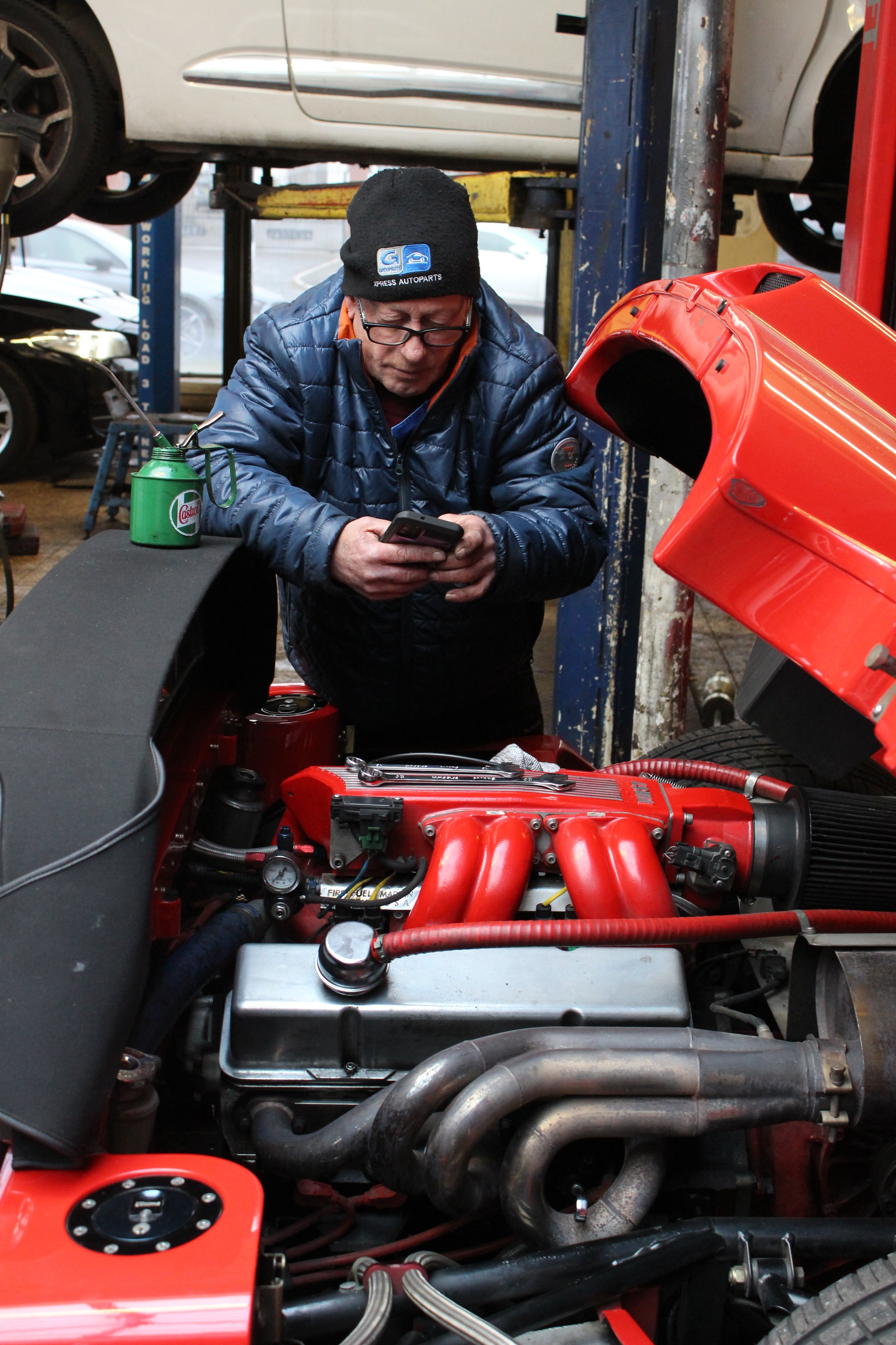
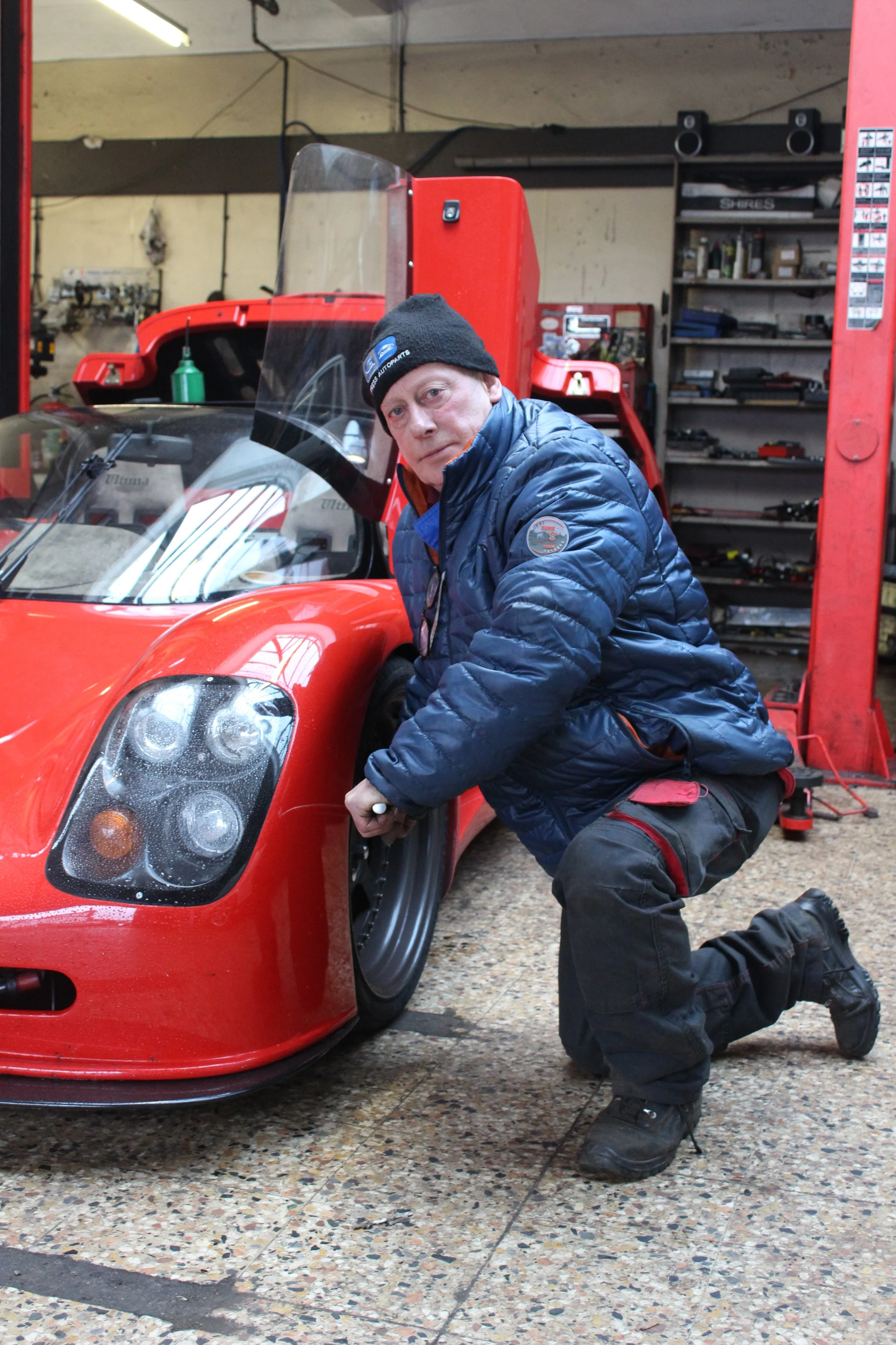
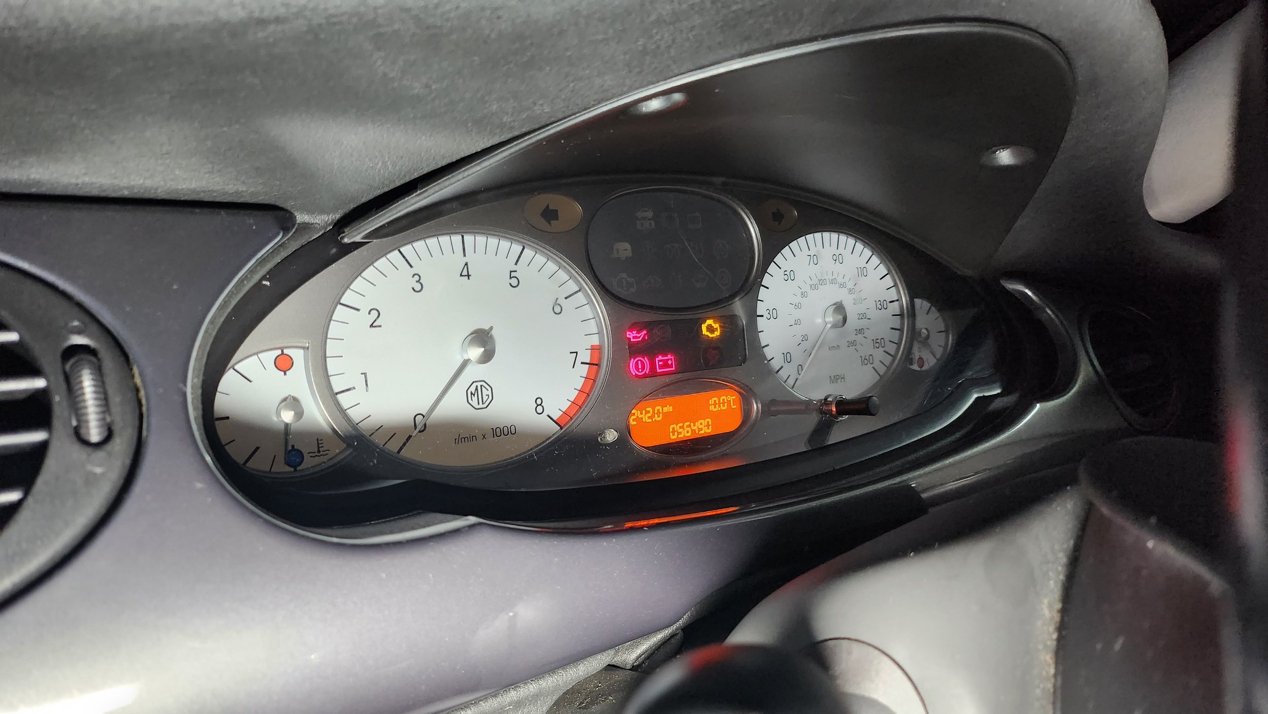
These photographs above are the non-edited images of the ones I used in the magazine mock-up. There is a minimum of 15 images for the zine and I have chosen 19 out of 181 images. As you will be able to tell above, I did my best to make sure the exposure settings are correct so I did little to no hue and saturation editing. There was only one image that I altered the levels due to poor lighting in the premises, but for all the other ones - the lighting is really good. I will only need to crop the image to delete some of the unnecessary parts of the image.
Post-Production
Edited Images For The Magazine
For this image, I altered the light levels as to me it seemed to bright. The contrast, the highlights and the white levels were mostly altered. This made the colours look more vibrant in the places I wanted to be able to be seen rather then looking somewhat white washed.
For this image I changed the image from colour to Black and White by clicking onto the B&W button inside Lightroom.
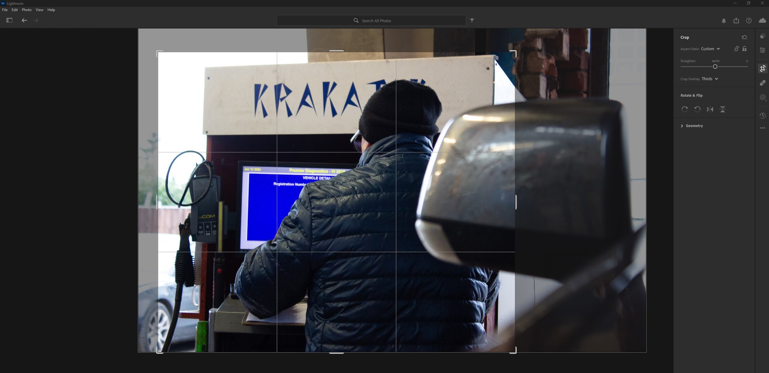

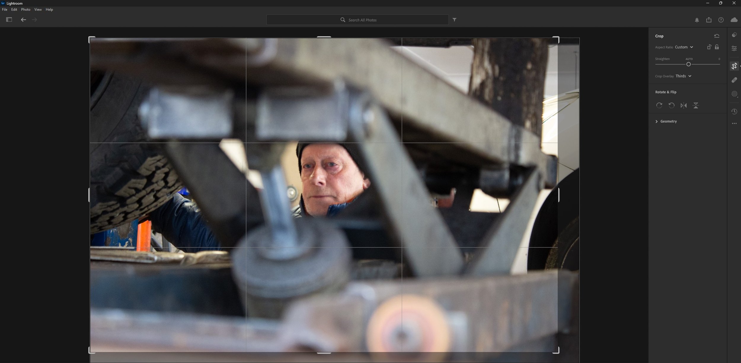
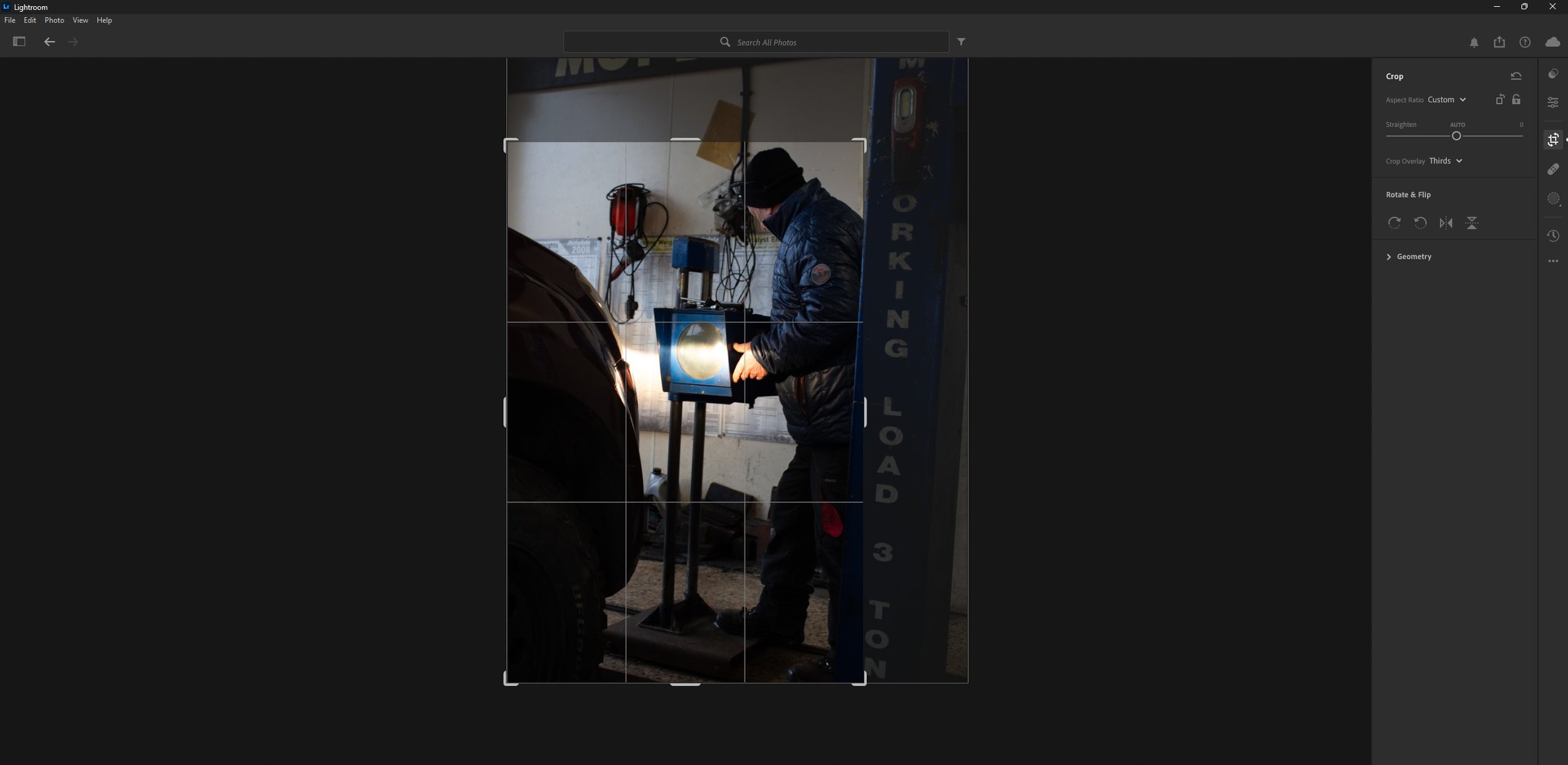
As you can see above, I have cropped the images to cut out the unnecessary parts such as some of the background to keep in focus the subject in the foreground.
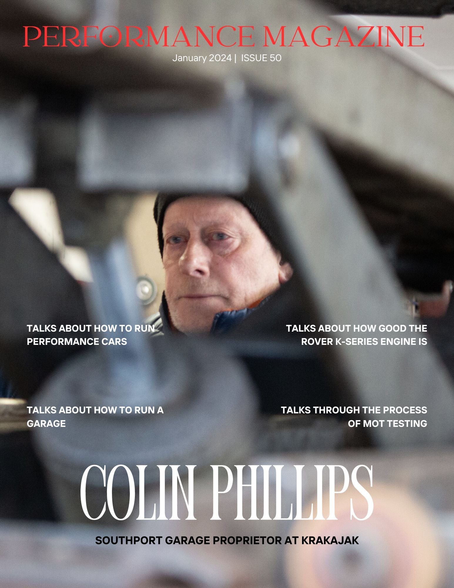
The Magazine Layout
As you can see above this is the magazine layout, I used a template originally and I customised it to the way I wanted it. The graphic design suite I used is called Canva.
Presentation
Evaluation & Reflection
Annotate three strengths & three Weaknesses of the final Documentary Photography Images?
To start with – the pre-production planning for this project was good as I knew exactly what I was going to shoot and how I was going to do it for example, the Land Cruiser image was inspired from a 60s image using an old WW2 Jeep and someone small under the bonnet working on something. (All this is evidenced in the ideas section under pre-production) Secondly, the camera exposure settings used were very good as I didn’t need to alter the levels in Lightroom, there was only one image that I needed to alter, but that was mainly down to the poor lighting in the building which made it dark. Lastly the magazine layout which I picked from Canva looks good and after putting in my 19 images in, everything came together exactly how I wanted it too.Moving onto my weaknesses, I could have photographed more of my Dads spare time and what he does outside of work rather than dedicating it to his work in a garage, but with the time against me on this project I couldn’t do everything, Secondly I could of shot a more variety images of machinery or miscellaneous items then sticking to the image of my Dad working in a garage. Lastly I could of added my own text into the magazine layout so it looks more realistic, for example when he talks about performance cars, I could of written in about that specifically like an interview – (now this is me being a perfectionist)
Who was your intended target audience for your “Day in the Life Zine”?
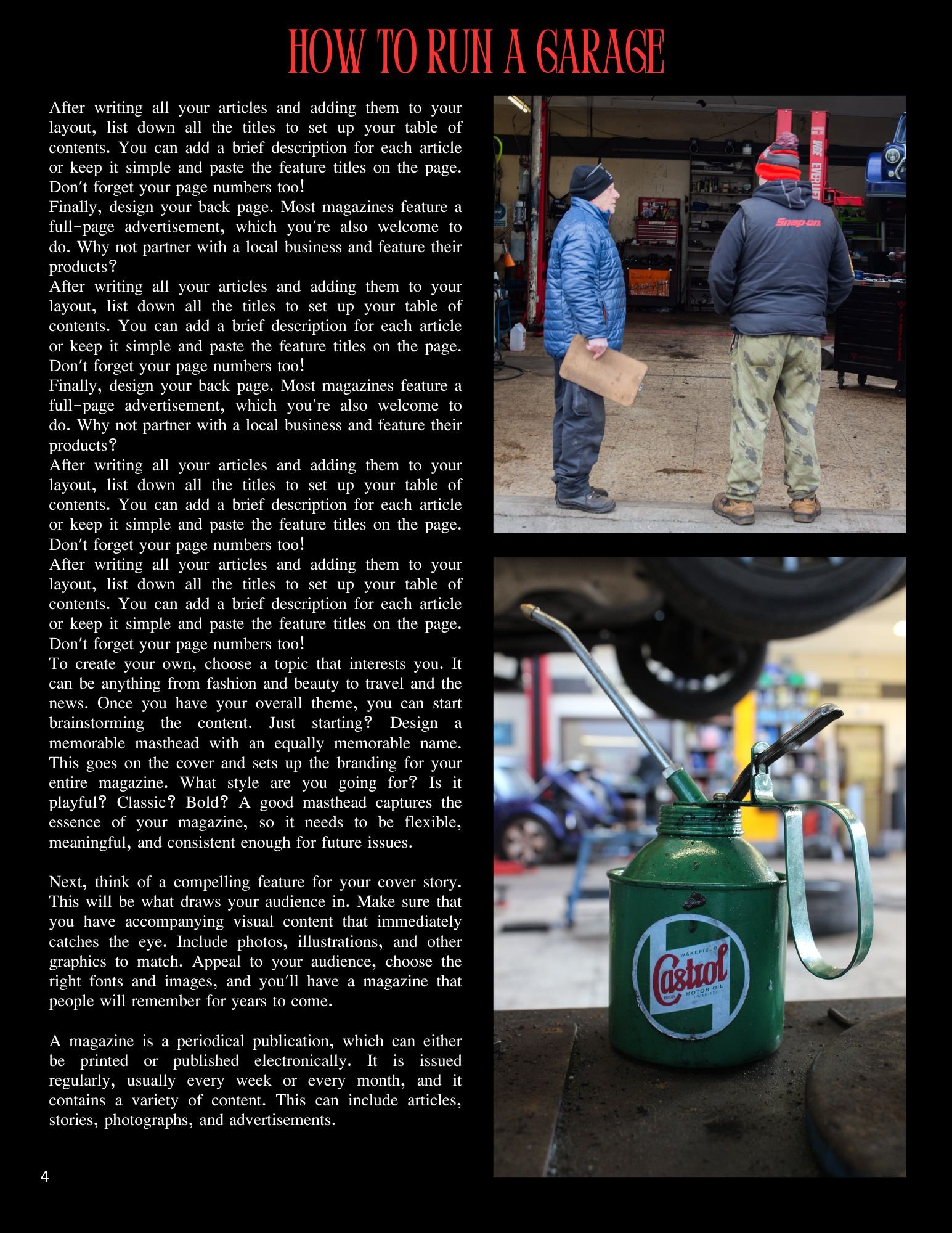
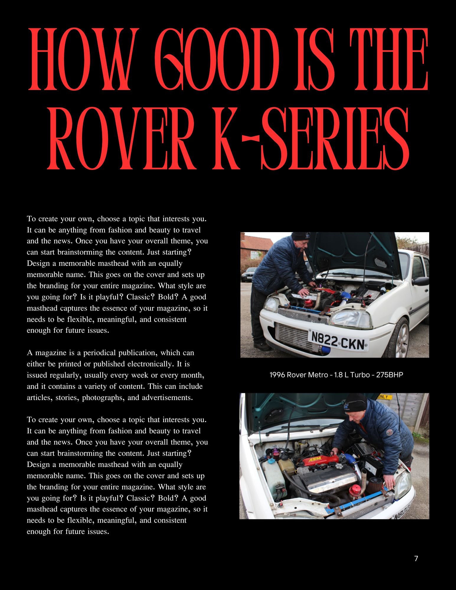
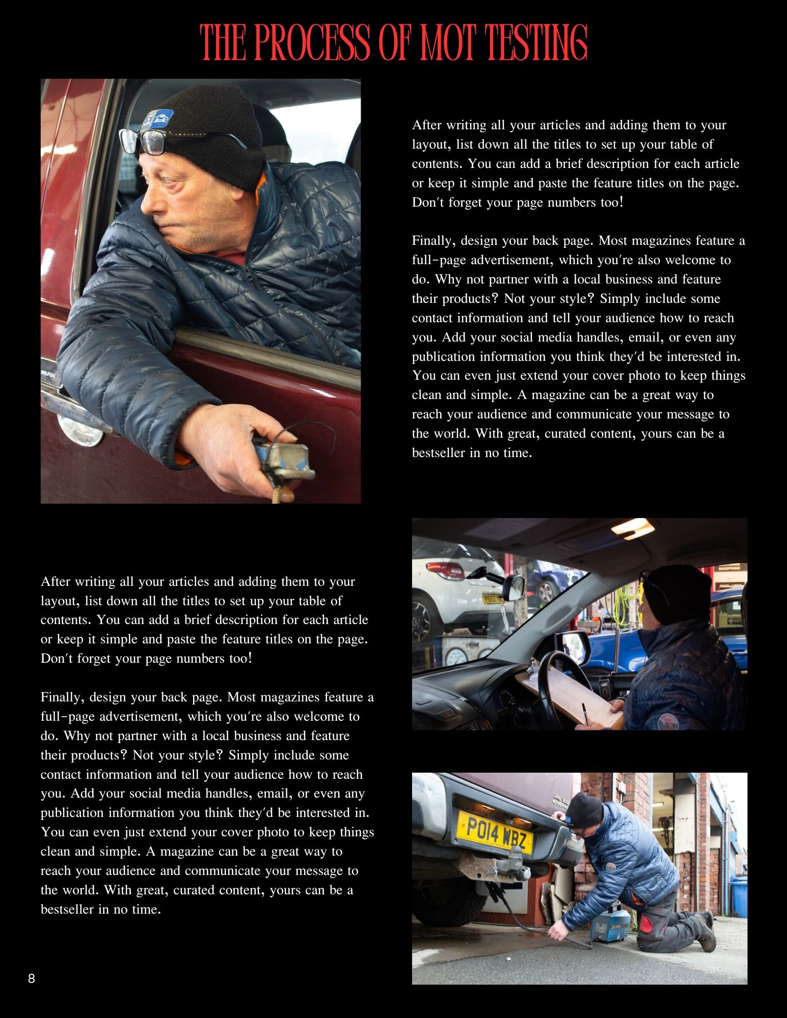
The intended target audience for my magazine is to the car industry or even somebody interested in cars generally interested to hear an actual mechanics take on things for example “the process of MOT Testing” or even attracted to a particular article such as “How Actually Good is the Rover K-Series engine” when back in the 80s and 90s it was known for its fragility and head gasket problems – what I am trying to say is that it is attracting people to read the article with their existing knowledge on such topics, but with their minds open to learn more about why this person thinks or how he thinks that way.
What were your key areas of development during this unit work?
The main area of development for me throughout this unit work is the photography techniques have improved significantly, as I am tailored towards more the film making side – I can transfer some of my skills from that field and put them into practice when taking photographs. The hardest part was making sure that the camera exposure settings were perfect before taking pictures as I didn’t want to alter levels in Lightroom. From that point of view, I am a perfectionist because it needs to be right otherwise it is not worth bothering with. It took a few days to practice and experiment with different angles and shot types to get the right one I wanted. I would go as far as going back on location again if I wasn’t happy with the pictures I’d got and reshoot.
Authentication Document

Television Commercial Production
The brief has asked us to create a 20 second TV Commercial / advert for either the TV or the Internet. It says it can either be shot in the studio or on location.
Before the internet commercials were mainly showcased on the televisions as that was really the only medium that it could be presented on.
Context & Research
Analyse x3 TV Commercials: -
With 20 seconds being the minimum for our own TV Commercial, I have picked adverts which have the duration of 20 seconds which will make it easier for me to analyse and also it is the same length as my final product.
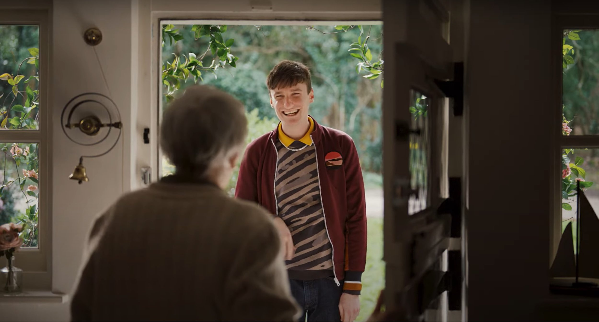
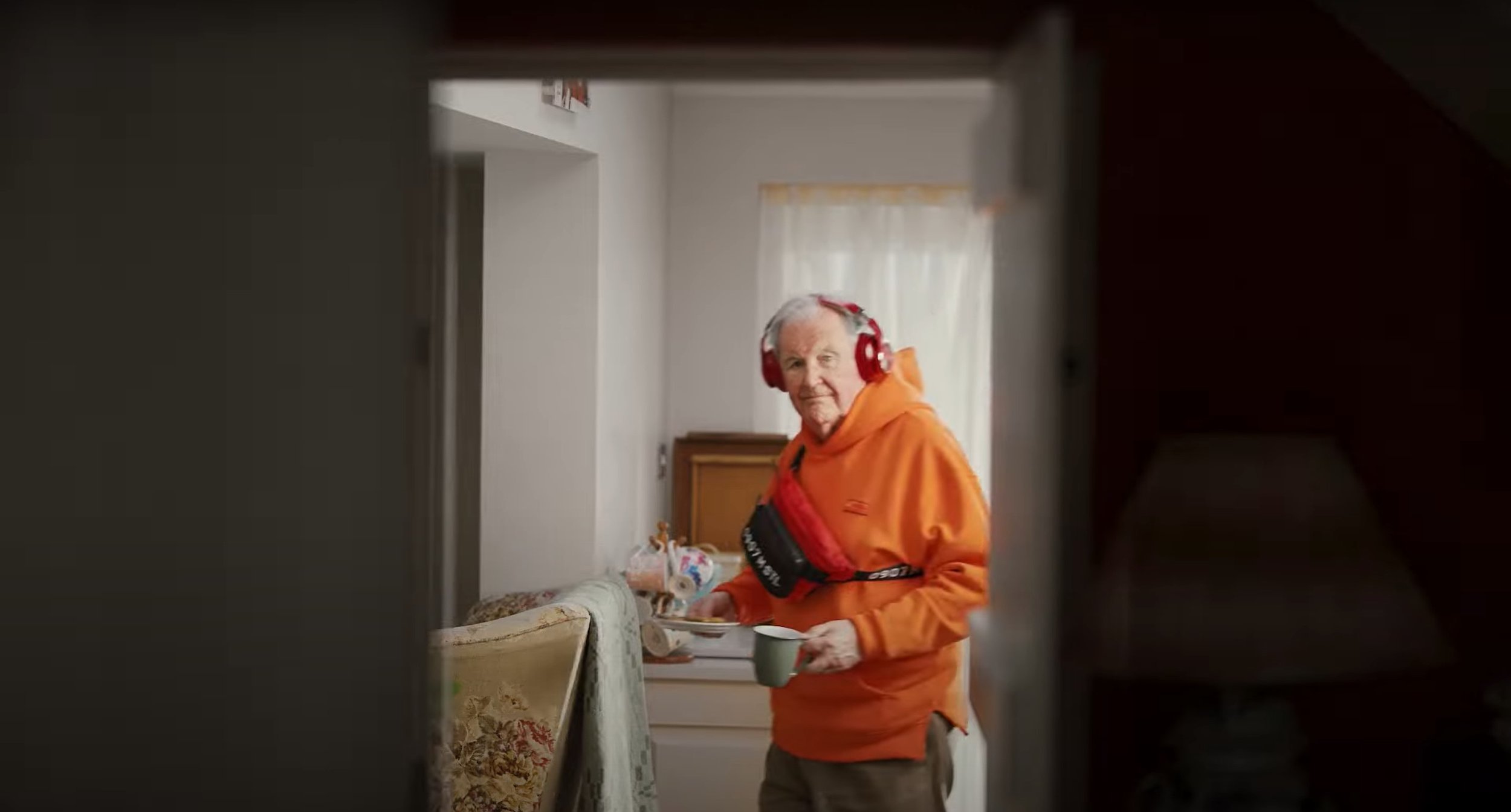
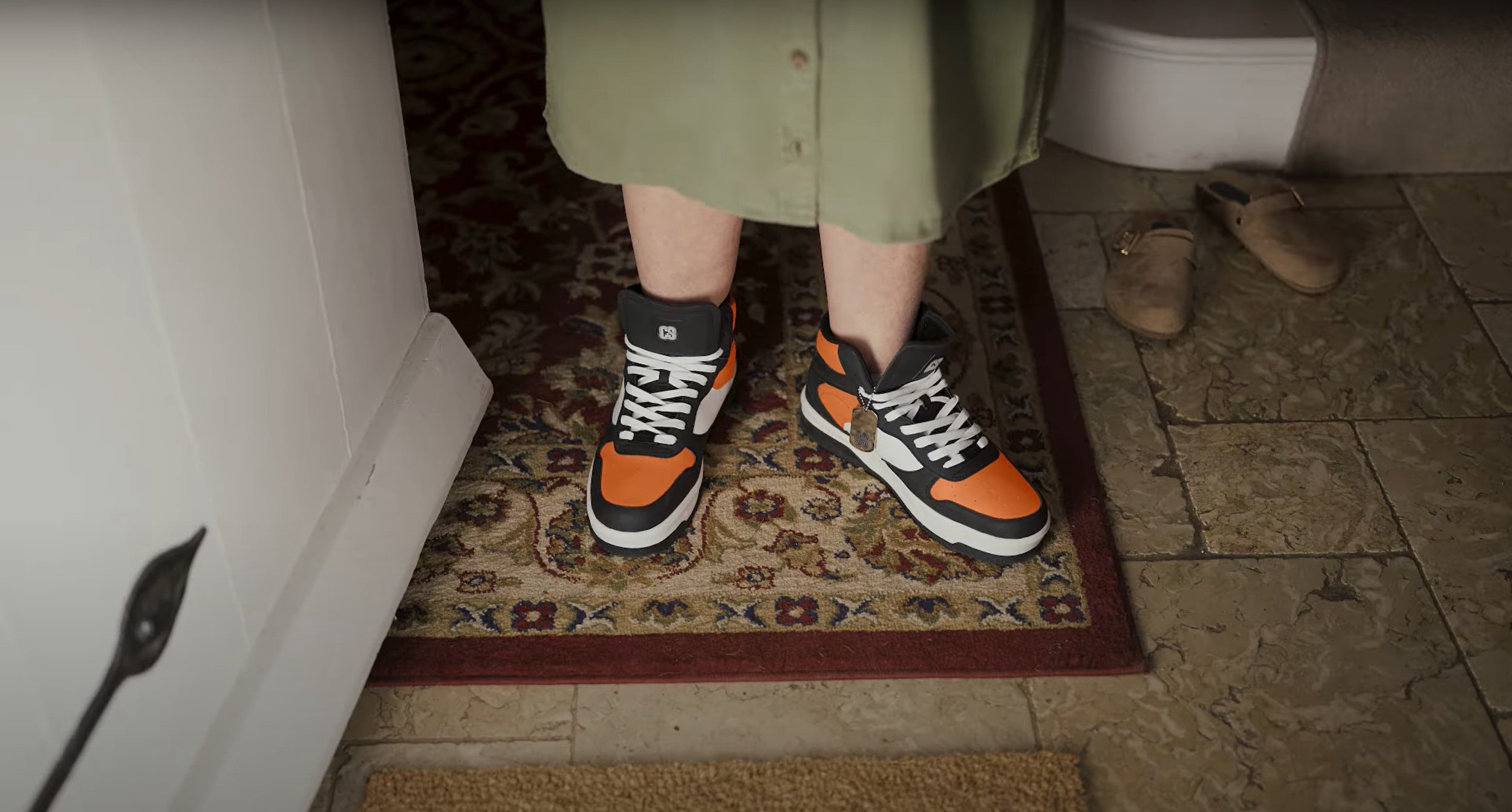
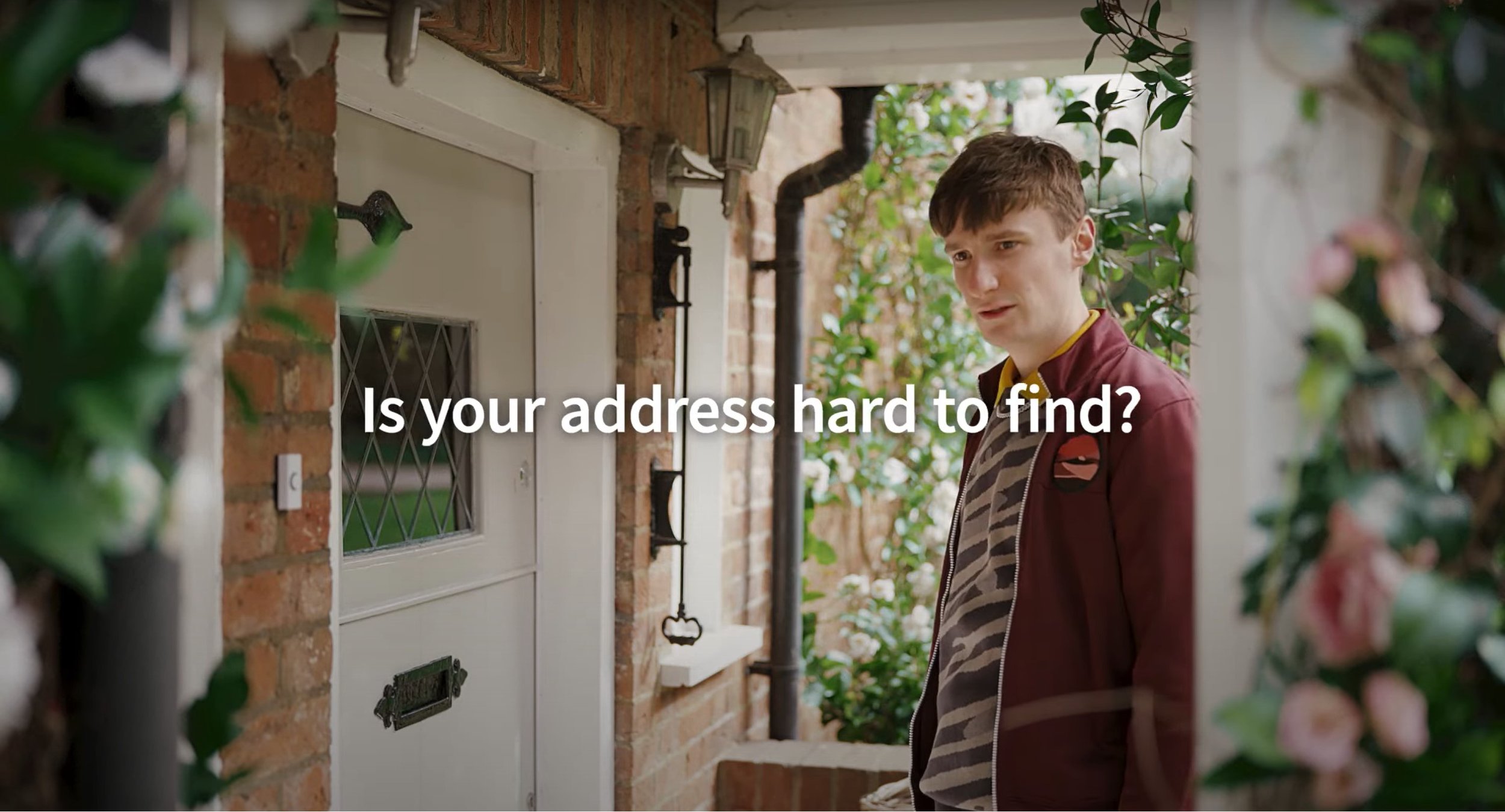
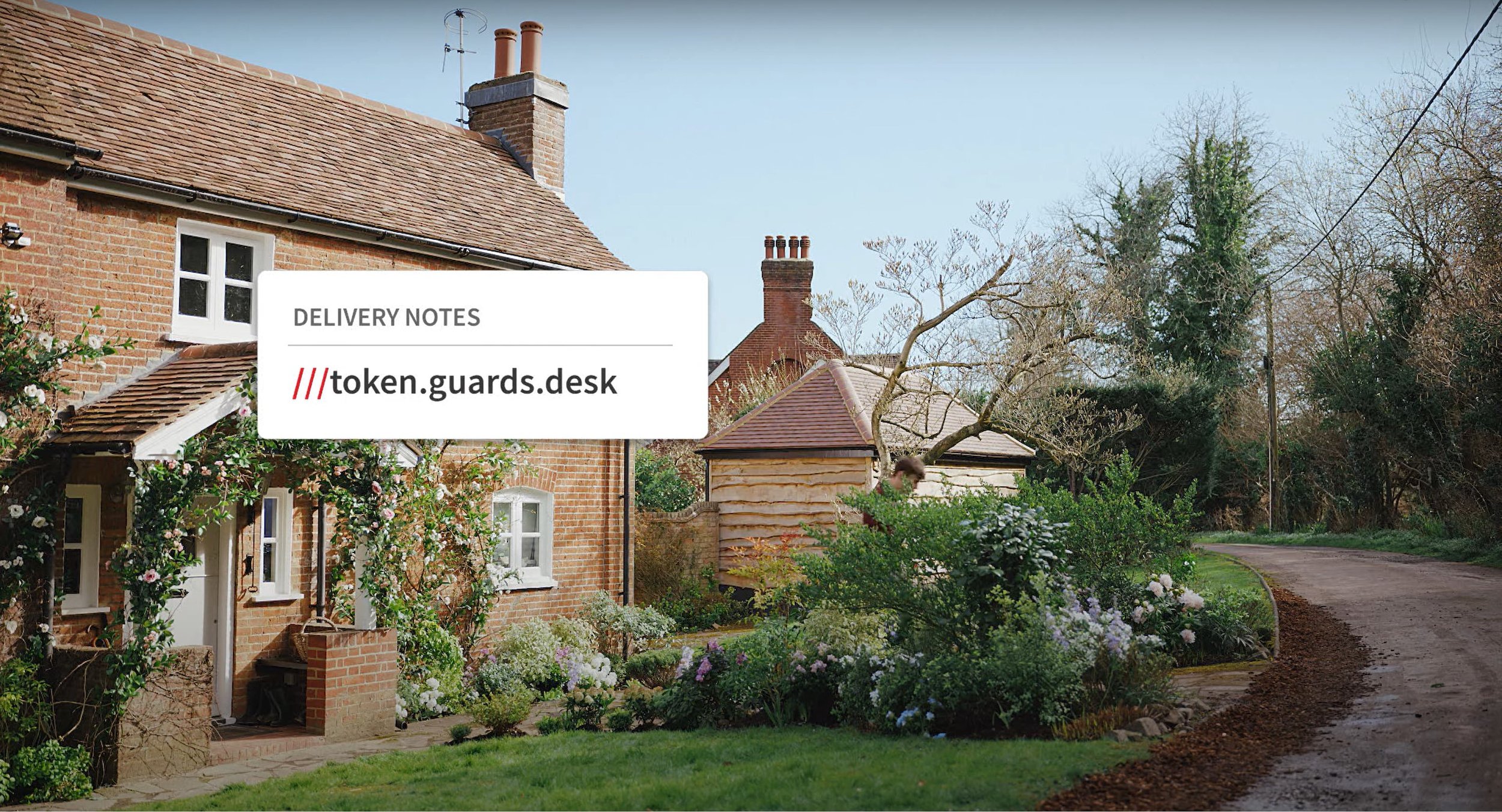
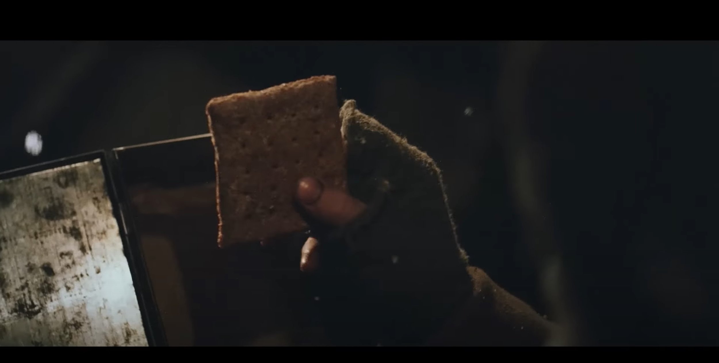
After watching this video a few times I can analysis this video, the ad uses basic shot types and angles through out, A medium shot is used at the beginning as the young man walks up to the old folks house, their is also a few close up shots focusing on the people walking around in the background with the man wearing the lad’s clothes, their is even a close up shot of the old lady wearing the lad’s footwear. Over the shoulder shots are heavily used as their is a conversation happening in this video and their is a wide shot at the end of the video as he walks away from the house. The lighting used is very generic, it heavily relies on the daylight to make the video bright enough. The target audience for this video is demographically 14 and above as the advert is on about using the right delivery service and stereotypically, people under the age of 14 nobody would be buying things online and having them delivered to your house. Their is also text used at the end of the ad which says “Is your address hard to find?” and then after that it comes up with delivery note with a bit of dialog of coding. Their is also screen grabs shown below to show what I am talking about above.
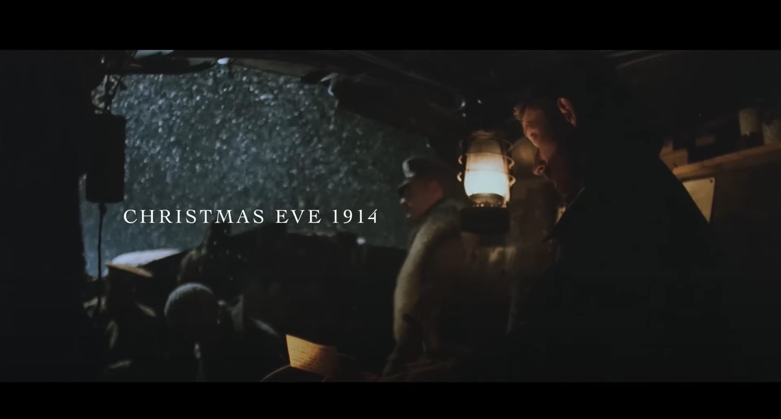
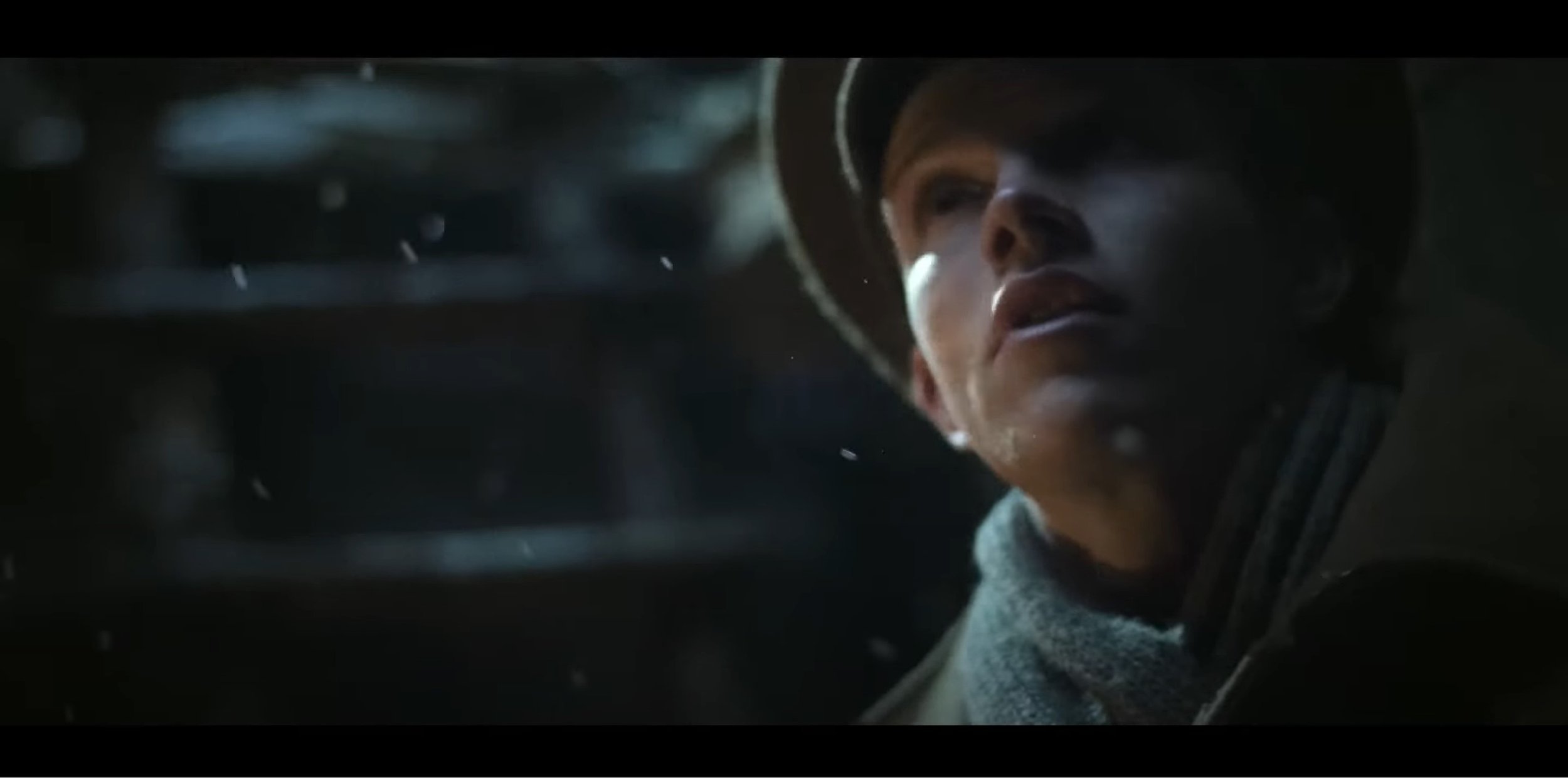
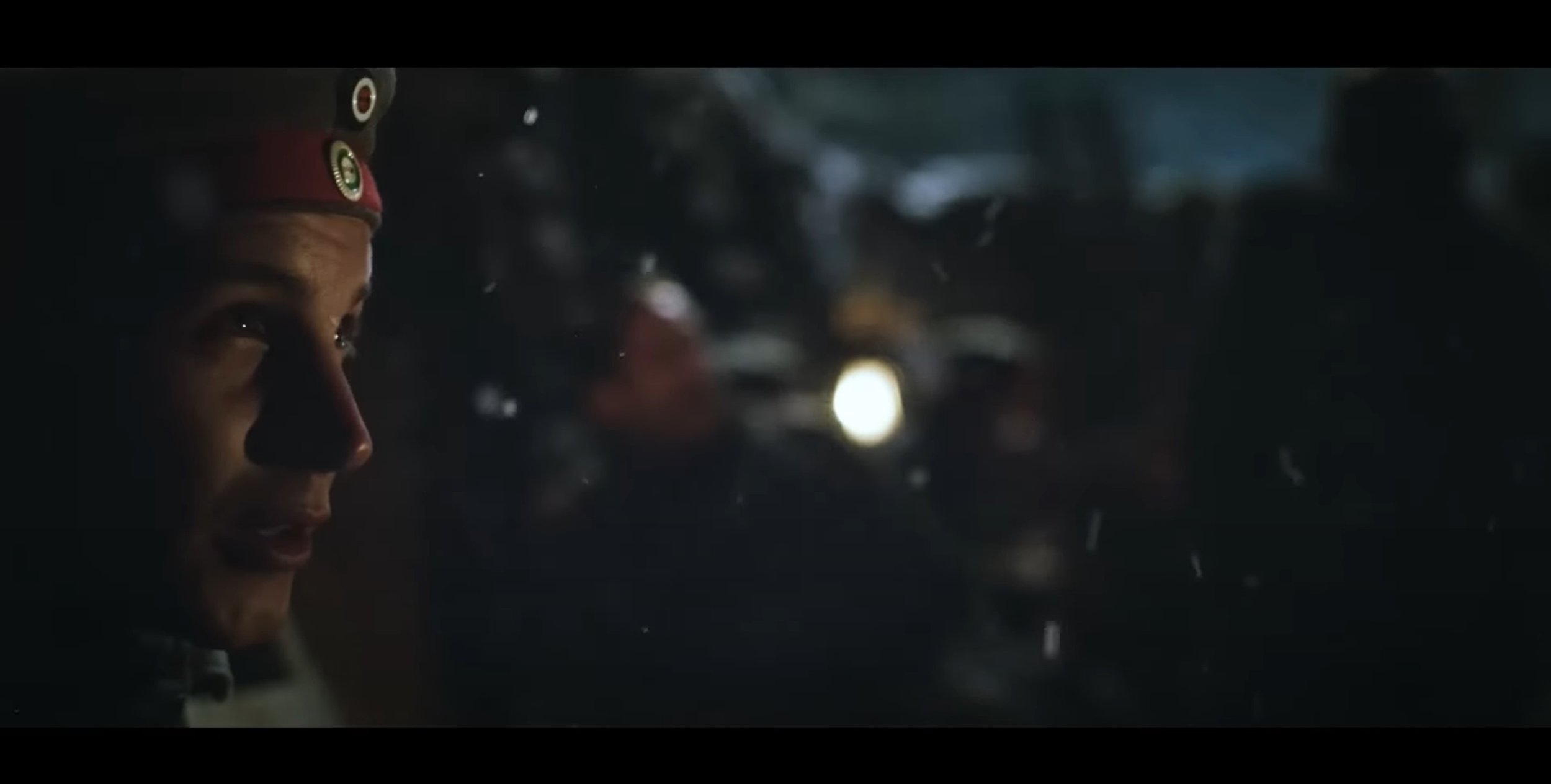
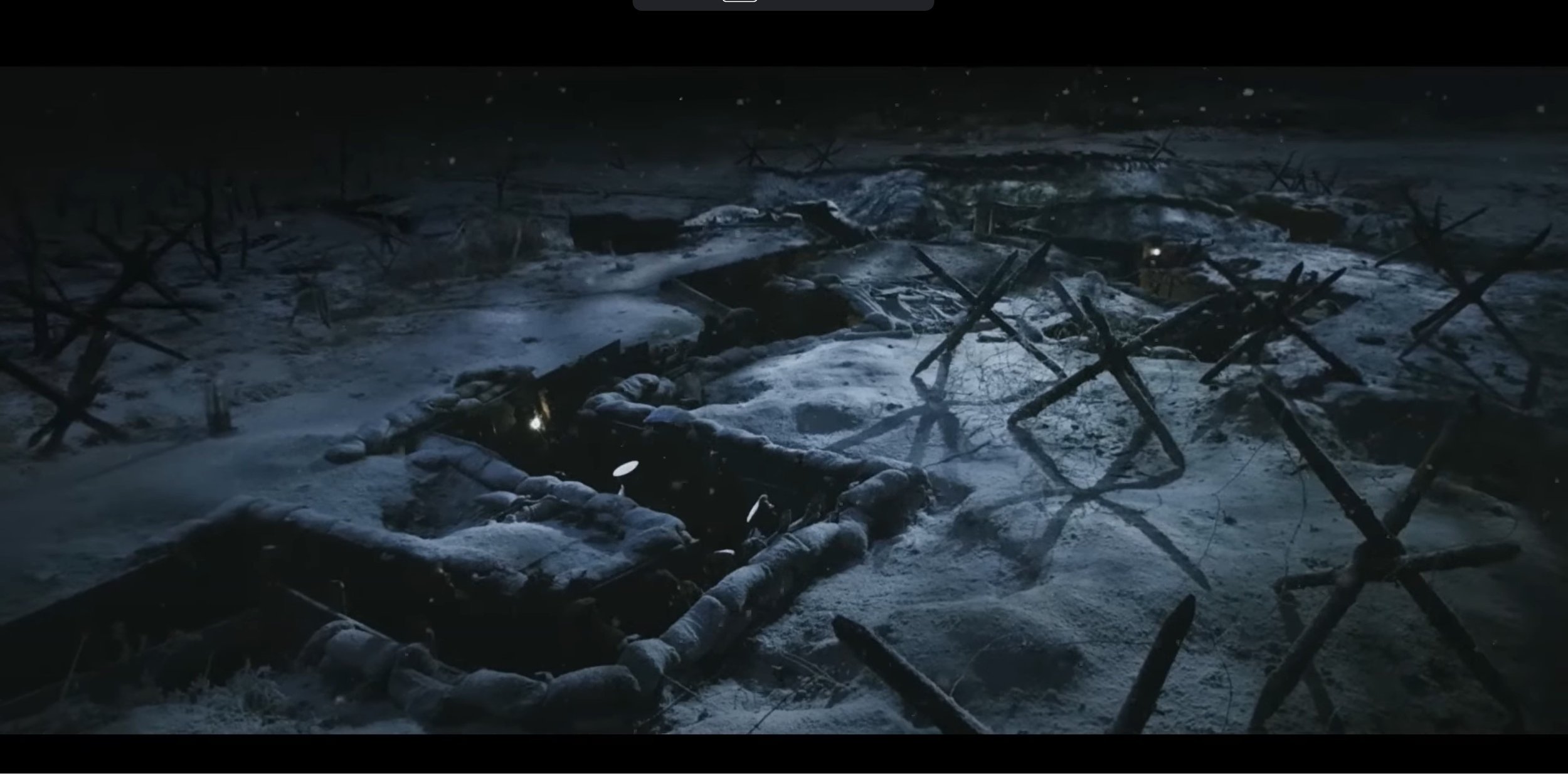
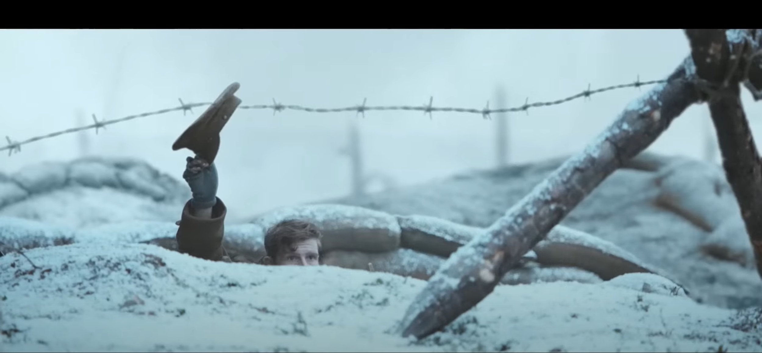
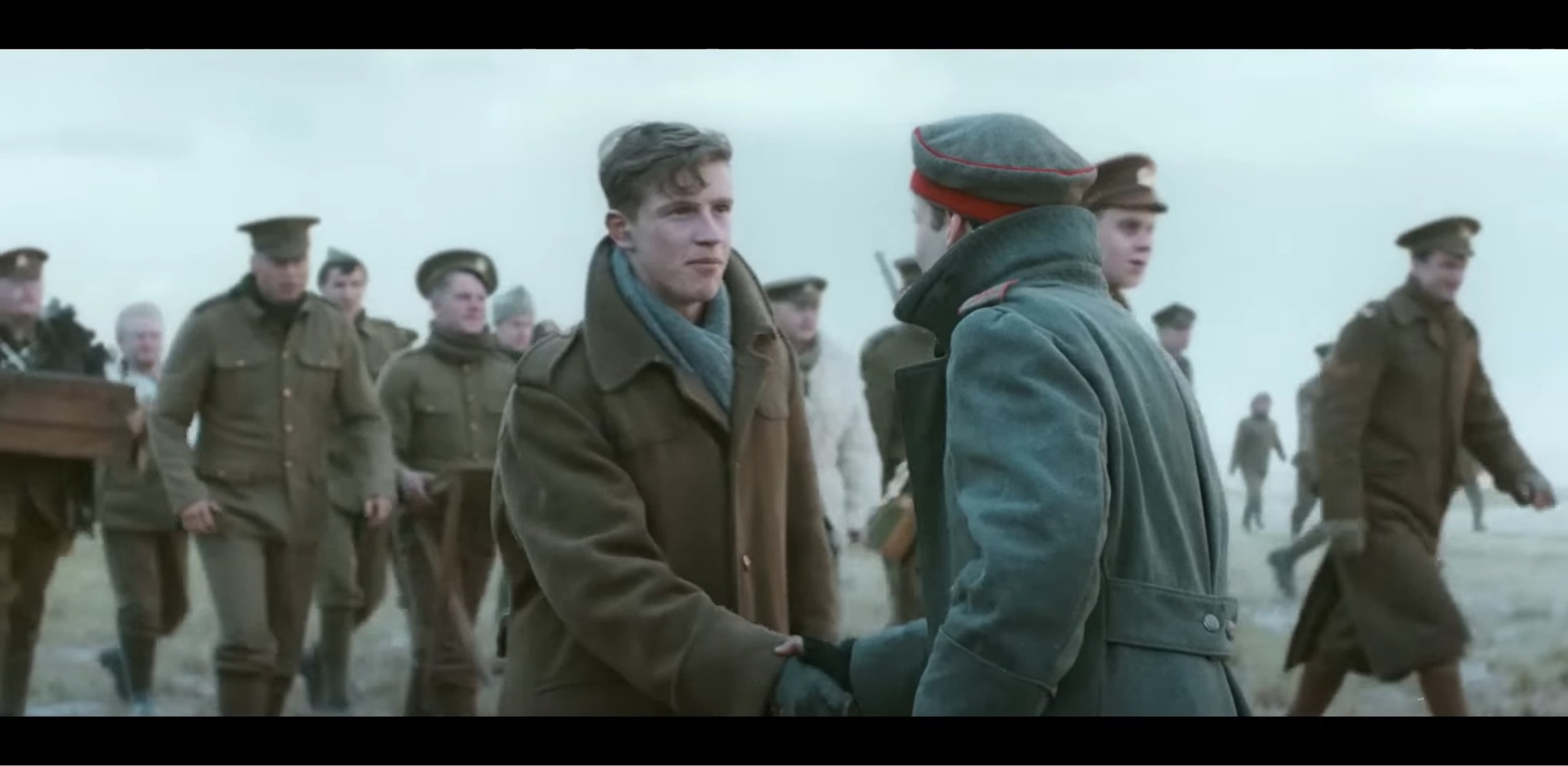
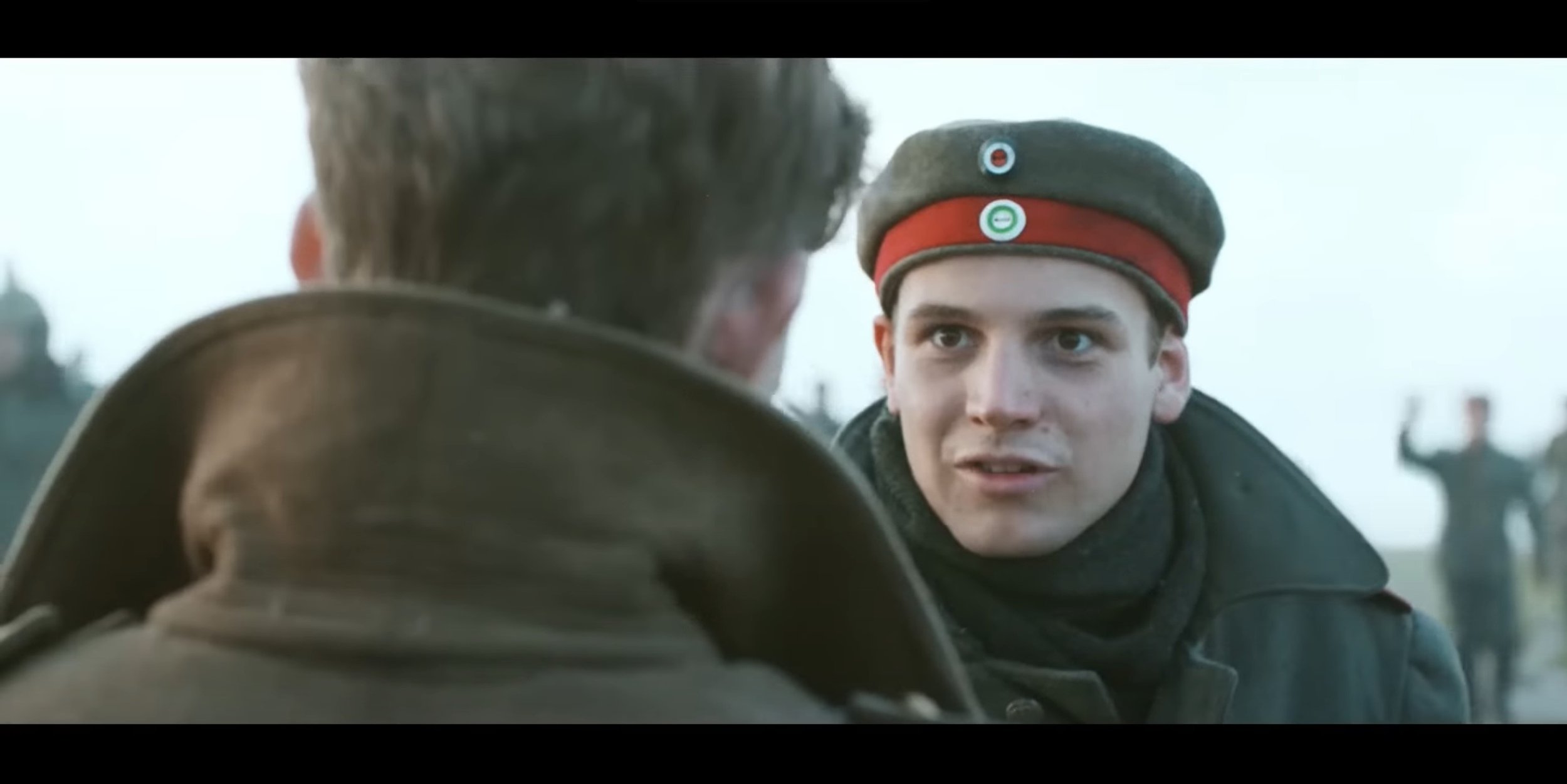
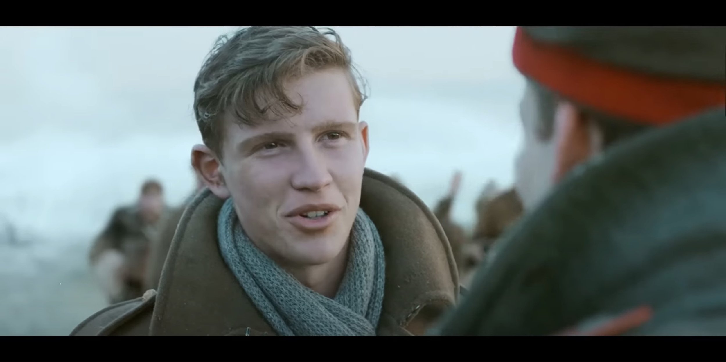
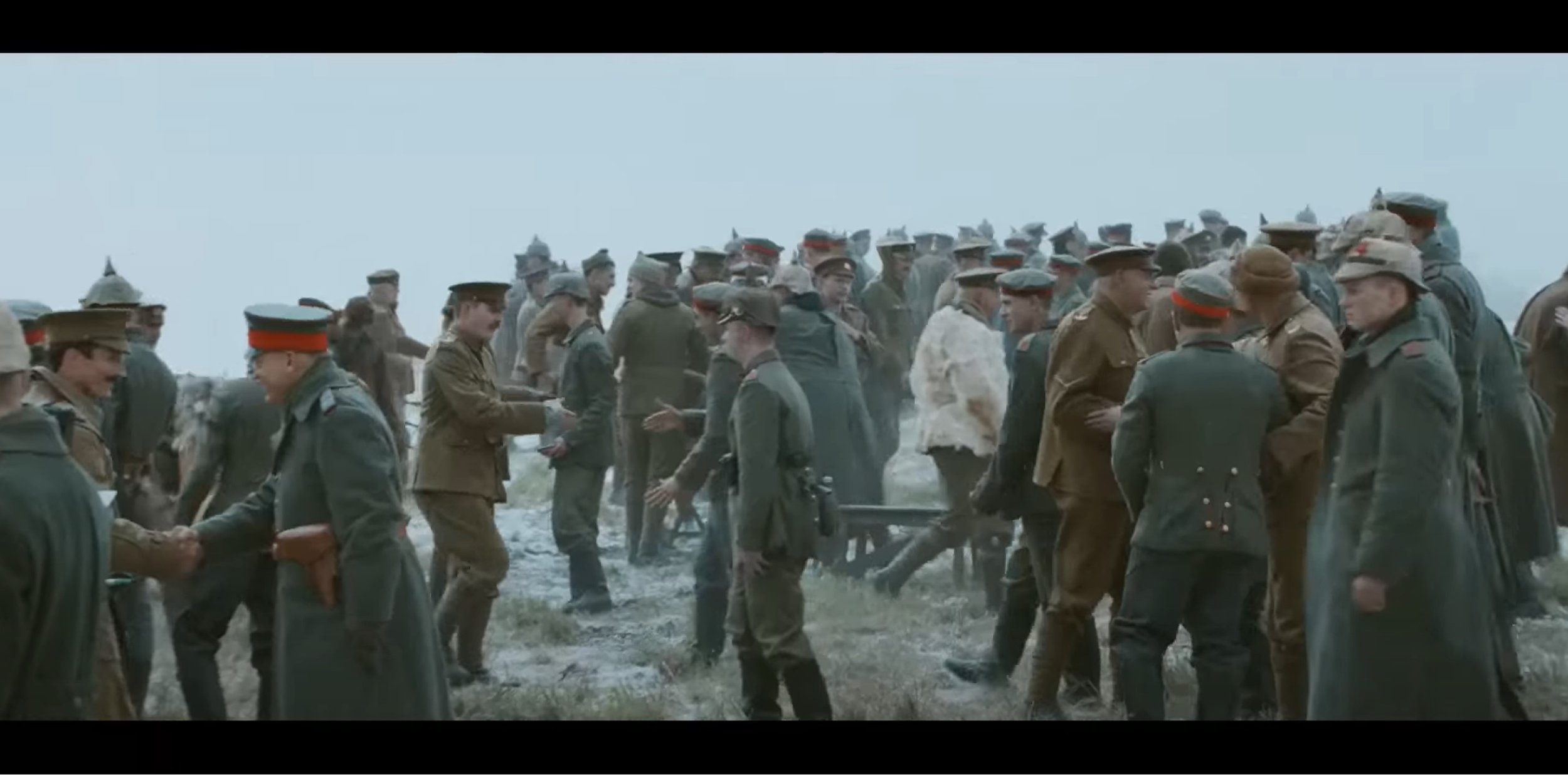
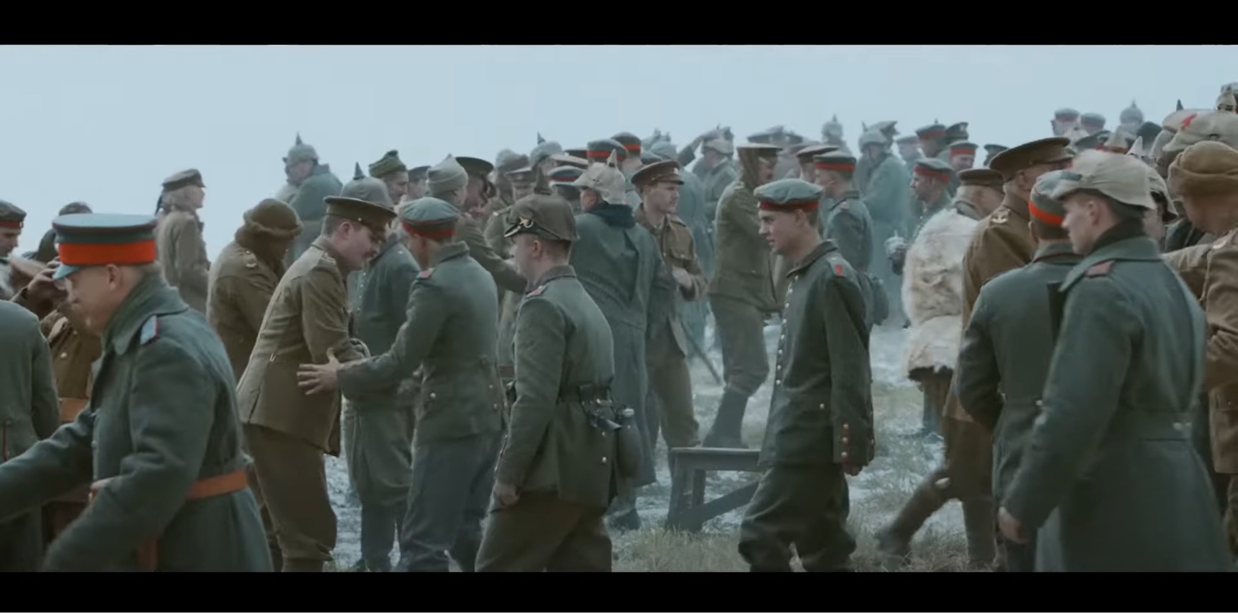
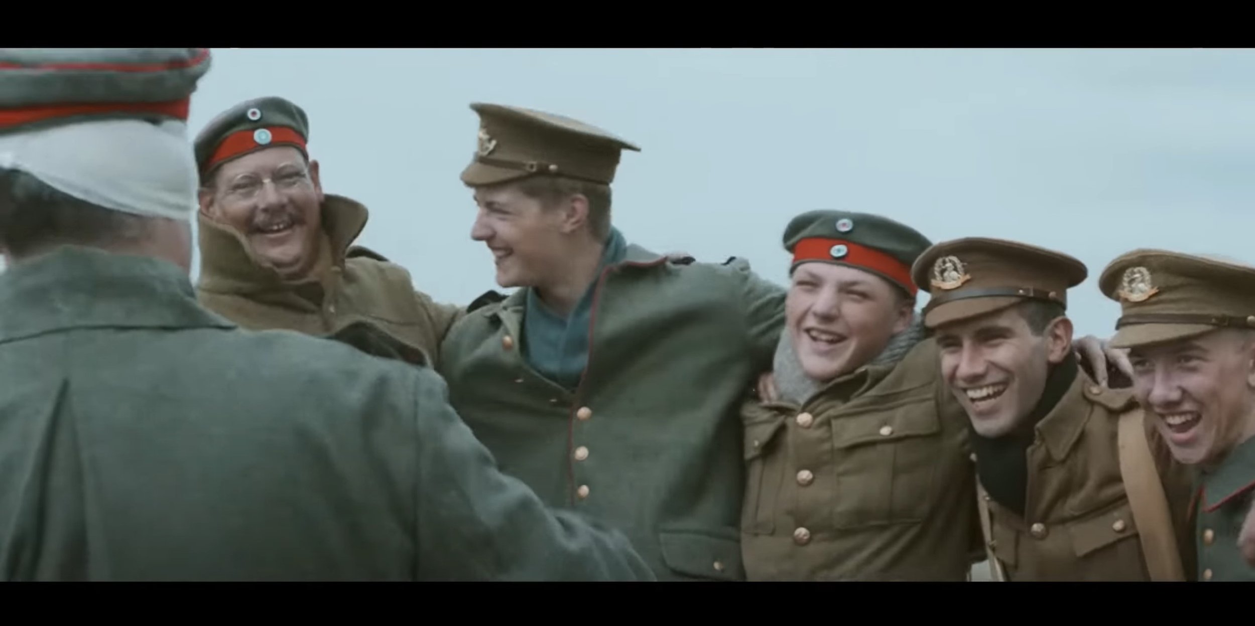
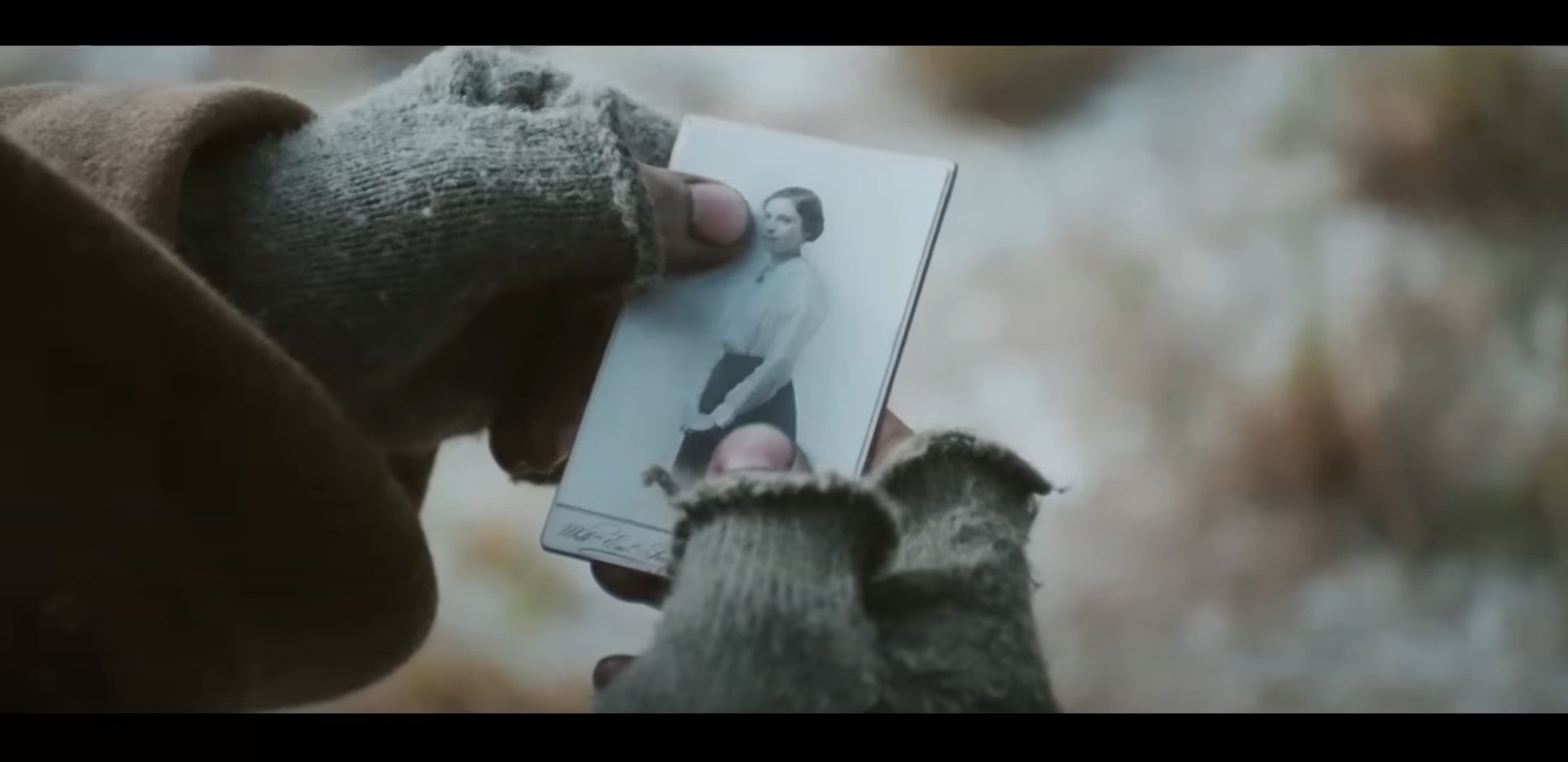
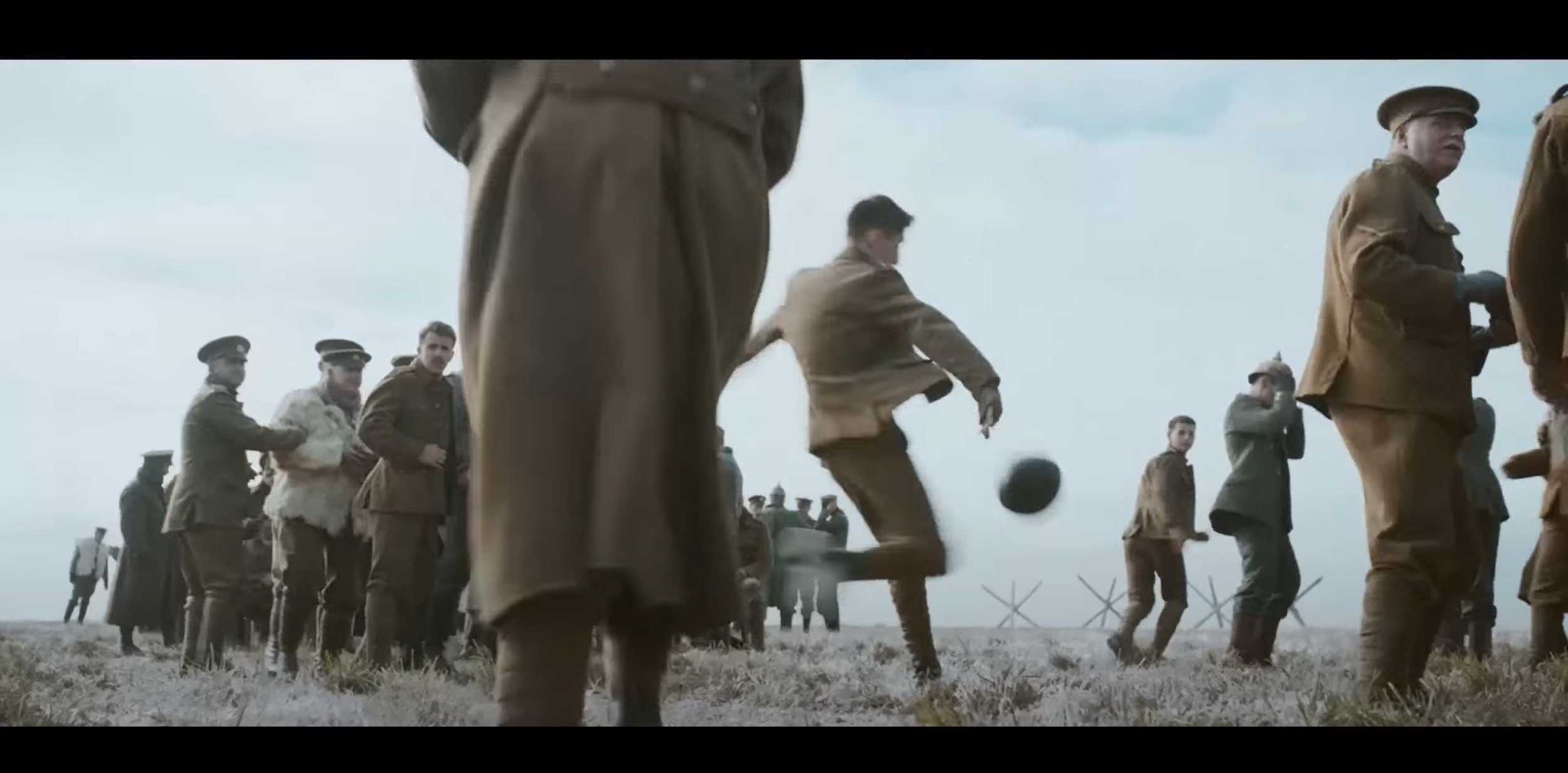
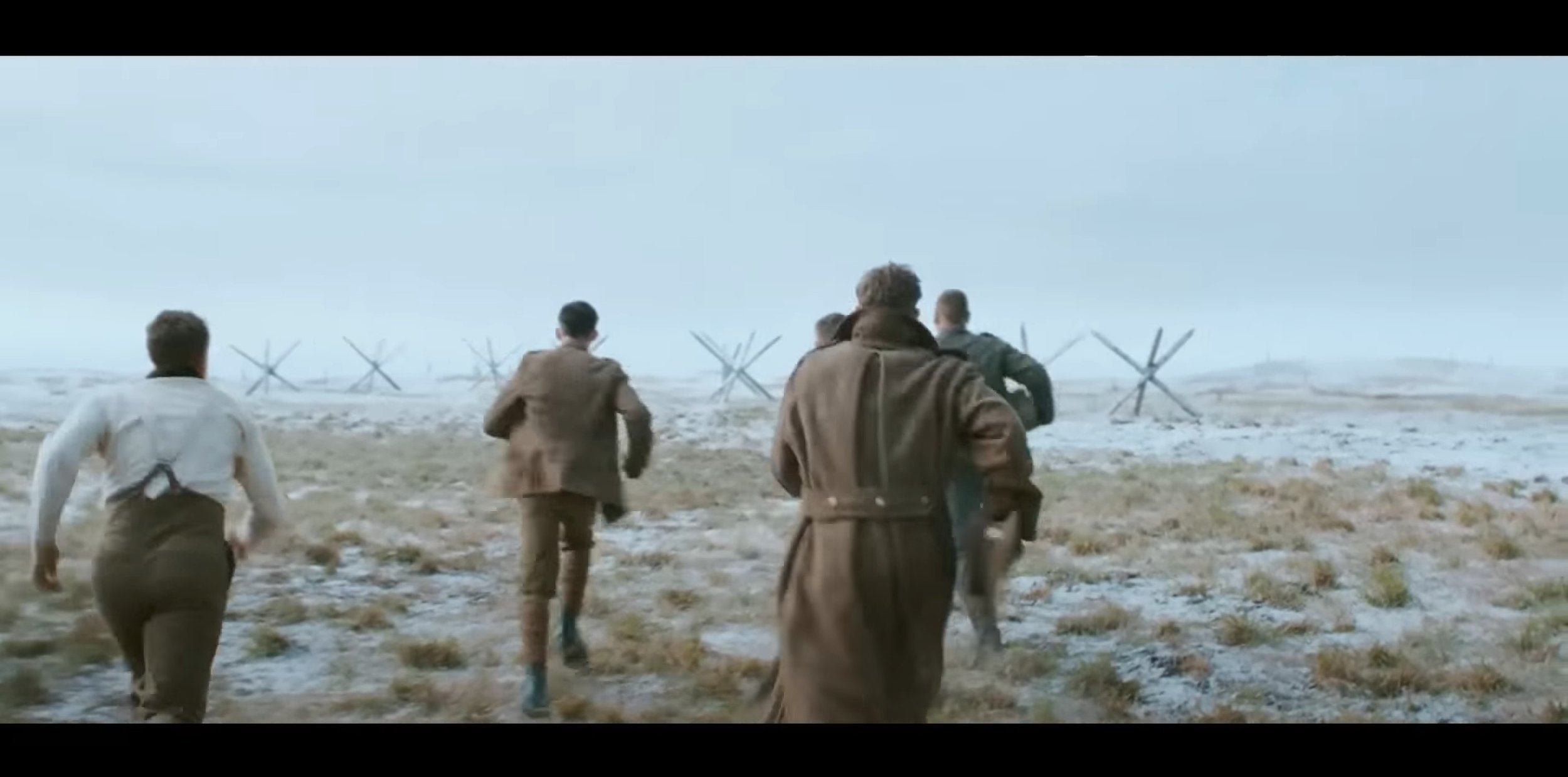
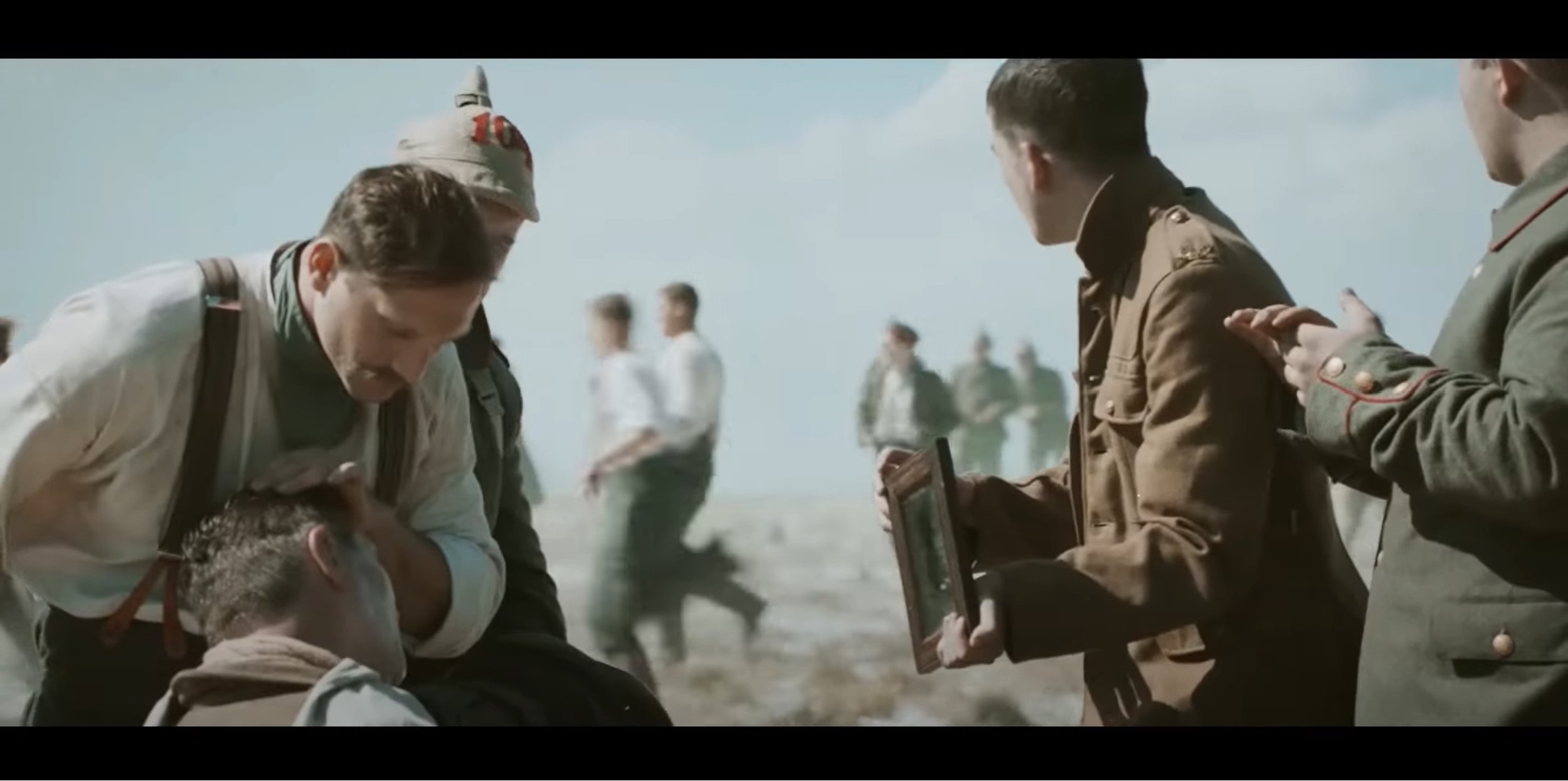
After watching this advert, it almost feels like a short film your watching but your not because it is an advert advertising for a supermarket called Sainsbury’s but at Christmas. In this commercial, Sainsbury’s has replicated the 1914 WW1 Christmas Truce between the Germans and the British on the Western Front. The target audience for this advert I think is any age because I think anyone could watch it and understand what the motto of the advert is and understand what is trying to portray. For me, this advert has been out for 9 years as of this blog was written and you can tell it has done itself justice if I can remember it for that long.
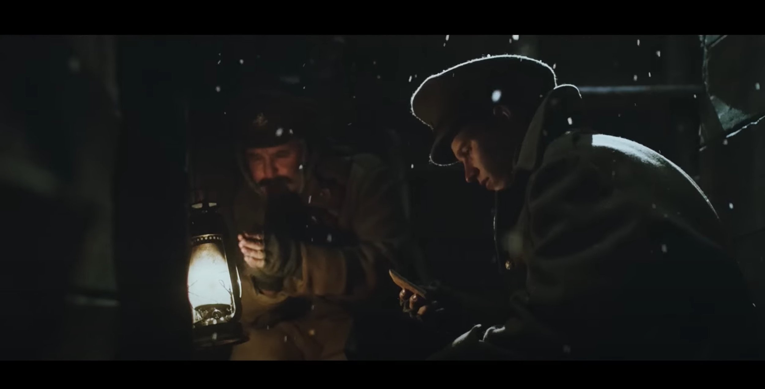
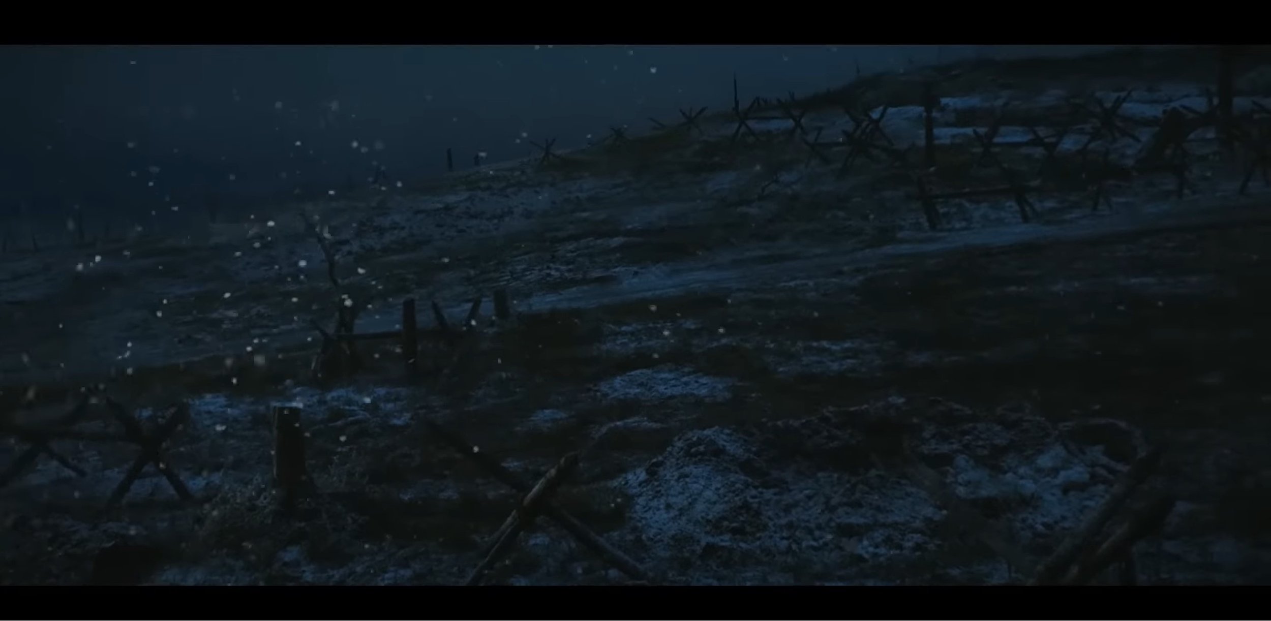
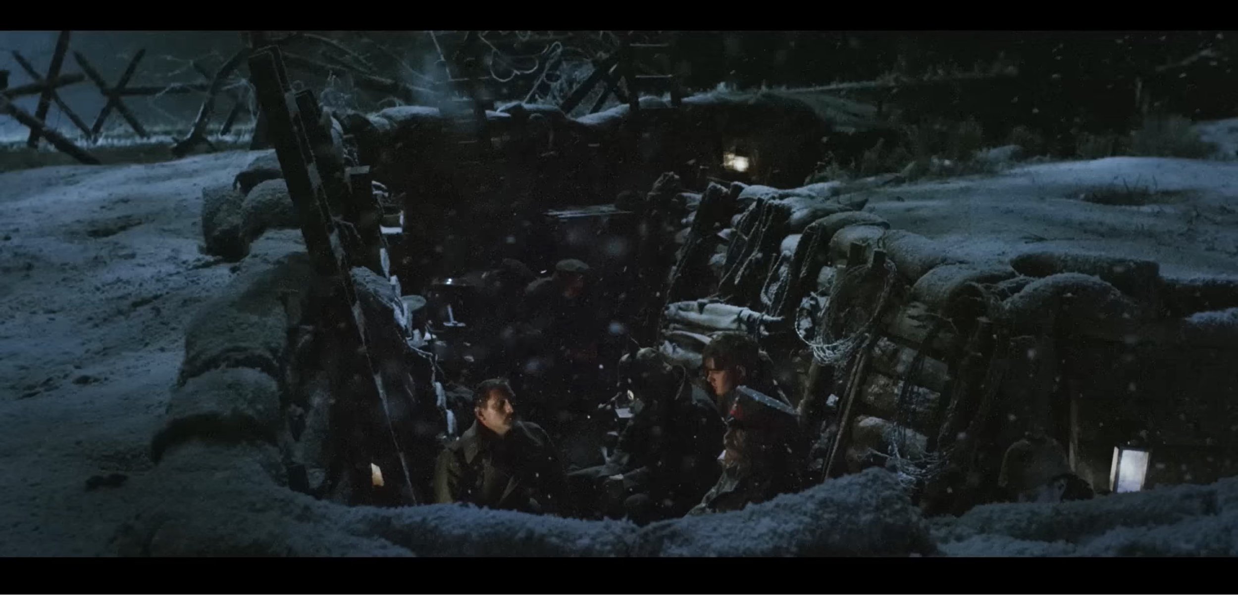
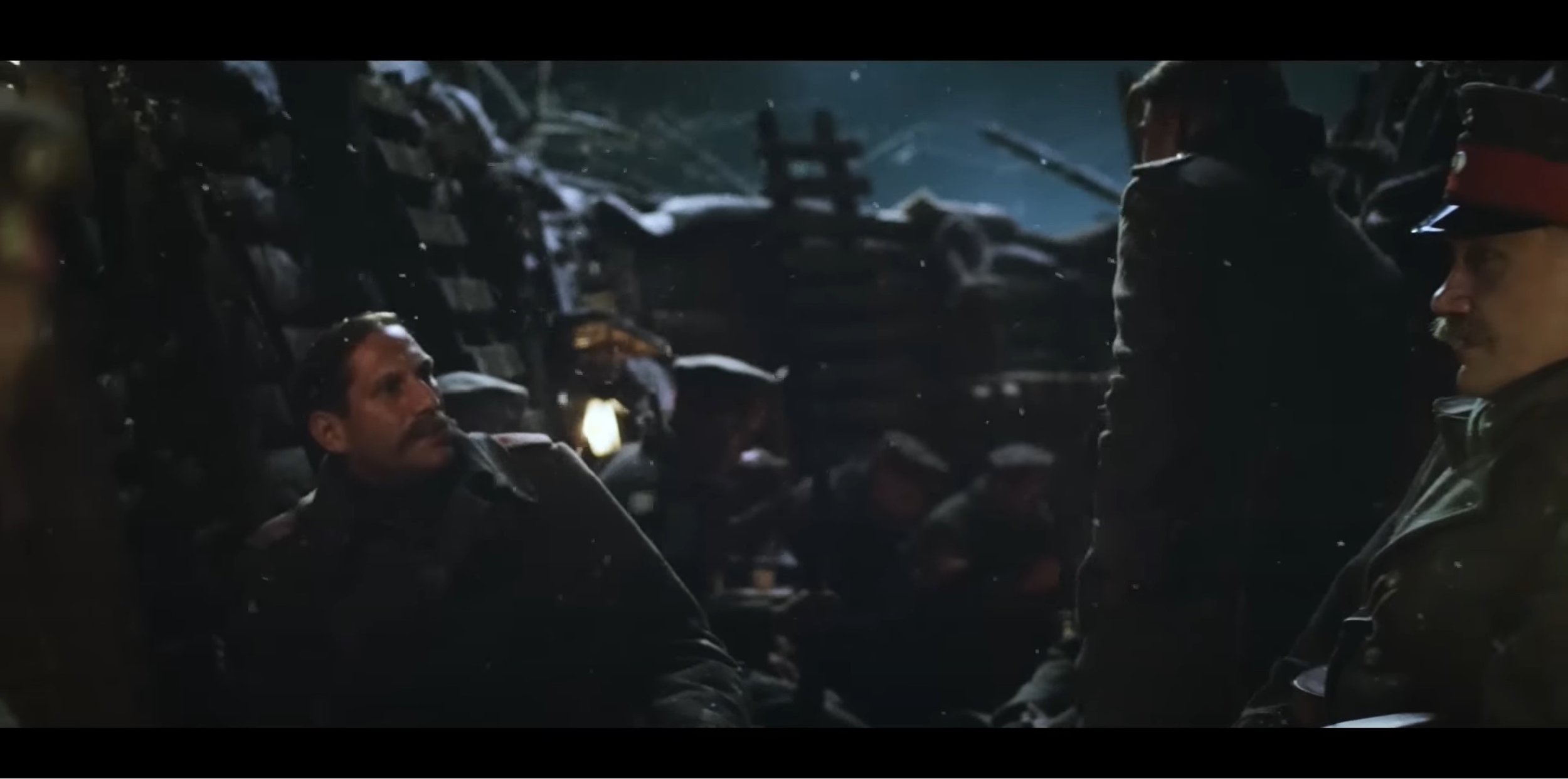
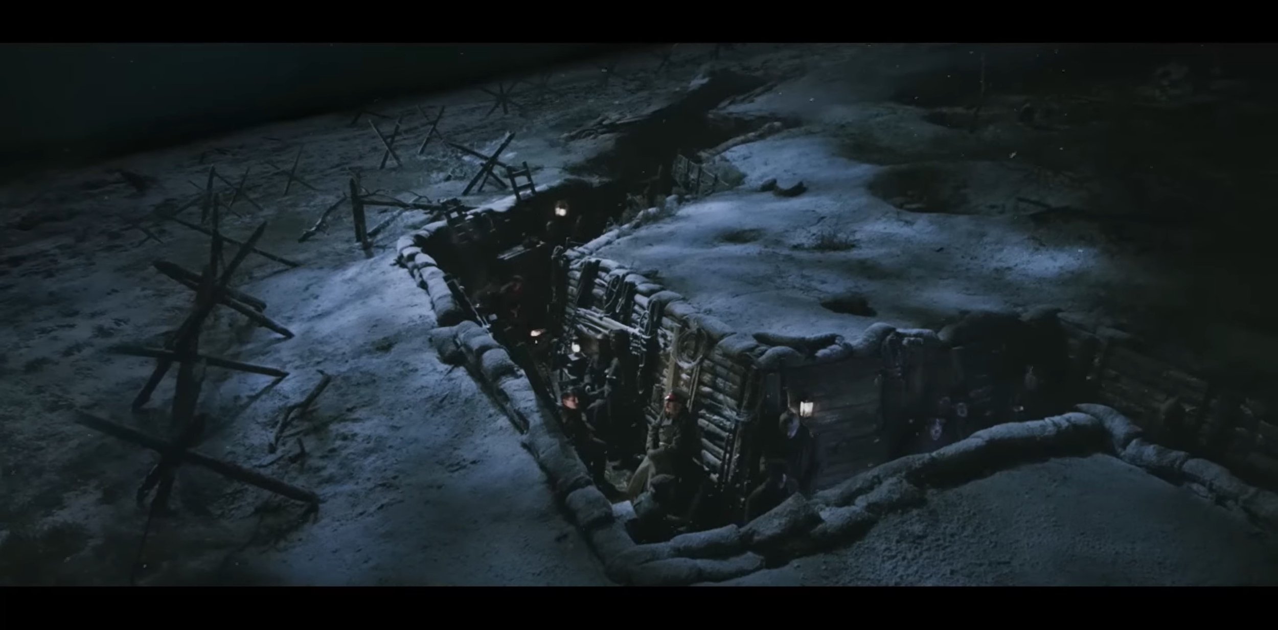
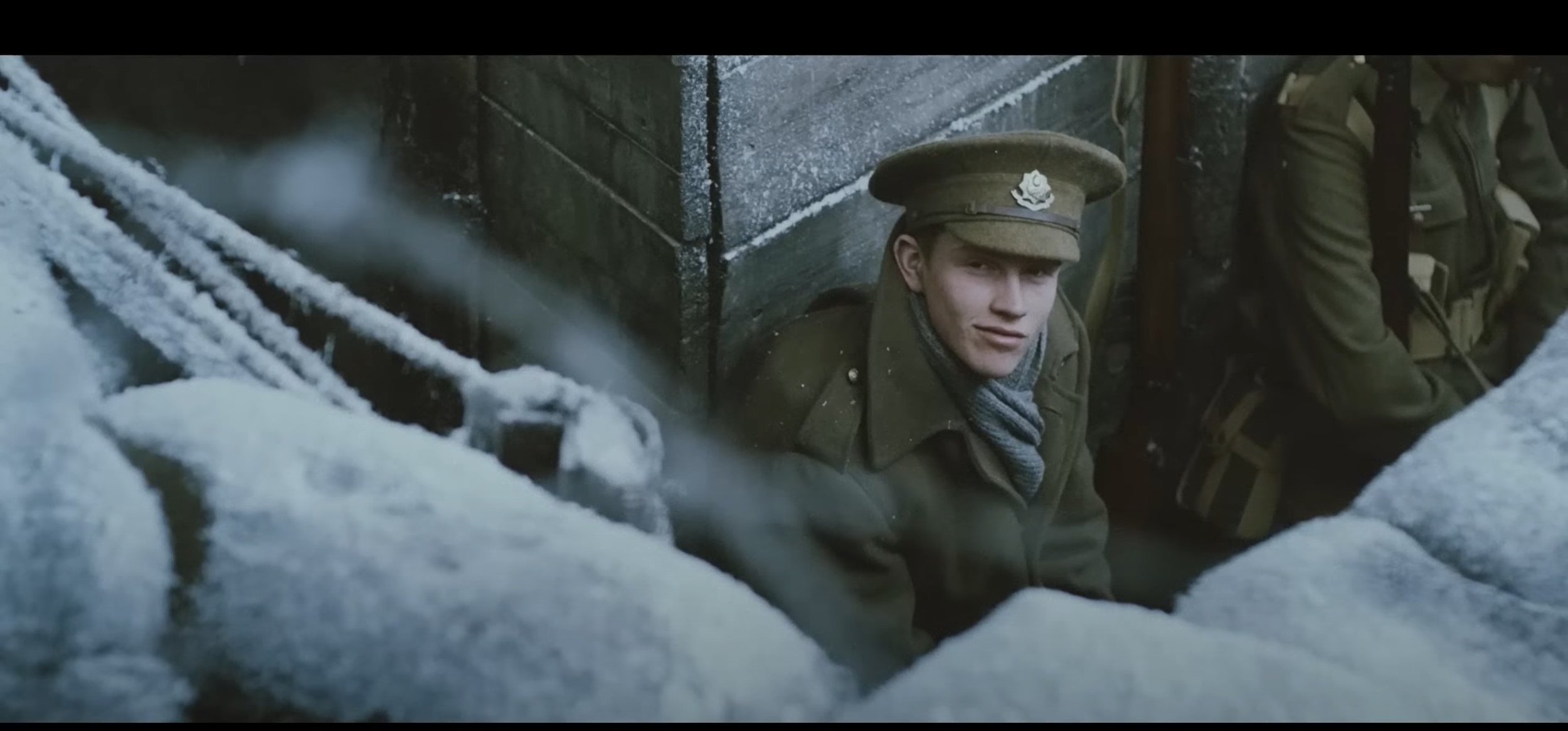
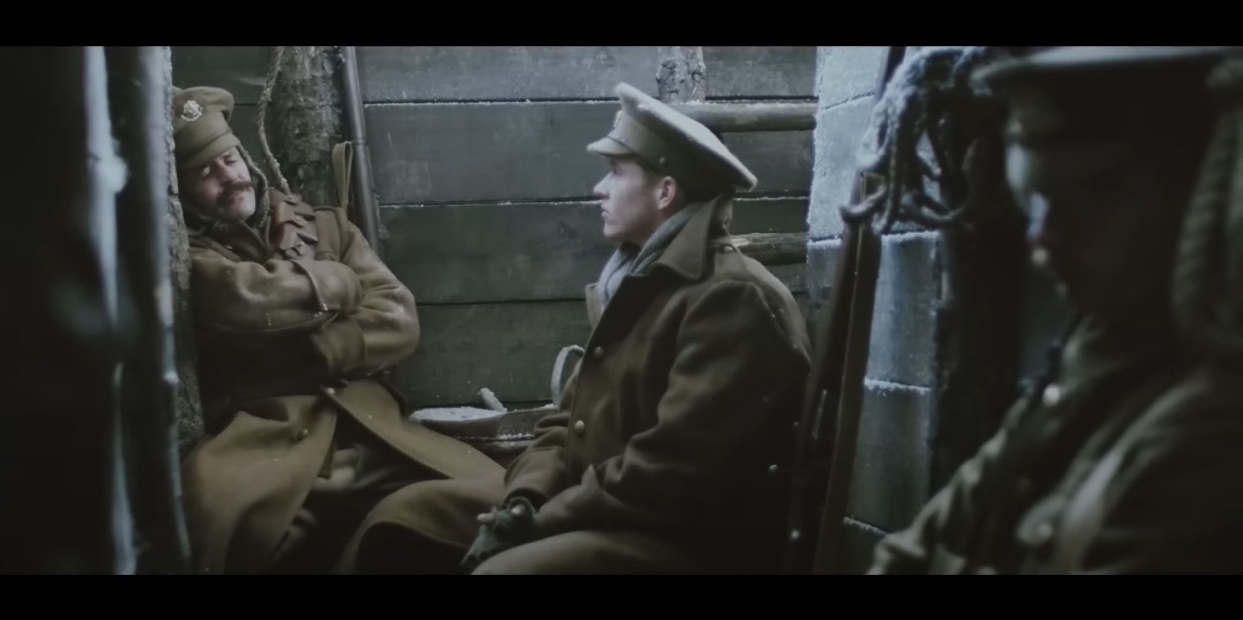
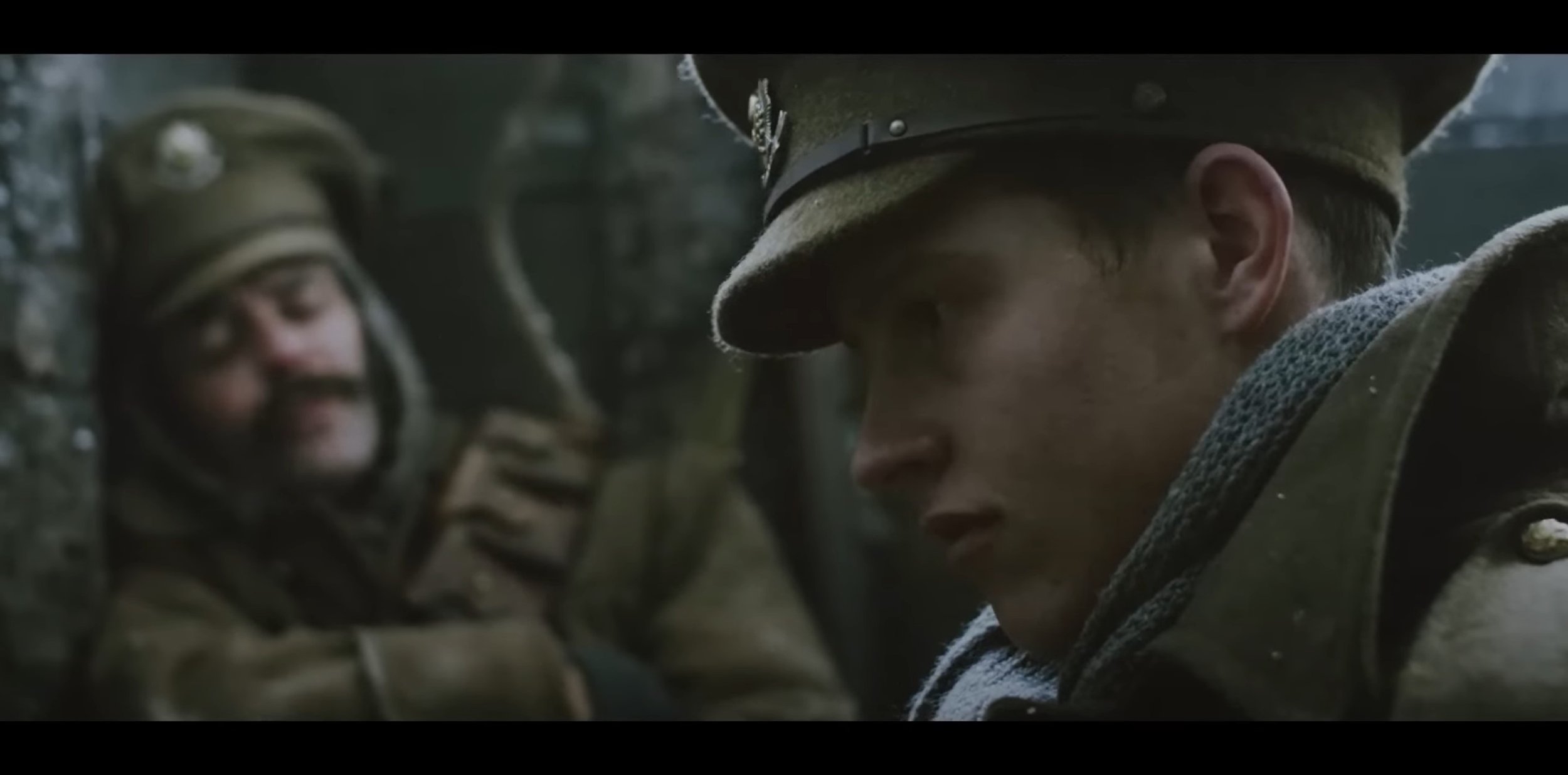
Now I’m going to talk about how artistically it has been created, firstly they have used the cinematic aspect ratio (2.4:1) to make it feel like you are watching a actual short film. As the beginning it uses the fade in transition and then at the same time some text gets shown which says “Christmas Eve 1914”. The lighting at the start is very dark as it is night time in the trenches, their is a catch light which is acting like moon light and their is a gas light used to show minimal lighting. Their is a variety of different shot types used through out in these scenes coming from over the shoulder shot, medium shot, close up shot and wide shot. The angles I see used in these scenes are high angle shots looking down into the trenches combing that with wide shot to show what it looks like from above. In terms of Camera movements, I see plenty of static shots and their is a few panning shots with some dolly zoom shots as well which is focusing on a certain subject.
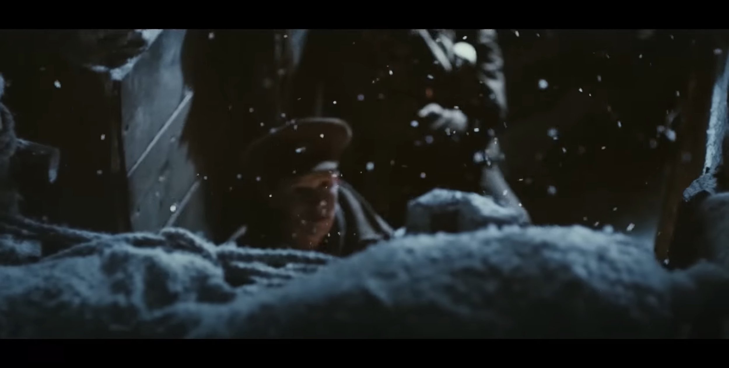
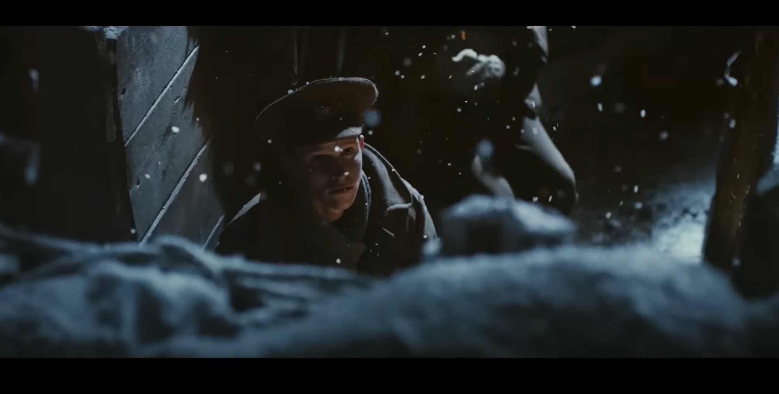
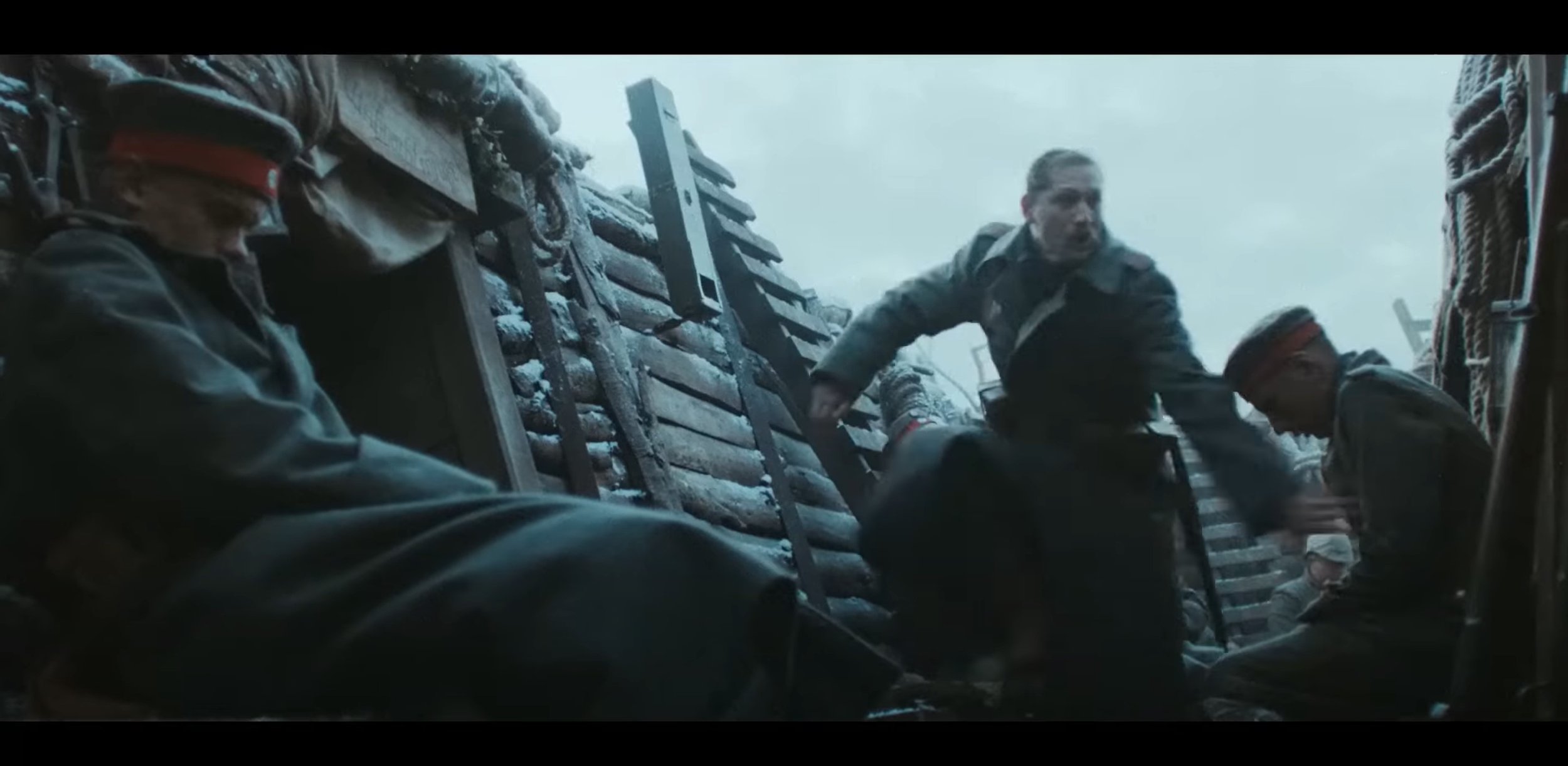
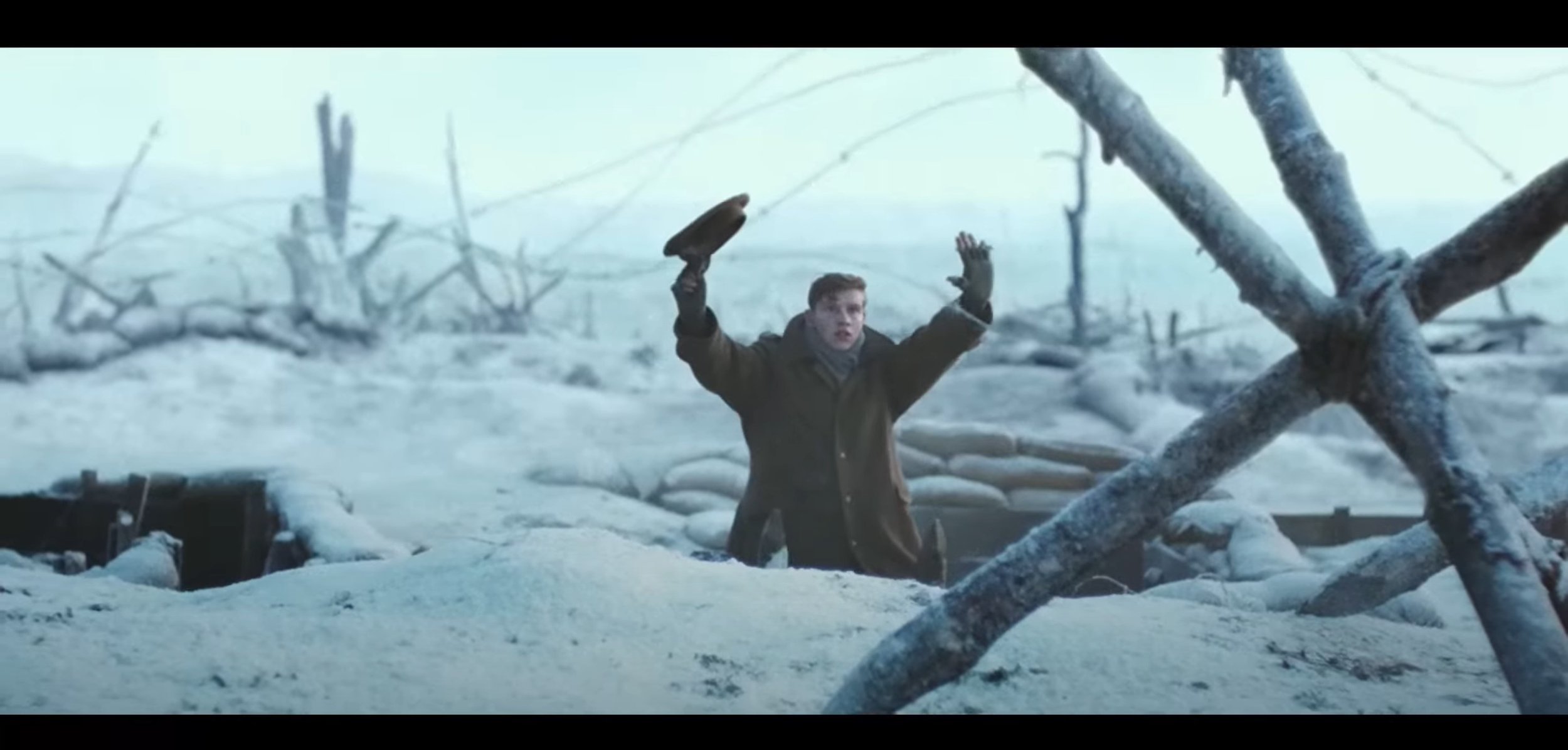
For the second part of this advert, it becomes day time and the video relies on the daylight to make it bright enough for the video, the shot types used in this section vary between over the shoulder shot, medium shot, medium close up and extreme close up. The type of angles used are a mixture between low angle which is was used in this to show the presence when the soldier is slowly showing their head over the top of the trenches and of course when the two countries meet in the middle of no mans land. The camera movements used are mostly static shots but their was a few shots in this section that used a slow dolly zoom and a slight side to side movement when the soldiers start moving to pick up the weapons and their is a tracking shot following the captain in no mans land.
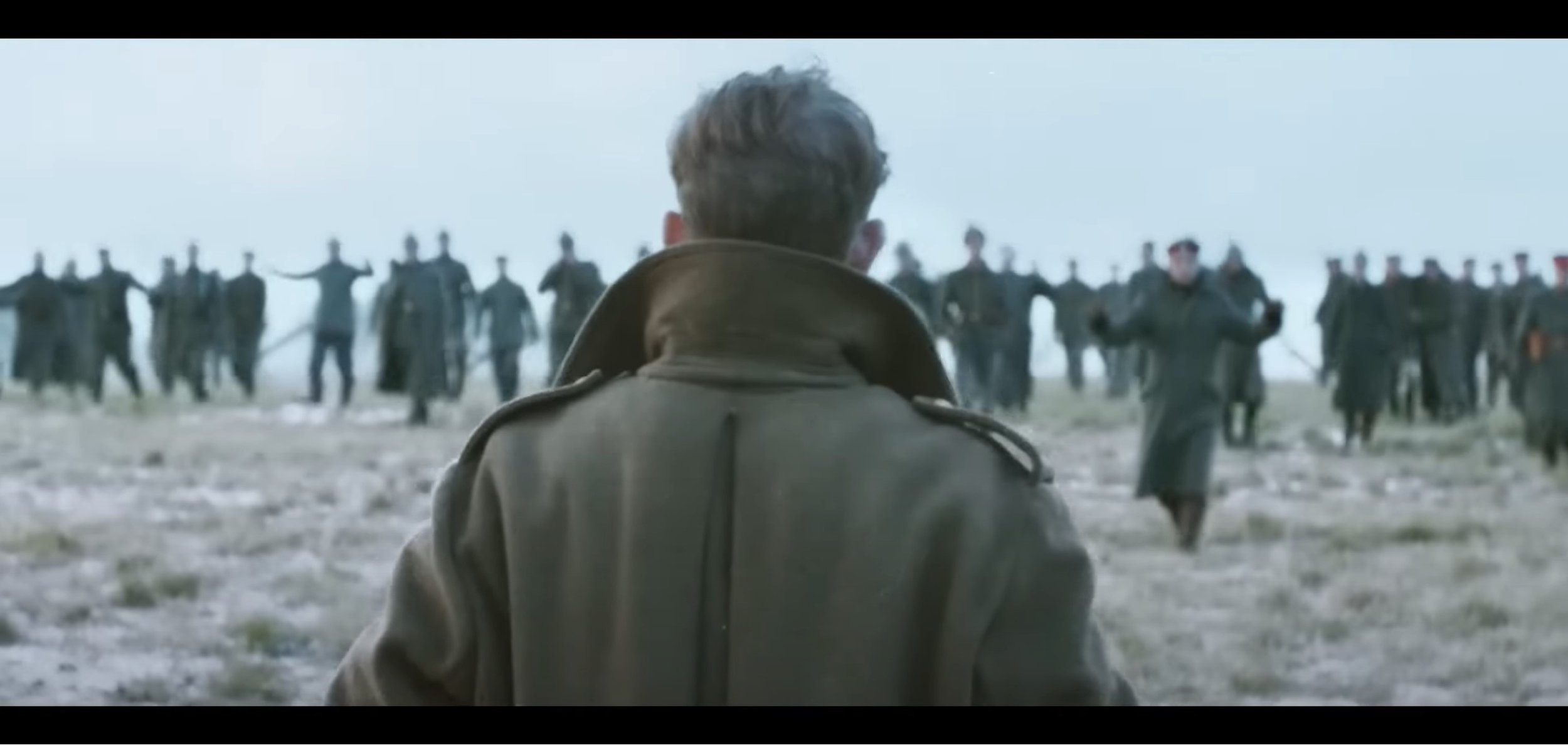
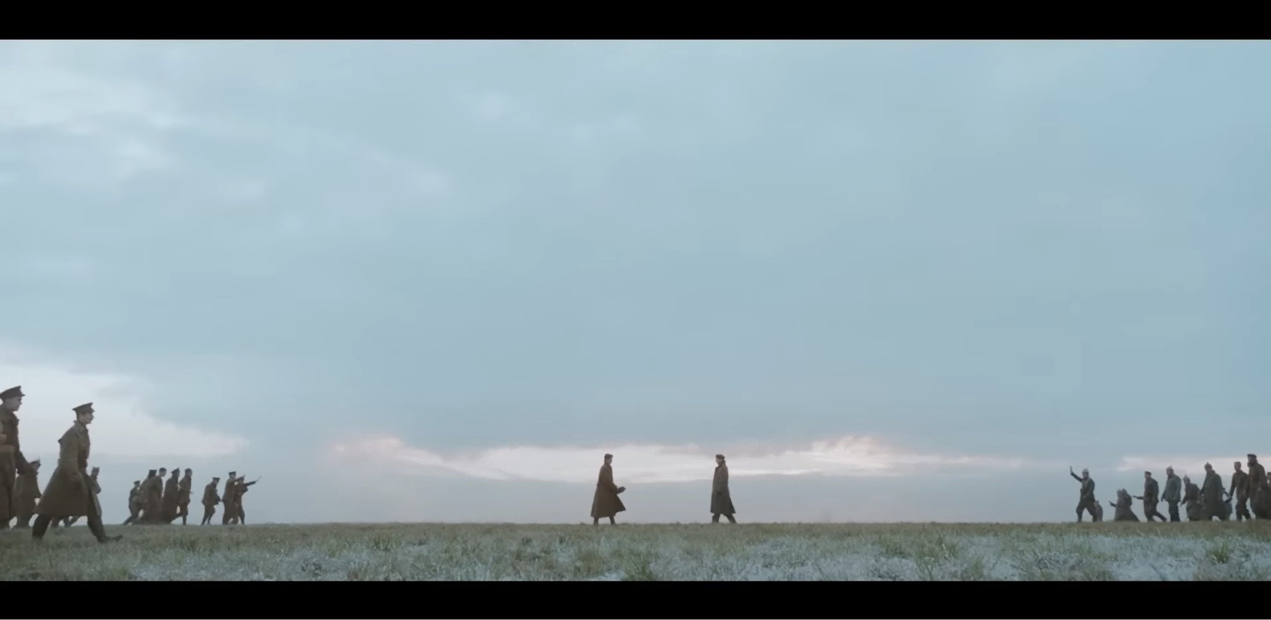
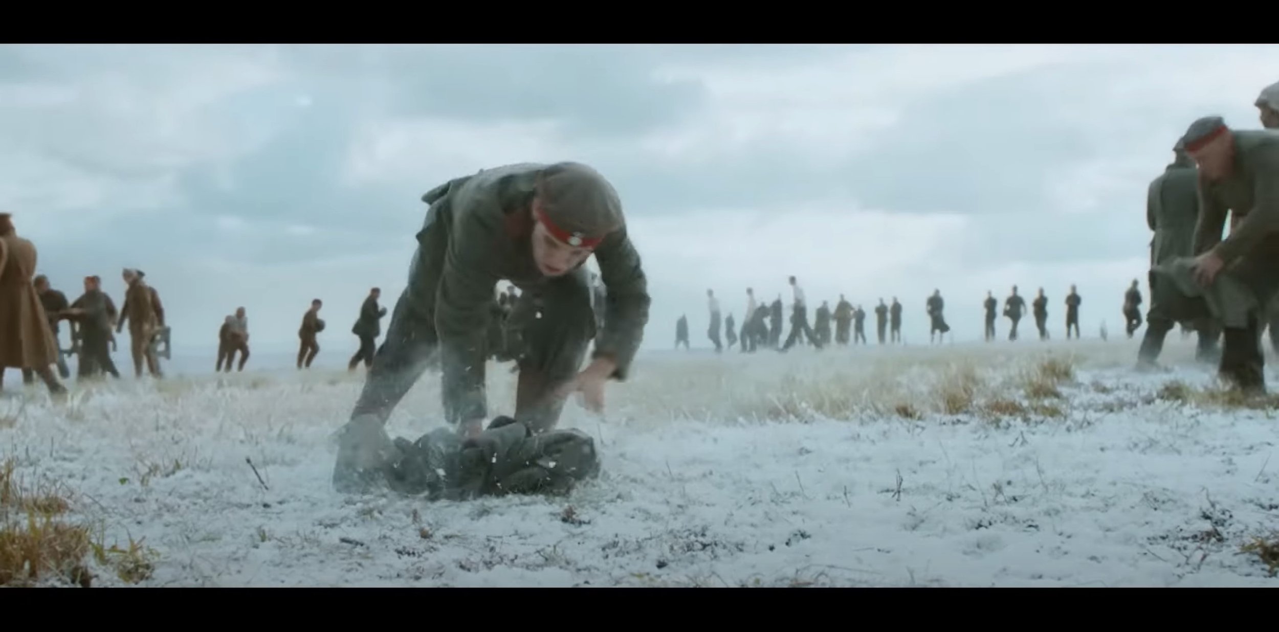
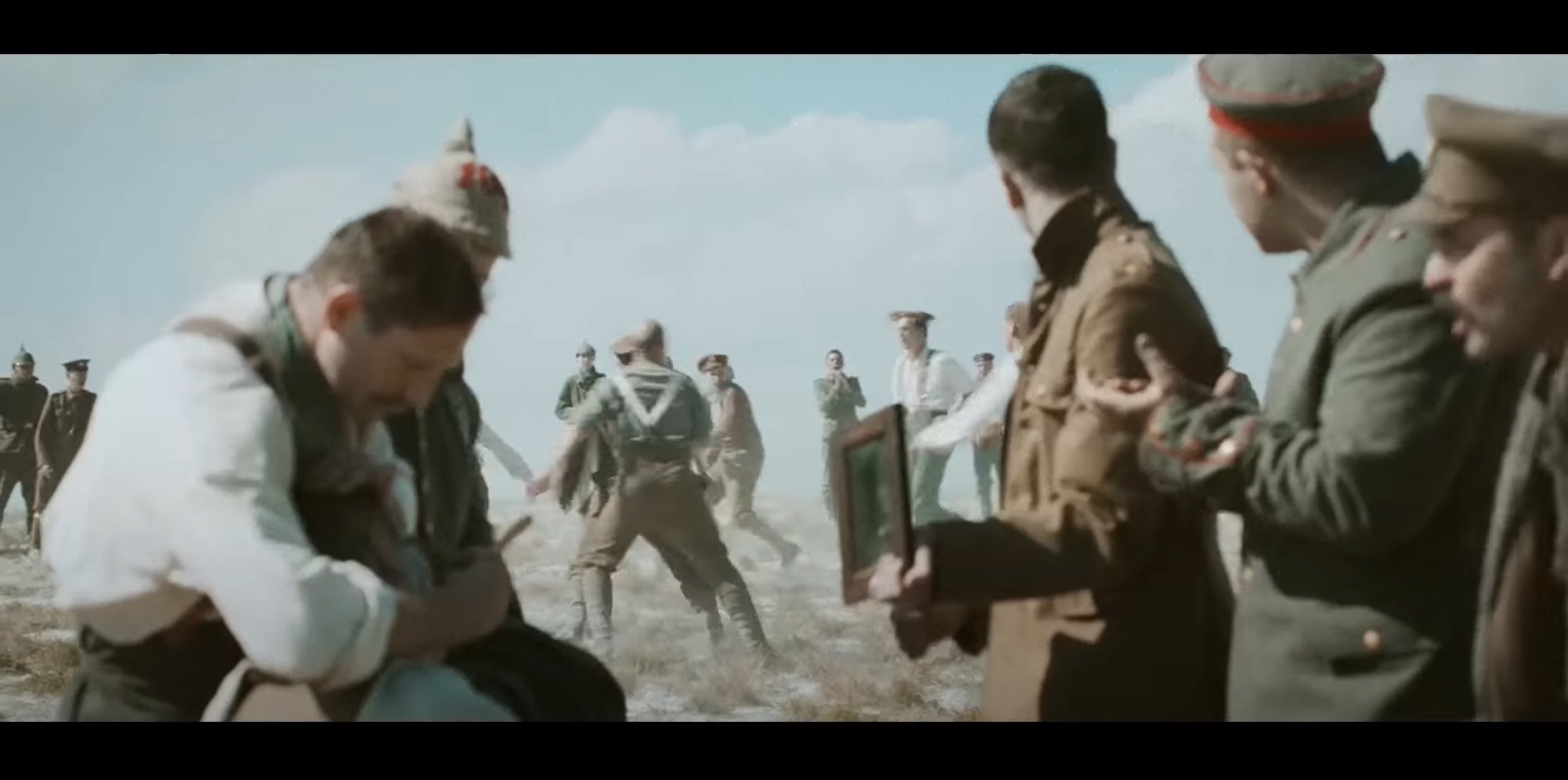
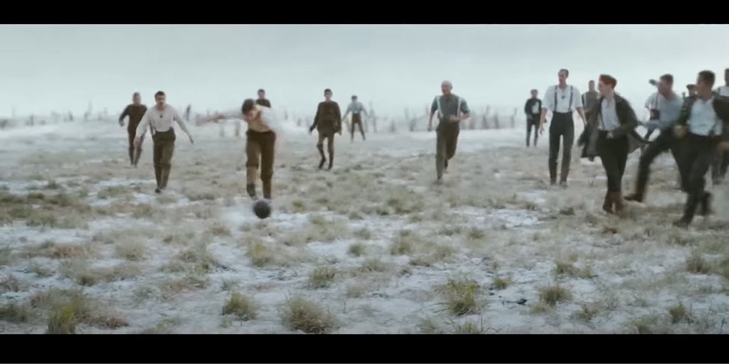
In the last segment, they unite in the middle of the battle field and play a bit of football in no mans land. Again for part, the video heavily relies on natural lighting from the sky to light up this video, in terms of shot types they use a mixture of over the shoulder, close up and even some medium shots. A dolly zoom movement shot is used zooming into the subjects from a medium wide type shot to a medium shot only showing from the waist and above. The angles which are used in this part are mostly eye level and low angle which shows presence of the subject and their is a few low angle medium close up shots which also focuses on what is happening in the distance as well. There is a bit of frame with in a frame action going on quite early on in the football scenes were you can see the action happening through the middle of the soldiers and then the camera re-focuses on the injured soldier and at the same time it pans left.
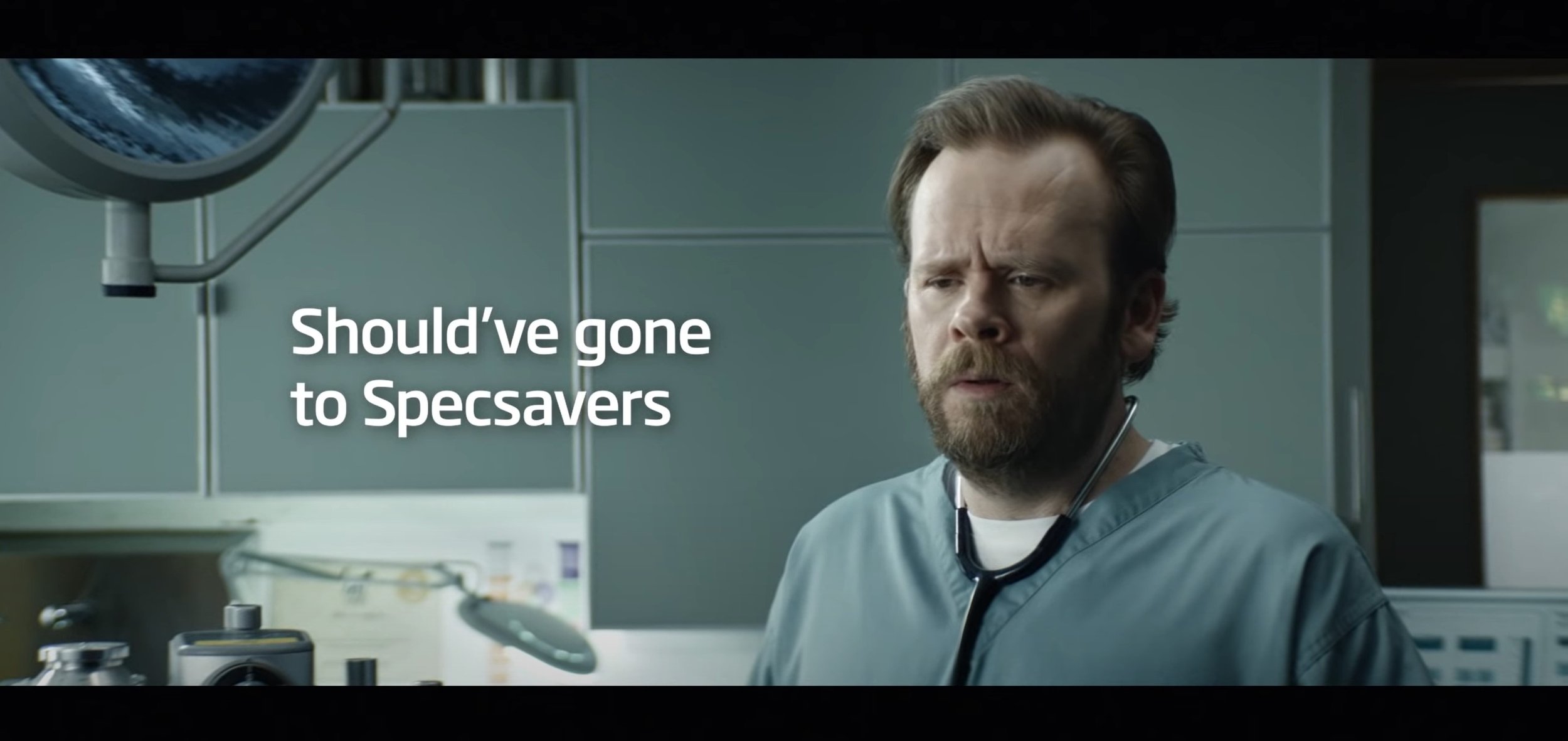
To start with, this advert has a very simple concept behind it but works really well for the type of advert it is advertising for. The target audience I think they are aiming it at is all ages as anyone who is struggling to see needs to get an eye test and with something almost obvious and staring at you. The lighting techniques used in this video are very bright and generic, their is nothing particularly special about it. The transitions that are used in this video are the simple cut to the next scene without any special effects and they are using the cinematic aspect ratio (2.4:1) in this video. The shot types which are used in this video are wide shot, close up shot and medium shot. The camera angles which are used to work with the shot types are mostly low angles and eye level. The movements are easier to analyse, the is a lot of up and down movement, for example from when looking at the doctor and then moving back down to the fluffy hat, next one is when the camera pans left and then zooms in quickly and then the camera moves down then back up. This is following the main subject in the next scenes, which is the women. Lastly at the end the advert finishes off saying “Should’ve Gone To Specsavers” with the doctor who has become the main subject in frame to the right of the frame with the text on the left, they have done this well by using a medium eye level shot.
The screengrabs are below to see what I am talking about:
Pre-Production
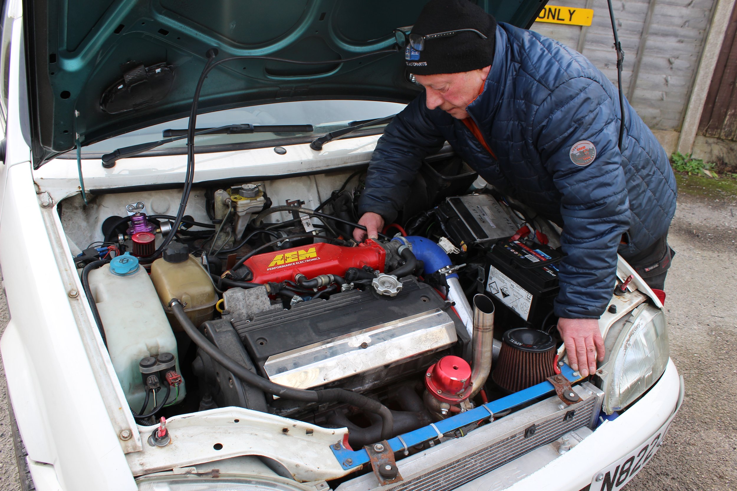
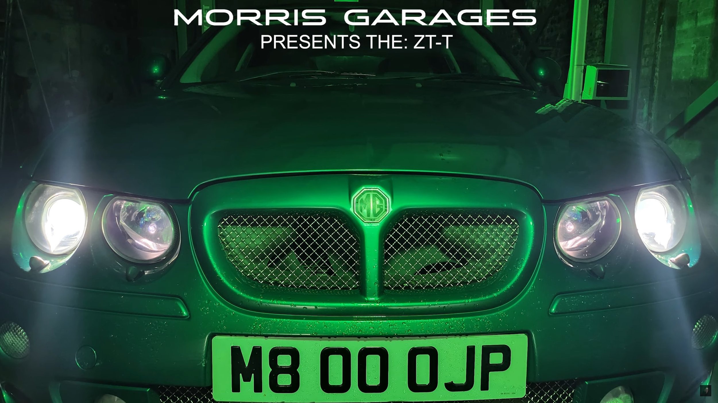
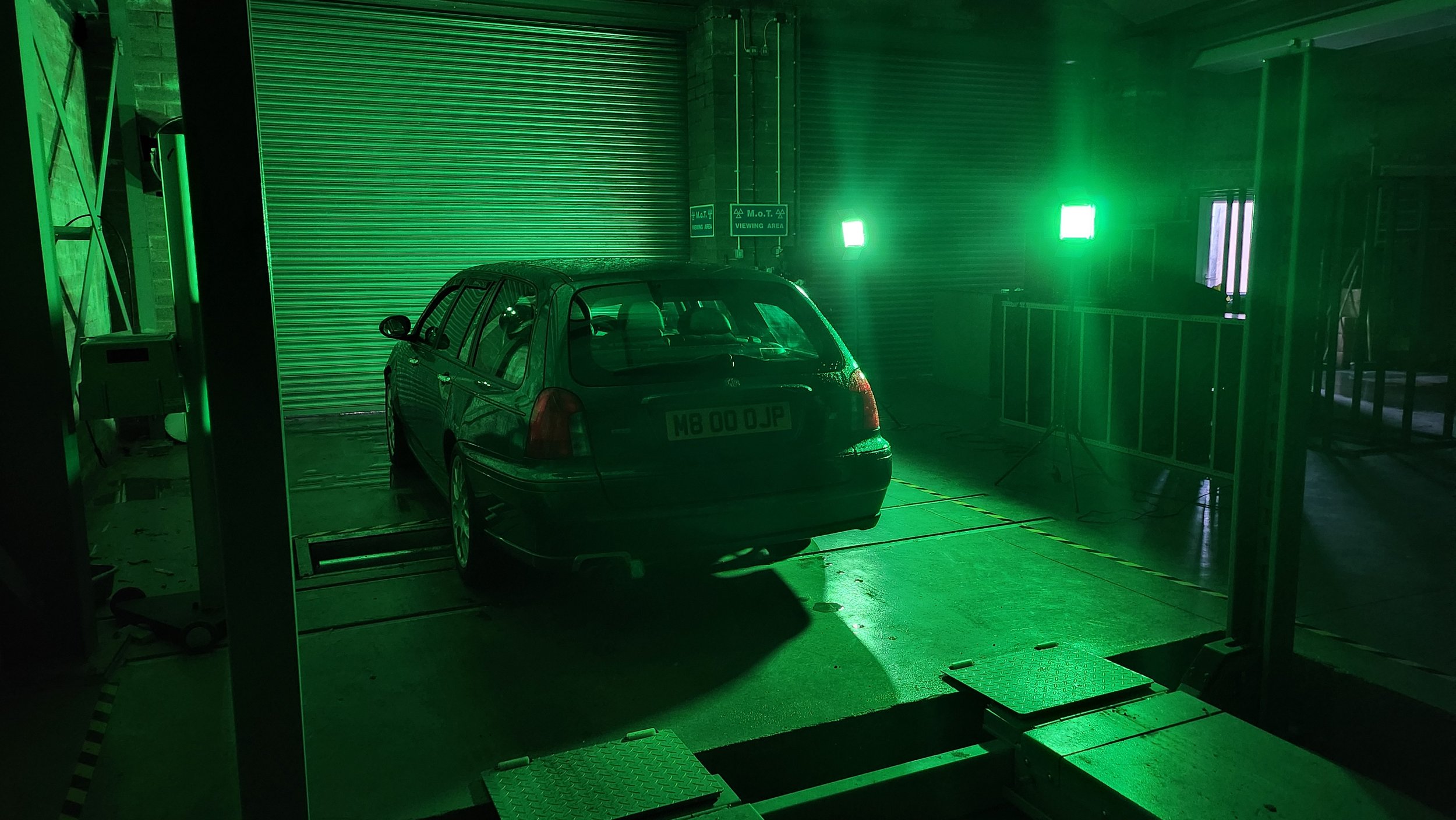
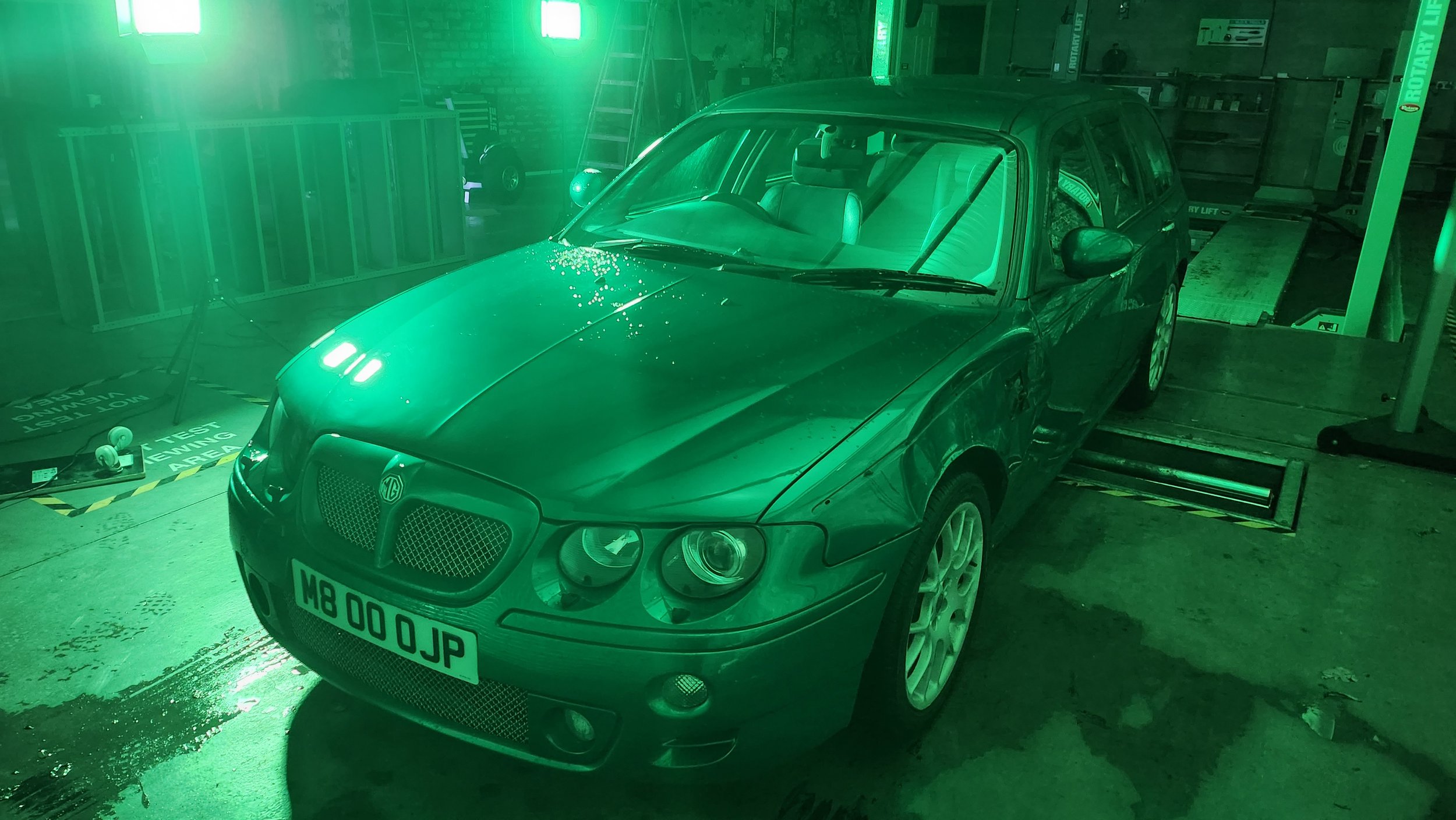
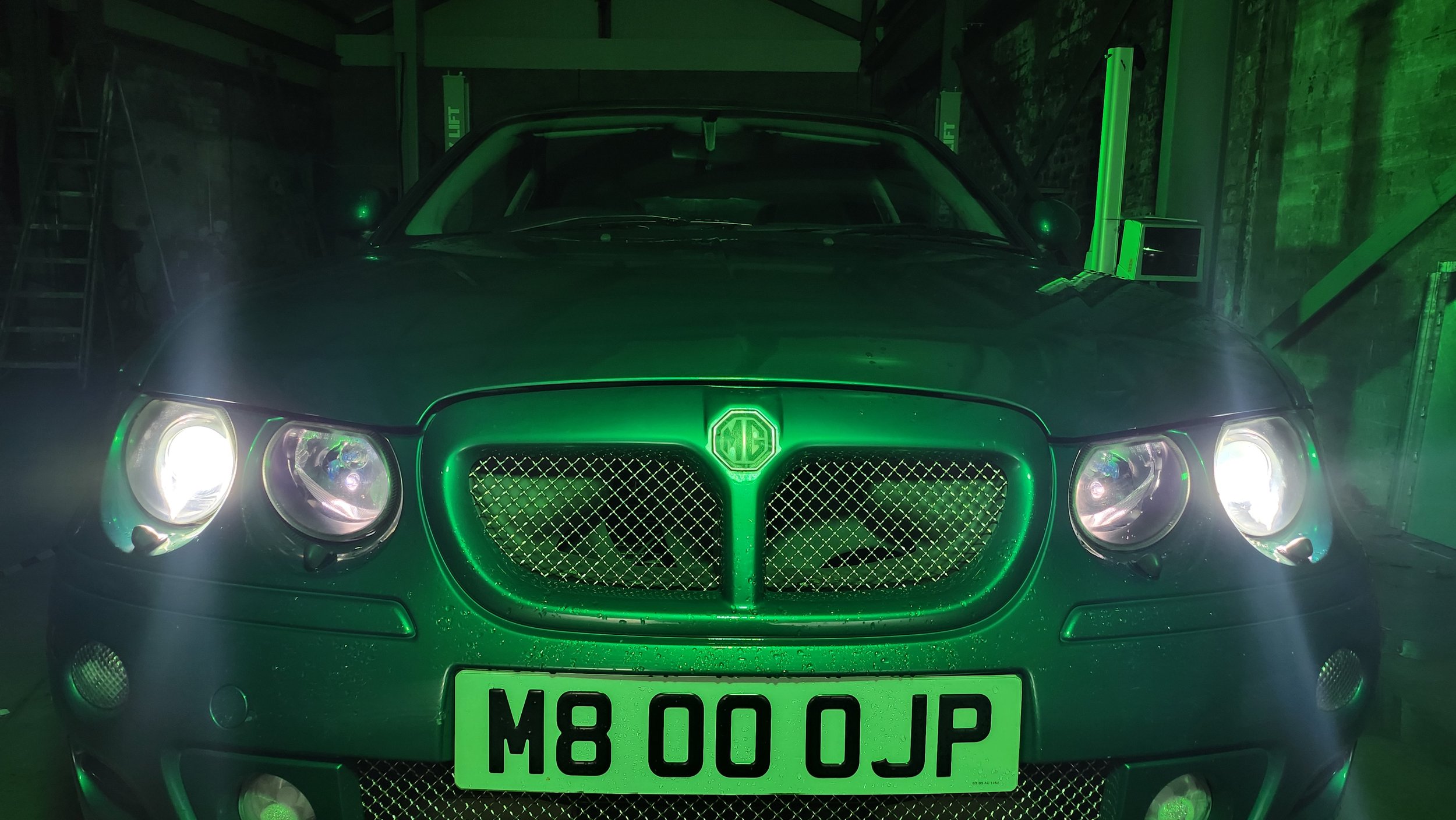
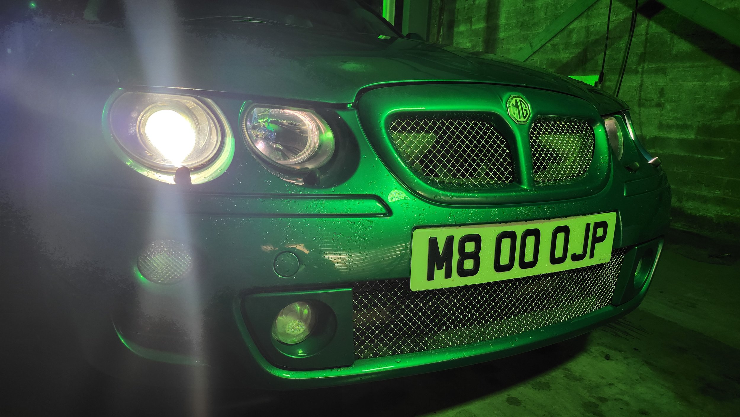
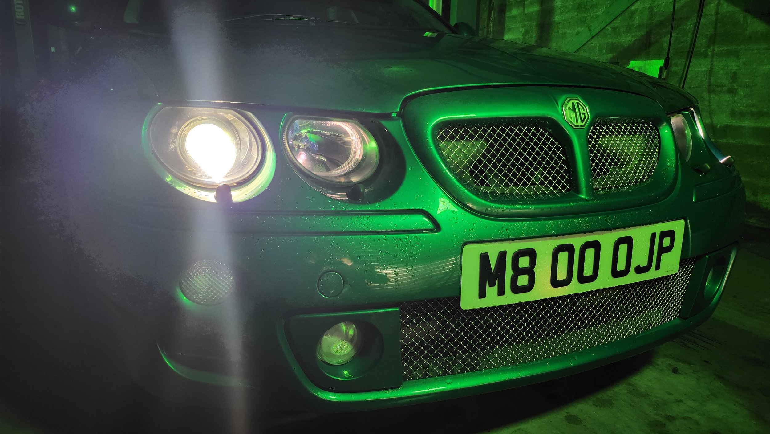
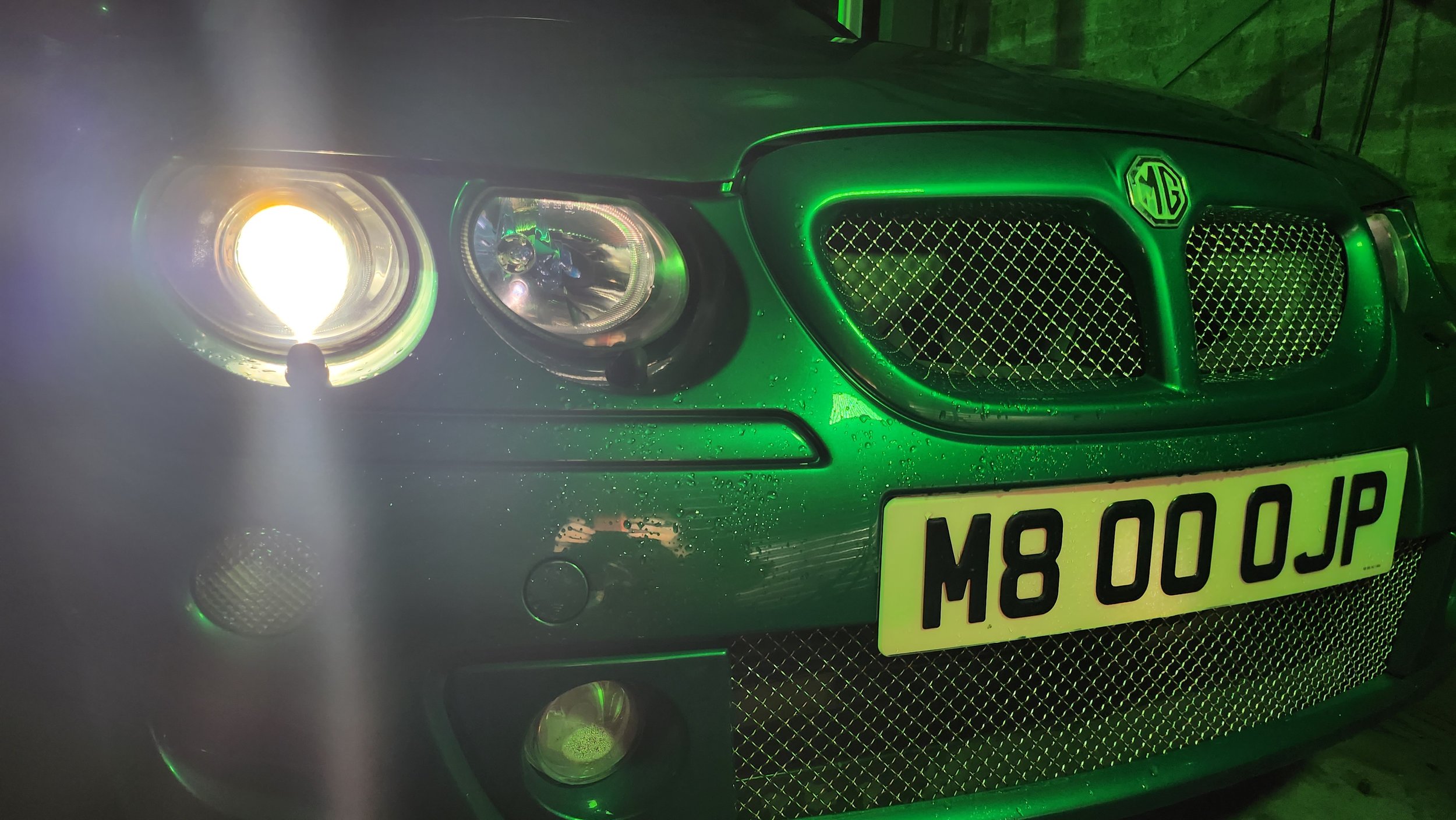
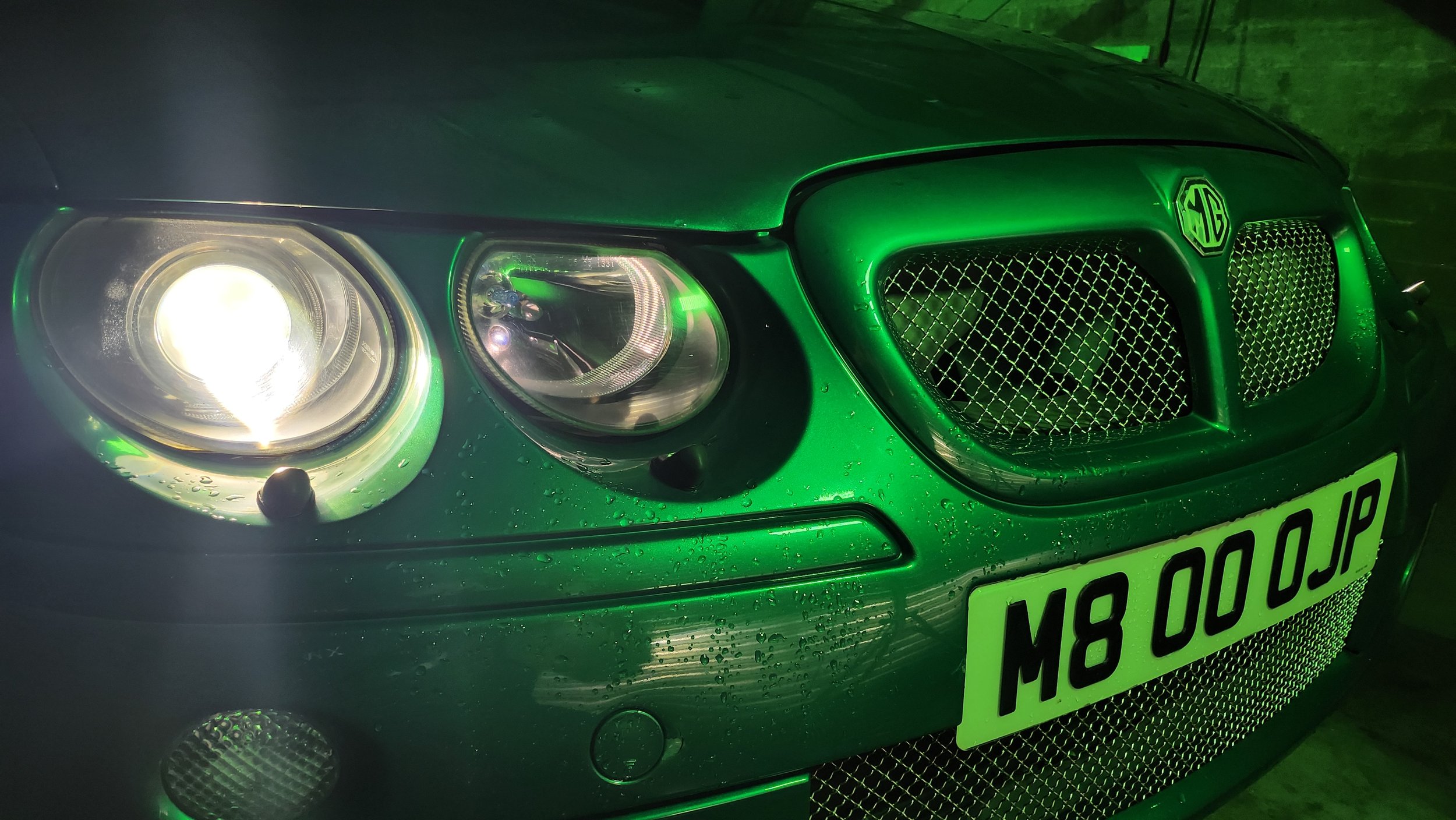
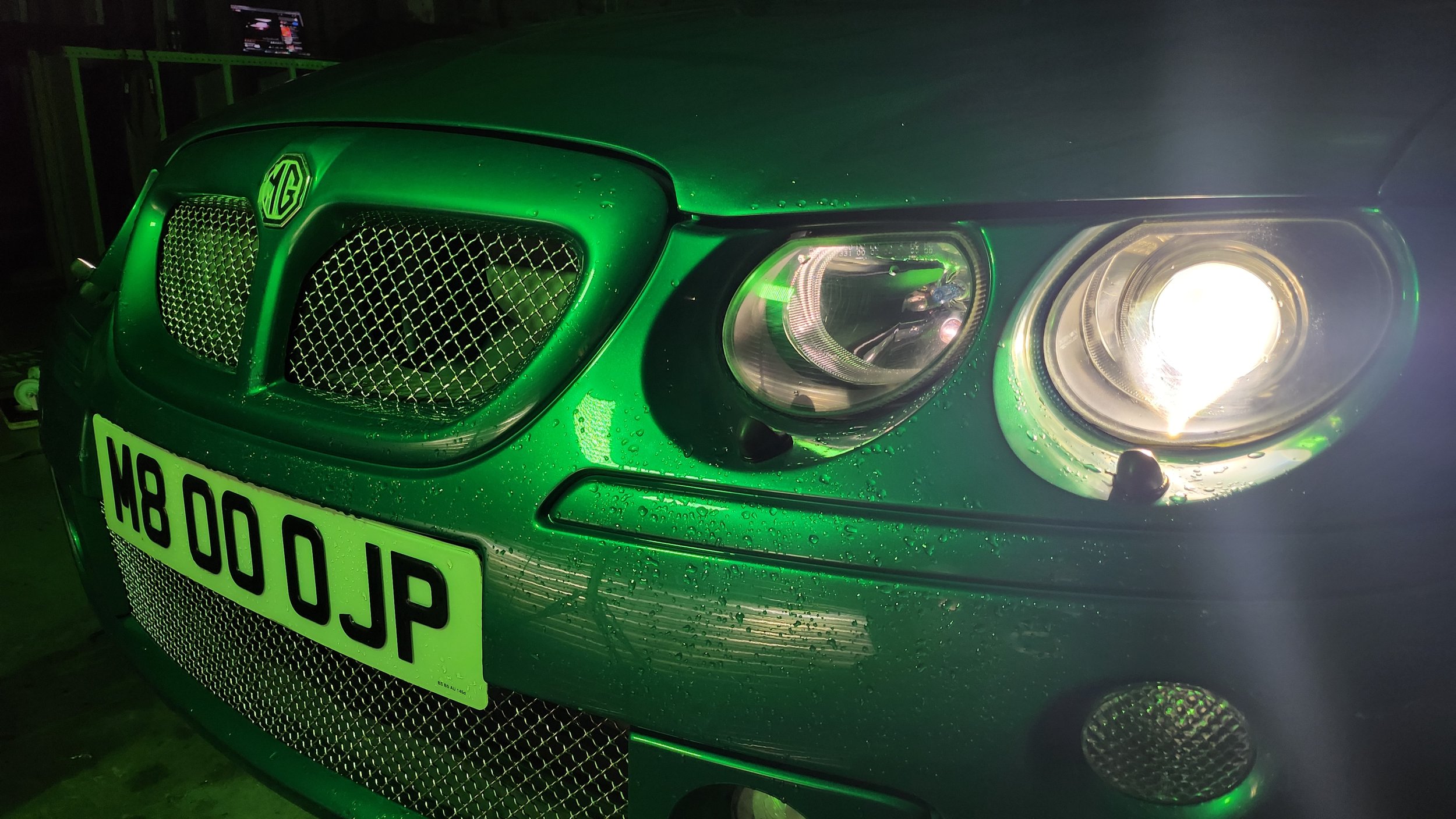
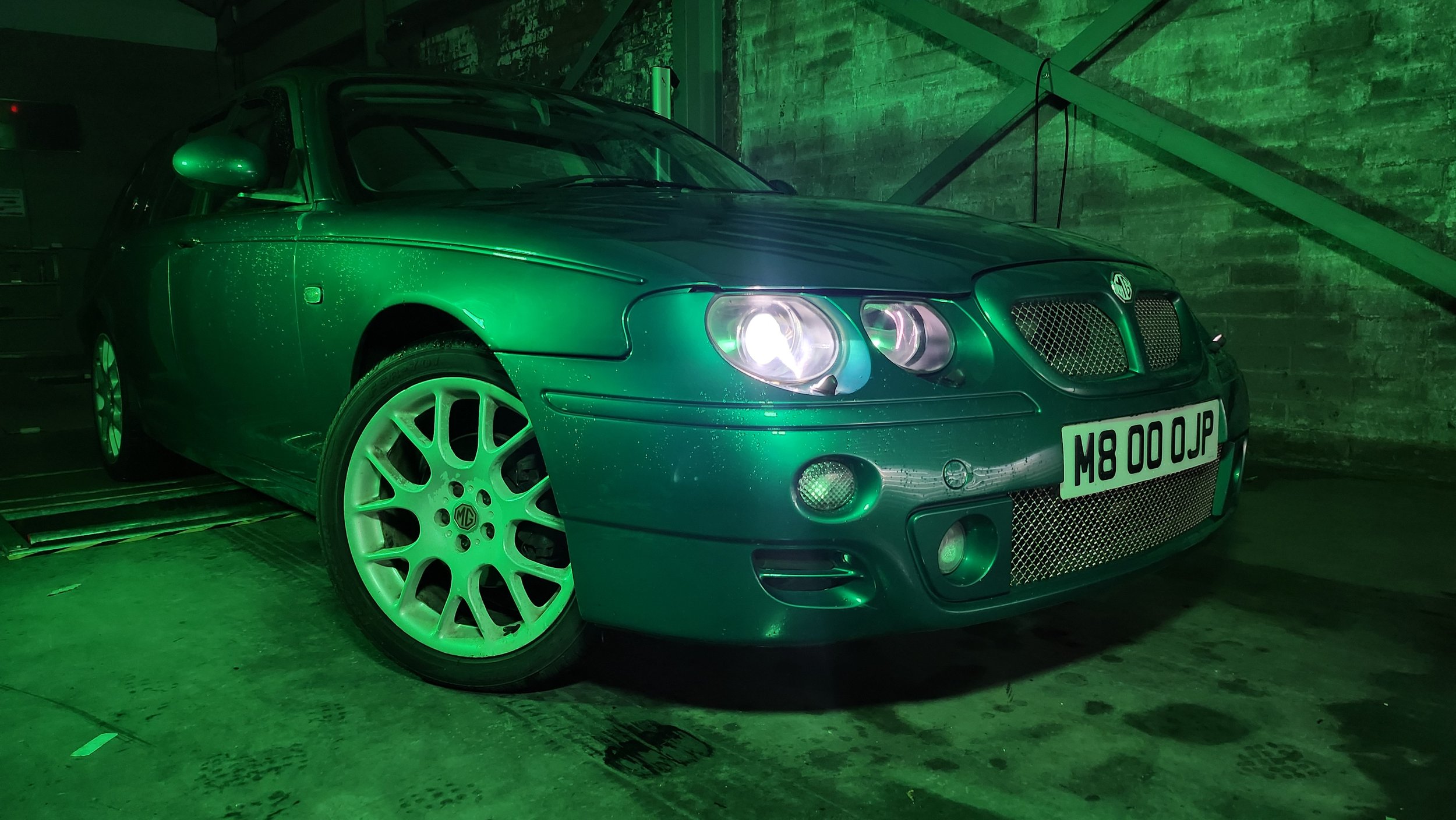
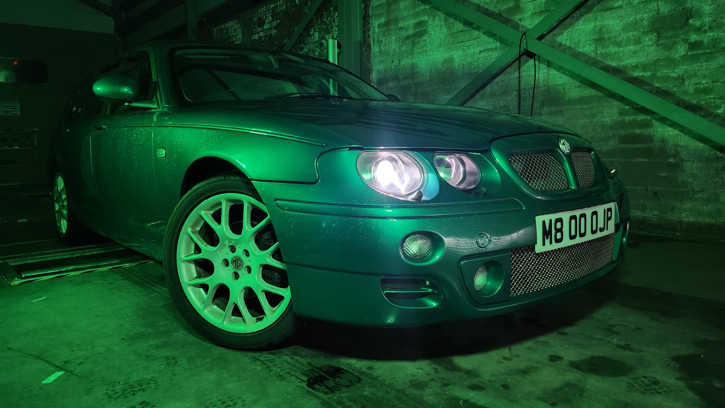
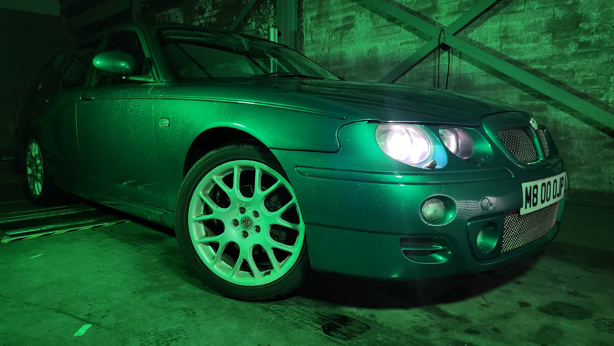
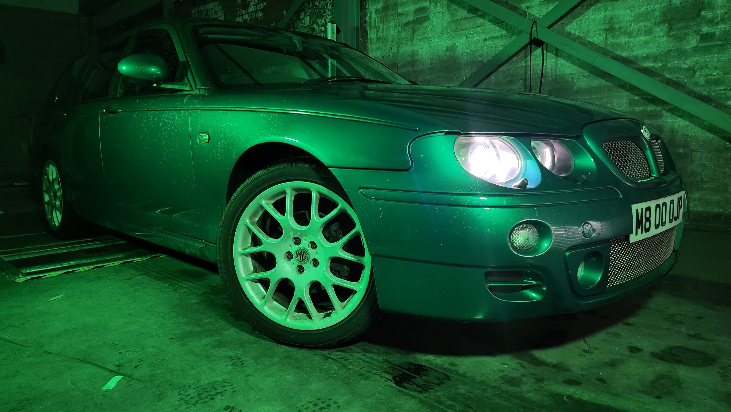
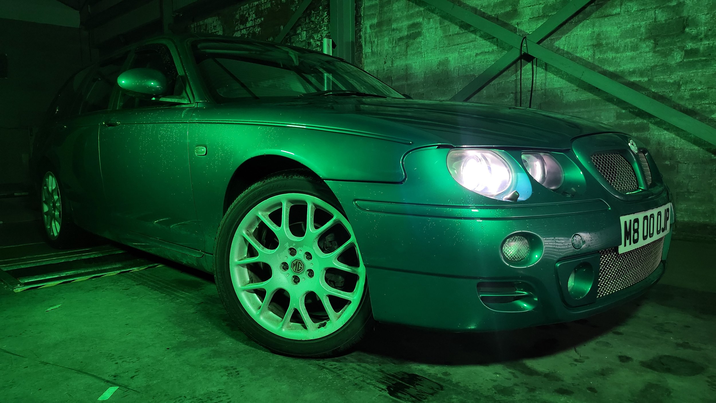
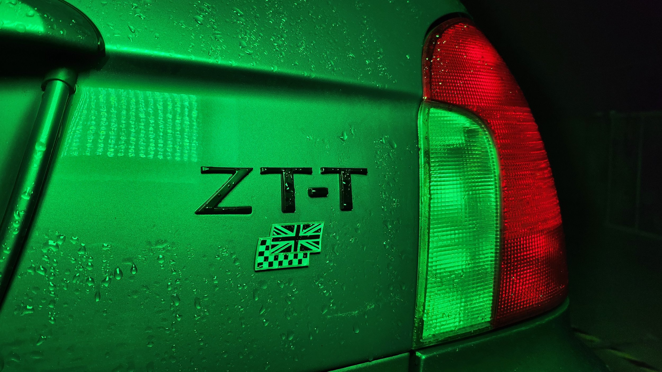
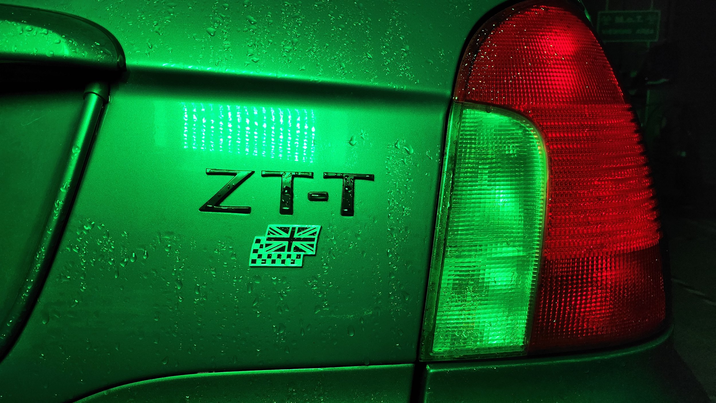
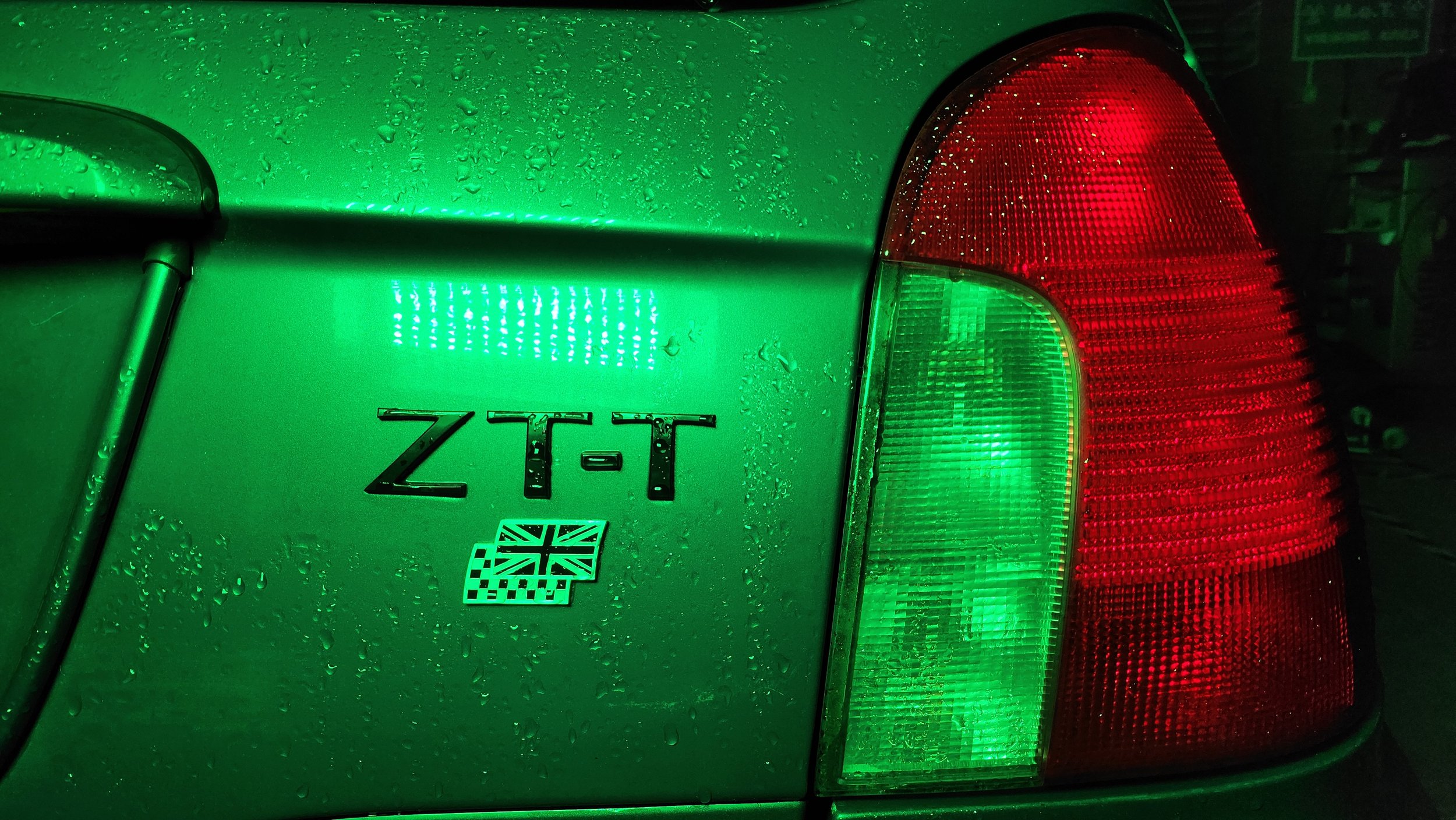
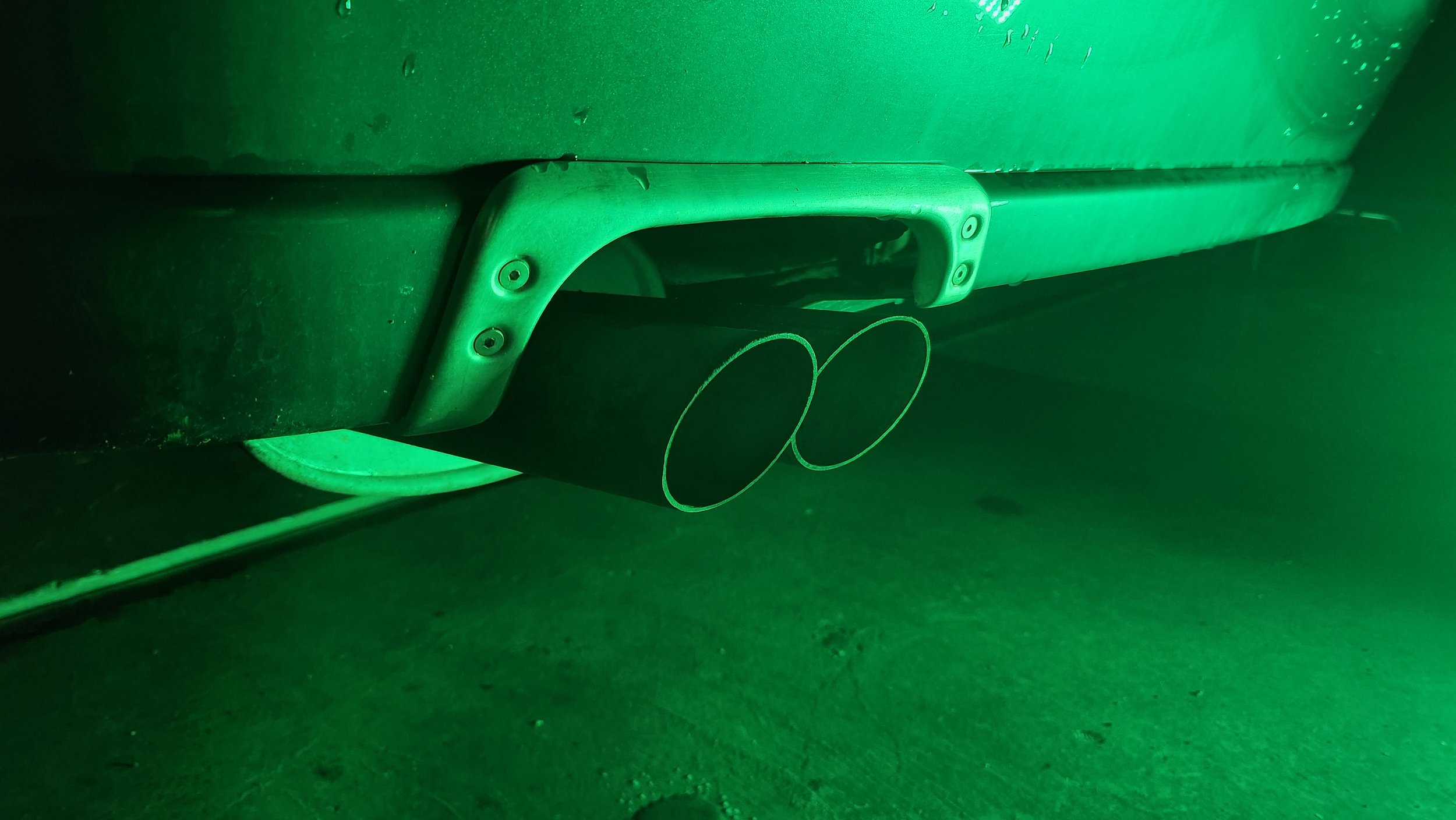
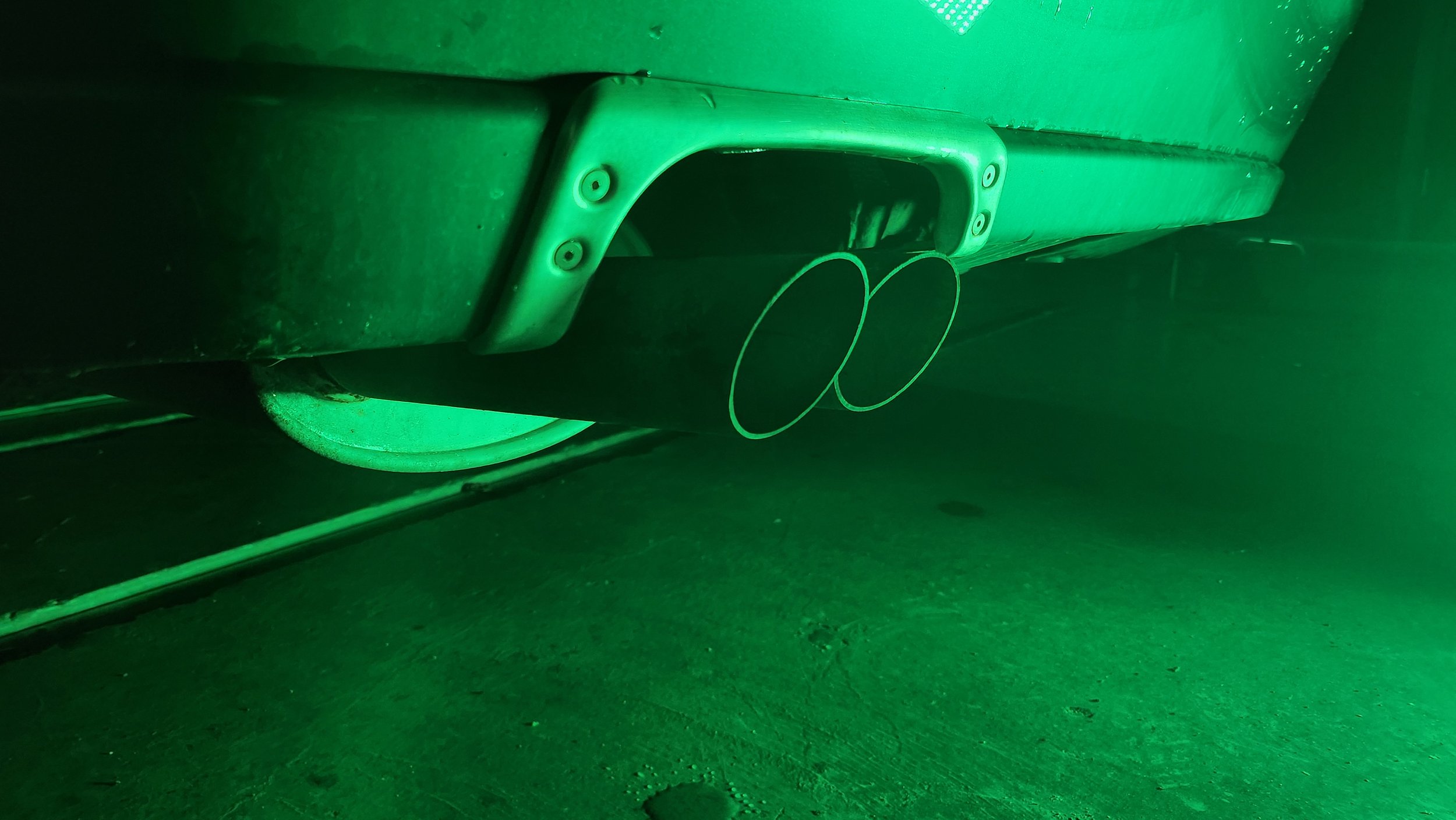
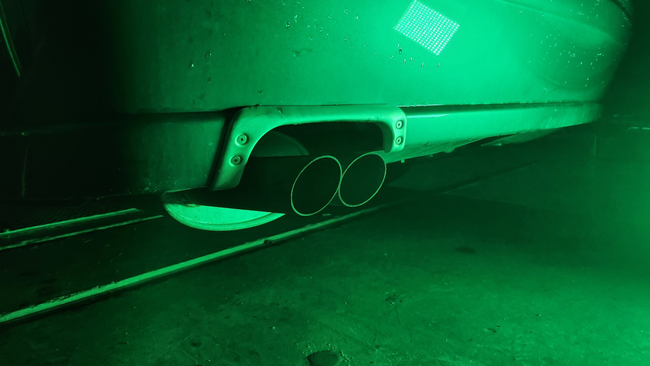
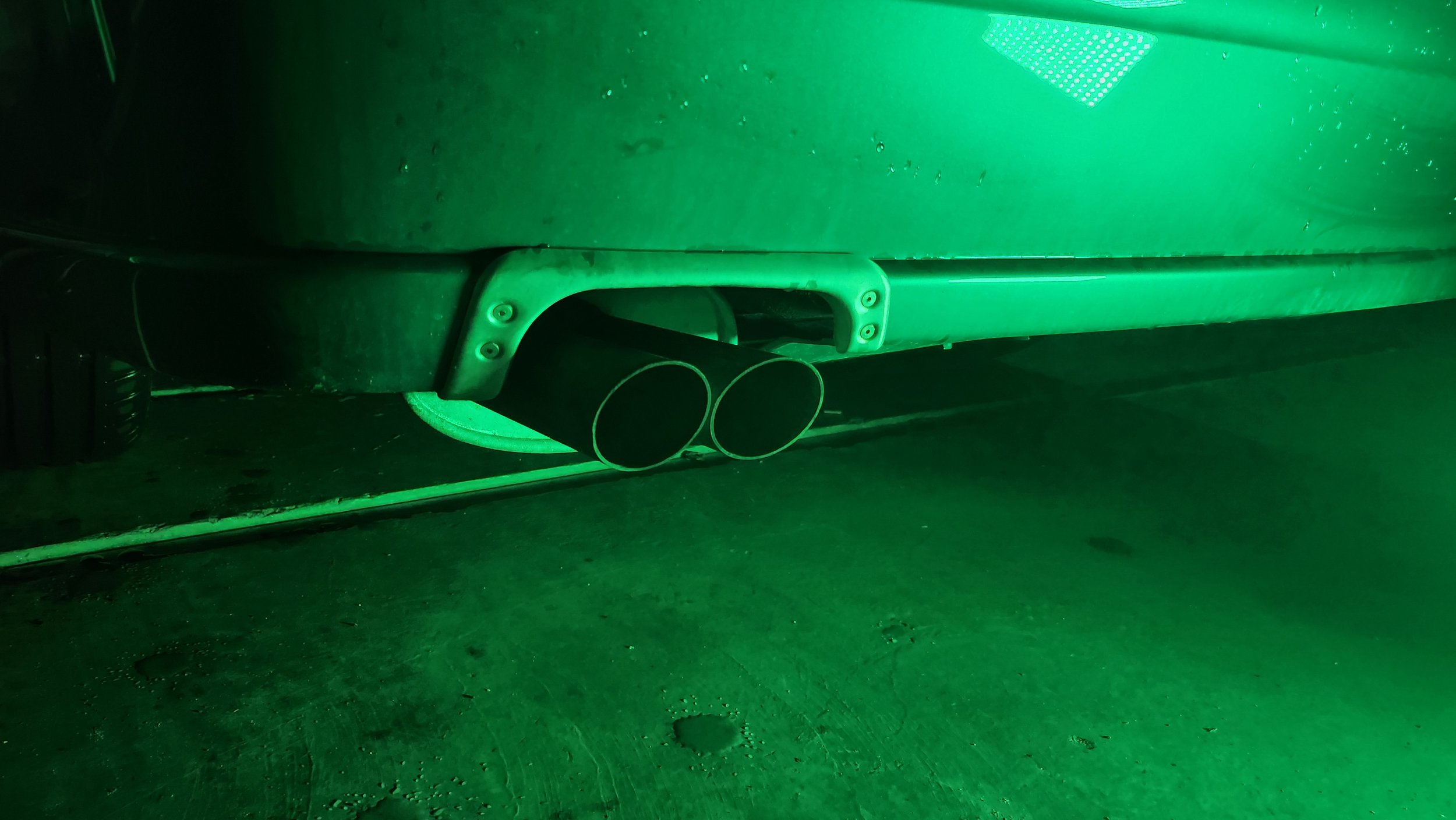
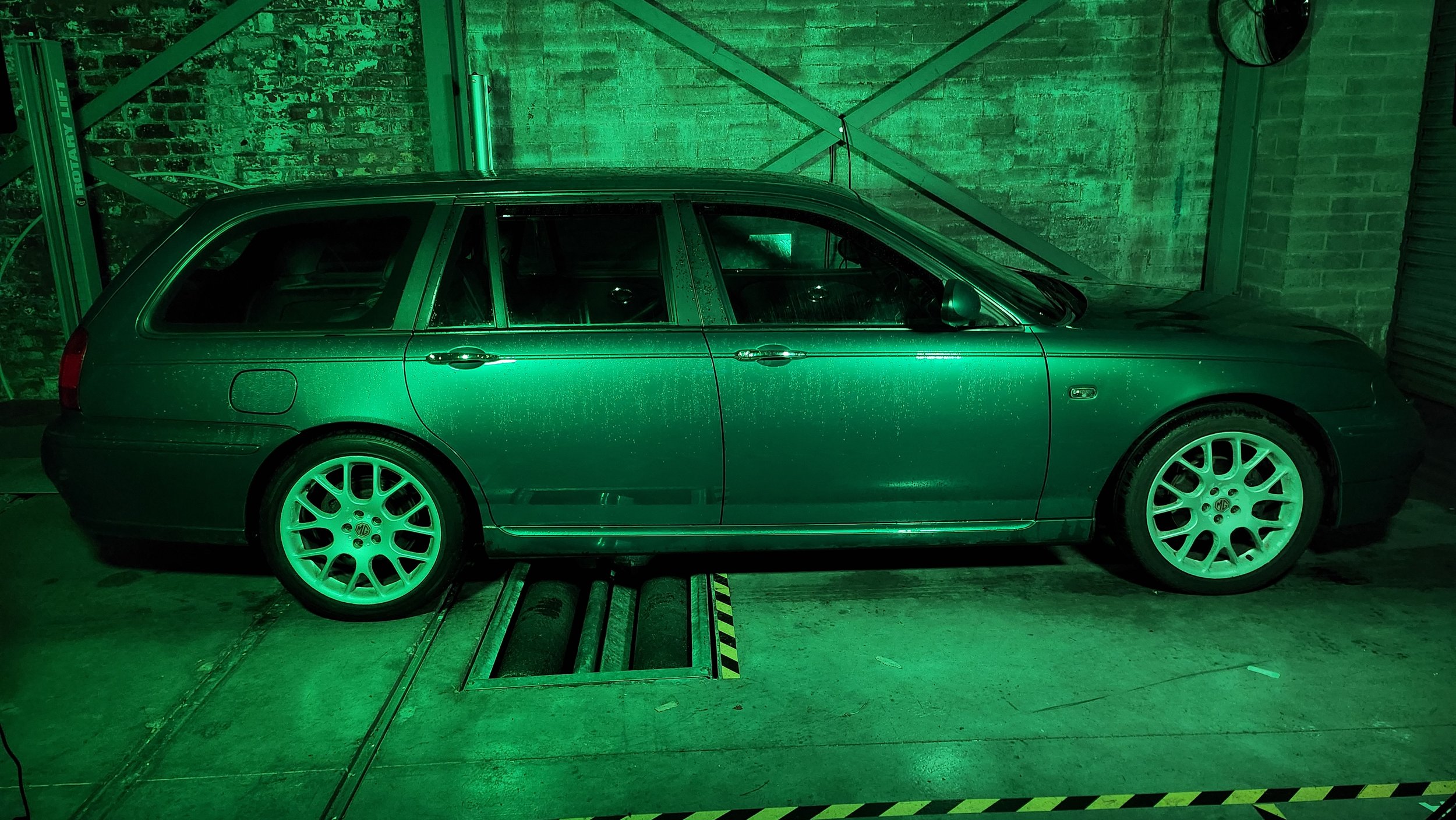
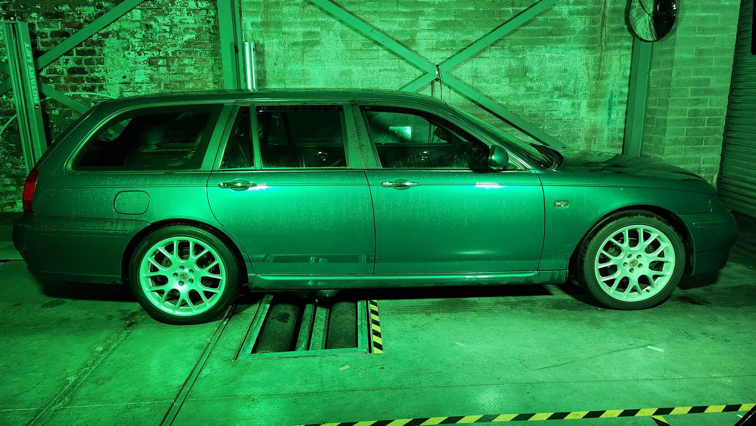
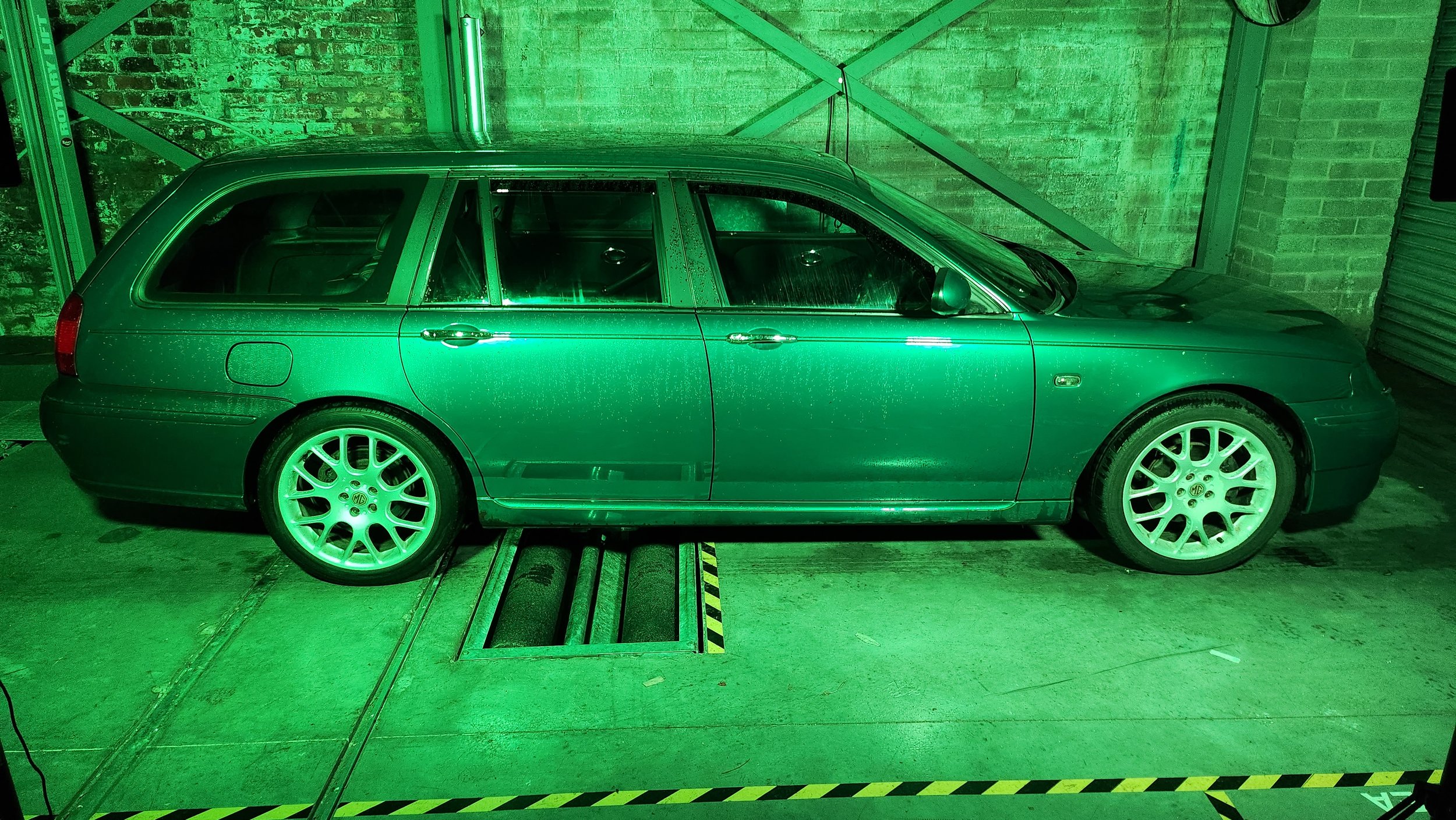
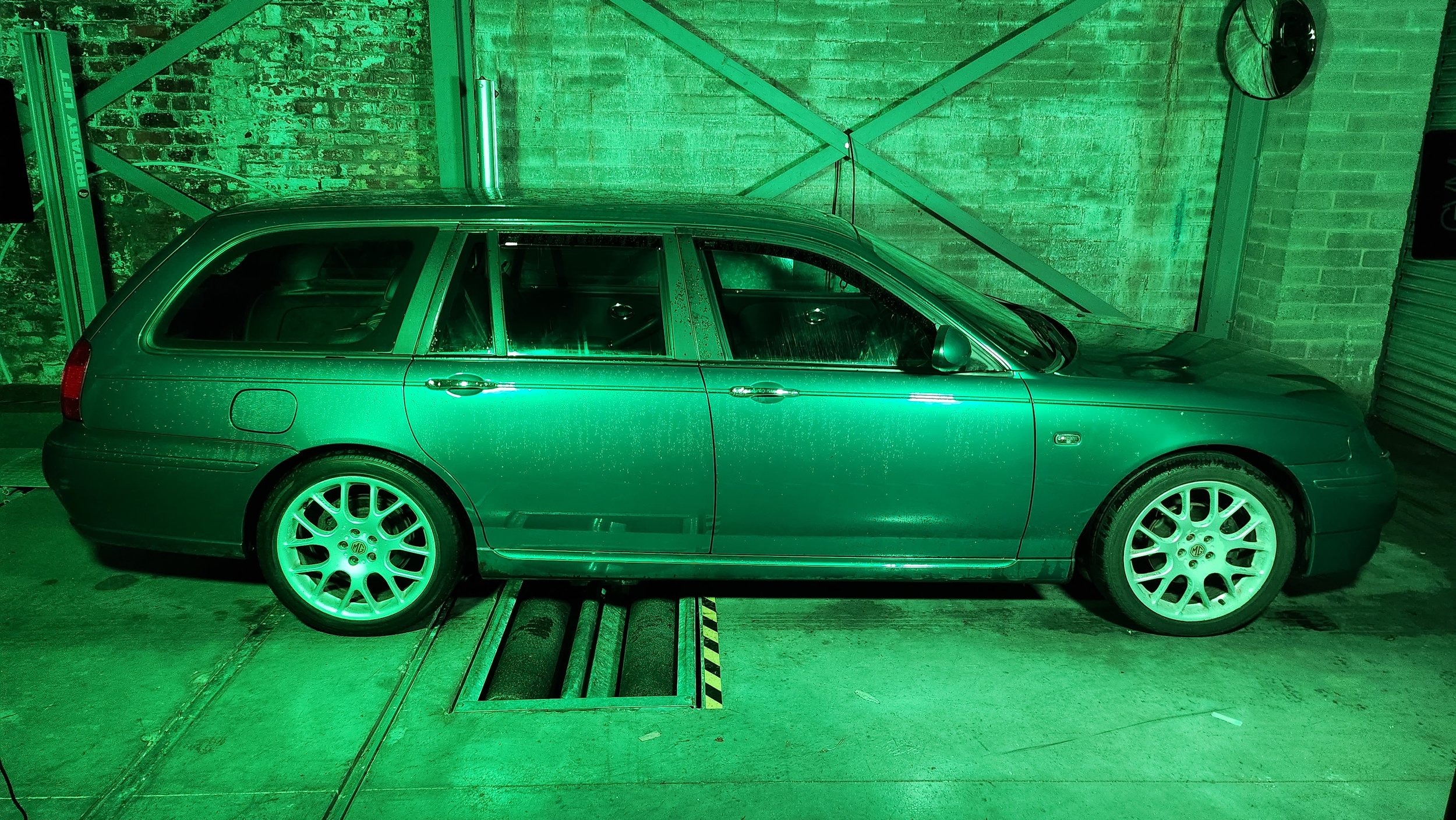
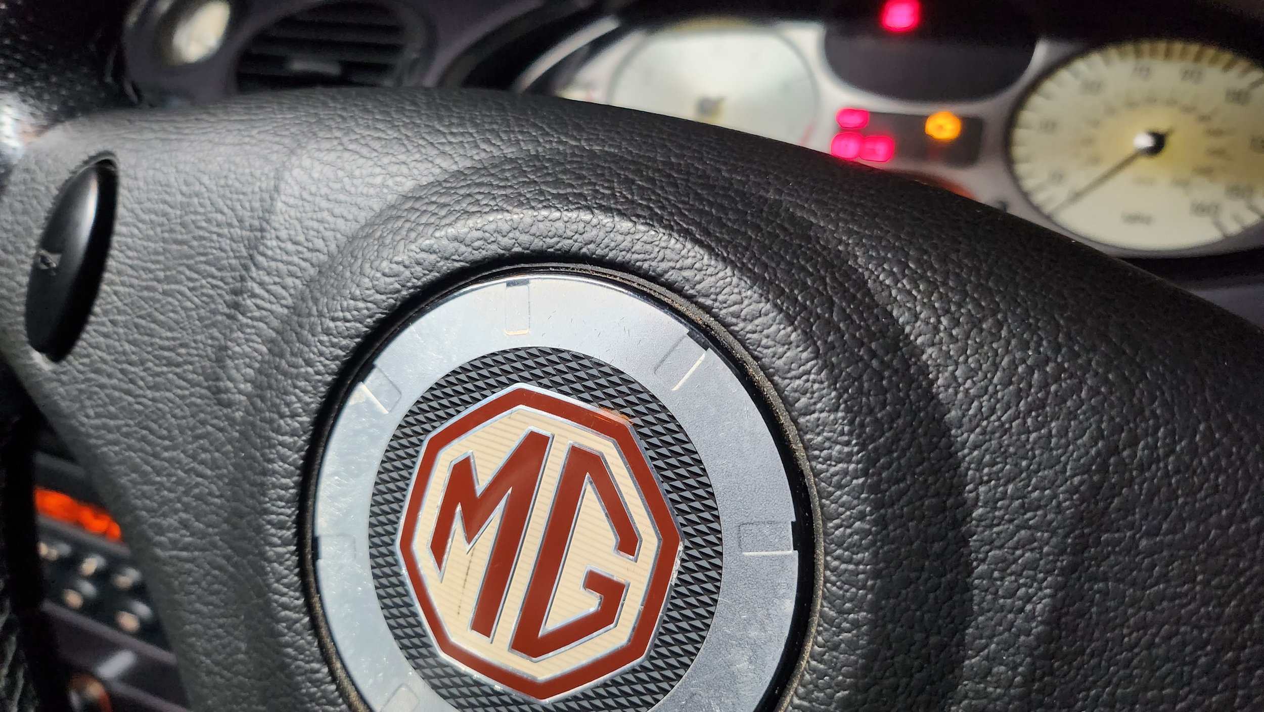
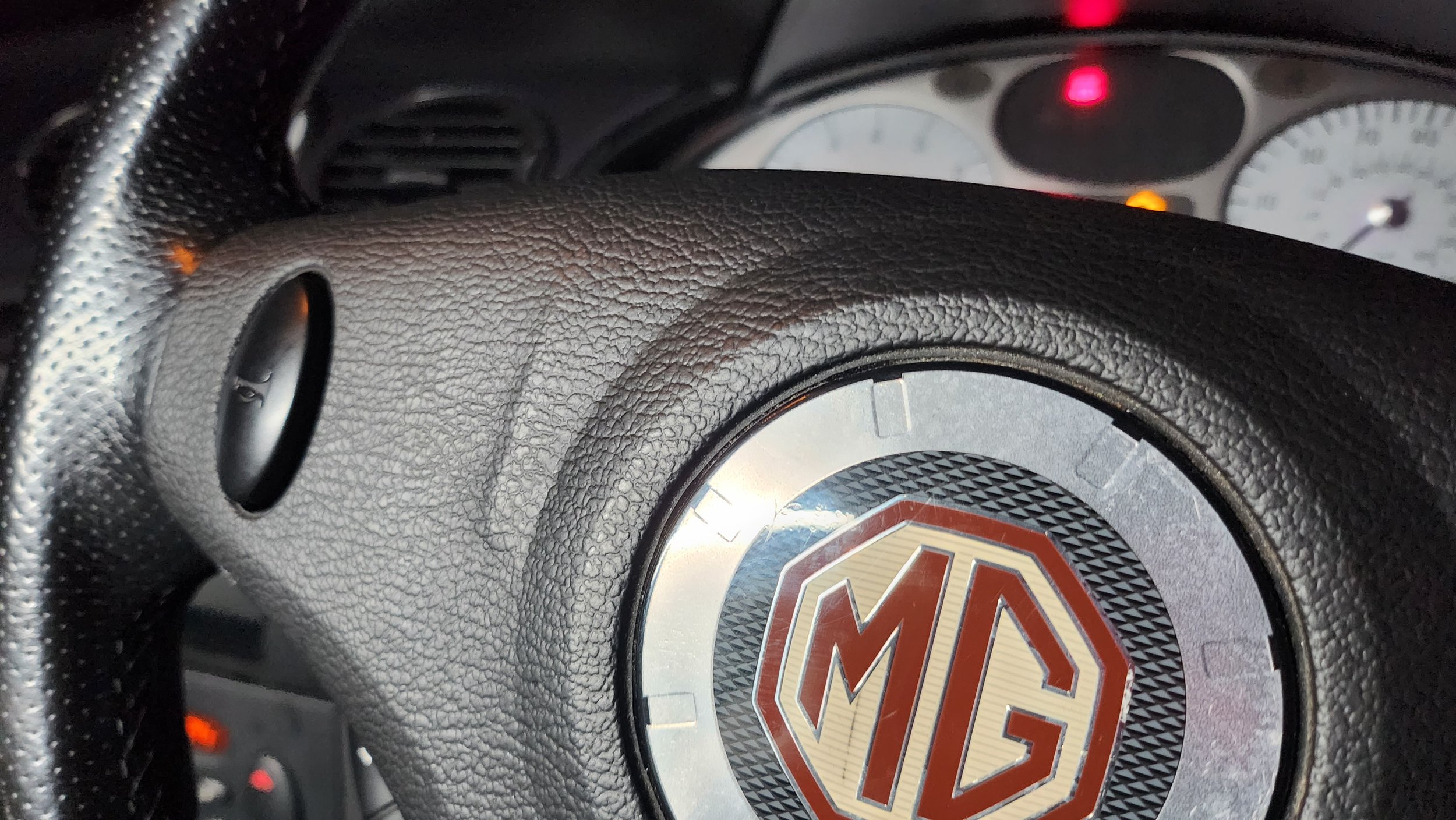
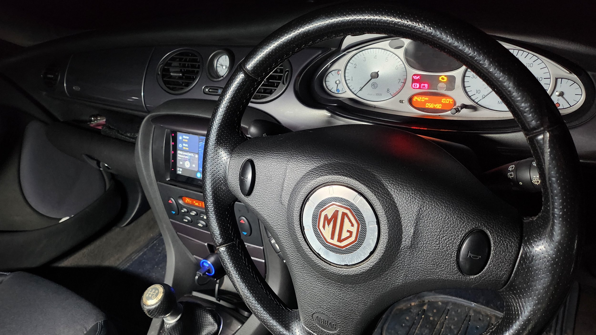
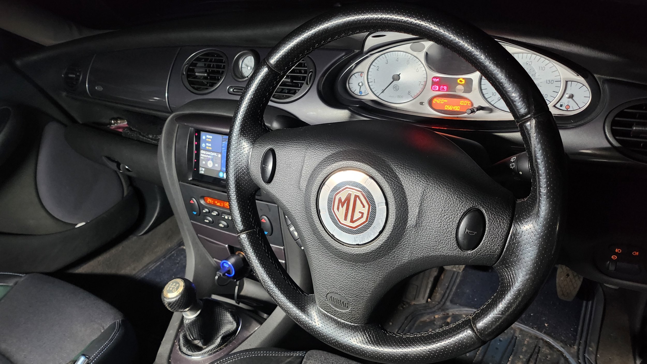
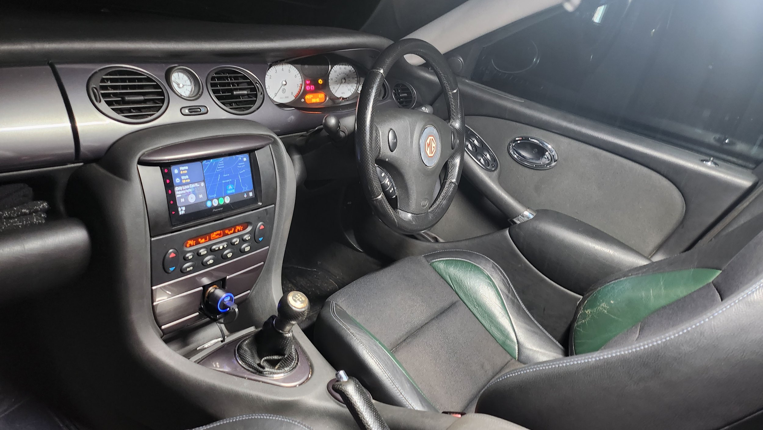
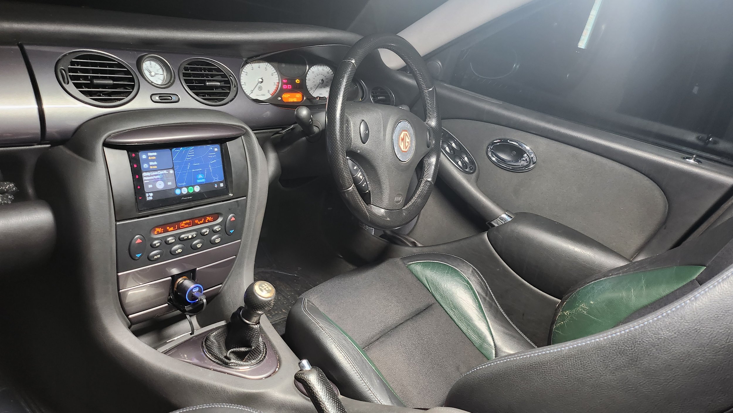
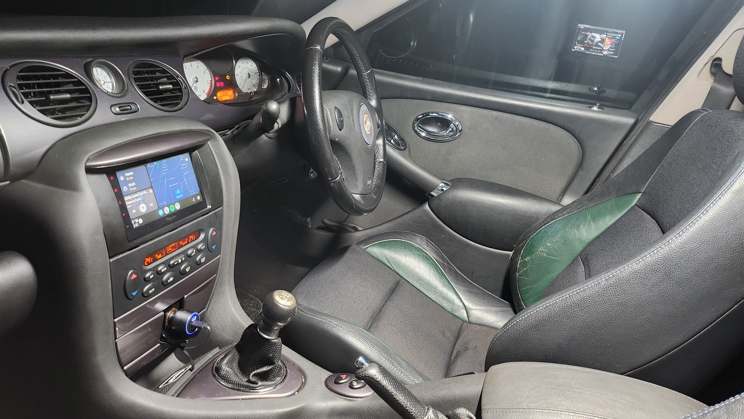
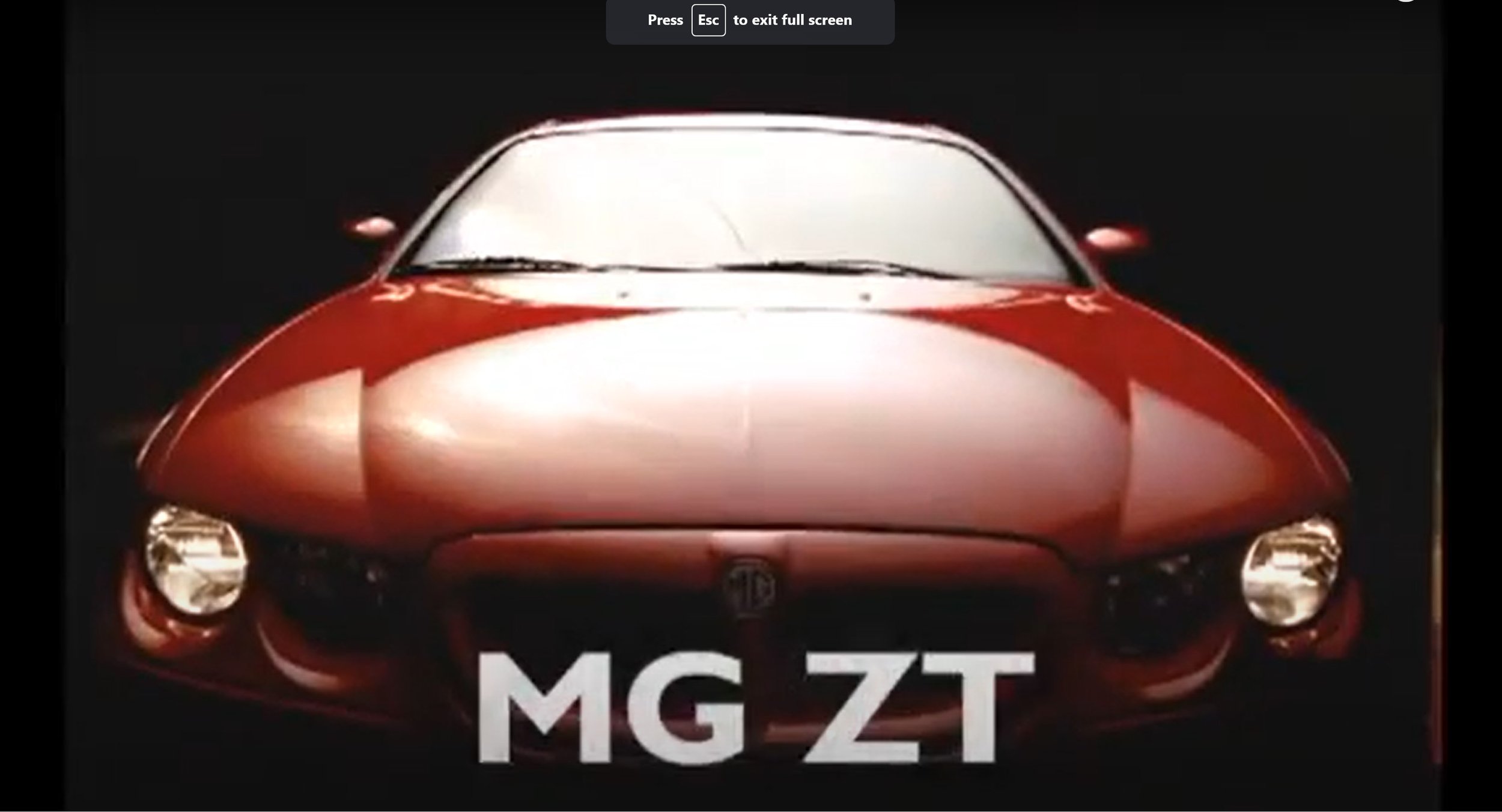
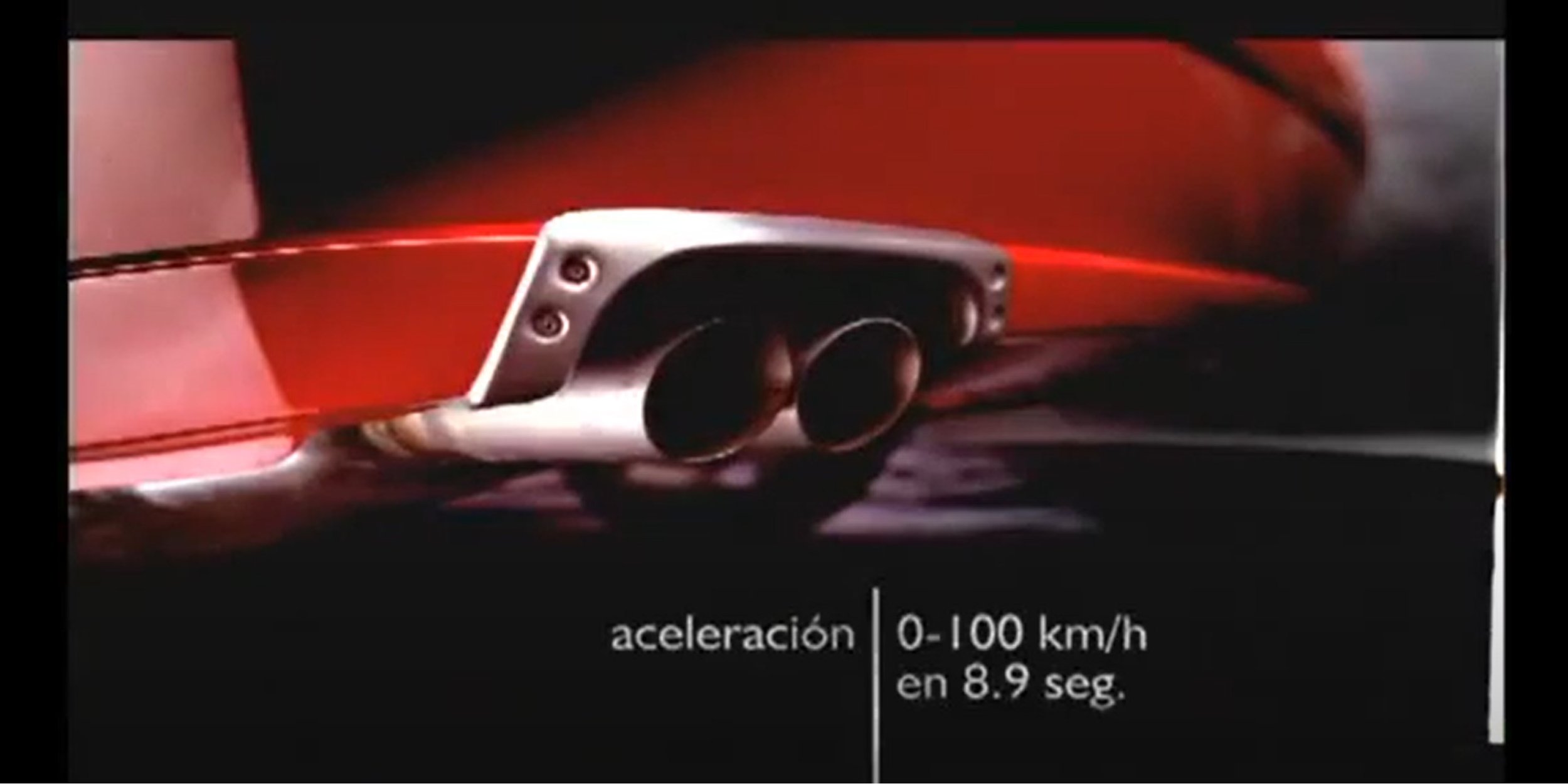
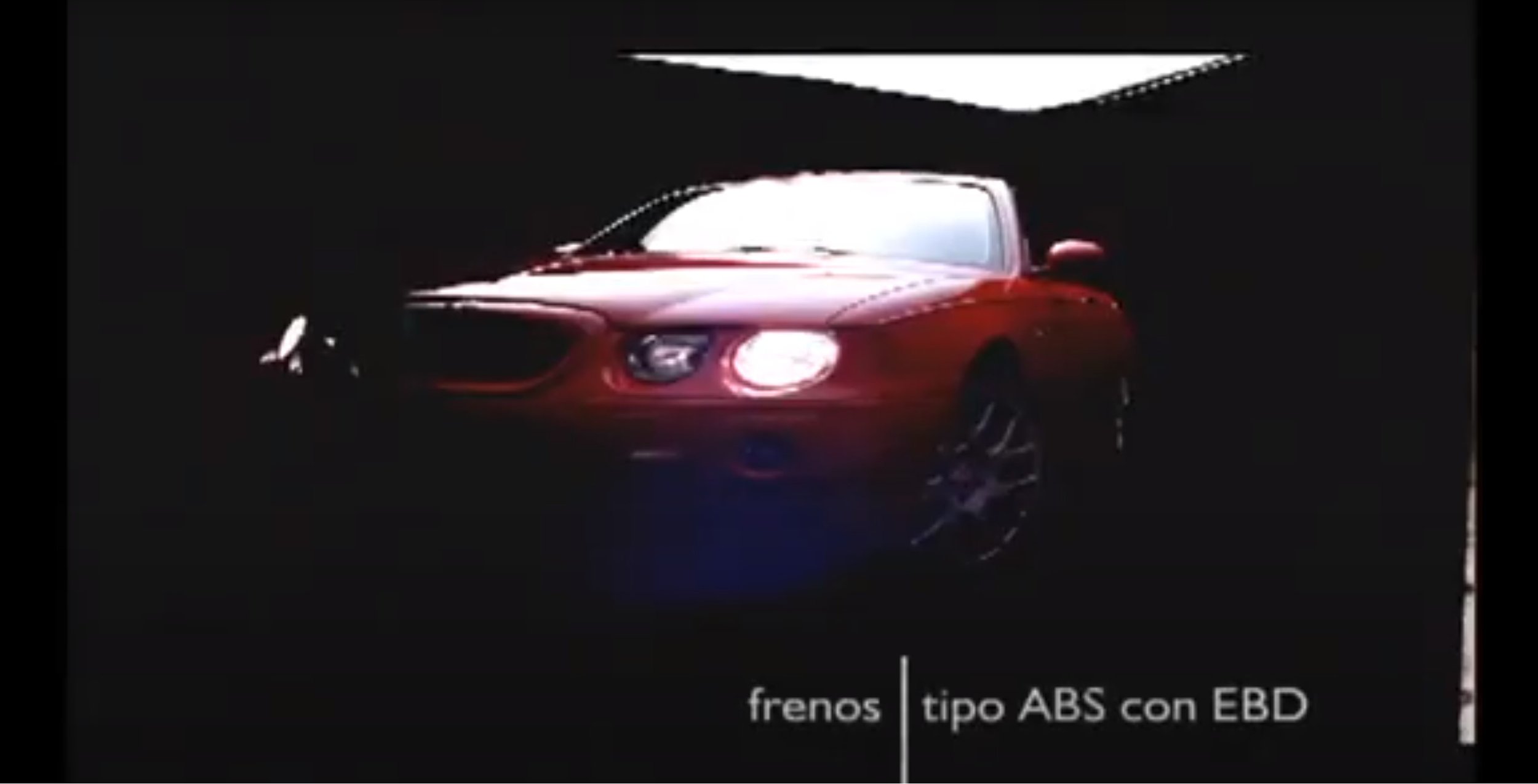
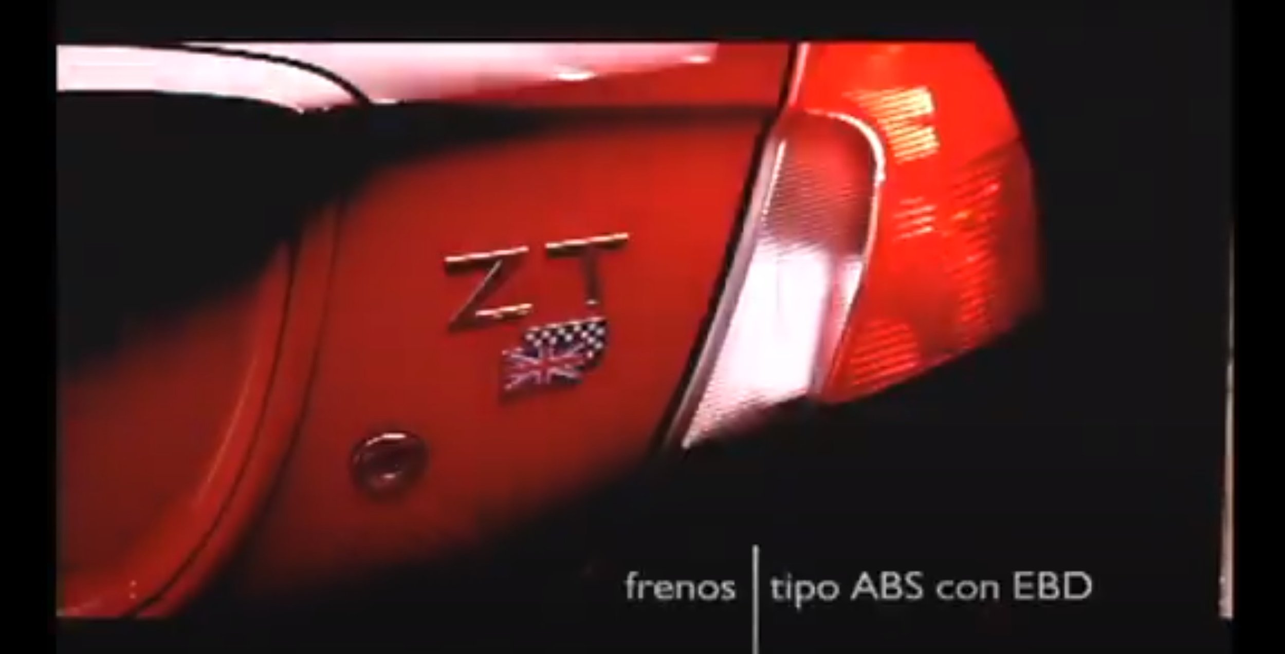
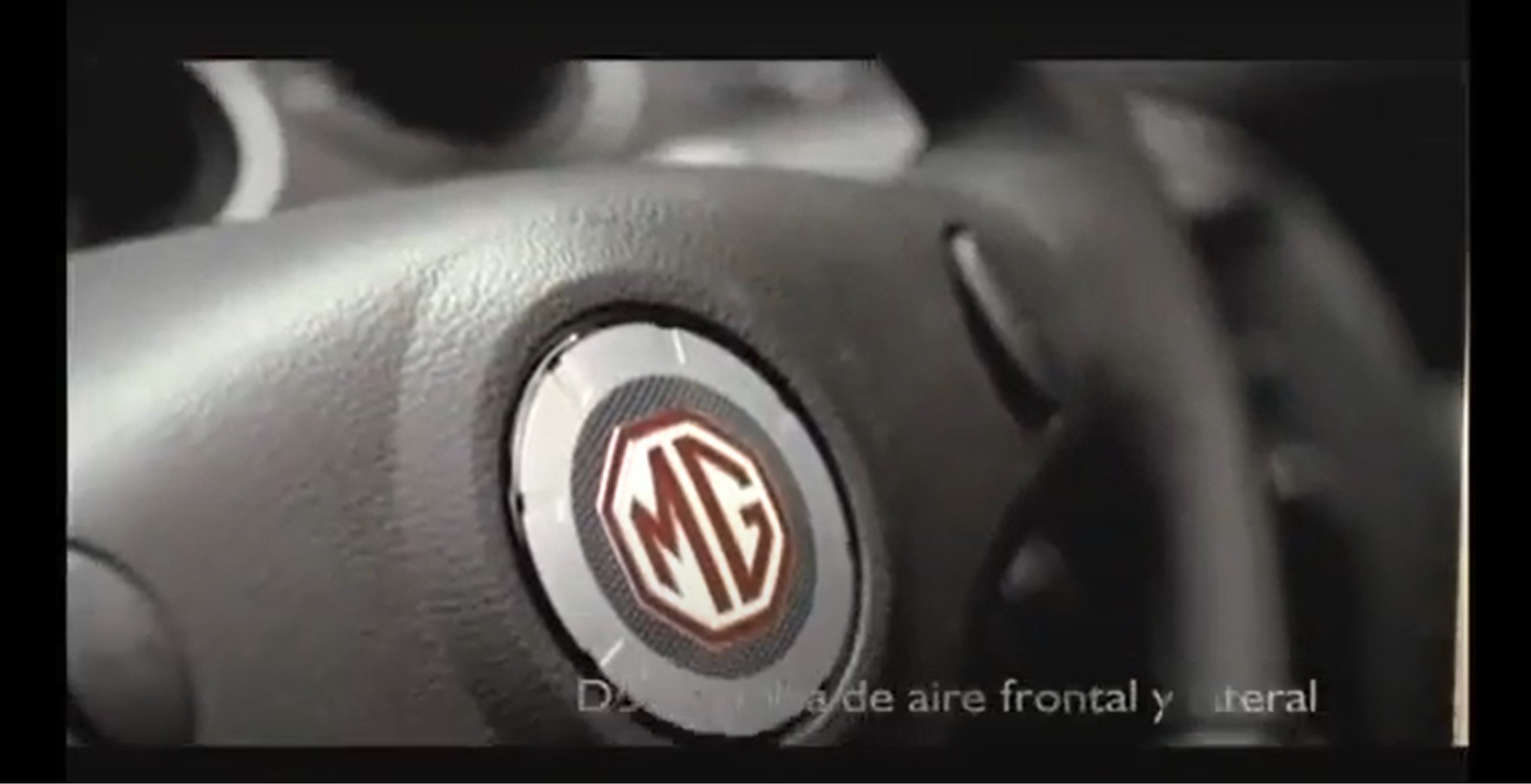
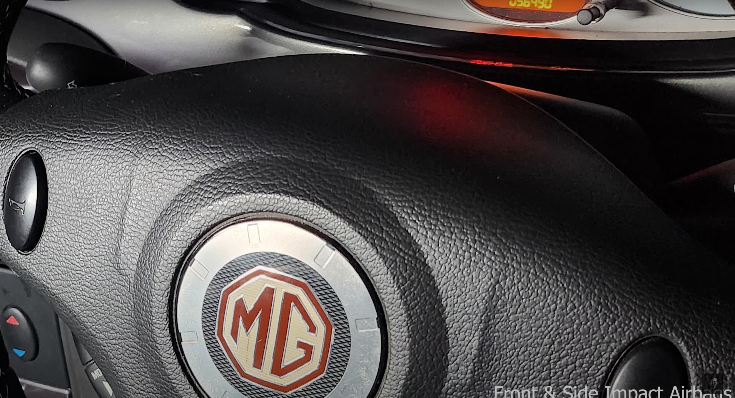
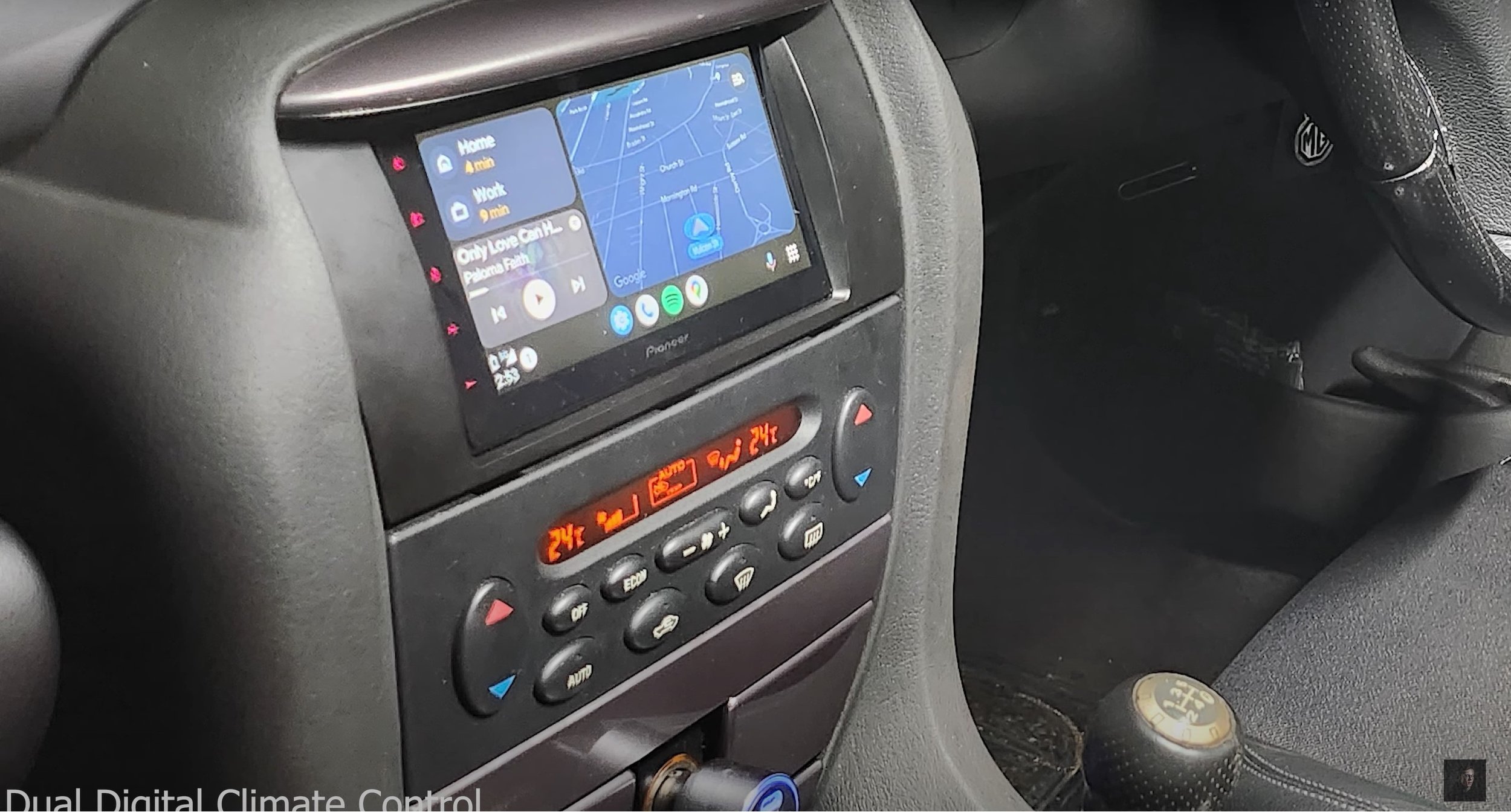
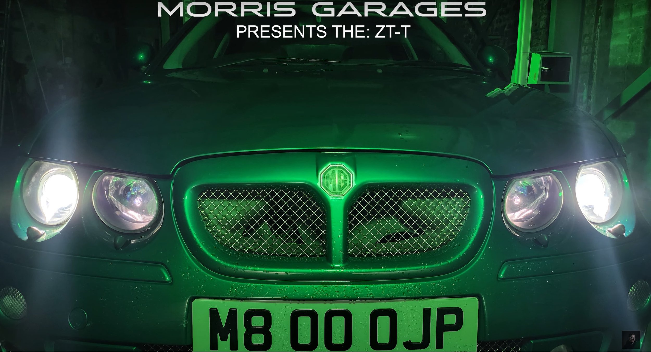
My Idea: - MG ZT | Commercial Ad
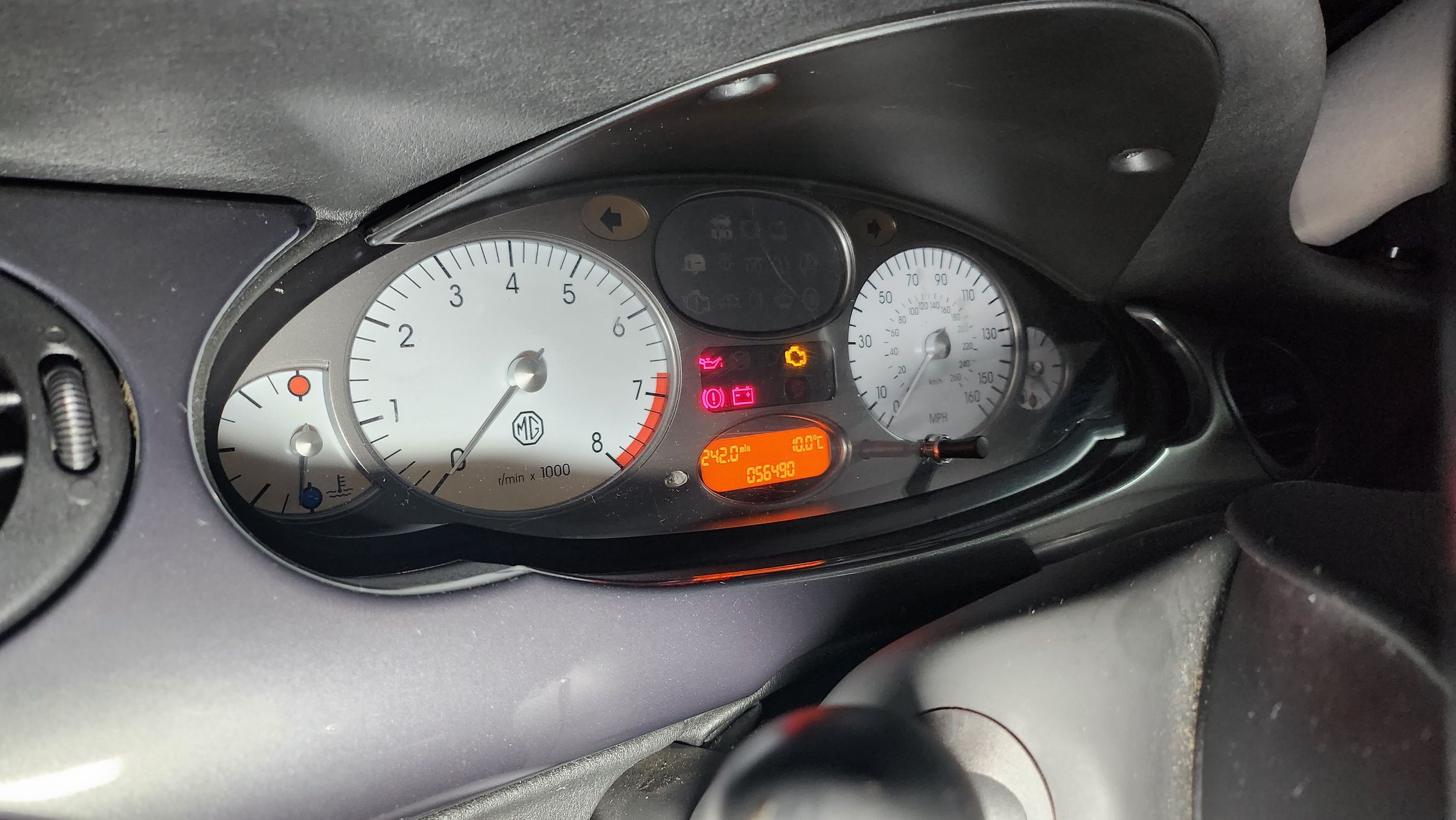
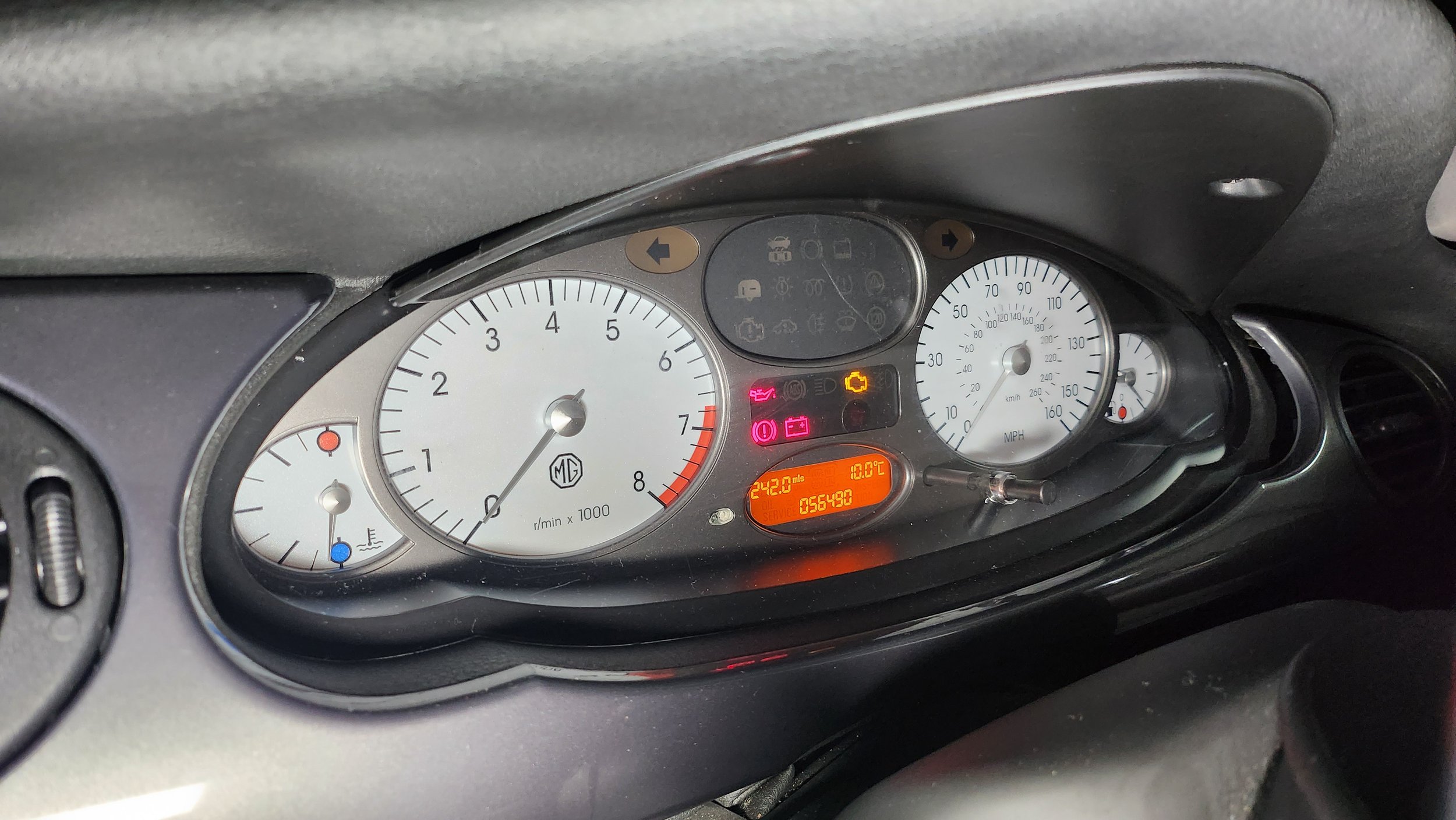
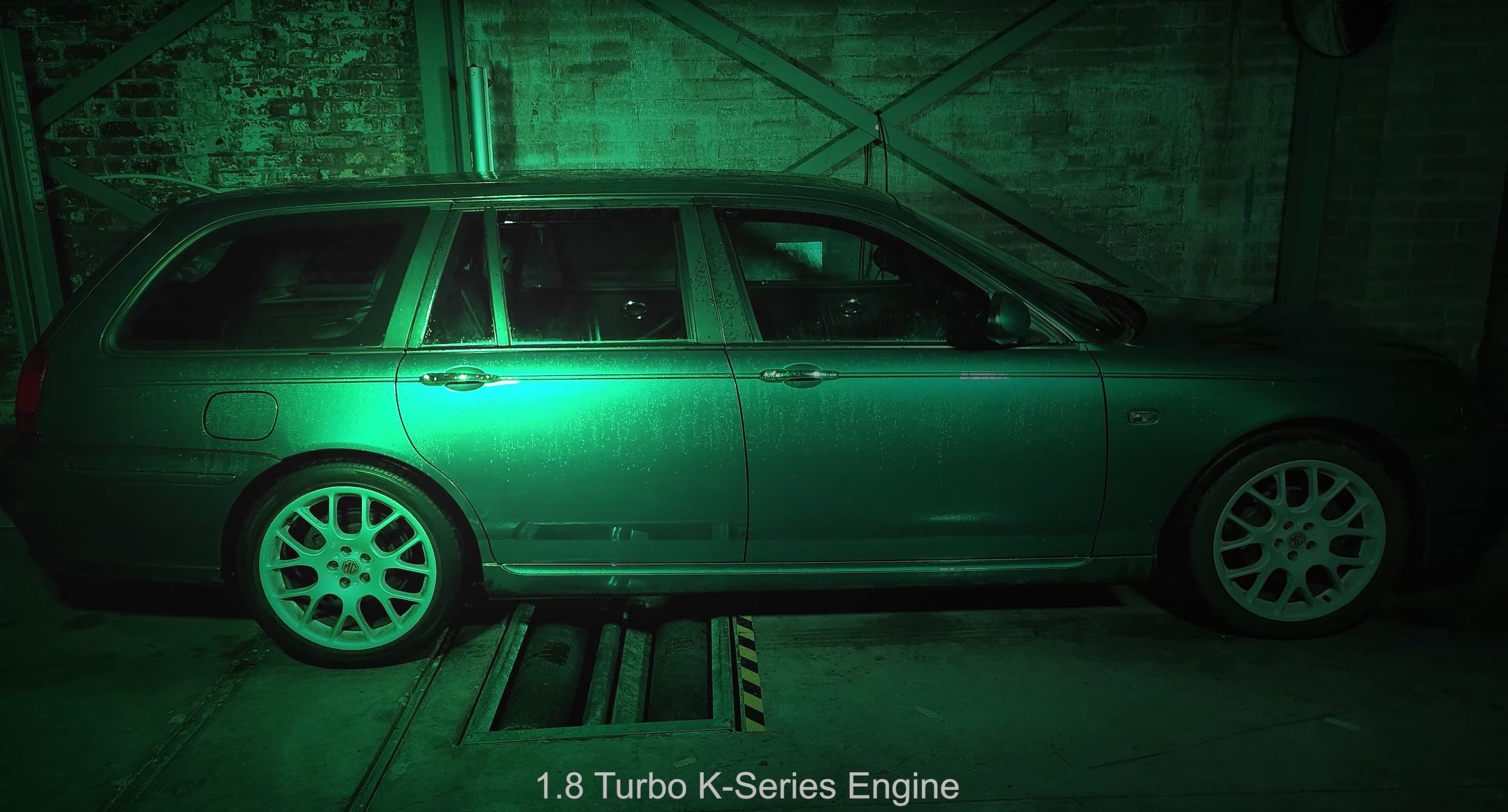
My idea is to create an advert which features my car (MG ZT-T) and use special lighting techniques. Something which isn’t too dis-similar to the one above, but I’ll do my take on the advert. I will also re-use the audio from the existing video as it fits with what I am trying to produce. The equipment I will need to produce this film is two light rigs, a light sabre for high lights. Most of what you can see is done in the post-production side, so I am heavily going to rely on the editing to bring out my final product. This is probably the hardest thing to make in the time scale set, but I am confident to make it work to the best of my ability. I will be filming inside in a garage and that is where I can set up my lighting etc.
Storyboard: -
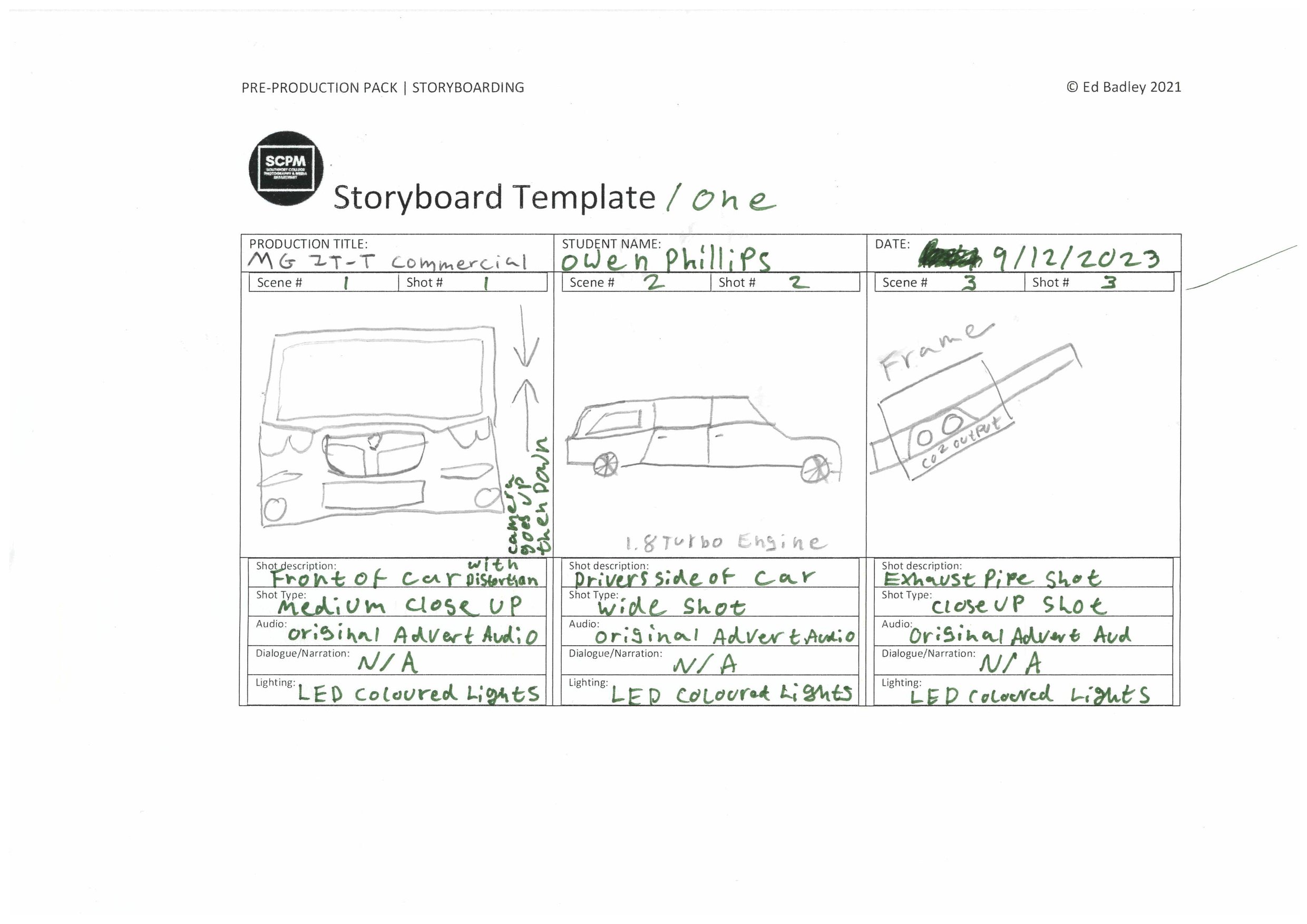
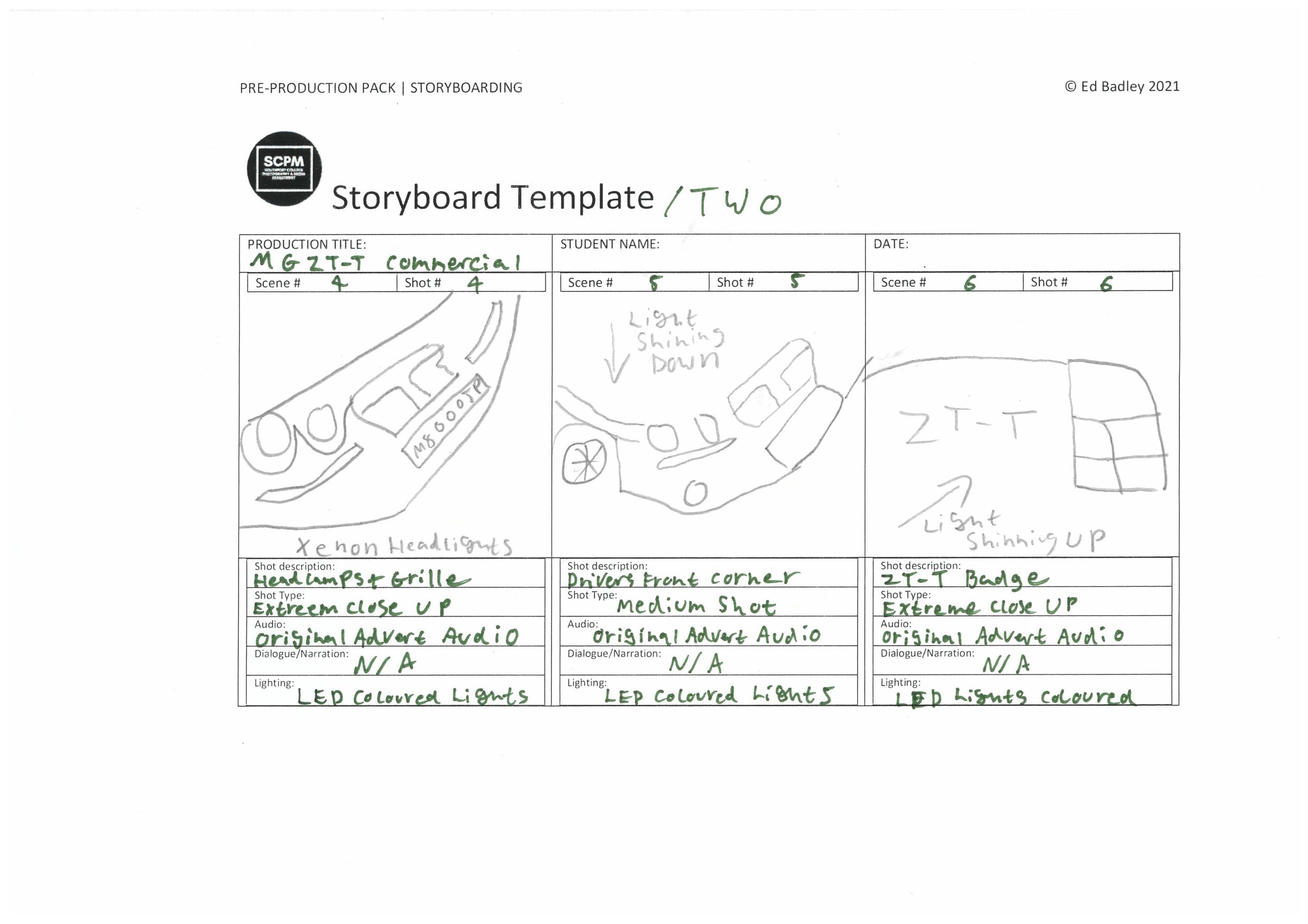
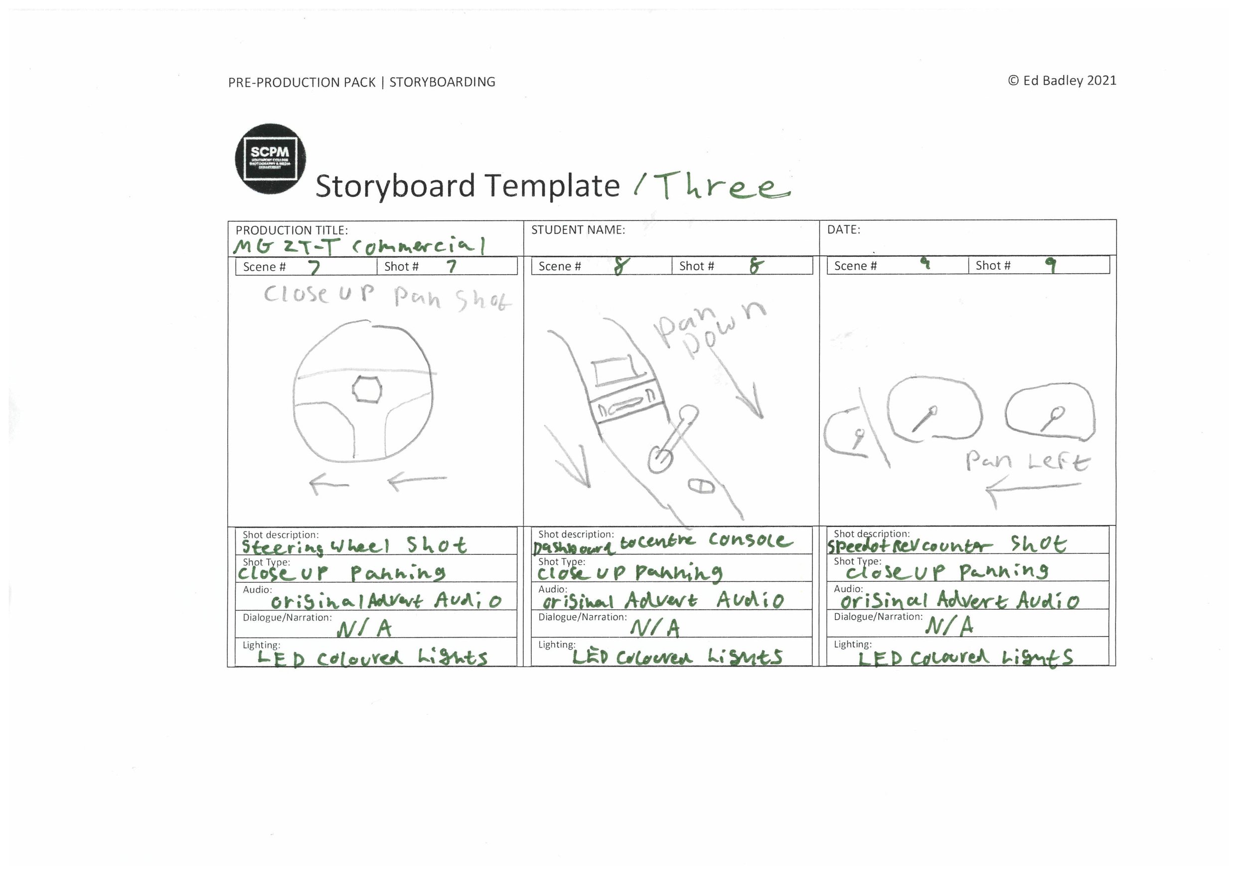
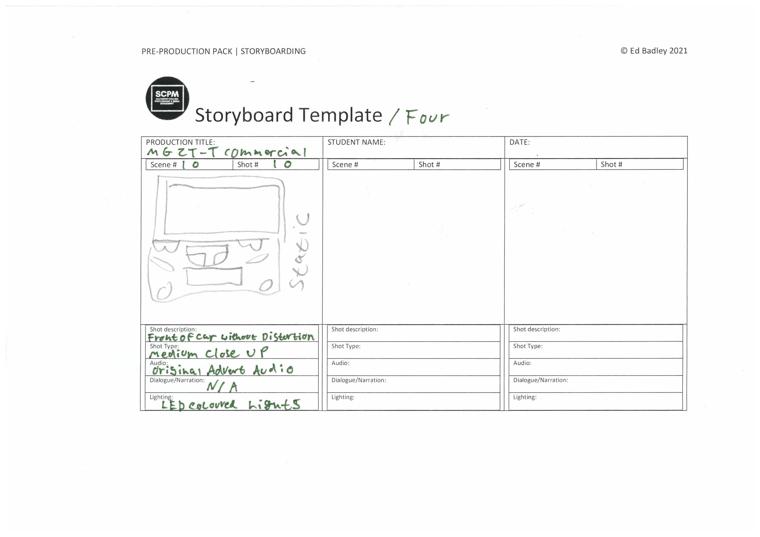
Shot List: -

Production
Behind the Scenes: -
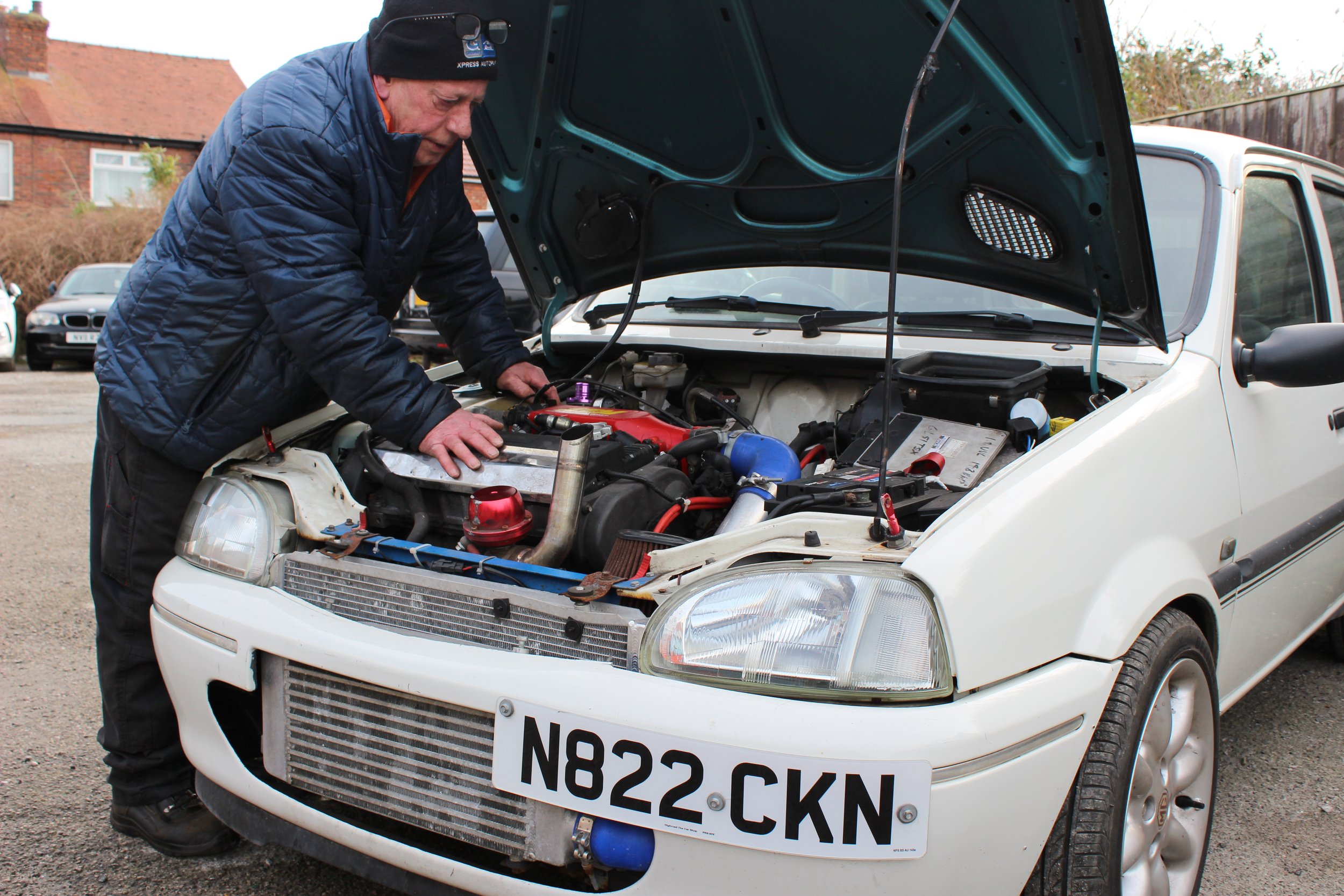
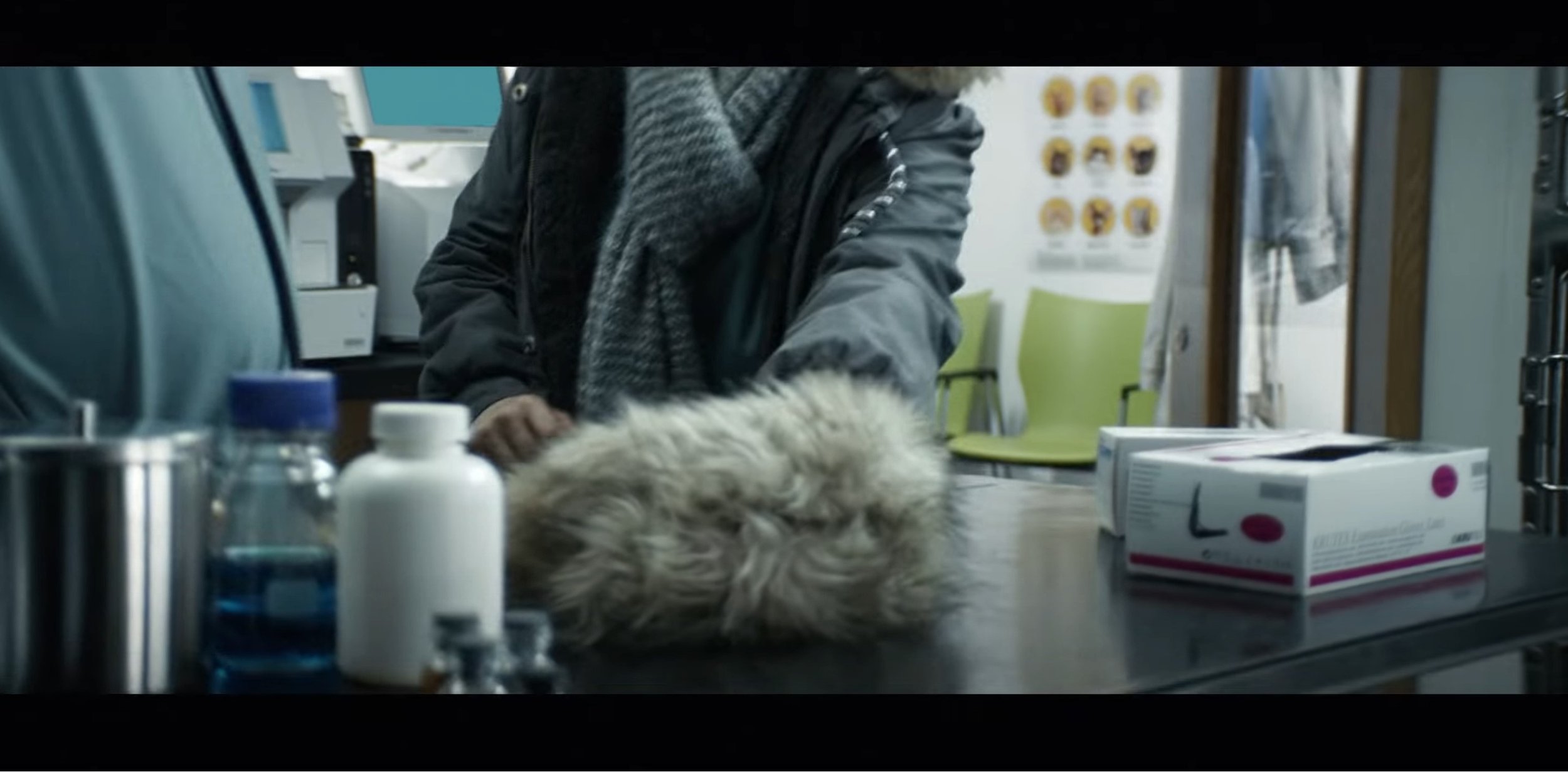
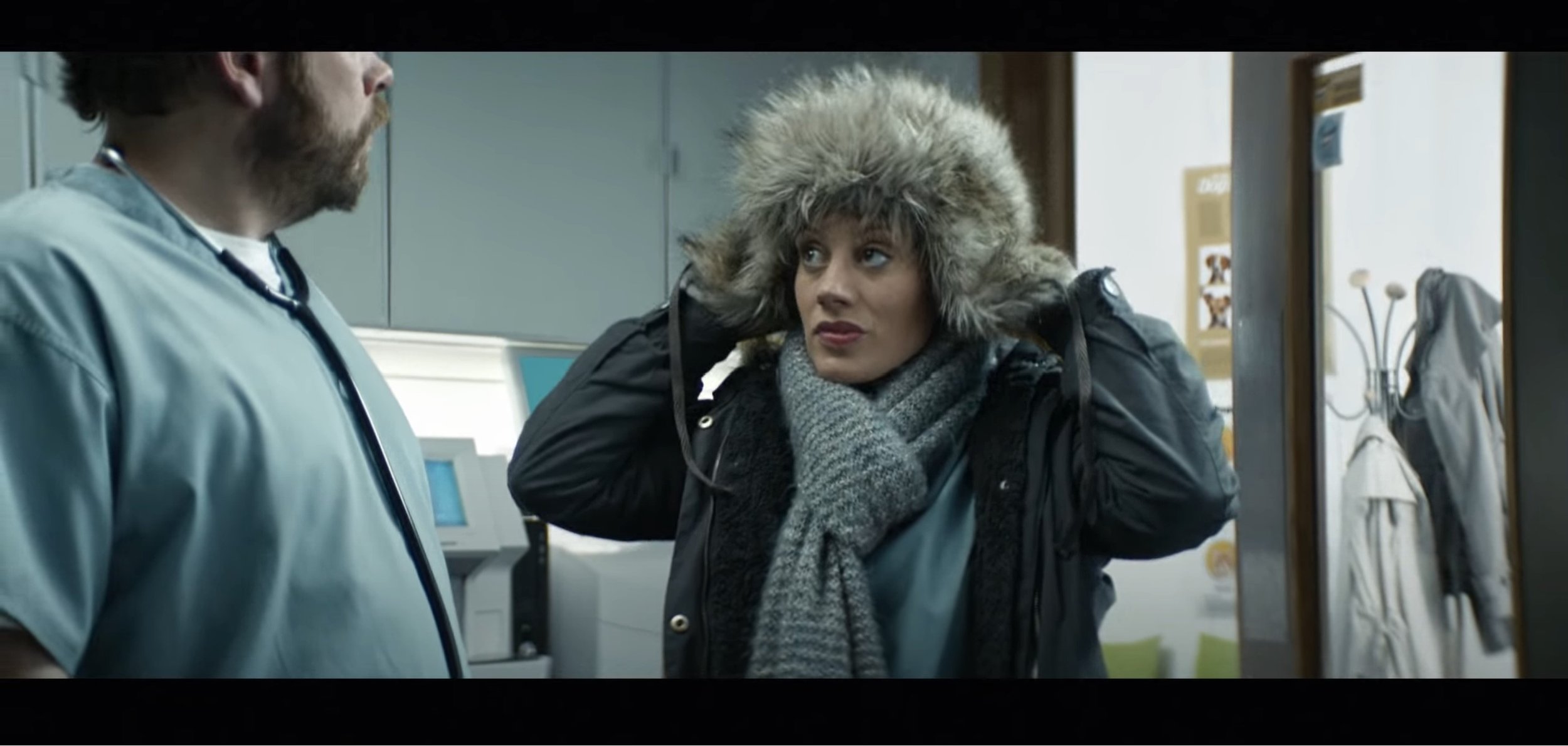
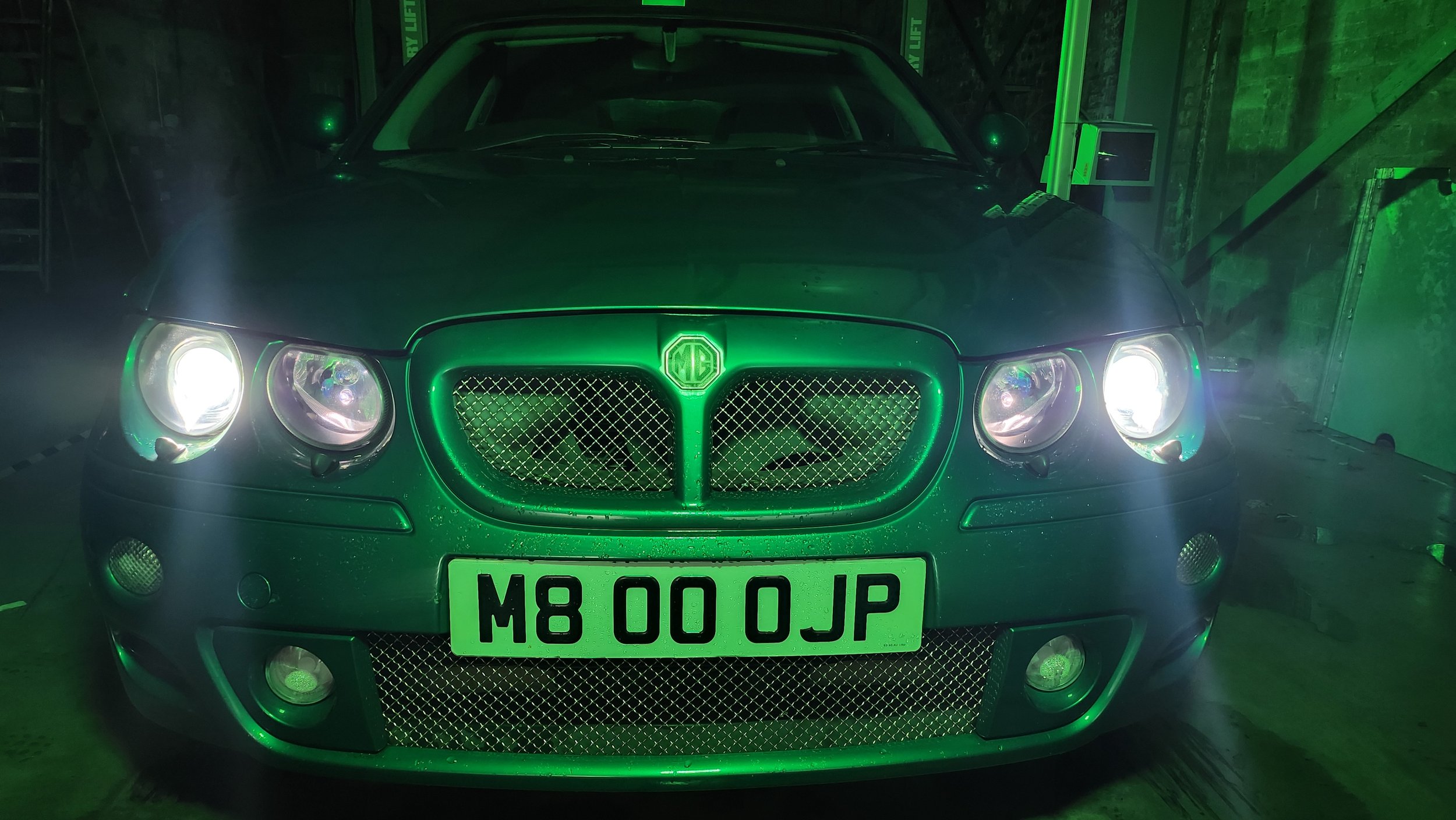
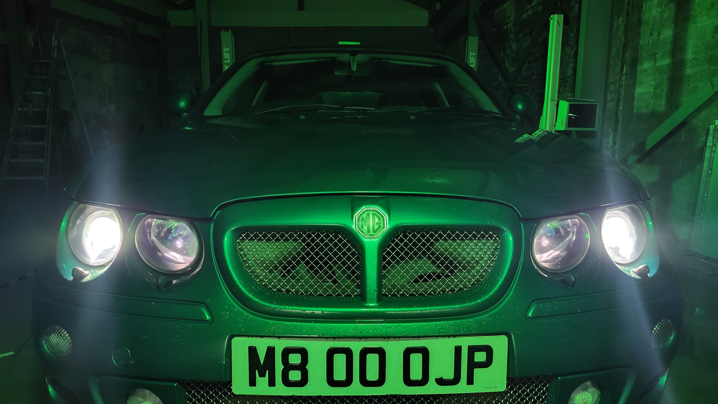
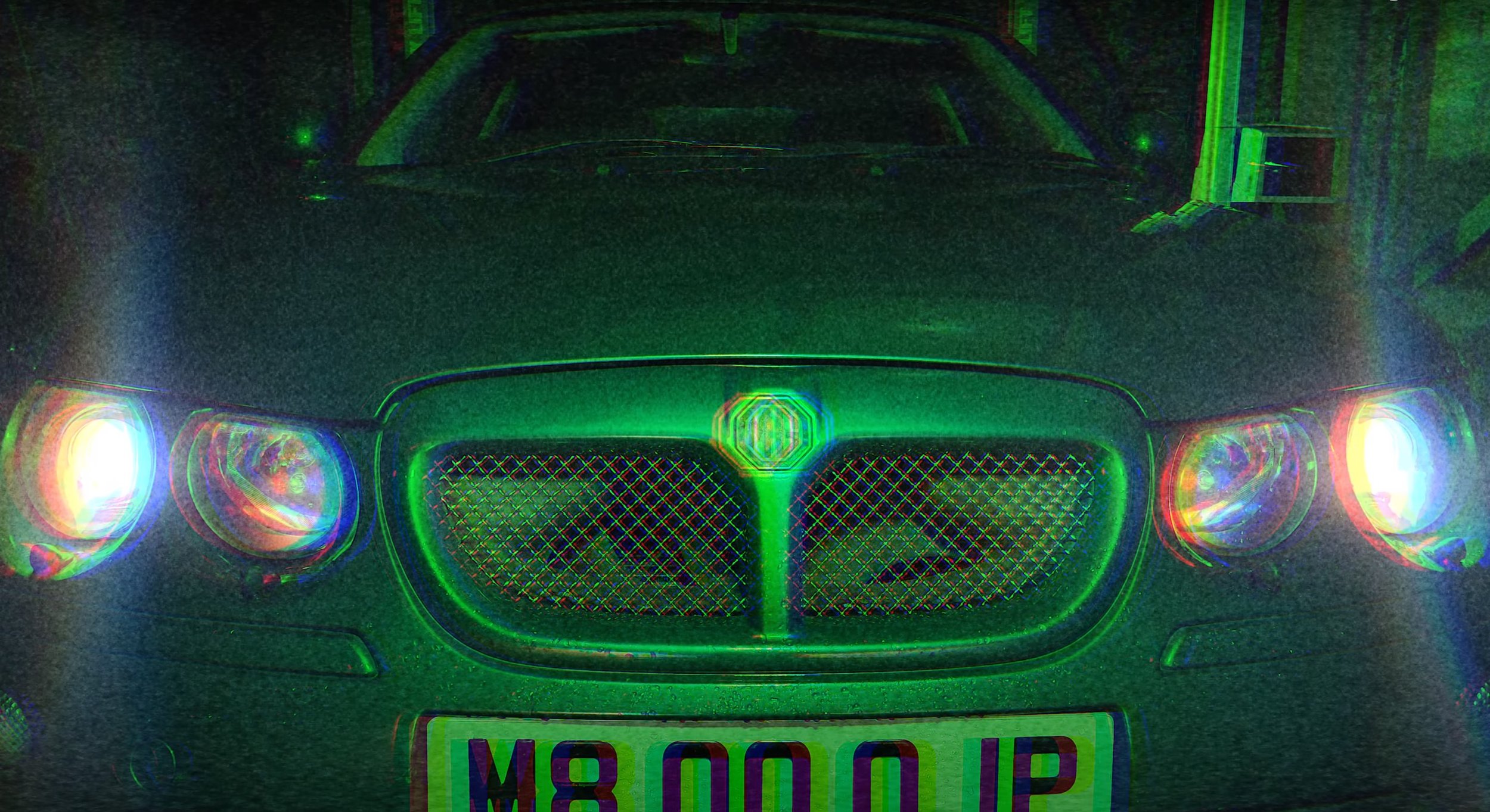
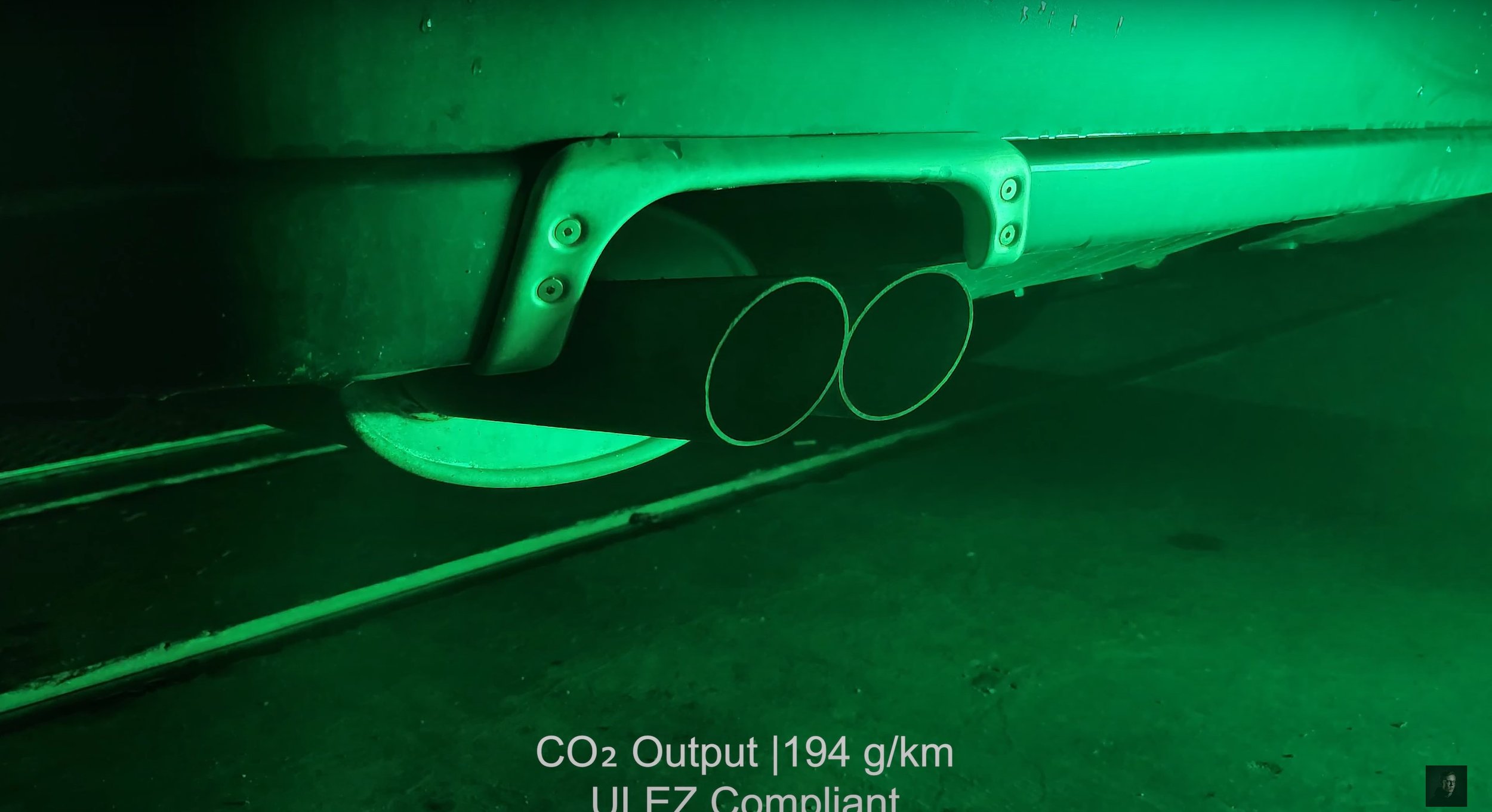
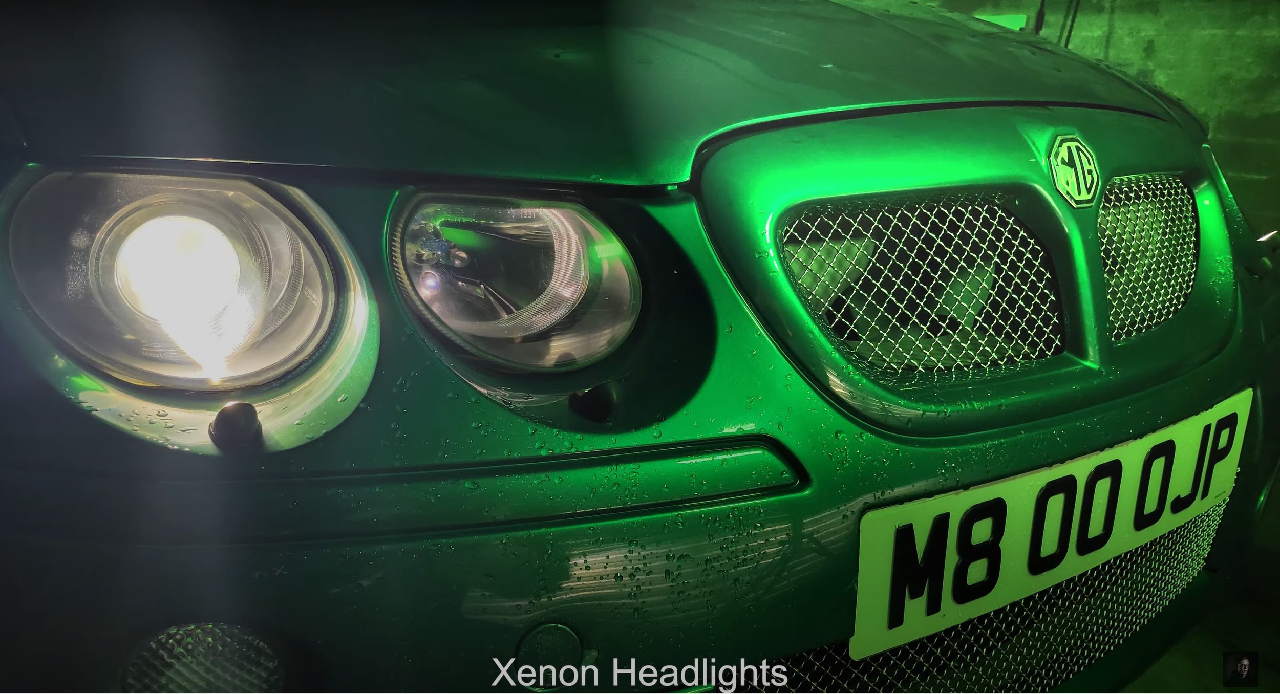
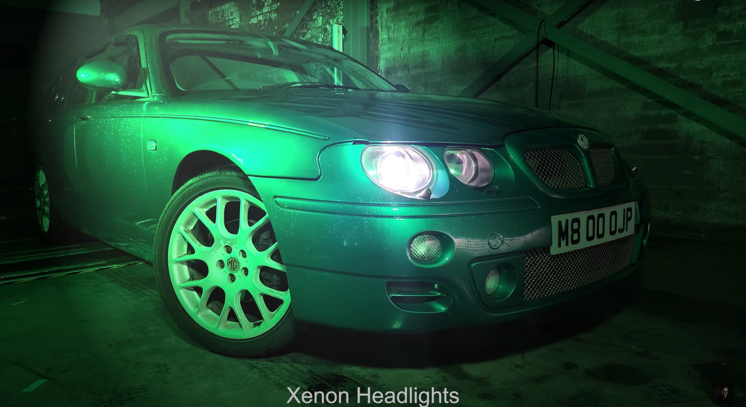
This is featuring the On Location Shots of the Television Advert Production, I have borrowed a fully functioning garage with a MOT Test Centre which happens to be down the road from Southport College. I spent one Sunday experimenting with the coloured LED lighting rigs to explore how I am going to shoot. I also was experimenting with a hand held light sabre which colour changes. After figuring out how I am going to shoot, in the afternoon on Monday I went back and photographed all the shot types and angles for the advert as I thought this was the best way to create this advert. Using bright white light or normal yellowy light didn’t do the car justice with its British Racing Green Colour, so I adopted for using a green light and it transformed the car on camera. I experimented with using a DSLR Camera and a mobile phone camera to see which one came out the best and it was my mobile which come out with the best results for this production, so I went with it. As you will be able to see, I shot from the driver side of the car because it is the best looking side compared to a dented wing and door. (which wasn’t my fault)
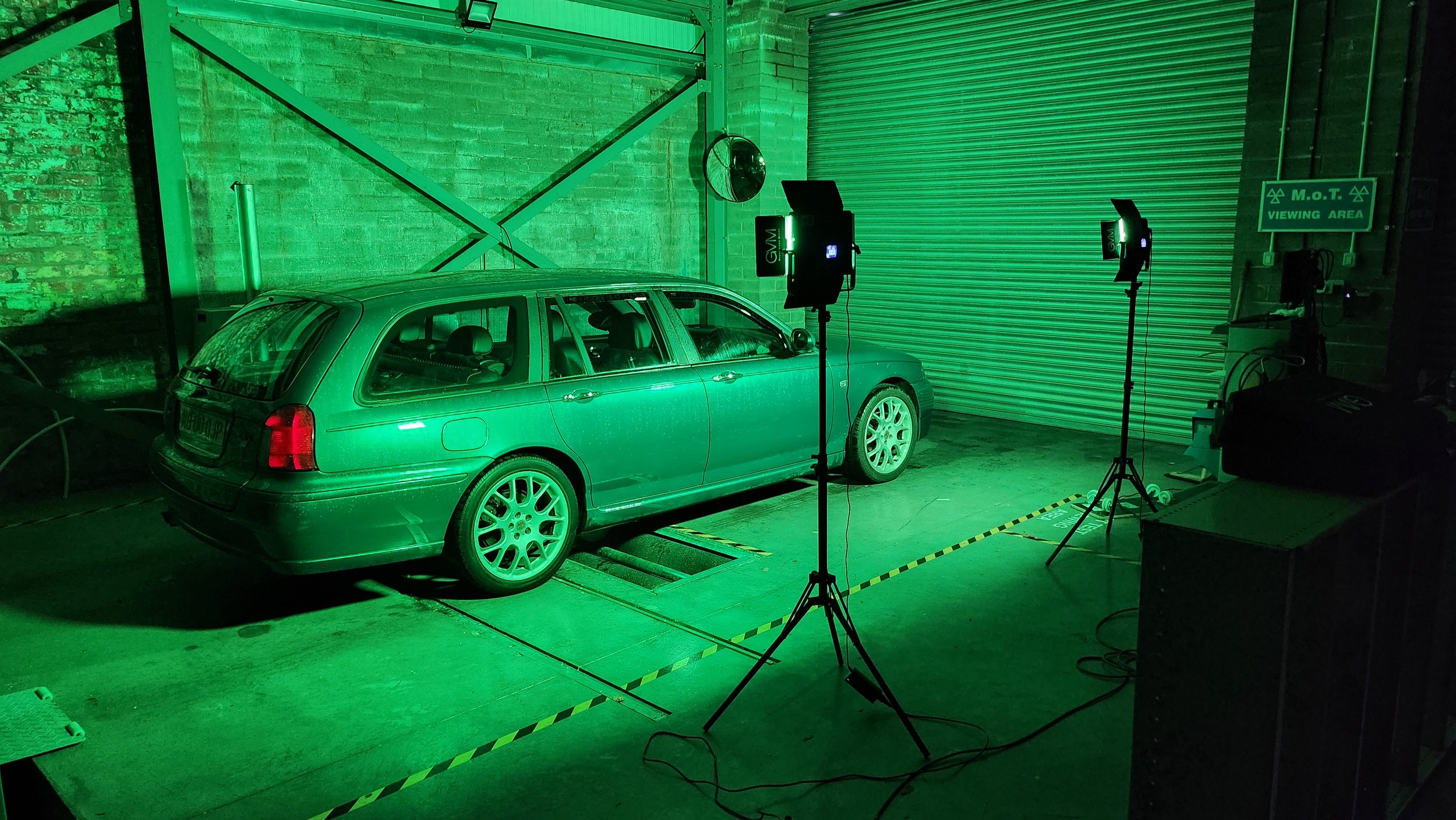
Production Photographs: -
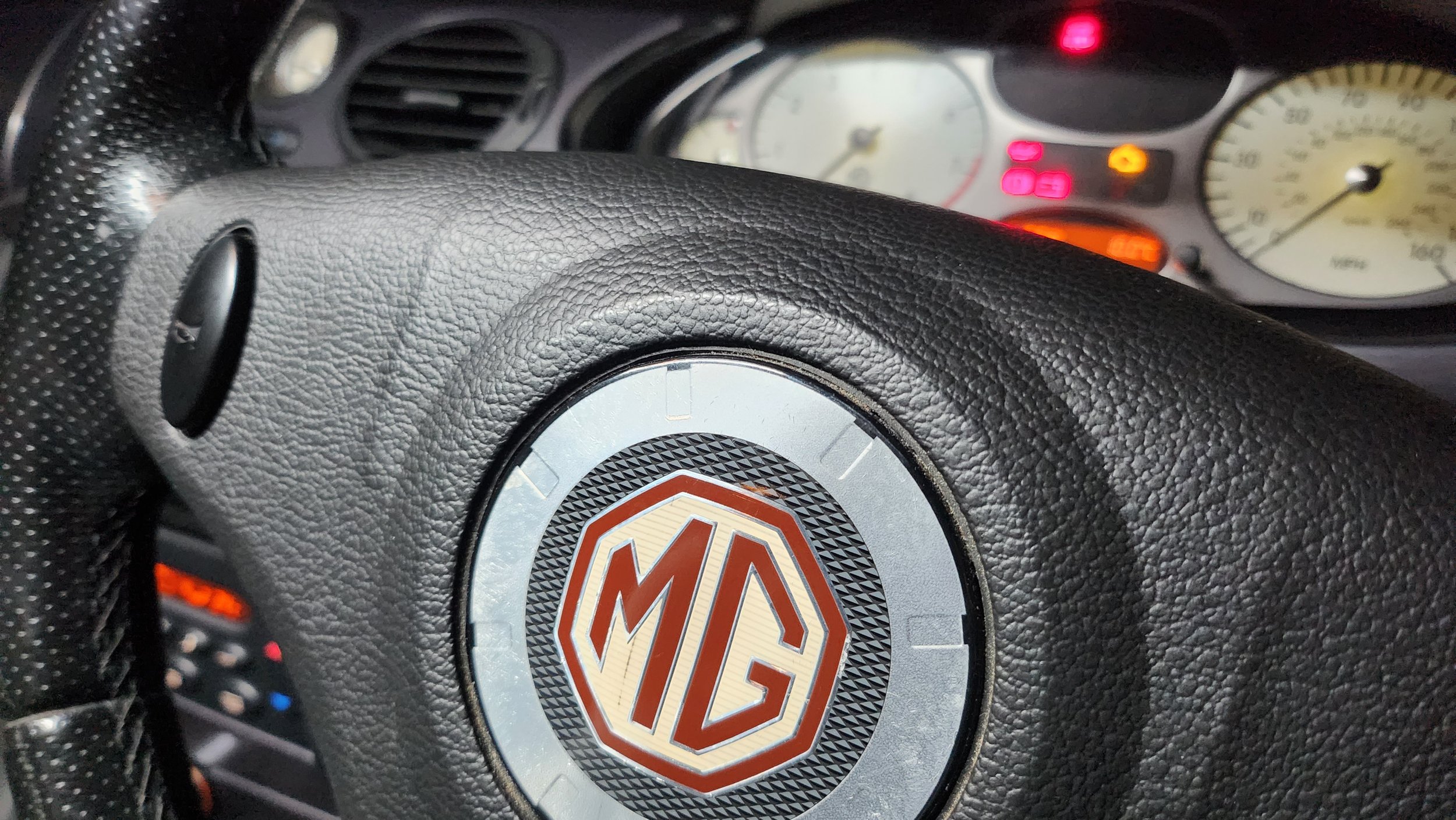
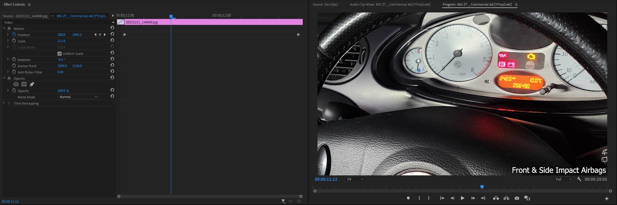
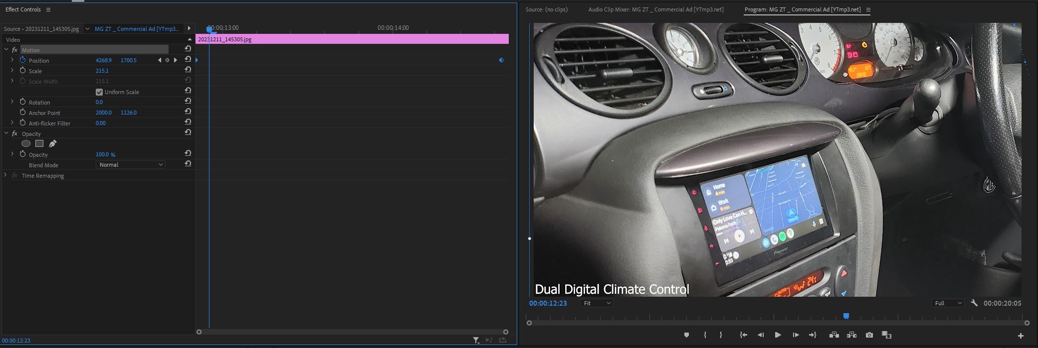
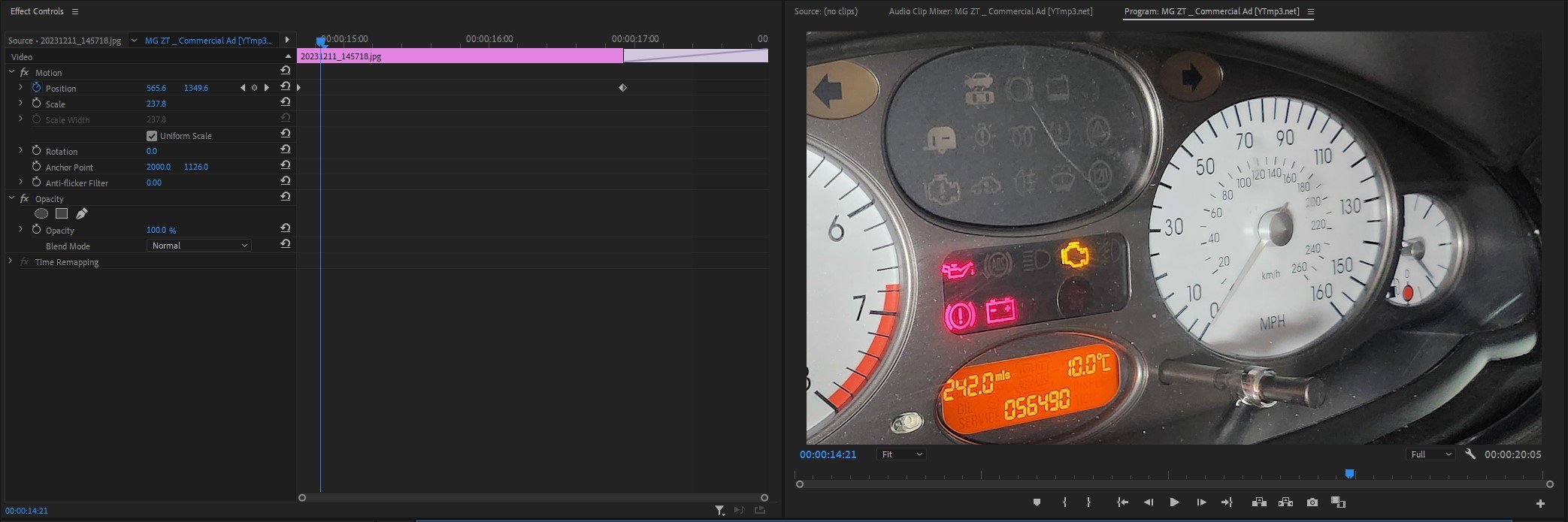
As you can see below, their is photographs which I have taken which I will be using in the advert. I have taken multiple images of the same angle or different angle from the same place so I can choose the best image to use in the final product. As you can tell the front images I have put on the Xenon headlamps and turned down the brightness of the camera on my mobile so you can clearly see the car and of course the headlights. As I said above I mostly shot the outside of the car from the drivers side of the car as it is the best looking side of the car currently. The interior images were shot by using the light saber on the brightest white setting and shot interior photos of the dashboard.
Post-Production
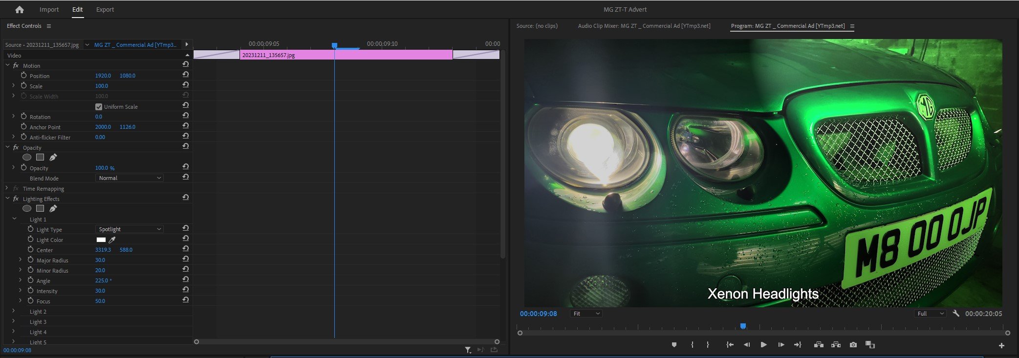
Premier Pro Timeline: -

As you can see above this is the timeline for my commercial production directly from Premier Pro. Firstly I will dissect the most obvious and easy things you can see from the timeline above, I will explain for in detail below about the glitchy transitions and lighting effects further on below.
First of all at the beginning and end I use the “film dissolve” transition which I use to show the start to finish of the video and it is very simple to use as you drag and drop it onto the image/clip. I have used a lot of “dip to white” effects to quickly transition from image to image but it was in line with the beat as it transitions. I have also added some text onto the images to show the specification of the car and what it comes with as standard. I used the standard arial font which is easy to read by anyone. Lastly in the last scene I added an image that I created using a website called myfonts.com which is where I created a font which I thought would relate and work with the words “Morris Garages” which is what “MG” stands for. I paired this png text image with the words in the arial “Presents The: ZT-T”. All this is a artistic decision made by myself.
Premier Pro In House Effects Used: -
Image One Glitch Effect

As you can see from the timeline above, this is how I created the glitch effect. As you can see their is time stamps above which represent certain aspects of the image to create this. The first set of time stamps, their is 4 at the top in row; they are in charge of the position of the image in the time frame created on the standard clip editing timeline. In this case it goes up and down then back to the default position. The next time stamps below, their are 13 in total in a row, they are in charge of the distortion and glitch effect and they decide in a timely order how and when should they happen on the image in the dedicated time frame set by the standard clip editing timeline. To actually create the effects, you have to play around with the “master amplitude” and the “colour distortion” to create the physical effects. I also used an effect called “VR Glitch Effect” which also helps create the glitch effect used above.
Image Two Lighting Effect

To create this particular lighting effect which shines a light in a straight line down the car in this case. You use a type of light which is called “Omni” and use the lighting colour as white and then what you do to animate it is create a straight line or squiggly line which shines the light in that direction, at the same time you use the centre time stamps to decide where the the light should start and finish. I also turned the brightness down around the circle to create a dark and mysterious atmosphere and make it look like it is specifically light up the car. This of course adds shadows to the background which shows the industrial aspect.
Adjustment Layer Transition to Image Three
For this transition, I created a adjustment layer which effects the clip it is encroaching and disrupts the stillness of the image. I used an effect called “Wave Warp” and this is the main thing which helps you create this effect, by altering the wave height and width makes the footage look like the footage has been disturbed or glitchy. I also set the direction of the glitch to happen at 90 degrees, I could of set it to 180 but it didn’t look as good as 90. I also set the wave speed to 5 and I also is set to effect every part of the image (all edges).
Lighting Effect For Image Four, Five & Six
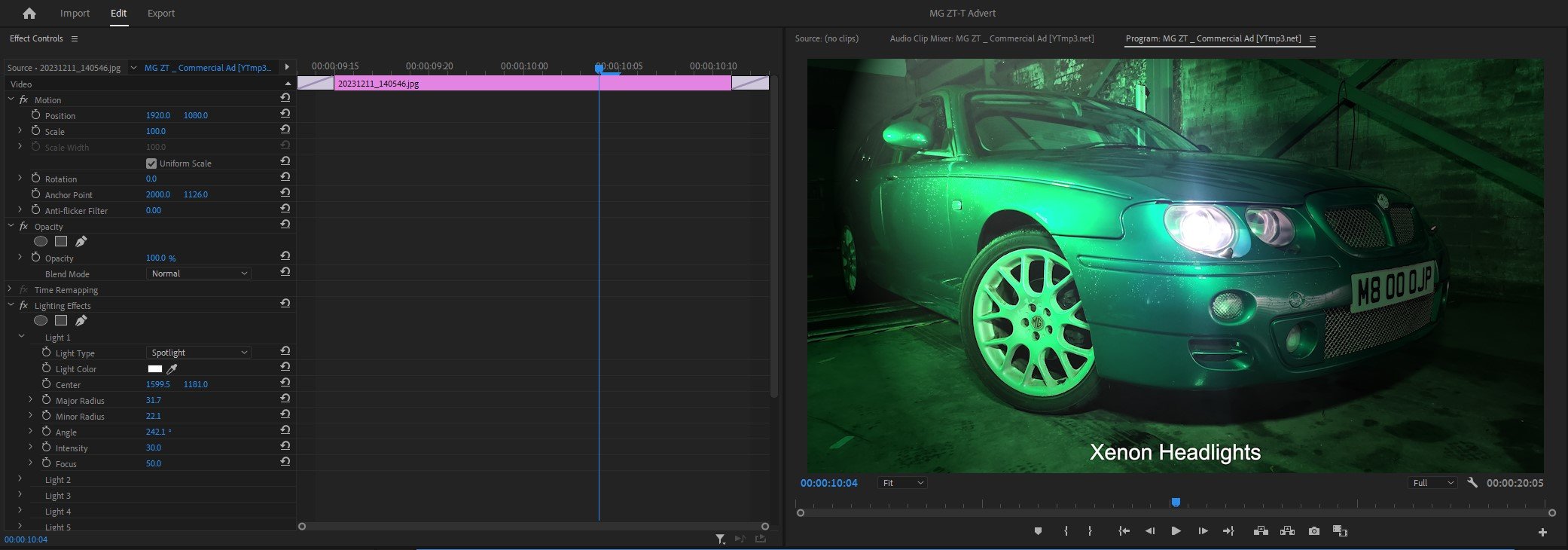
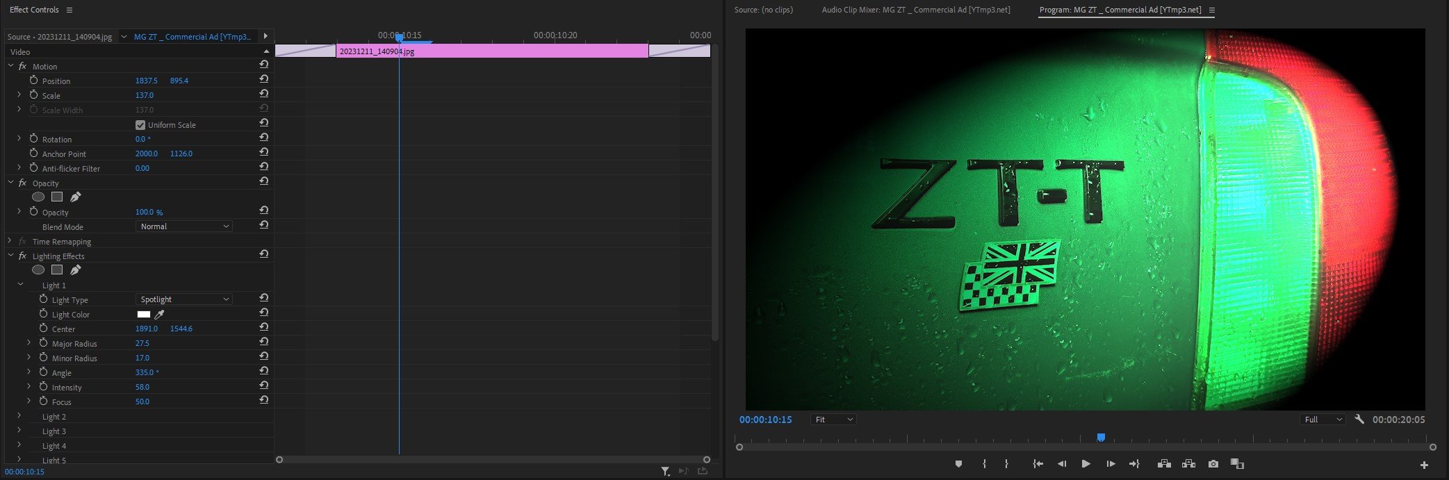
For these three images, I haven’t edited a crazy amount but what I have done is use the spotlight lighting effect overlayed onto the images in the places in which it looks good and left it. I haven’t timed them to come in using time stamps or anything like that, it is simply a overlay on top of the existing image. I have had to adjust the brightness of the background and altered the density of the lighting. As you can see above I have used the same concept through out with the images above, but altered the lighting to suit.
Animating Images For Seven, Eight & Nine
Lastly, To animate / move the images up and down the screen, a very similar concept to how I created the Omni lighting effect, I created a straight line down the image and the software simply follows the line but with a slightly zoomed in; so that the image doesn’t run off the frame when you animate it.
As you have read all of above, it looks fairly straight forward thinking about it and watching tutorials but doing it is a different thing, so I had to research to see how to do it. So below I have dropped in a little Bibliography so you can see where I learned how to do it and how I created these effects or transitions.
Compare & Contrast My Advert with the Original Advert: -
As you can see the obvious comparison is the angles are slightly different between the two adverts. I slightly changed them to make it look like my own film.
The huge different between my advert and the original one is that my video has the animated effect where the still image moves up and down and also it distorts at the same time. The original advert simply fades in and has the simple text which reads out “MG ZT” and then slide swipes up.
With both of these, I think the lighting techniques used in both mine and the original are brilliant, same wide shot used, but the cars are facing opposite direction. The techniques used are completely different as the originals uses a strong light to light the car up and mine uses what they call Omni light to simply shine a spec of light across the car.
The lighting techniques between the two adverts are different, I use a bright green light and the original advert is a standard white light which looks very glossy and shinny. The shot type is a low angle, The text is also different, they both read different things. For example mine reads about exhaust emissions and the other says performance figures.
The close up angle looks very similar between the two adverts, but angled slightly differently. The lighting is different as the original bright shinny light and my advert uses one spotlight shinning onto the car in green.
The low wide shot of the two cars is very different, the angles are slightly different as the original advert is angled more around the front of the car where as my advert is shot directly from the corner and shows depth to the car. The lighting techniques again are very different as in my advert I am using a green spot light coming down onto the wide of the car and the original advert shows the light directly coming from above lighting up the bonnet, roof and windscreen.
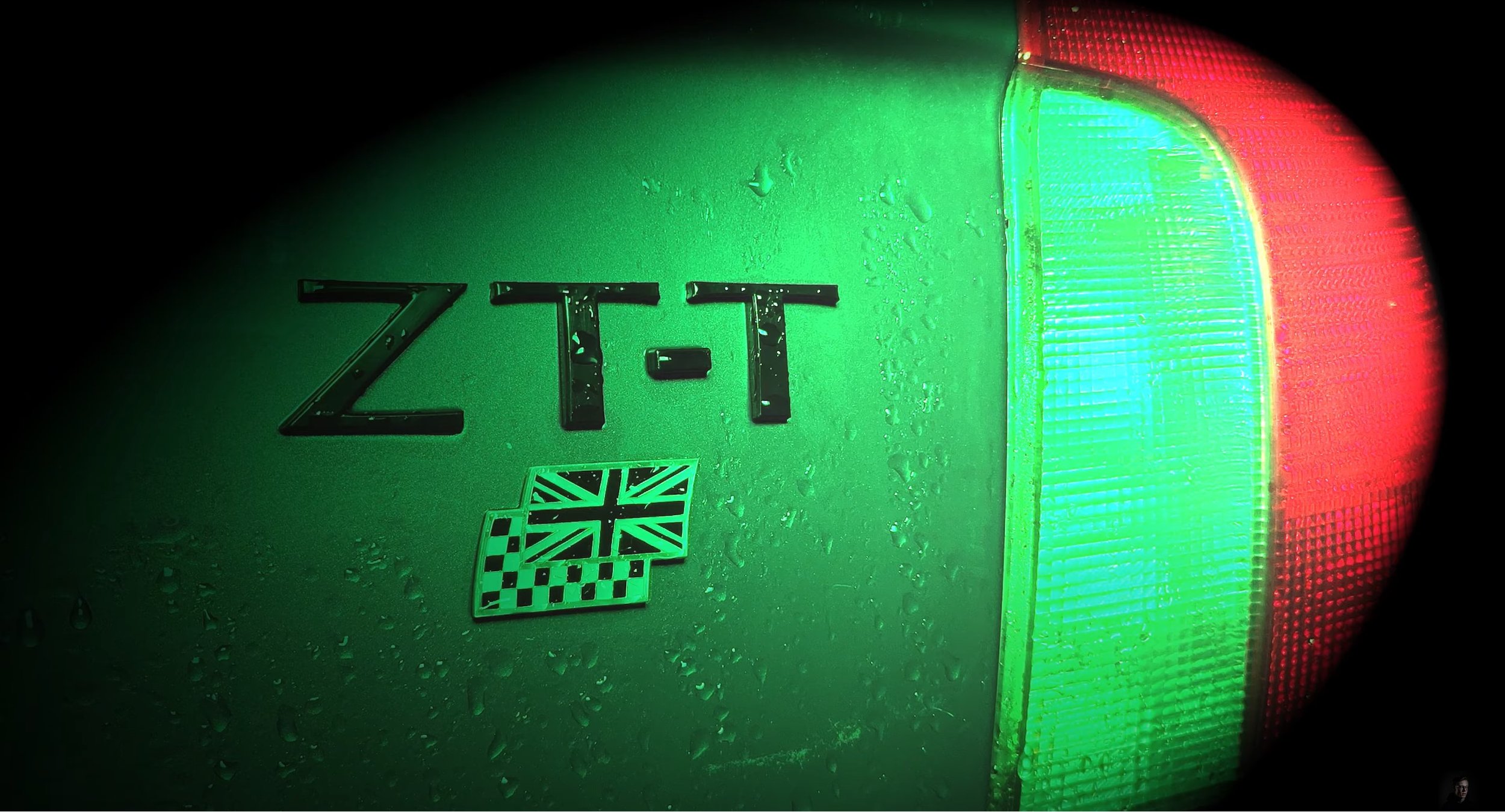
The original advert uses a slight Dutch angle and my advert uses a more straight on close up shot, the lighting techniques are very similar again with it on angle shinning onto the badge. Again my advert uses a green light and the original uses a bright white light.
The lighting techniques are very generic in these next three images, but the camera shot type is still a close up and the angle between the two adverts are different as my advert is slightly angled more at the steering wheel where as the original advert is angled more on a angle.
The shot types used are a close up, and the angles are very similar when comparing them to each other.
The huge difference between the two images is that my advert is more zoomed in onto the dials and gauges. The camera angles are different with these because the original is set at an angle when it pans across and my advert is less on angle and more head on at it as it pans across.
Compared to the beginning there is nothing really going on in this part of the original advert apart from the flickering text and logo and the headlamps are off, with my advert it is the same image used at the beginning but without any distortion or glitchy effects, I have only added special text which I created and I have left the headlamps on as I think that looked the best.
Bibliography: -
https://youtu.be/_MYBC4Yy7kk?si=ErkGPmNqolCPJIMH - Glitch Effect Tutorial
https://youtu.be/hx3jD6ngWLU?si=nOVzR8D2Fpz2wCjz - Lighting Effect Tutorial
https://youtu.be/pCvWwIetM1g?si=r0kOLw8D1Y4CSEDD - Still Image Animating Tutorial
https://youtu.be/cdEwVWF-4Lc?si=L27uYq65tGAkQ4vm - Glitch Transition Tutorial
Presentation
Evaluation & Reflection
Annotate three strengths & three weaknesses of the final TV commercial?
To start with the obvious thing, the post-production editing of this advert was good, coming from the glitchy effects at the beginning to the light effects. I spent a good half an hour experimenting with all the different options of how to do it and picked my favourite that looked the best for this production. Animating the still images was another thing which worked well and looked good. Secondly the camera angles and shot types which I shot looked good, I took multiple of the same shot so I could pick the best looking one, bearing in mind I didn’t use a tripod, so I thought I did well with that. Lastly, the production lighting techniques used were another thing I thought I was happy with because I experimented a lot to make sure there were hardly any catchlight shown in the still images, it wasn’t perfect, but it all worked how I intended it too.
Moving onto my weaknesses, I could have switched up the type of shot types and angles which I used then replicating the ones in the original advert from MG Rover. Secondly, I wish the lighting rigs were little bit better because they weren’t as good as I’d hoped. I think the white light would have looked far better, but it didn’t seem bright enough for my production, hence why I stuck with green light as I had a green car, so it worked well from that point of view. Lastly, some of the lighting effects used, for example on the low wide shot of the car, the post-production spotlight looked odd in that place and didn’t fit in with the video.
Who was the intended target audience for the TV Commercial?
The intended target audience for this car is 25 years and plus because of the type of car it is, it is an estate car. The age group it is mainly targeting is people who want family car which comfortably fits 4 people and plenty of luggage space, but they also want a sporty type of car. This car will not attract a younger generation from 17 years and up because of how expensive stereotypically it is and, they would not want to be seen driving an old person’s car.
What were the key areas of development during this unit work?
Experimenting with lighting techniques was a huge factor through out with this assignment because I wanted to create my advert with my car and fancy lighting techniques. As you saw throughout my advert, the main lighting used in the production was green and the reason why it was is because the cameras that I used wouldn’t pick up normal white light, even experimenting with camera settings didn’t work either. The best results that came out was using my phone camera and that really bought out the right kind of light for this production, but already knew that most of this would be altered in the editing stage.
Aside from that, I learned a lot about how to distort and glitch the camera in the editing stage, using video tutorials to help me, they shown me how to do it. Secondly, I learned how to create more lighting effects is another thing I learnt and how to move it like a spotlight. Lastly, I also learnt how to animate images, this made normal still images move and it sets the whole off the whole production when done correctly.
Authentication Document

Product Photography
Context & Research
Outcomes
Create a Logo: -


For this project we have been asked to produce product photography for a fictious company called “Good Vibes”. The brief has asked me to create a logo for it and include it on a billboard campaign for the fictious company. As I have created three logos, I have created a Google Forms voting page to see which one the people thing I should use. This will go into my Primary Research Section.
Subject Research
Primary Research: -

I made a survey on Google Forms to see what my class mates thought of the logos and which one they would like me to use, as of now I have received 3 responses with 66.7% chosen option 3 out of the 33.3% who chose option 1. For me this was a good way to see what the people think of the logo and it gives me a good idea of what I should be using for this next project.
Secondary Research: -
Product Photography is a very small type of commercial photography which is used for selling products online. The aim is to clearly show the product for the people online shopping to have a better experience of viewing and to see what it would look like in real life.Usually most product photographers have to be really technical compared to other types of photographers, because the shots are taken in a studio environment with specific studio lighting. These type of photographers can get really creative with all types of props and models especially with either natural or artificial lighting.
Most product photography features show the brand and other visual featureswhich would make the shopper look at the item and buy it. The type of images that would be taken are a key factor to selling things online for the viewer.
Their are many different types of Product Photography which are usually related to different business uses, some vary in different styles.

E-Commerce Product Photography: -
As I have talked about the E-Commerce and how it works in my own blog, I will put a link into my previous article below to refresh your memory if you don’t know what it is.
E-Commerce Multi-Media Campaign — Owen Phillips Media & PhotographyThis type of Product Photography is centred around selling online and most have different styles for their shop, different shops usually have different requirements for their photography whether it is white background or a black background. These shots can easily be done by picking the colour for the background which is plain and the goal is to represent the product to the customer as if they are going to receive it. Most often white backgrounds are used as it is a very simple and bland colour. Most sites like Amazon or eBay use this type of medium.

Creative Product Photography: -
This type of product photography goes way past the plain and simple white background used and incorporates a artistic element with a background, props and even a bit of false greenery in a form of a plant etc. This type of medium is usually used for content branding, advertising and even used digitally. Most of them are used on product pages as it represents that type of product. These type of images even work well on social media platforms and throughout your online shop.

Print Product Photography: -
This type of product photography is mainly used to create a tangible marketing or advertising material, usually requires plenty of pixels to create, the image used will probably resized for many type of print product photography. It is so you can capture enough visual information to avoid any type of distortion in the printed photographs.

Lifestyle Product Photography: -
Putting the product into a contextual environment helps the shoppers imagine themselves with the product in the lives and this could potentially appeal to the customer instead of trying to focus on the features of the product. In traditional terms this is usually expensive and can include models, different locations and even assistants to help you. Another one also requires Adobe Photoshop and turn it into a stock photo which is your contextual environment, all this is called lifestyle compositions.

Food Product Photography: -
This type of product photography mainly shows food and beverage which are available to purchase, photographers who work on this type of medium work closely with a food stylist to prep the plater and make it look good to be photographed. Some images may even feature the preparation stage. They also use complex lighting techniques and complex backgrounds.

360 Degree Spin Photography: -
This is a very special type of product photography where you take a series of images and combine them together to create a GIF type of image. These type of images can give the buyer a complete look from every angle of the product. Most people usually add a few lines of code or more to make the photographs animated.

Now I am going to be moving onto the different types of lighting techniques people use when they create product photography.
”Hard light photography” is used a lot as it gives off a sharp edge shadow of the side of the item, these type of shots are usually best shot from above the item as this gives off plenty of texture enhancements and creates more contrast in the photograph.Another type of Hard light is called “Specular” which retains it’s qualities of reflectiveness. When the light shines onto the subject, it bounces off the subject into the camera. The bright spot which is the highlight of the technique appears on shiny objects when illuminated. It is very important in modern day computer graphics as they provide a strong visual cue for object shape and location.
Linking into “Specular”, “Diffused” is another type of lighting which has all of it’s reflective qualities removed, as the light hits the object, the light does not reflect any form of light back into the camera.

“Flat white photography” is softer light which is shot on non-reflective white material, it is usually white paper. A contact shadow happens when the light meets the subject, but then a softer light goes past that. All this helps give the product place. For example glasses are usually require attention as it is a see through object at one end.

“Natural light” is a technique where a window of light creates soft light coming in from one direction. This creates a long soft shadow which could be left dark or changed to be lighter. A comforting casual look uses natural light with a grey background and with messy reflections of the subject which are natural.

Practical Skills
Production Considerations: -
For this assignment, the ideas I want to do for my project is do some water splash photography featuring a good looking can with a funky design on it and crop it to only the can and the splash which makes the image look good as you have captured the water and the can. I will be using the laser which makes the lights flash as something is dropped passed it. I think this is a good basis to start off with as it is creative.
For my next set of images if this doesn’t pan out as how I want it, I will do a simple product shoot using “Hard lighting” their is no shadows from the image whatsoever and it is a dead sharp and crisp image. For this I will need a white background with something white to sit the product on top of, some sort of levitated platform (a table or stool), a tripod and a camera.
Production: -
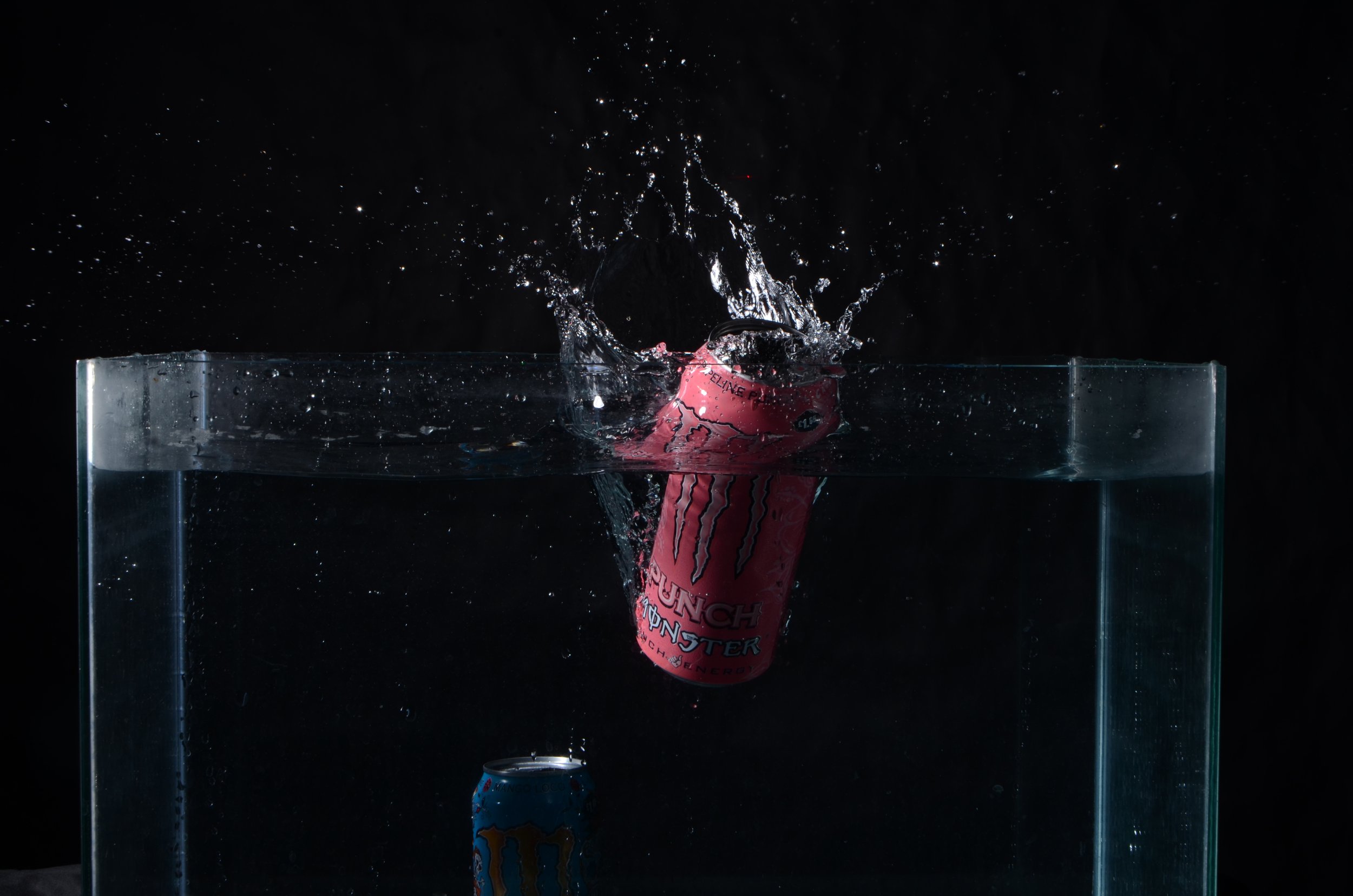
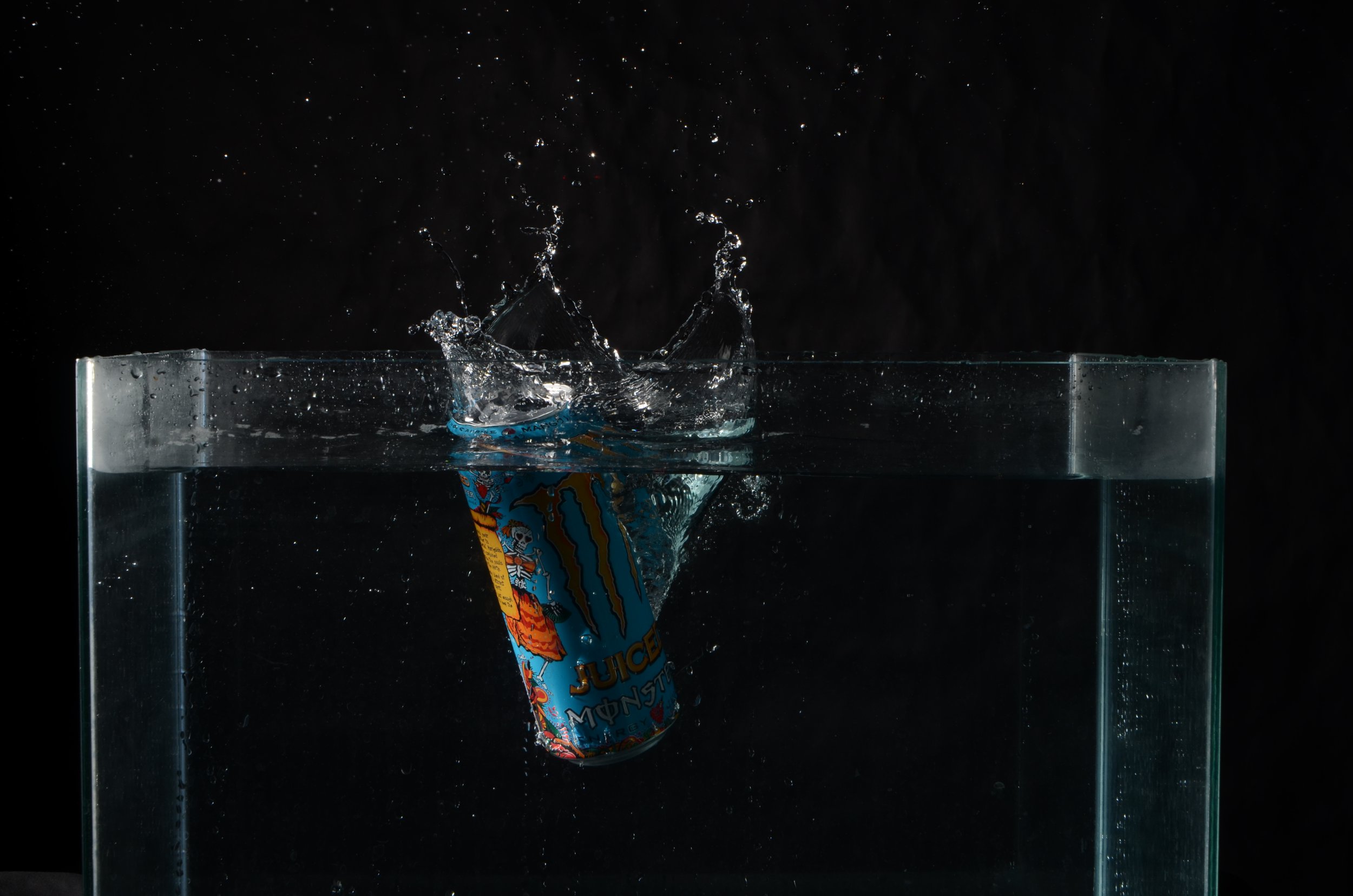
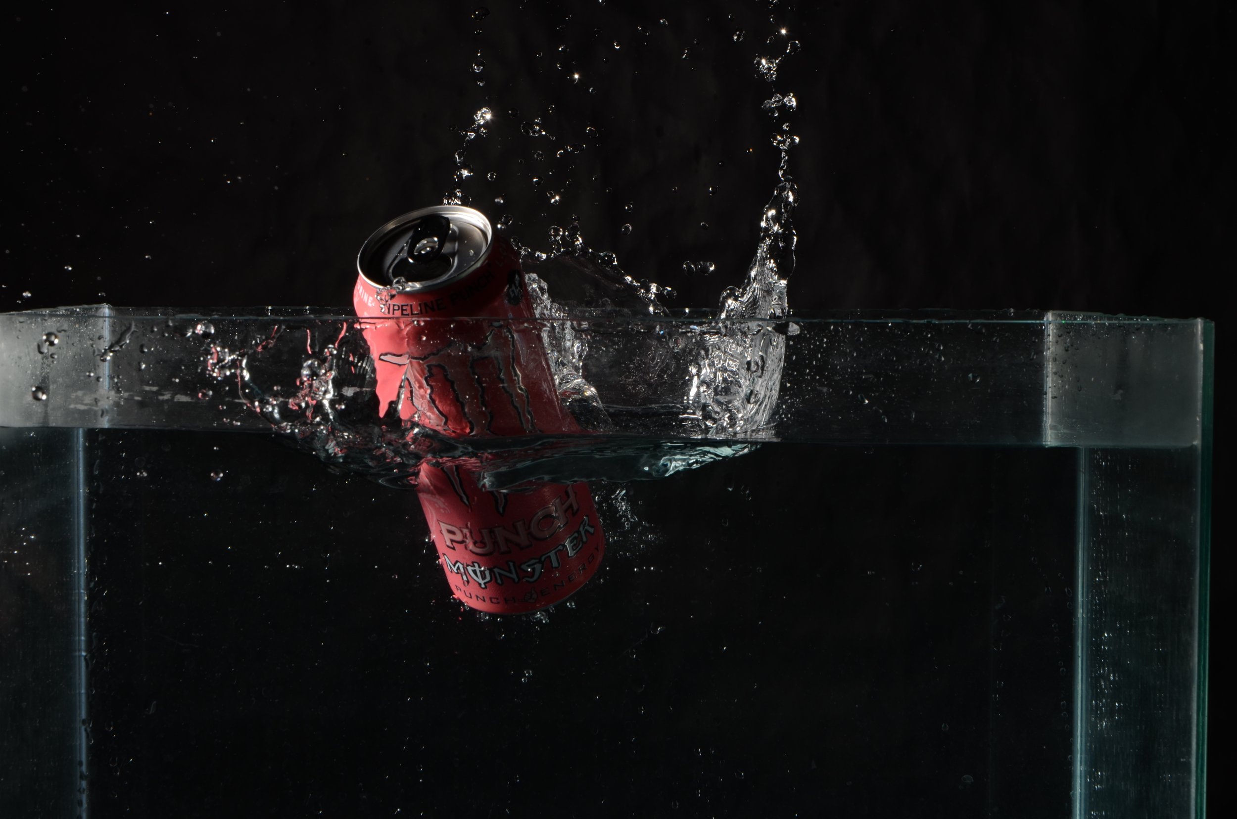
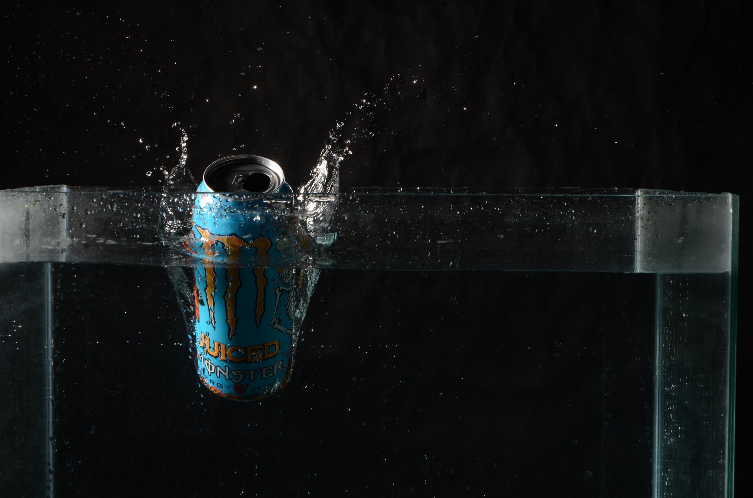

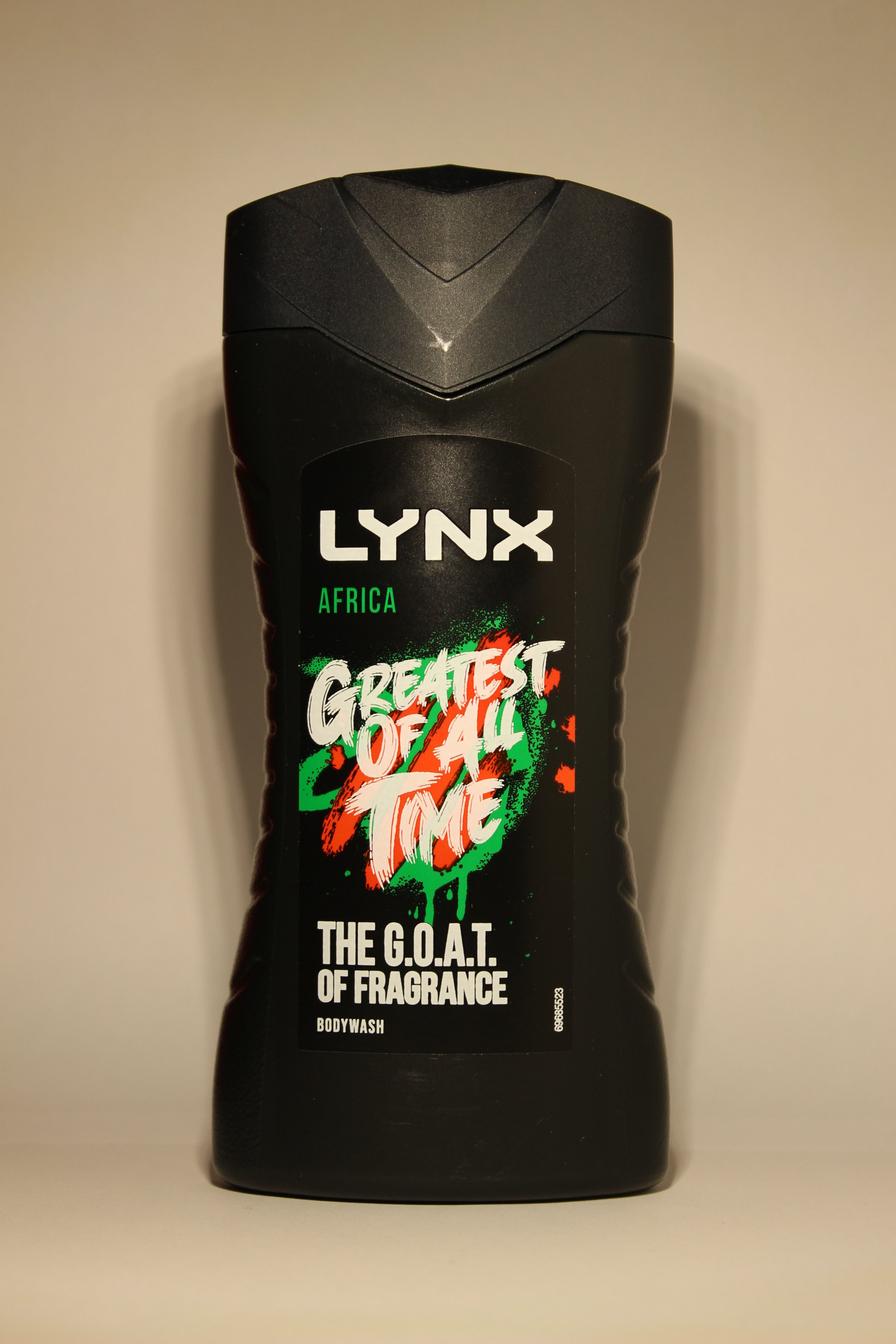
For the water splash images using the Monster cans, we used a laser which made the lights flash when we dropped the object into the fish tank full of water. I took about 21 shots and out of 4 of them were usable for this project.
For the last two images, I will not edit them, as I think they don’t need any altering. I created a DIY setup to shoot this, I used two pieces of clean white paper, a lighting source which was a light, a tripod and Canon EOS 100d. I shot landscape as you can see. Behind the scenes for this shoot is below.
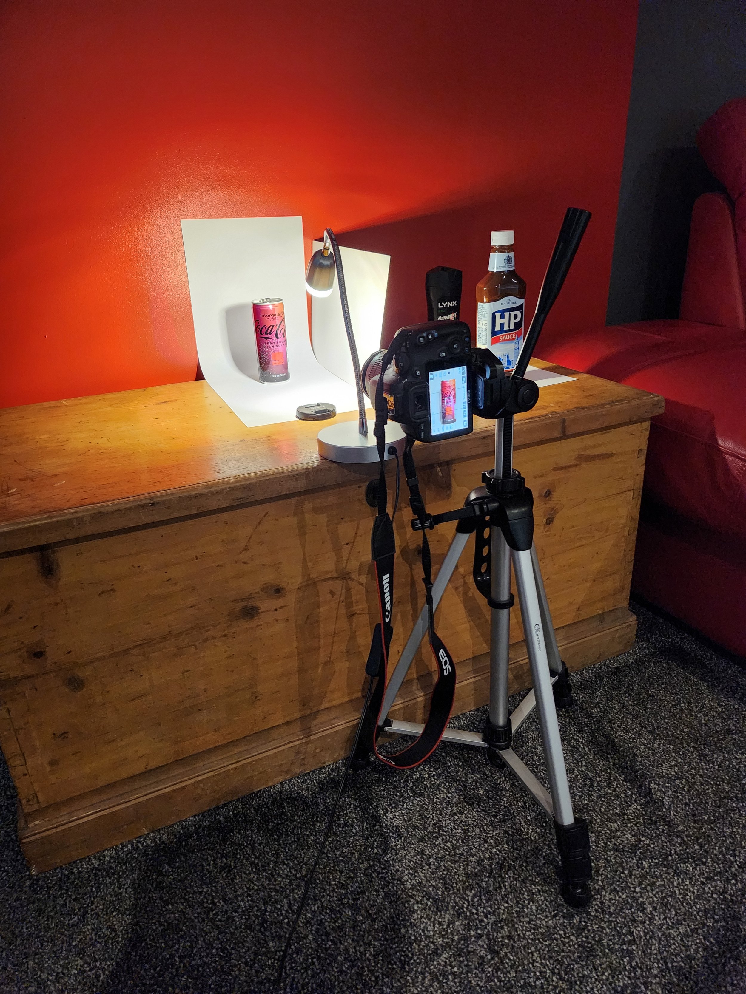
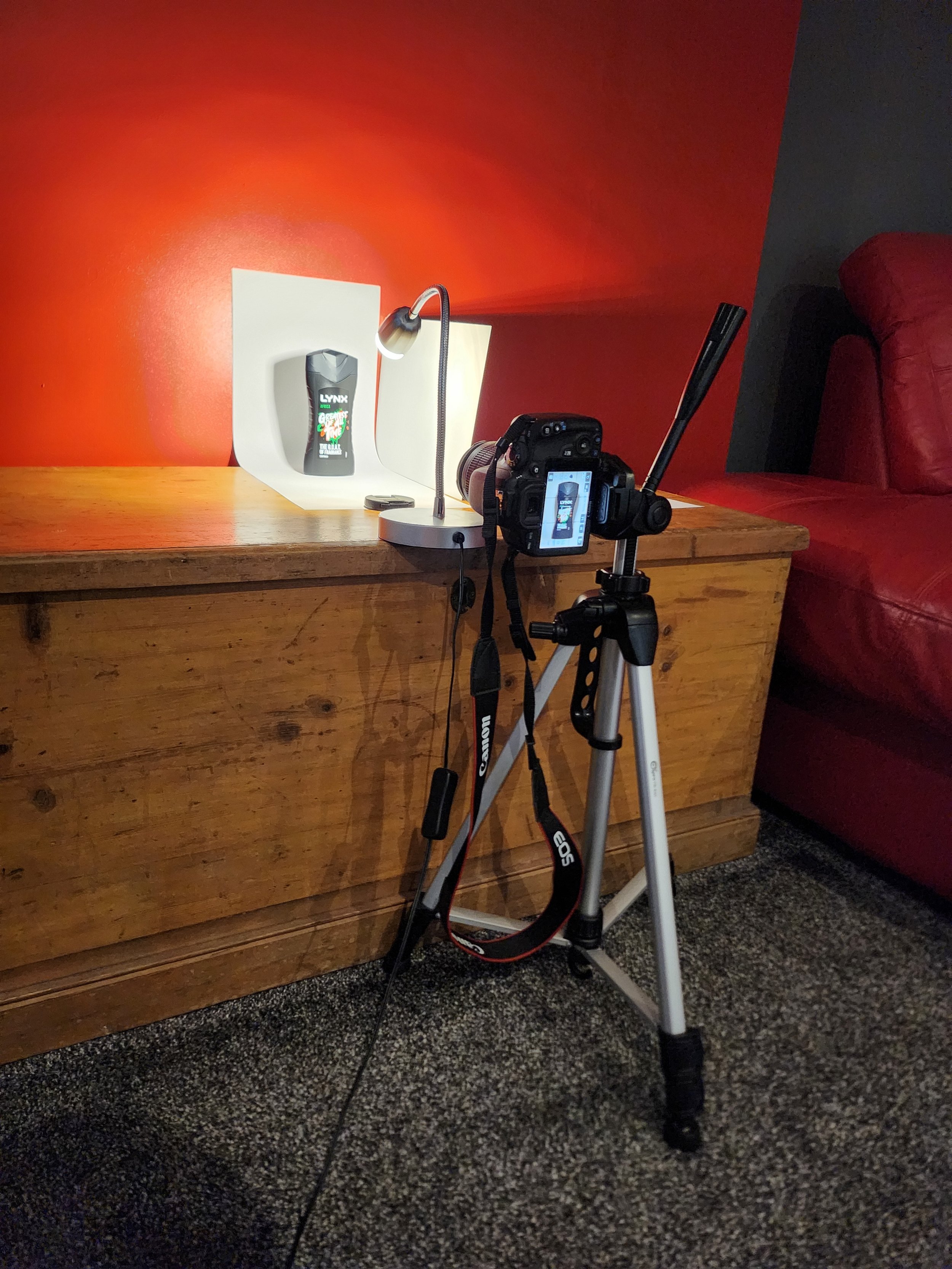
Post-Production
Edited Images: -


For most of the images, I have cropped them and not altered any of the exposure or contrast levels, but with this Punchline Punch Monster Energy Can I altered the Exposure as the red/pink looked too dark for my liking and effectively it brightened the image up. The software used is Adobe Lightroom.

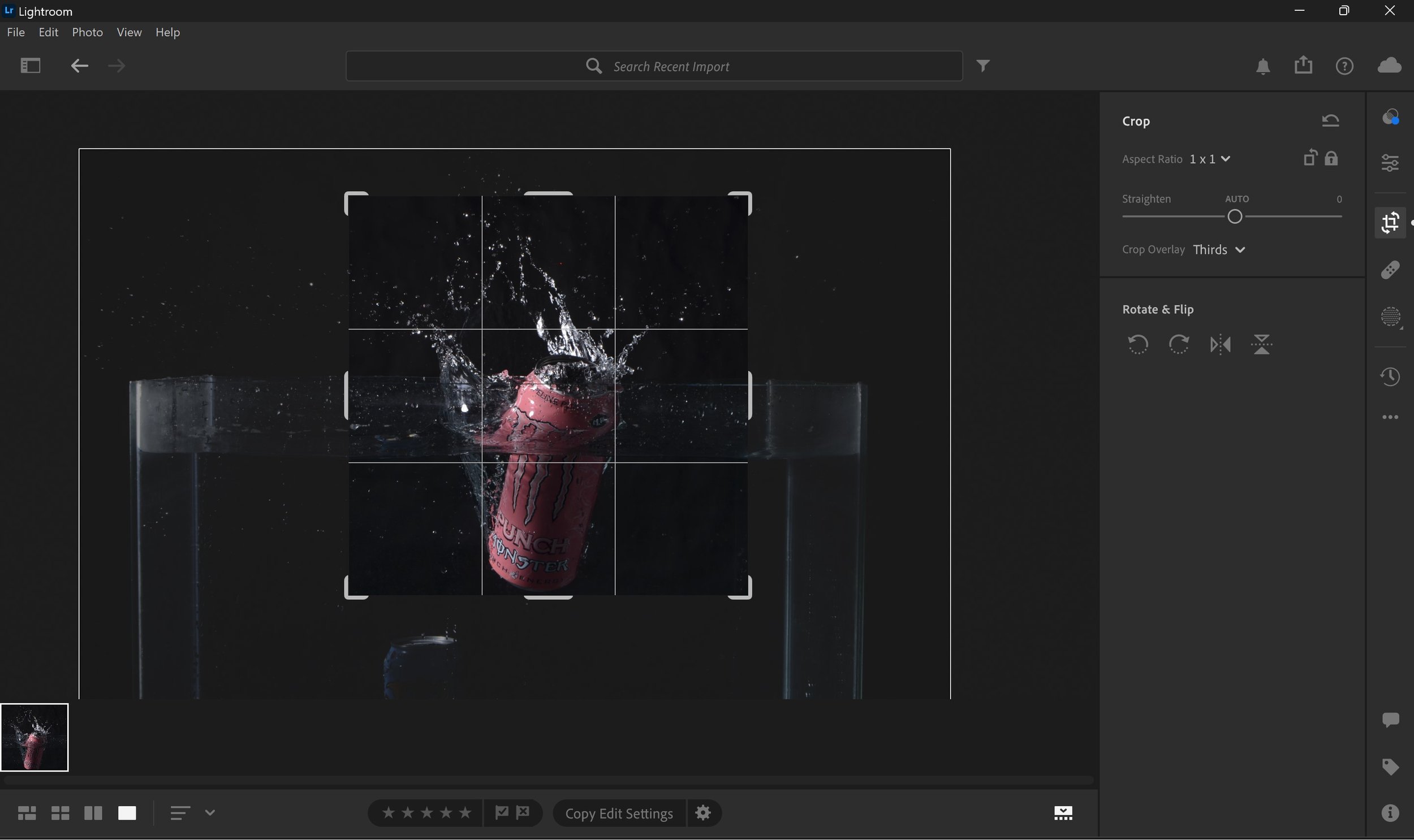
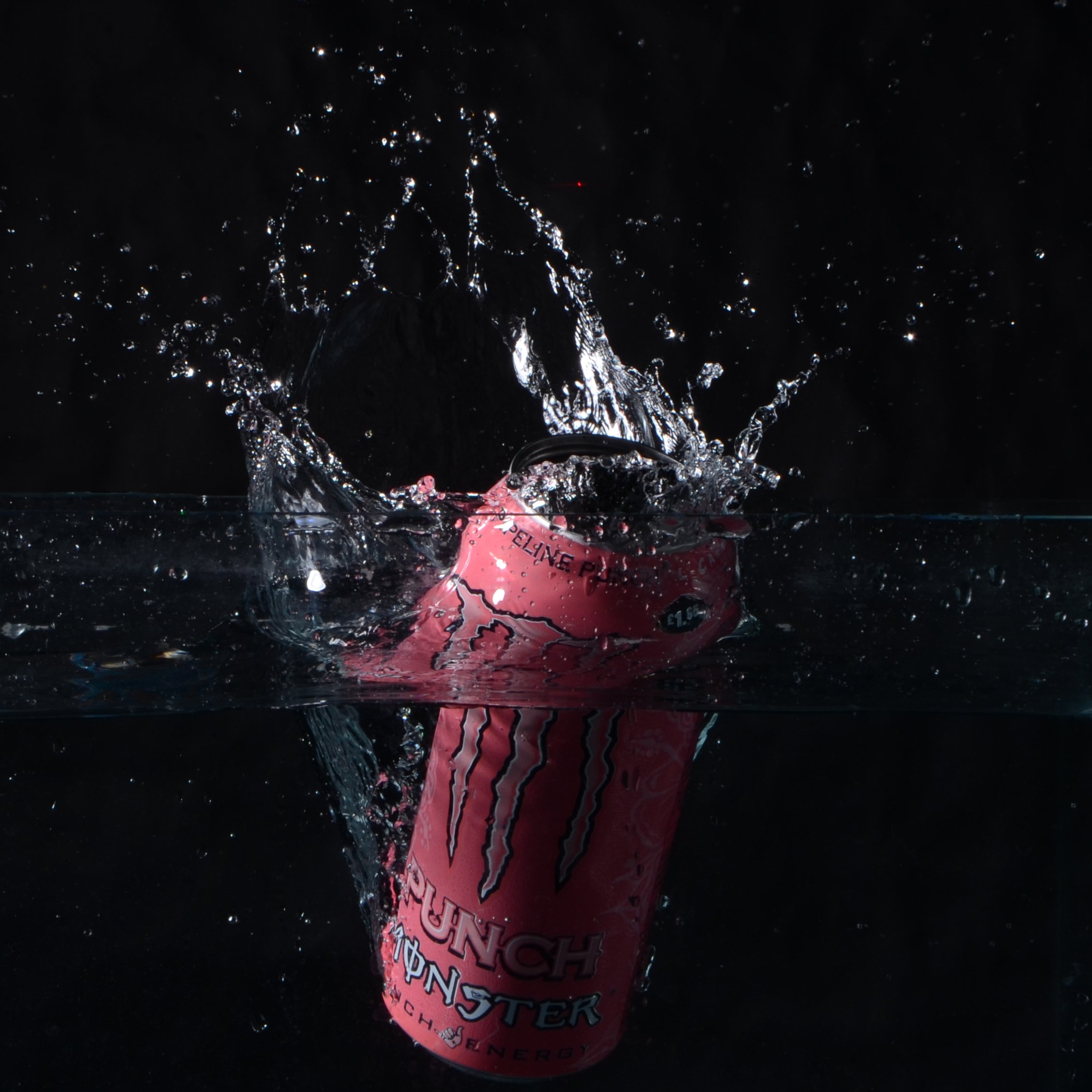
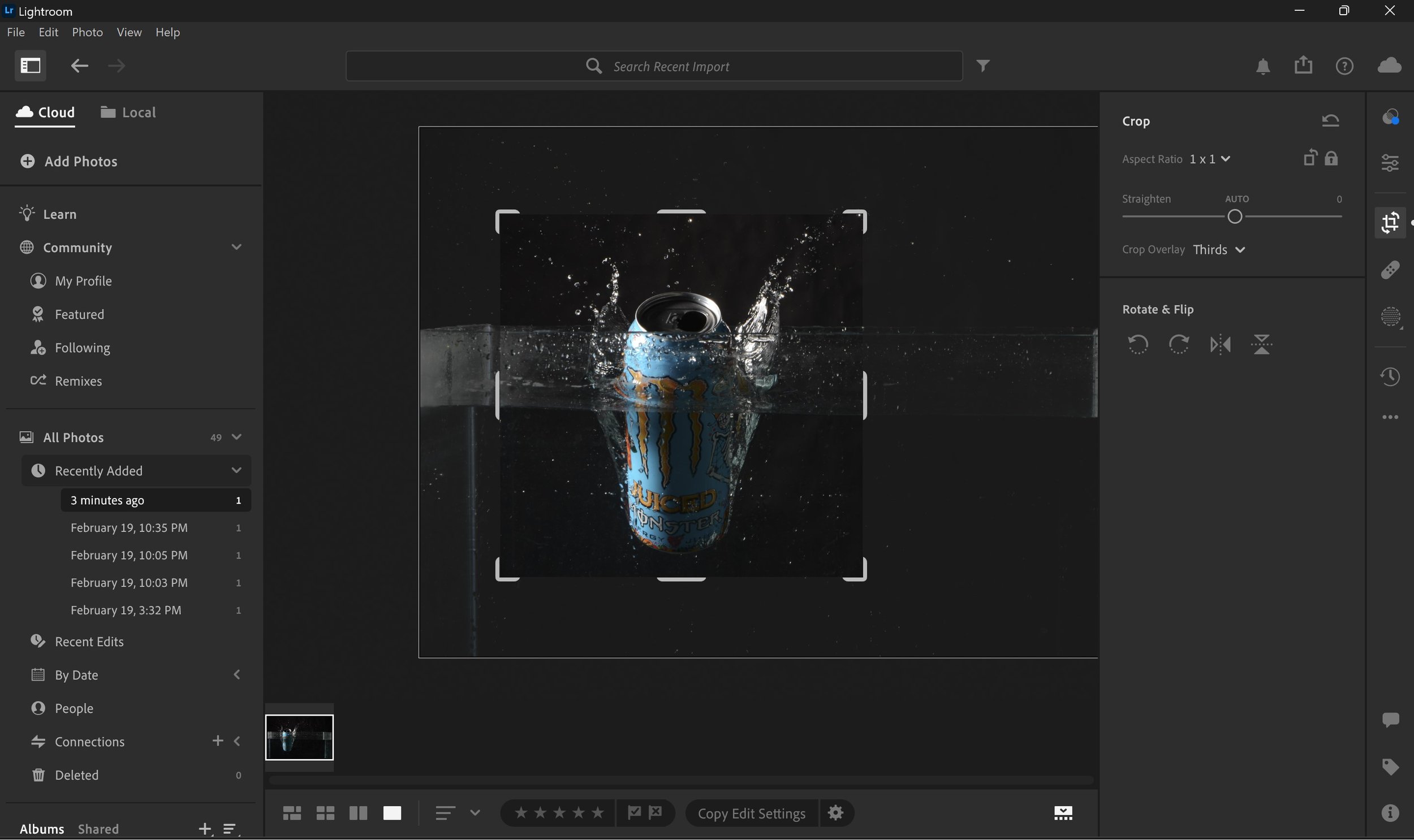
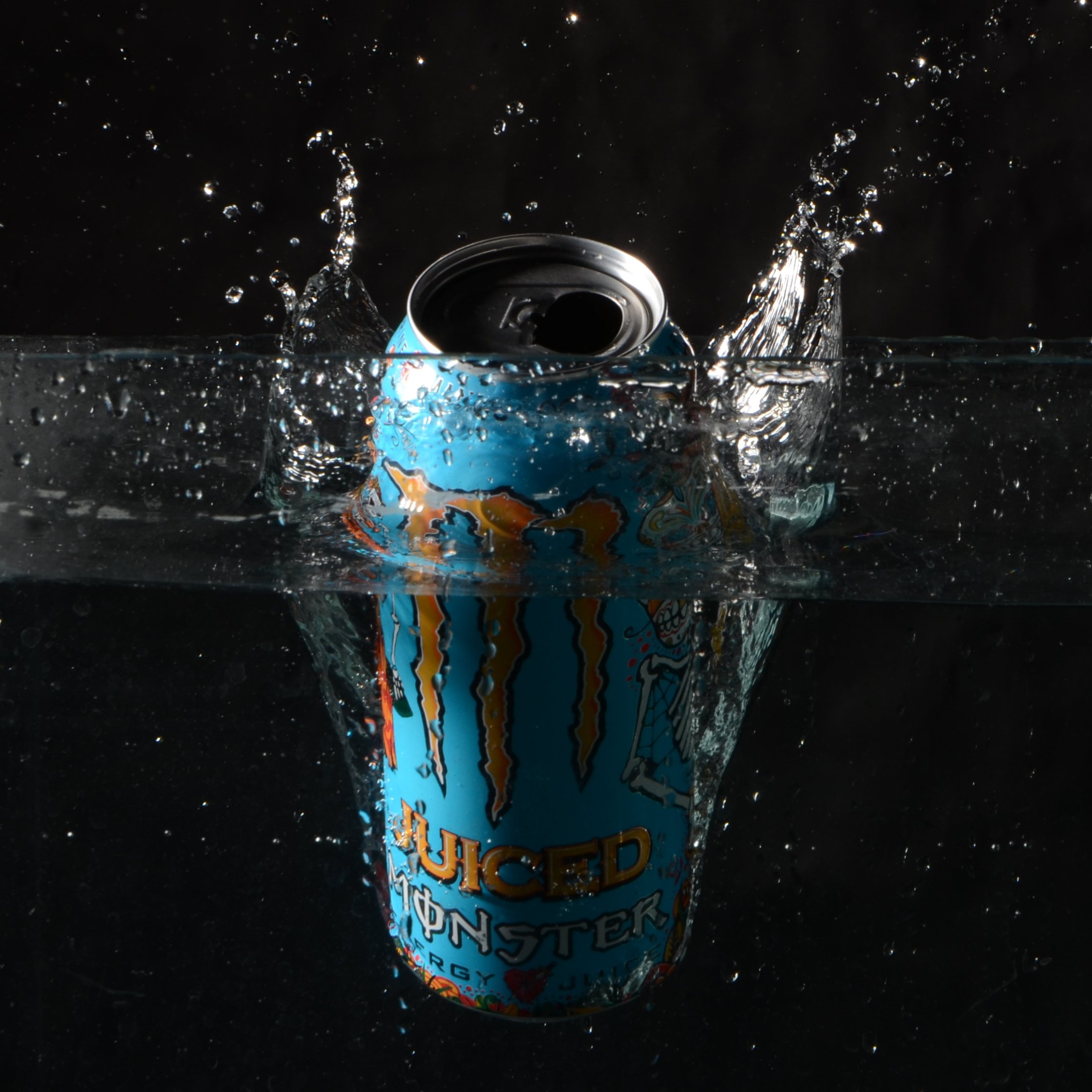
As you can see with these two images above, I have cropped the image using the square crop to only catch the action in the images, like the water splash and the can itself. There was no alterations the levels to these images whatsoever. The software used is Adobe Lightroom.
Advertising Posters & Billboard Designing: -
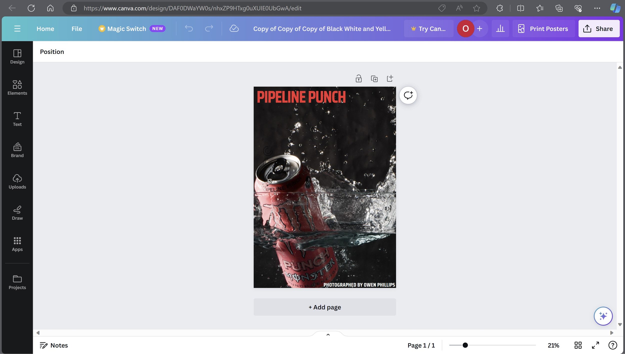
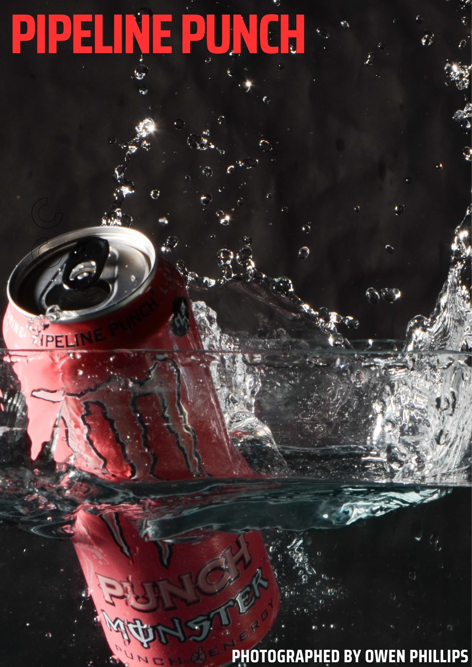
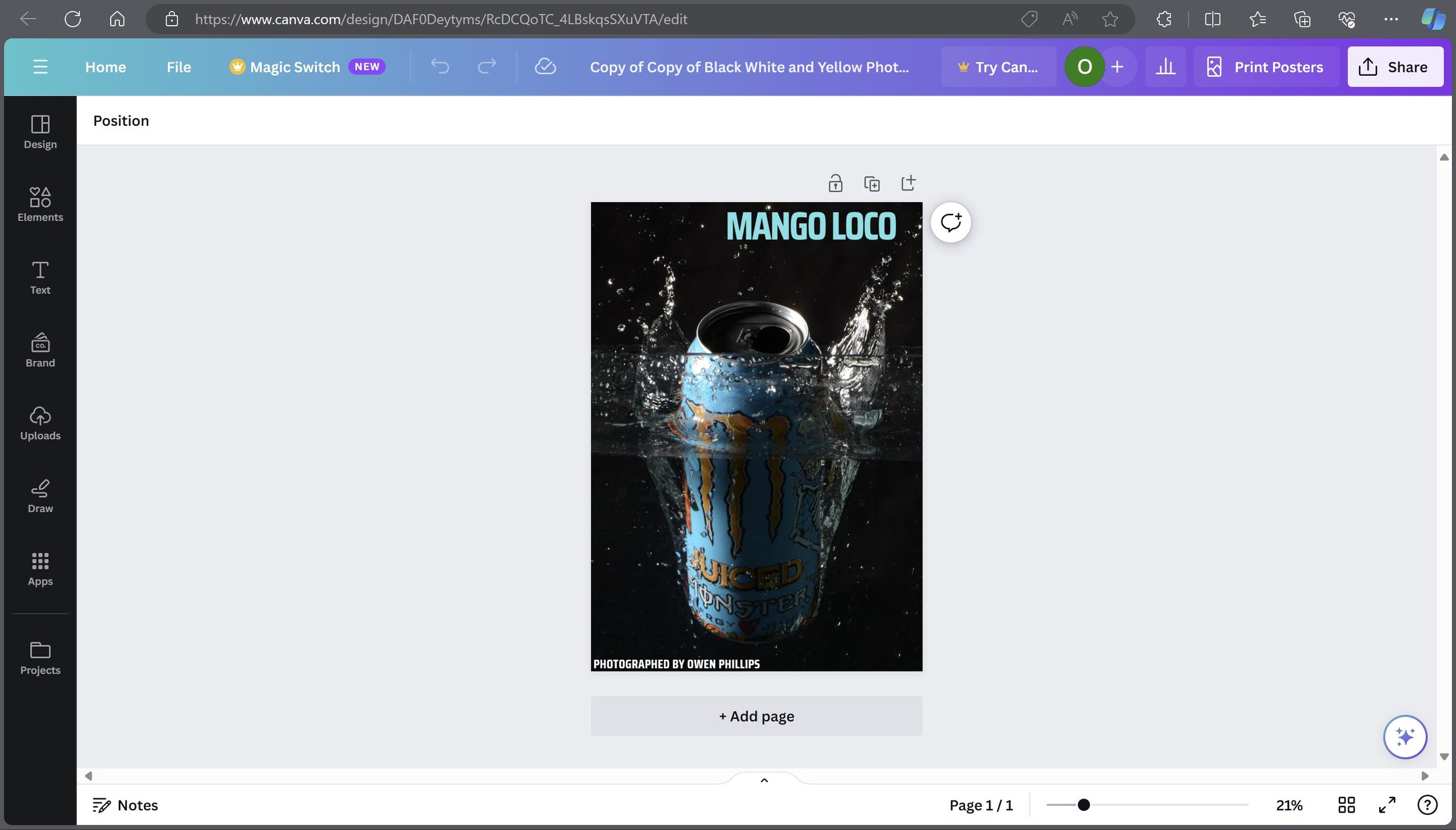
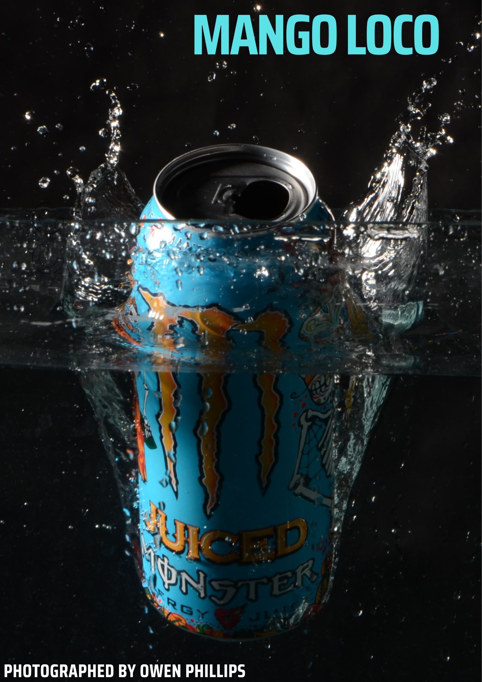
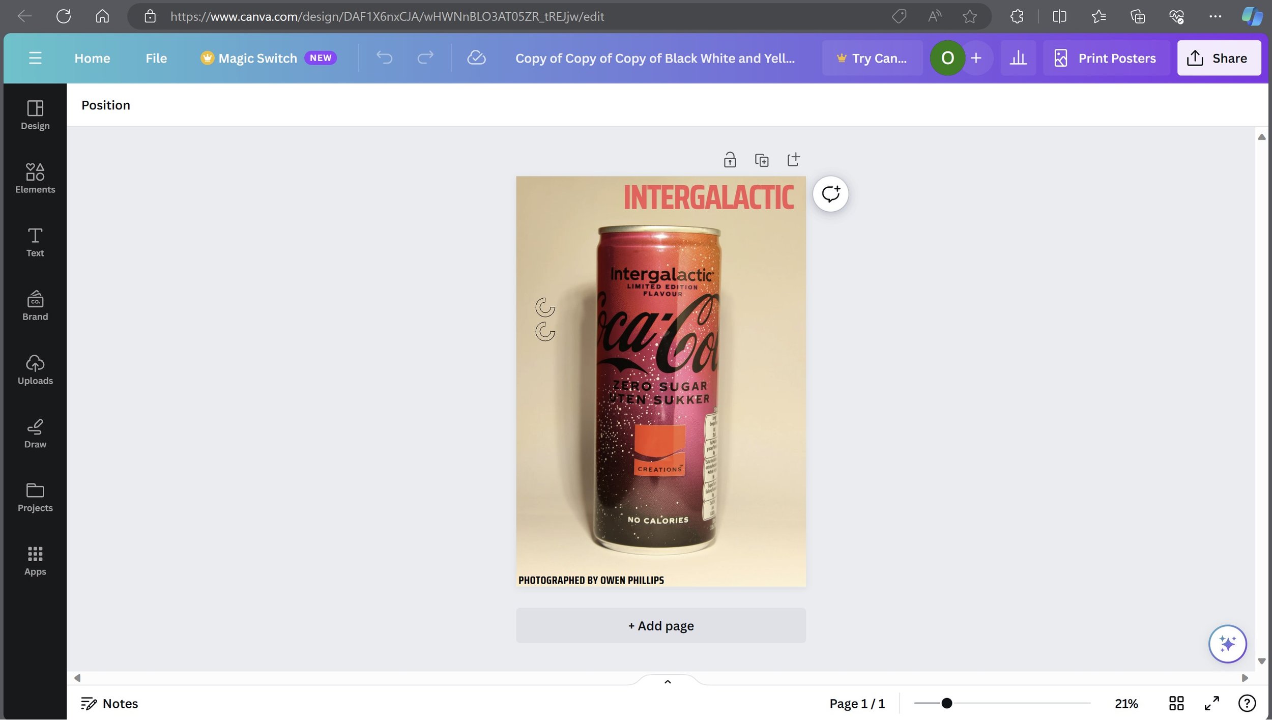
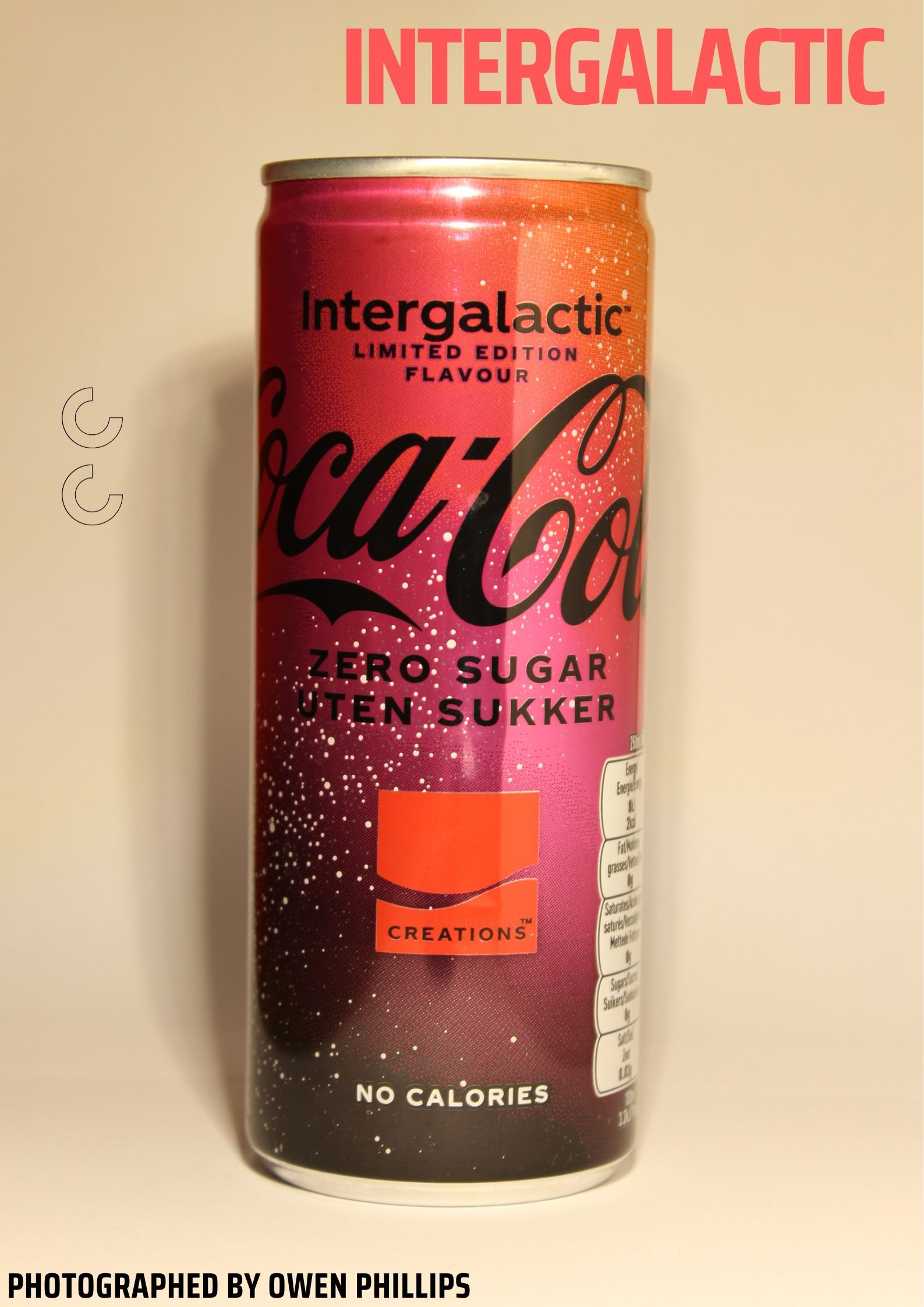
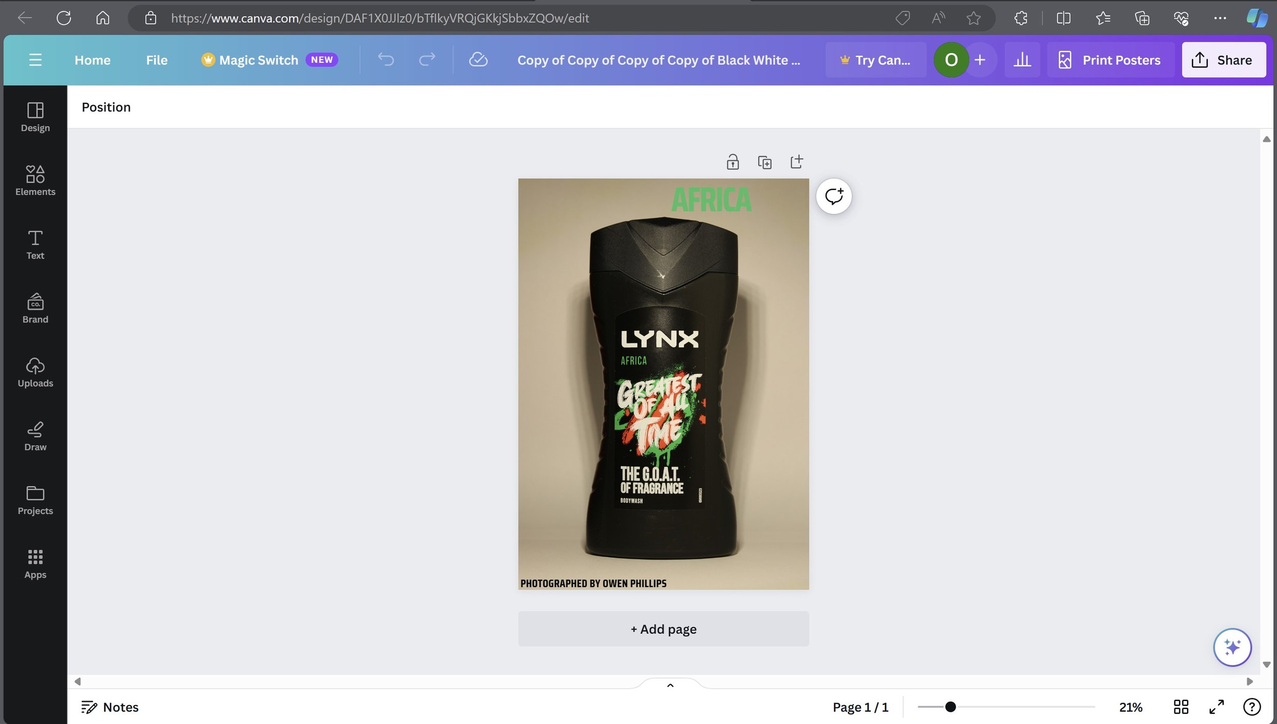
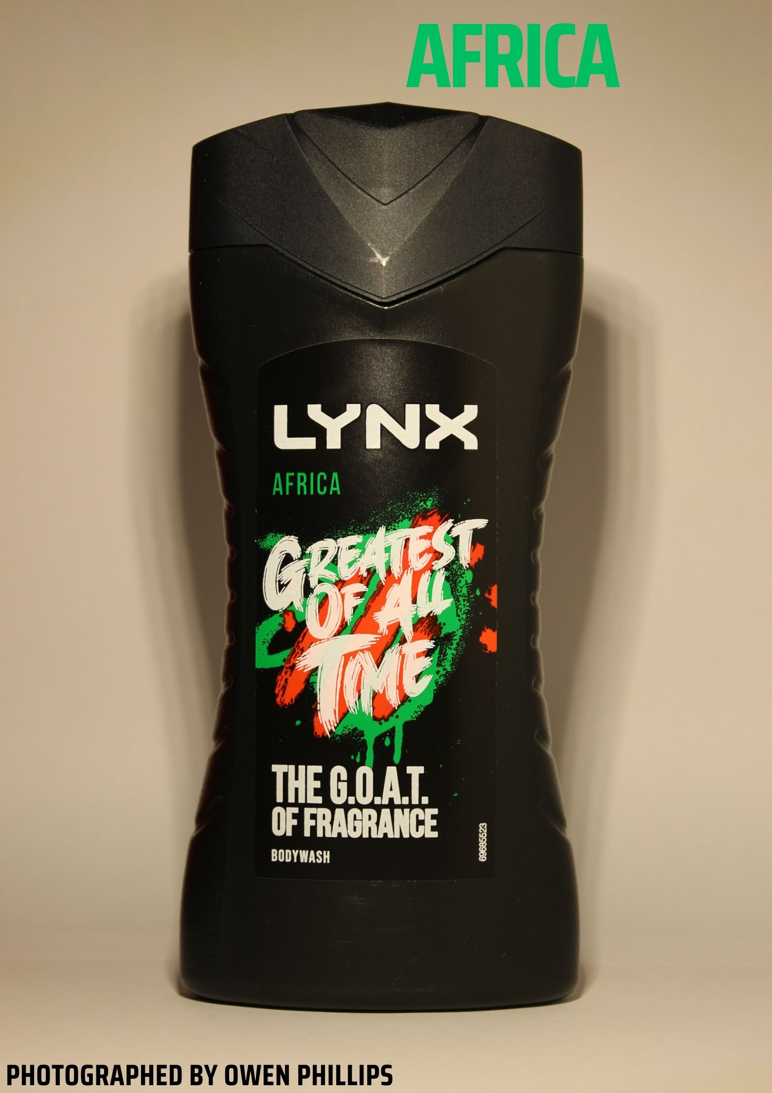
I used a site called Canva which is a graphic design website to create these advertising posters. The way I designed this is fairly simple, The type of text I used is Saria Condensed. I used the bold version for the title of the poster and the standard one for the bottom text. I changed the colour and text for the titles depending on which flavour or image it is.
Billboard Designs from Graphic Burger: -


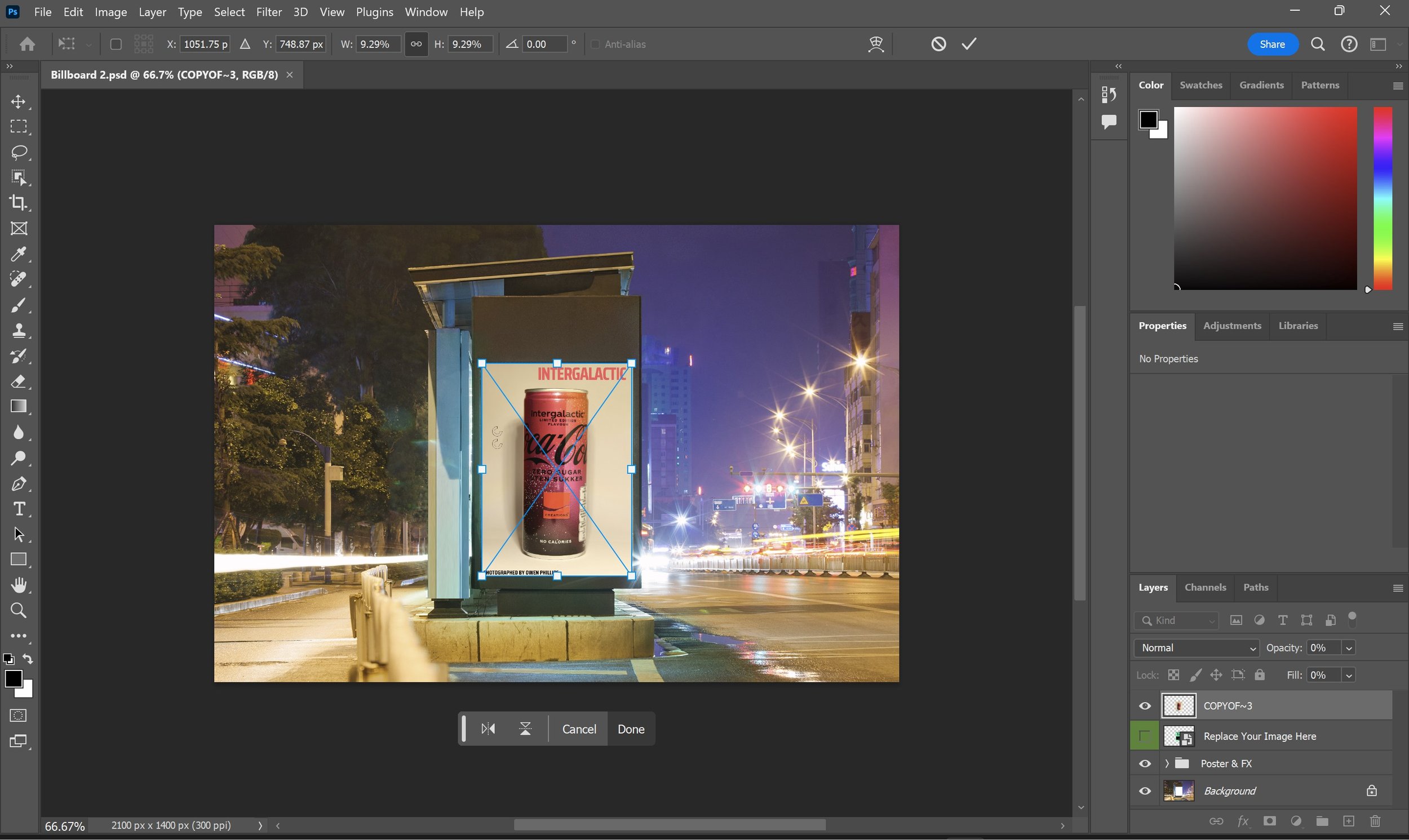

I used a site called Graphic Burger to find templates for the billboard advertising screens. The site allows you to download a set of photoshop files and all you do is drag in your image into the program and it places it into the selected slot on the layer. In this case we are dragging out newly created advertising poster created from Canva into Photoshop. I used my two favourite image from the shoot to create these Billboard Designs.
Presentation
Final Selected Product Photography Images: -

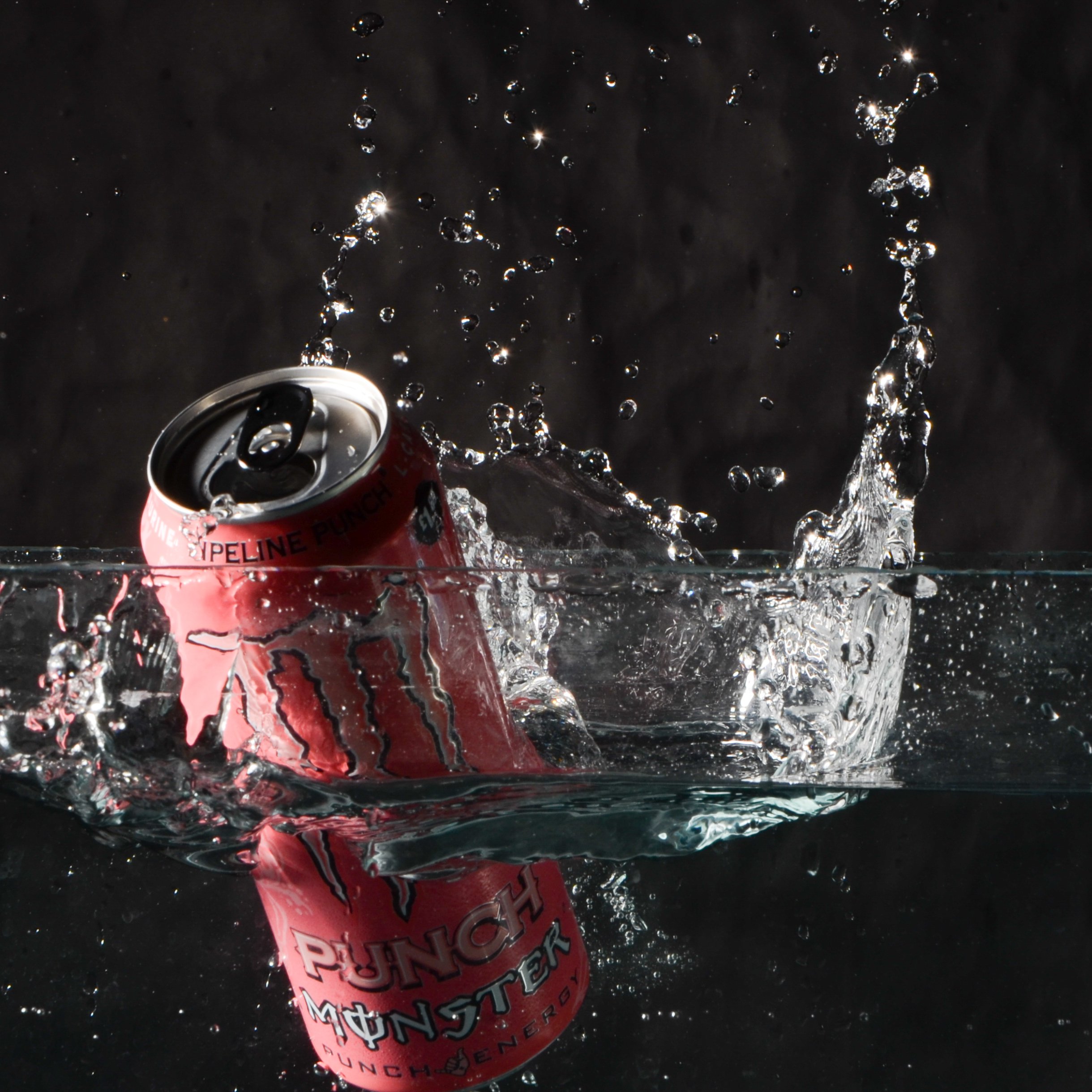

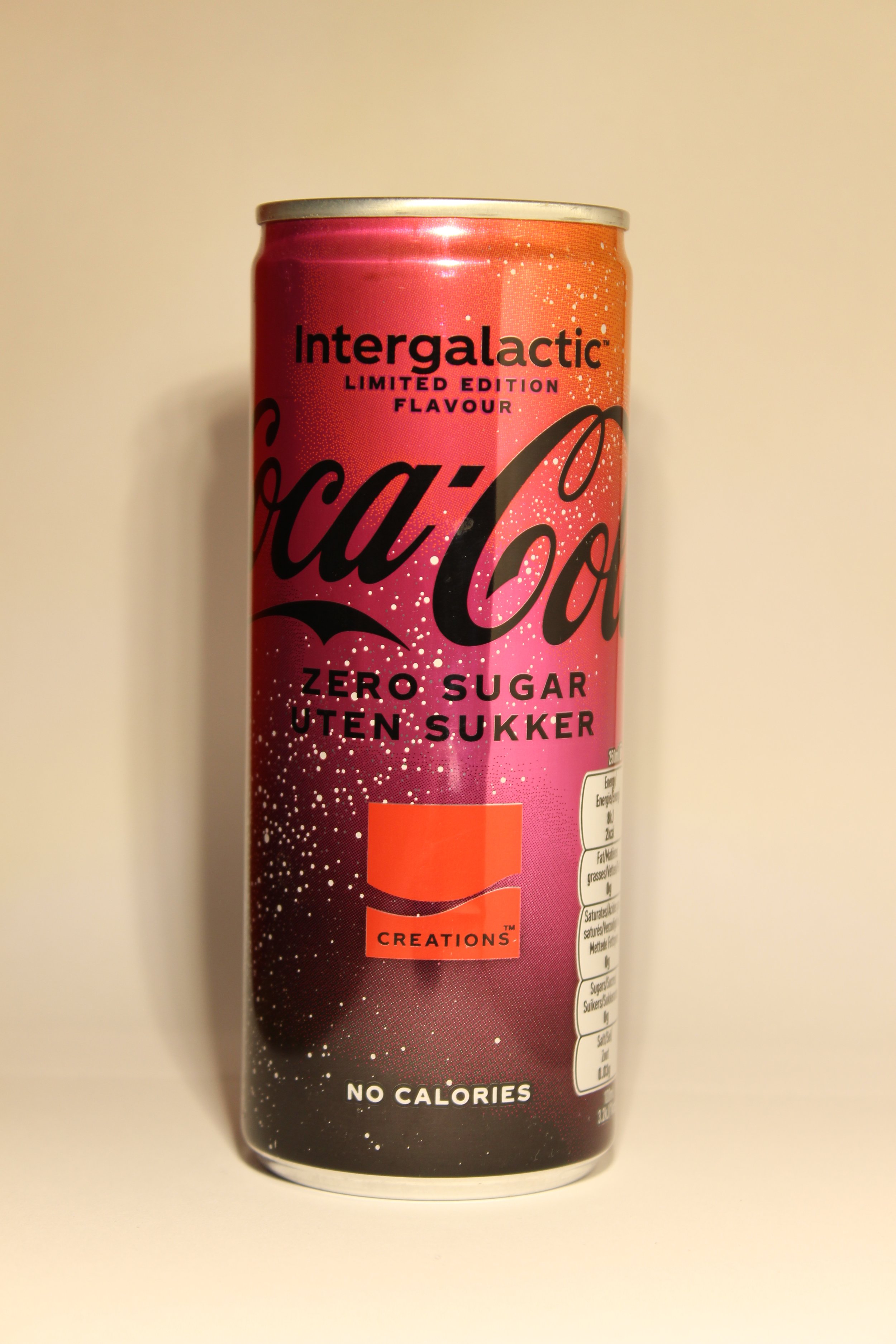

Final Billboard Design: -


Evaluation & Reflection
What are your three strengths & three weaknesses of your Product Photography?
My first strength for this project is the planning was well thought out and it was clearly talked about in my blog, and I knew exactly what I was going to do, secondly, I think my final products are strong especially the water splash images as it shows the splash from the water and a clear view of the actual Monster cans. Lastly which makes my images look good was the use of the advertising posters and of course putting them into the bus stop billboards as well which makes it realistic.
My first weakness is some of the water splash images that I had taken were either miss timed or looked good from the splash but couldn’t see the artwork of the can. I have placed some of these examples below.
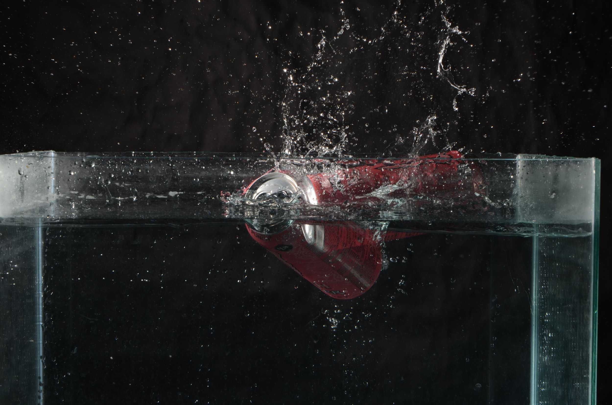
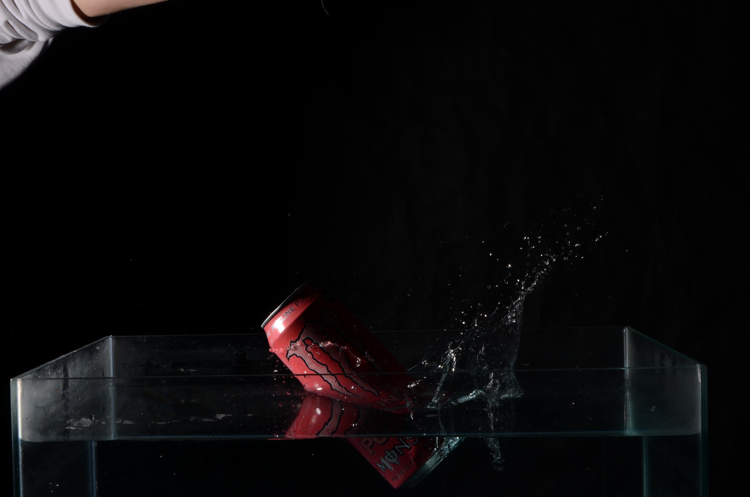
Secondly, I should of photographed more images of the hard light product photography as from looking at my two brilliant examples, I feel as I could of used different products then just the two I have used and this leads me onto the time management problems I had because if I had more time to shoot and experiment, I think I could of come out with a better selection of images and more in detail images using the logo I created for the fictious company “Good Vibes” .
What do you now understand about the characteristics and contexts of Product Photography?
I learnt mostly about all the different types of lighting that is involved in creating product photography, such as Hard Light, Soft Light, Flat white and even Specular light which is another type of Hard light. I also learned about how there is many different types of product photography for the different industries that it is used in, E-Commerce is a huge medium as it requires you to sell it online and it requires product photography to be involved. 360 Degree product photography is probably the most interesting one as you take a series of images from different angles and then you put it together to make a moving image of the product.
What were your key areas of development during this assignment work, Give Explanations
I think experimenting was a huge factor through out this assignment as at the beginning I didn’t know how I was going to shoot my ideas. After researching into every bit of lighting techniques and of course I asked my lectures for support with setting up the lighting rigs etc. I also learned more about different camera settings which need to be set up for the water splash.
Authentication Document


E-Commerce Multi-Media Campaign
In this brief we have been asked to create a 45 second fashion clothing or footwear promotional video and a fashion magazine.
We have been asked to create this as if we were employed by a fashion/footwear company, for this project it is a fictious company called HIP.
We are commissioned to create their first campaign video which will be published in a form of a magazine and video footage across social media platforms.
The company’s target audience demographic is between 18-25 year old with the backdrop for the campaign having a urban vibe.
Context & Research
Outcomes
Three Logos for “HIP”: -
For creating these logos, I used a free graphic design site called Canva, I used three different mock-up designs on the site to create the logos. I will also use “Google Forms” to ask people which logo is the best looking and that will be the one that I will use for this project.

Photography Shoot for “HIP”: -
In the photography studio I taken about 77 images, But I have selected 12 photos as my favourites for this assignment. The lighting technique which was used in the studio is called “High Key Lighting” which makes the frame of the image really bright with soft lighting, minimal shadows and with low contrast. In other words the technique uses minimal shadows with the majority of the image composed of highlights. The idea to use is lighting style isn’t just because it is popular in the fashion industry, but it a very pleasant and attractive style which is one of the reasons why it is used in film as well like, sitcoms or comedies.

Generally speaking, how to setup “High Key Lights”. This type generally reduces the amount of shadows in the image, a forth key light may be added as shown in the diagram. In order to maintain the correct exposure levels for the shoot you can move the key light further from the subject.
x2 Mock Up Magazine Designs + Supporting Pages: -

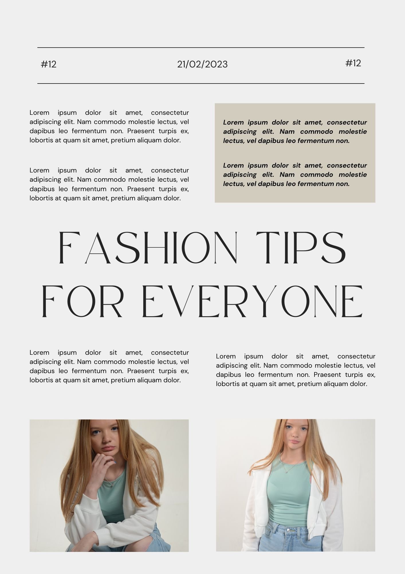
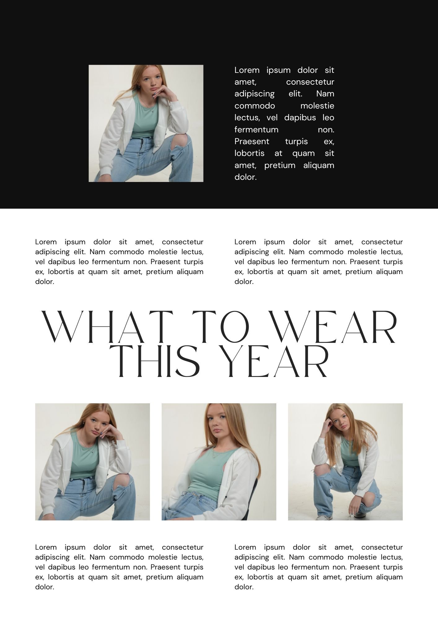

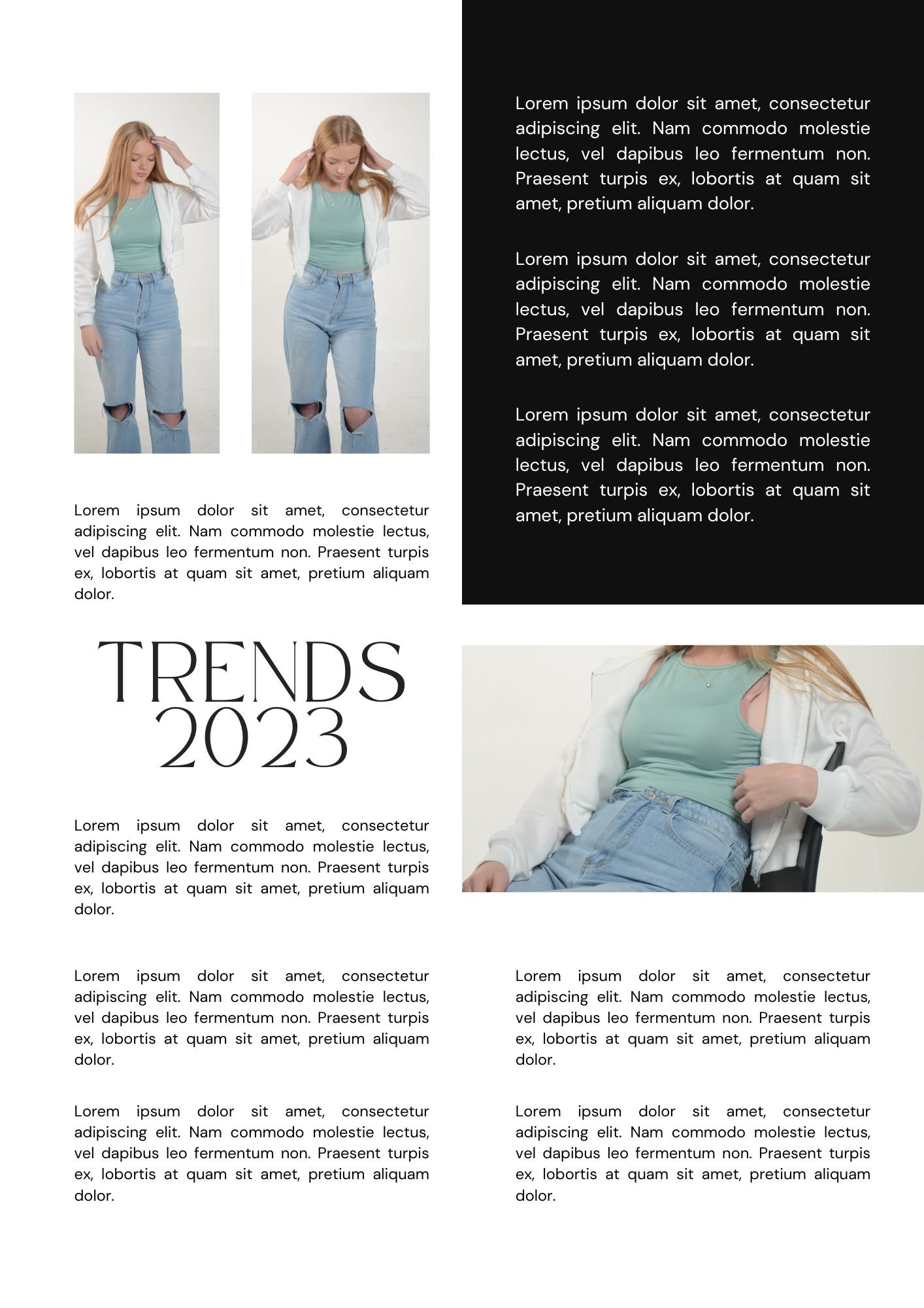
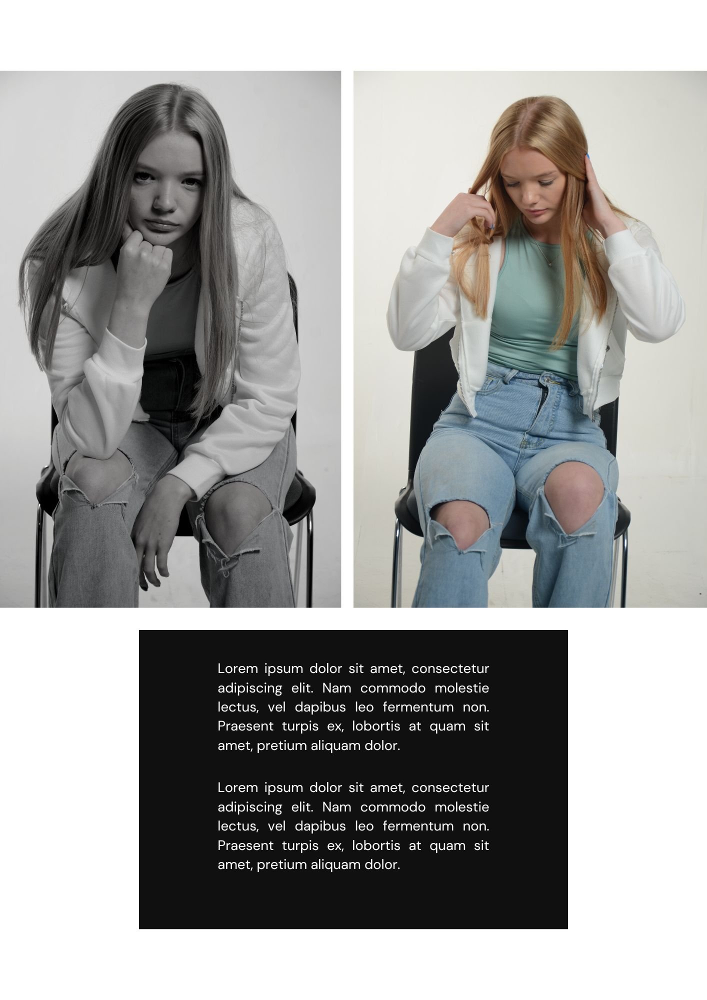

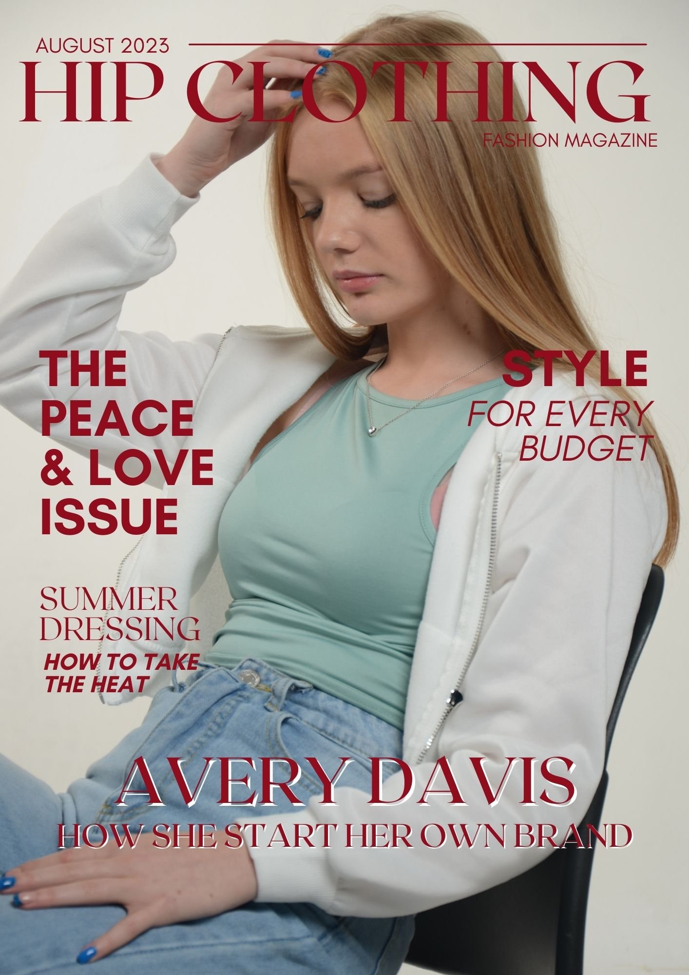
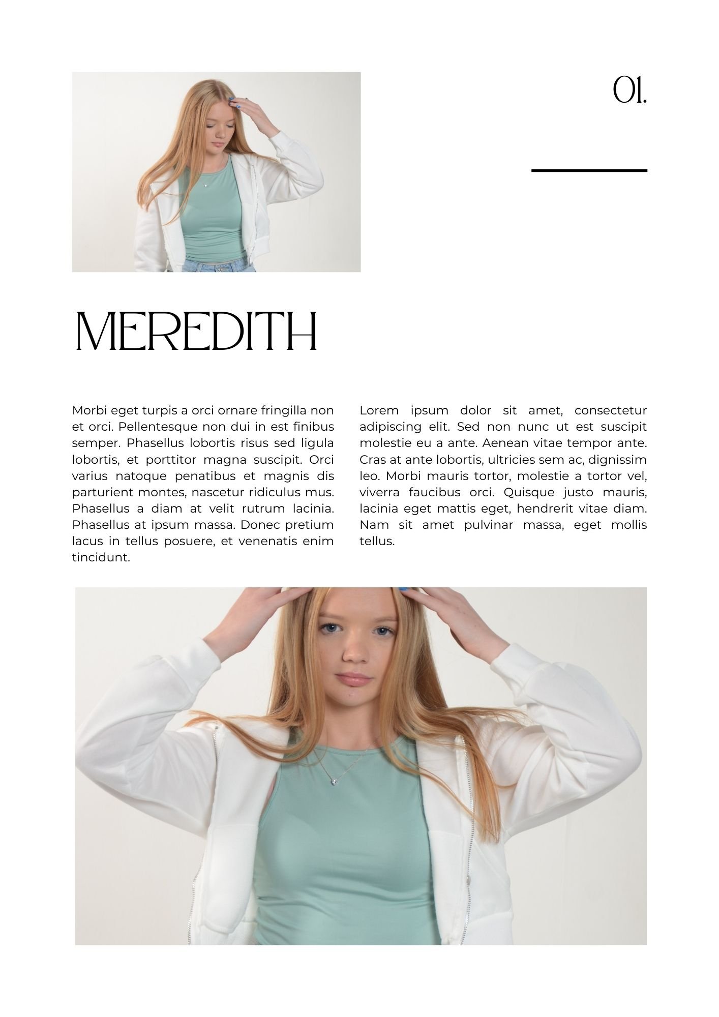
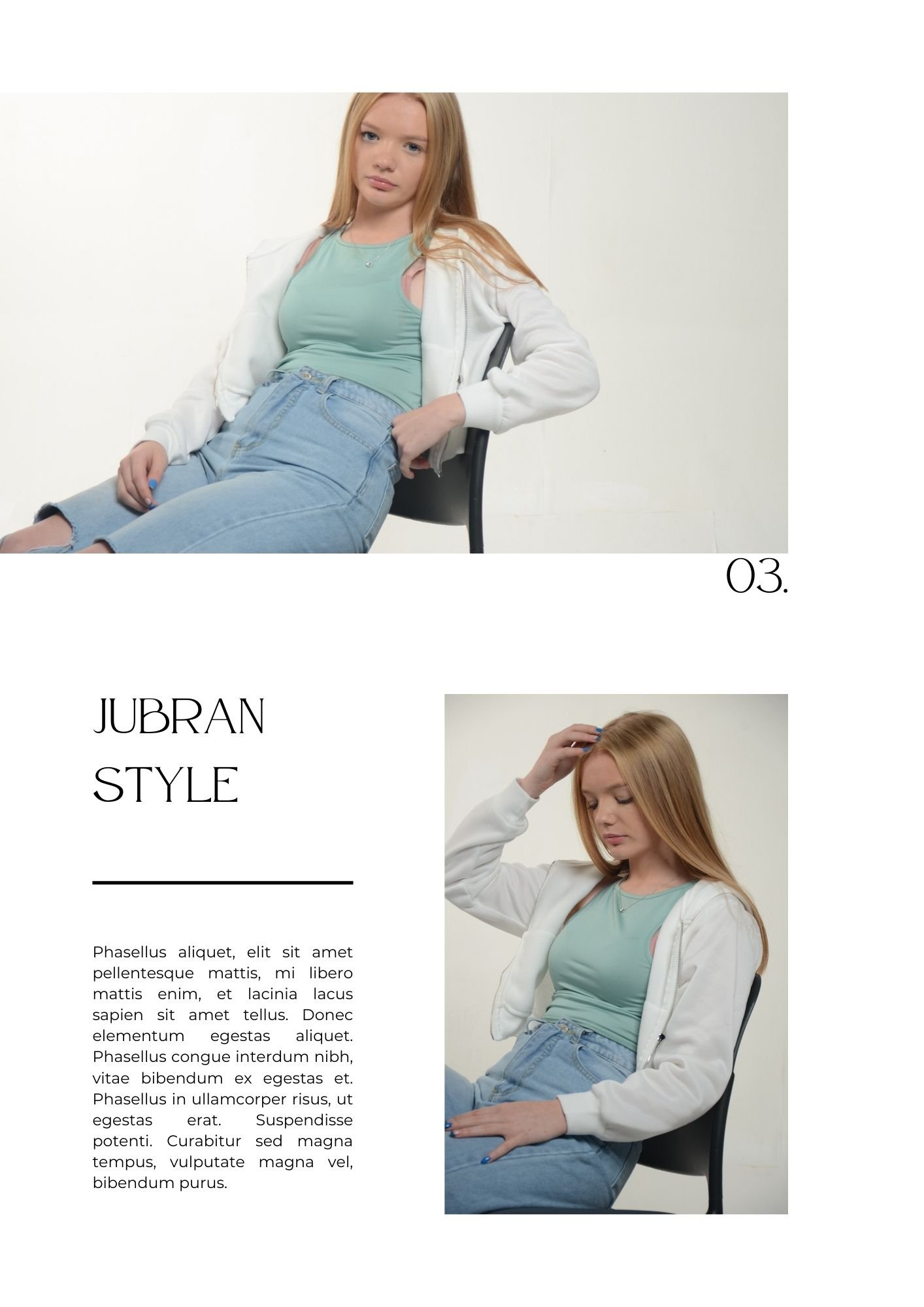
Context & Subject Research
Primary Research: -

I made a survey on Google forms after I created three logos for project “HIP” and I received 8 responses with them being in favour of Option 2 (5 votes @ 62.5%) out of Option 3 (3 votes @ 37.5%). Nobody liked Option 1. This was a brilliant option for me to do because it’s a simple way to see what the public opinion is on the logos which I have created. In this case it is class mates who casted votes on the survey.
Group Mock-Up Video - A Potential Outcome
Storyboard: -
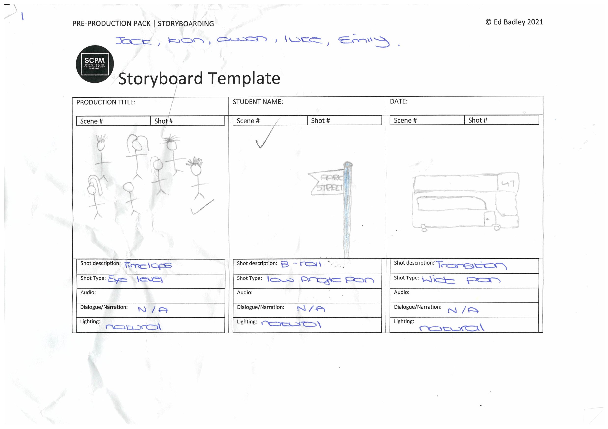
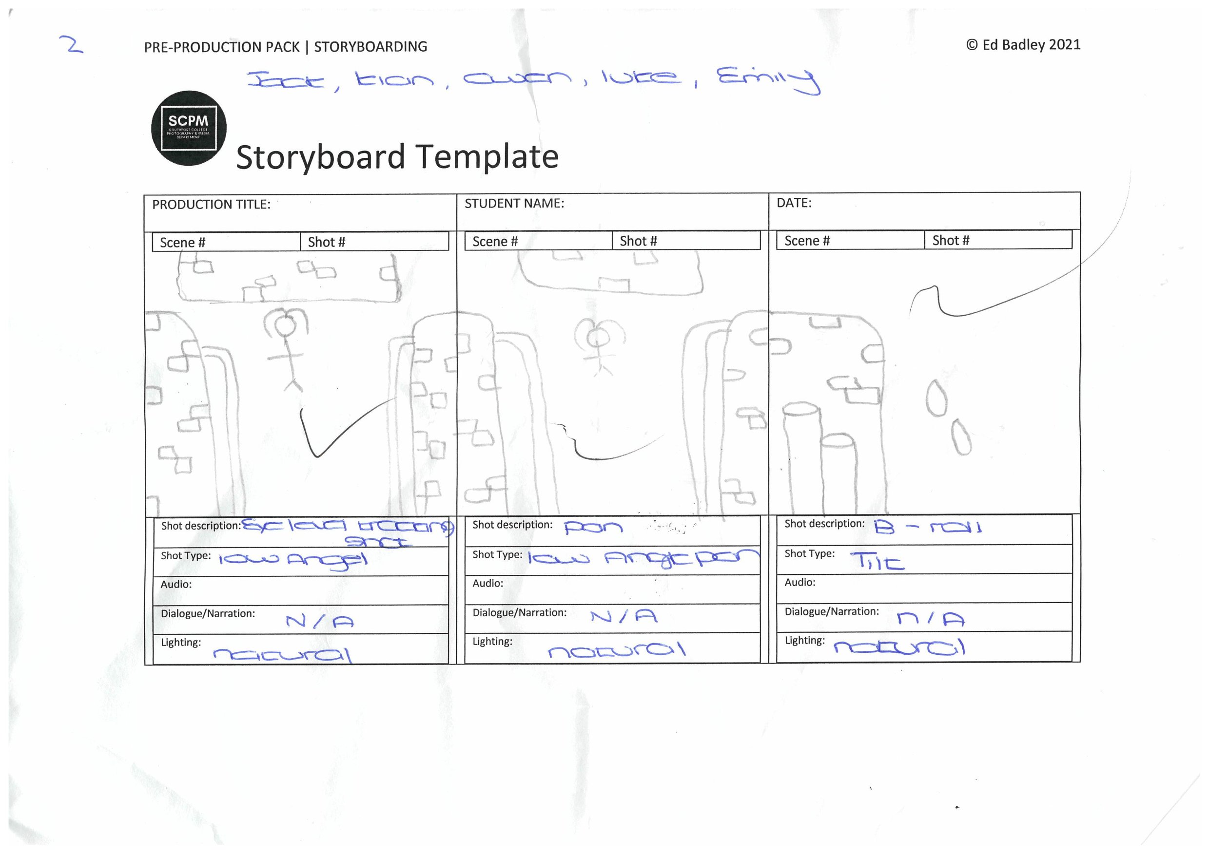
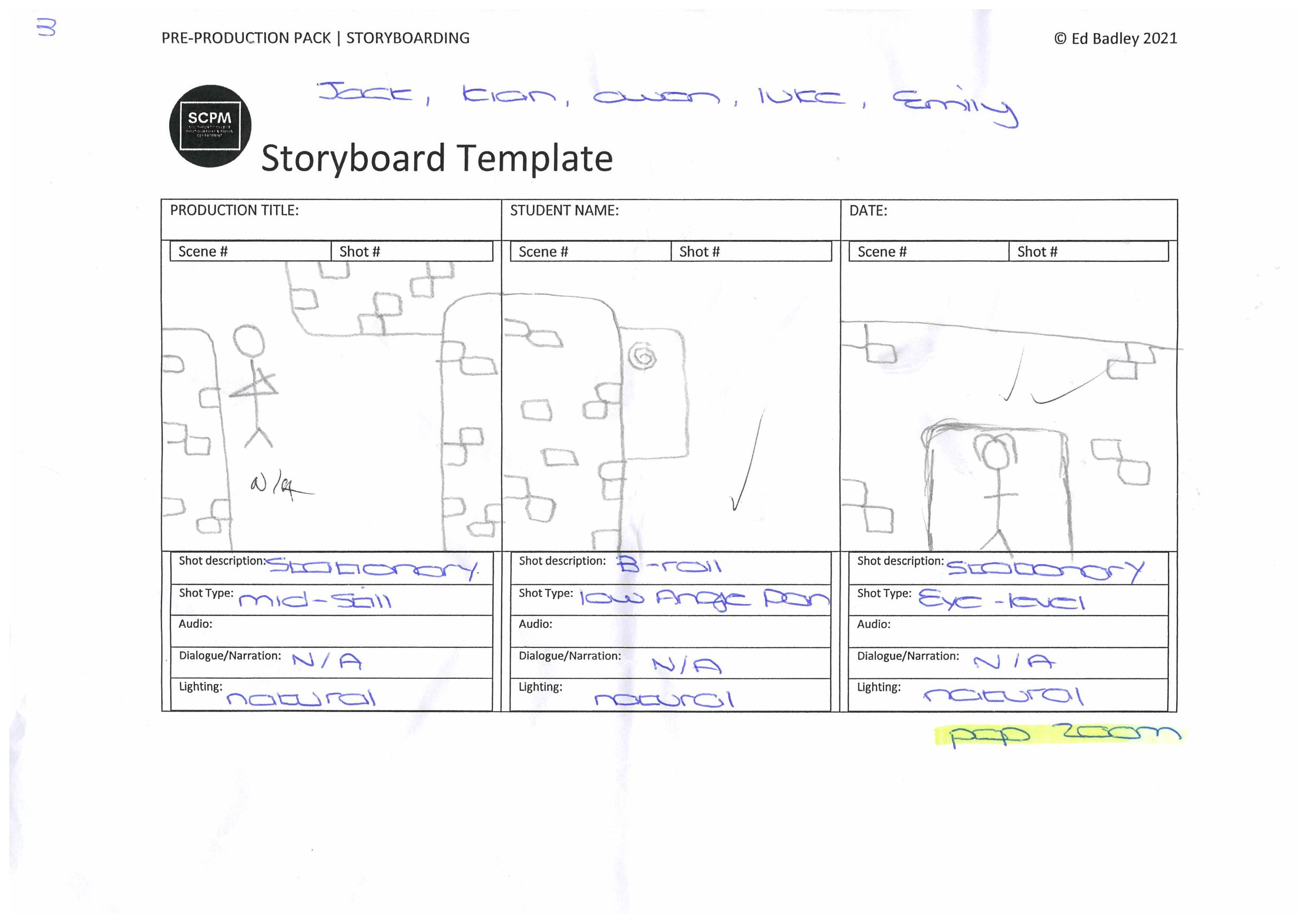
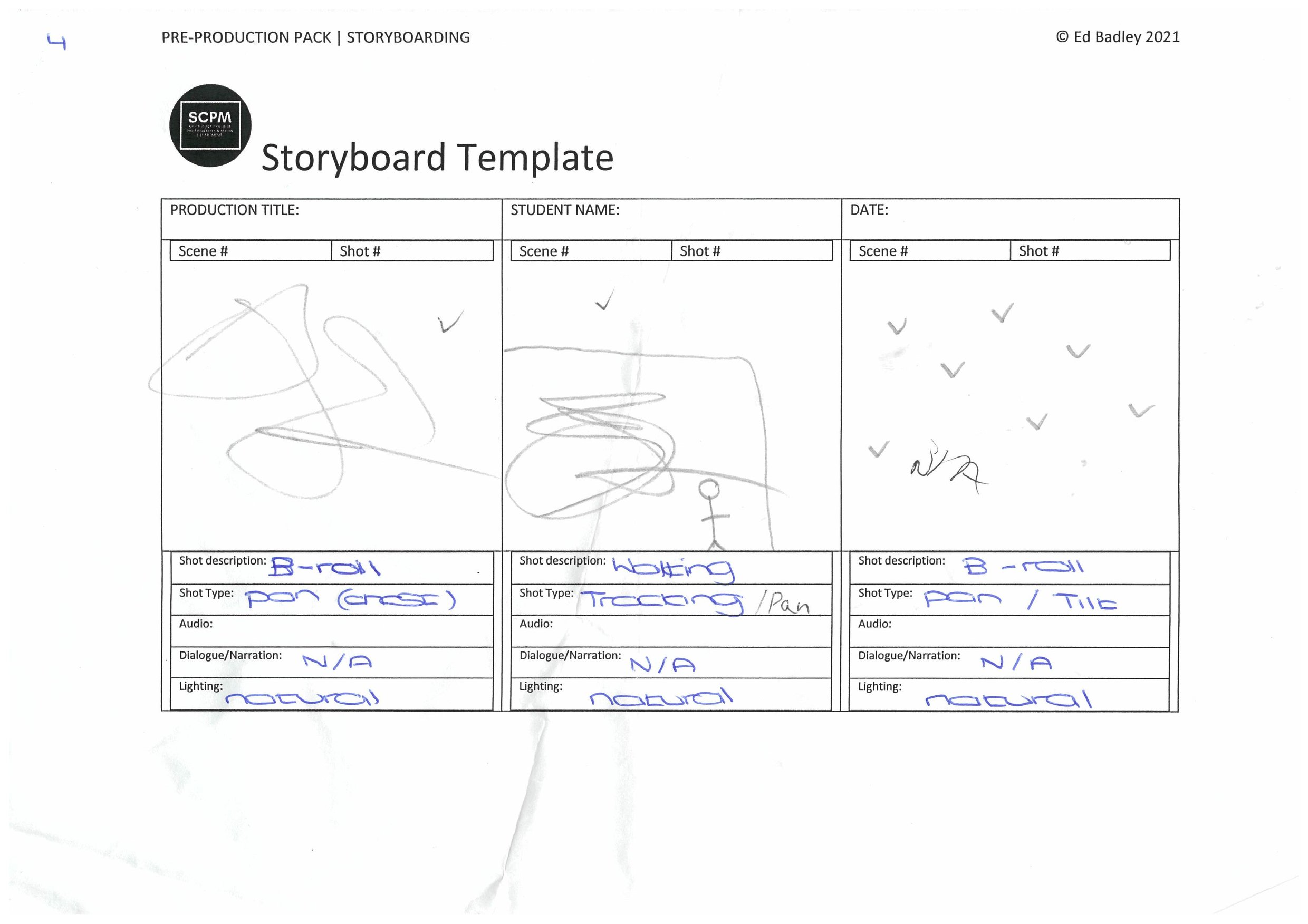
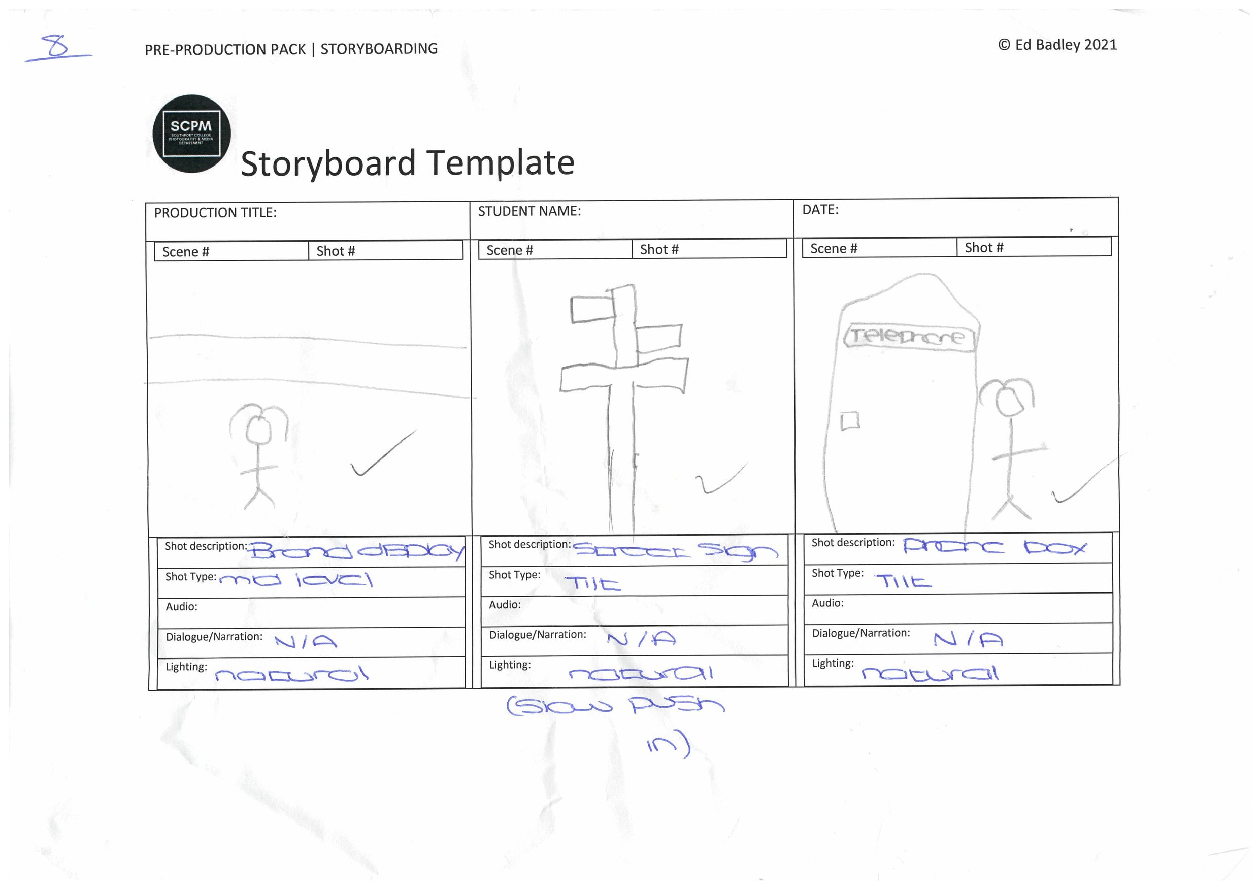
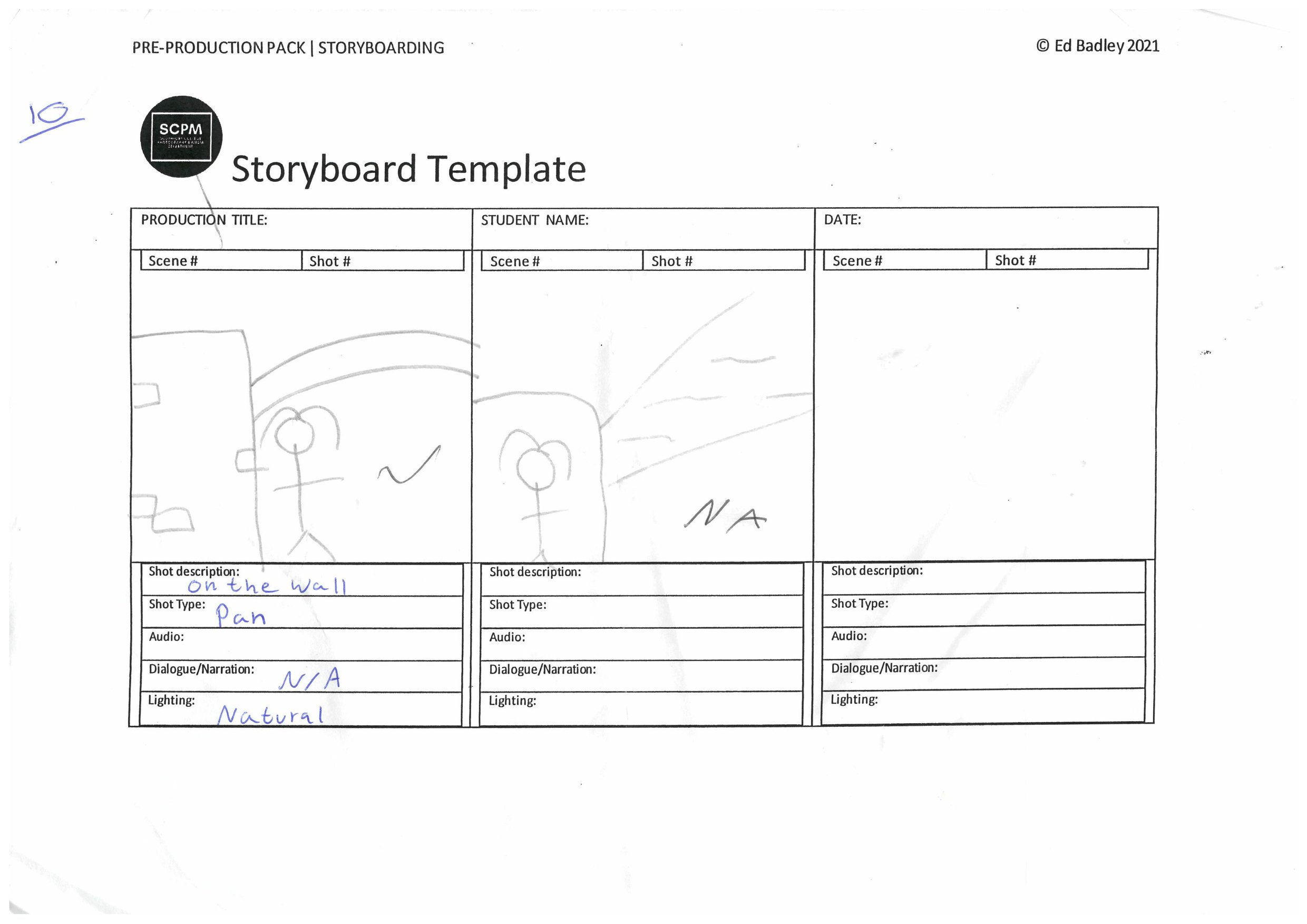
To help us get back into producing again, we were commissioned to create a fashion video in groups. In my group especially we had jobs in the team to create the film. Jack was Chief Cameraman, Owen (me) assistant cameraman, Kian was storyboard manager/video framing, Luke was video editor and Emily was the model.
Behind the Scenes: -
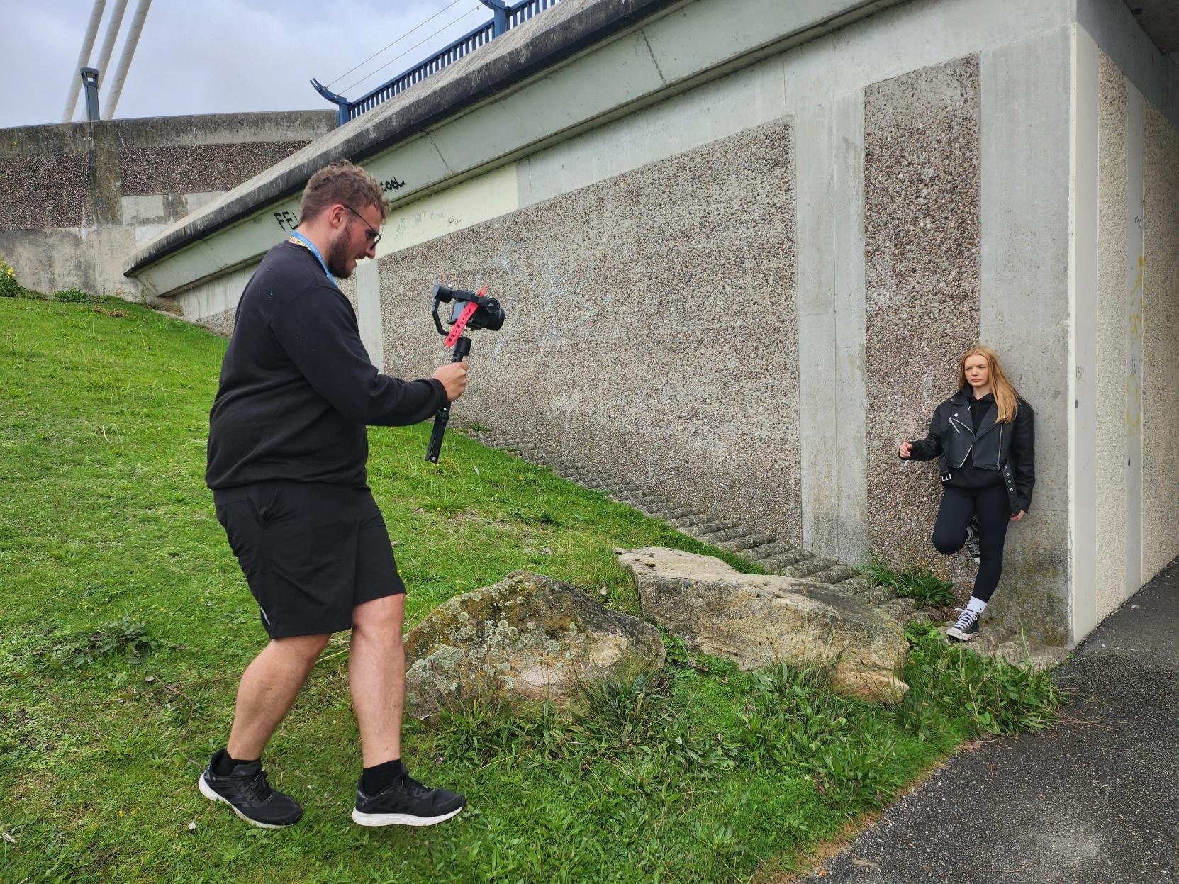
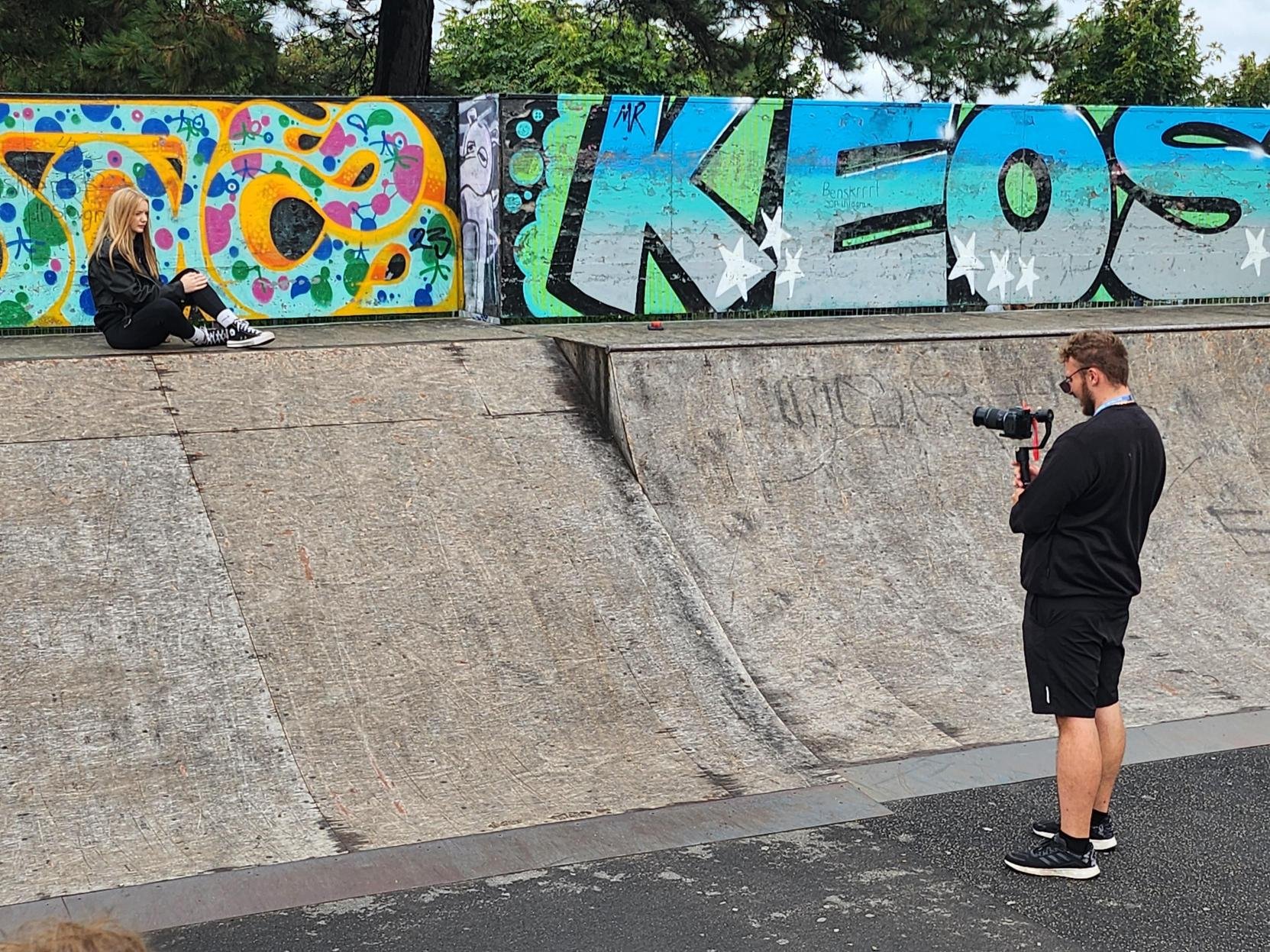

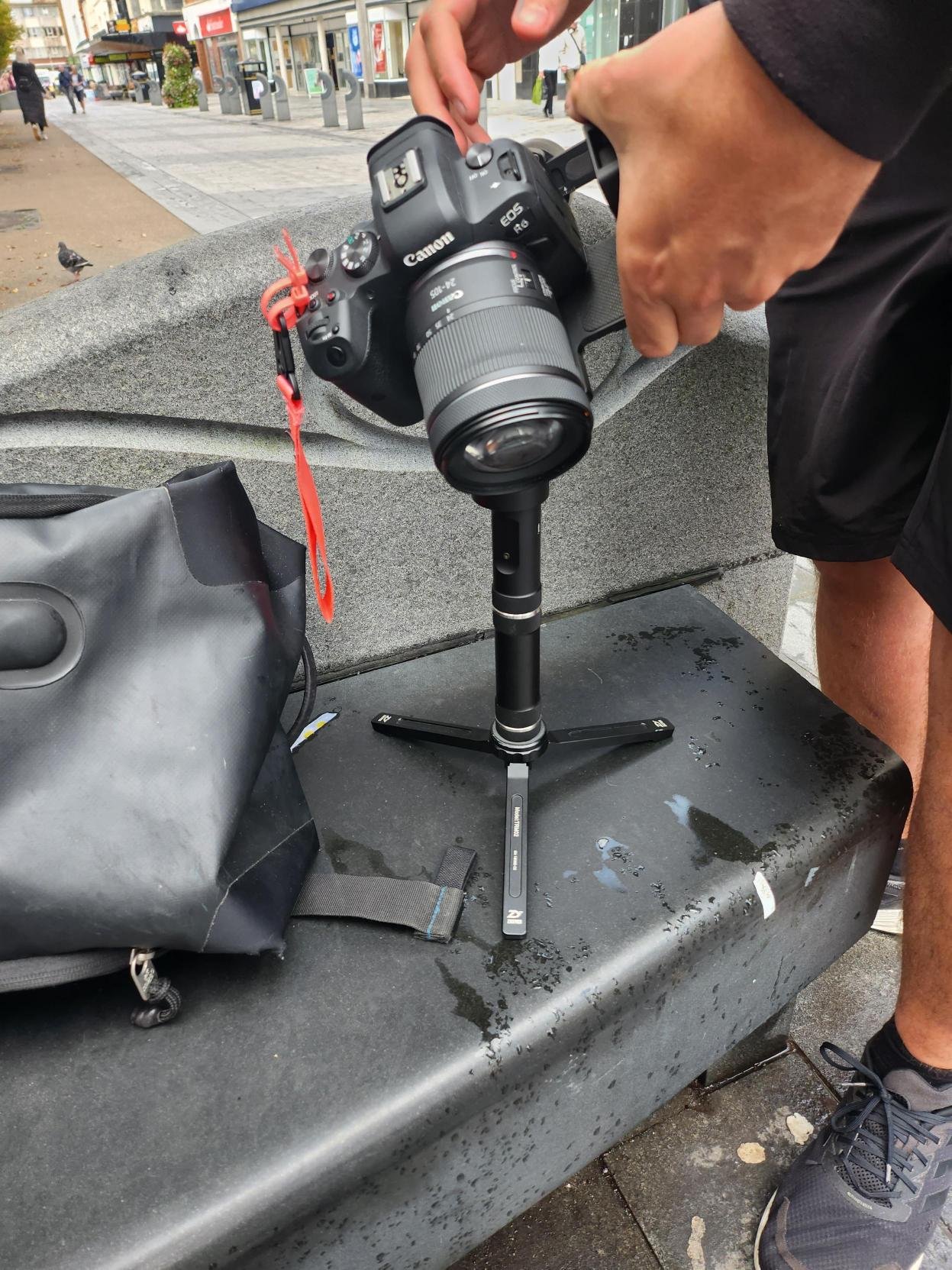
As the behind the scenes footage shows for the Mock-Up video, We used our own equipment, we used Jack’s Canon EOS R6 and my motorised gimbal called Zhiyun Crane Plus.
The Group Final Production: -
In this video we tried to emulate the “BLACK. promotional video” but the locations we used were based in and around Southport Town Centre.
Secondary Research: -
E-Commerce has become huge due to the rise of the internet, with the functionality of buying and selling goods or services. This also enables a wide variety of systems for both buyers and sellers such as a secure online payment encryption and the functionality of being able to use your mobile for shopping.
Most businesses use this medium to check their online presence to conduct marketing strategies and to oversee logistics and fulfilment. According eMarketer, in 2022 the whole sector will surpass $5 trillion for the first time with more then a fifth of sales, but they say by 2025 even with the slowing of growth the sector could exceed $7 trillion total spending.
Pretty Little Things

One of the biggest E-Commerce websites is “Pretty Little Thing” with their aim is to sell the latest fashion for women. Like most online shops, their aim is to sell clothes, shoes etc, so their latest marketing strategy is to find the latest upcoming influencer to boost their sales and model their clothes for them, for “Pretty Little Things” it is somebody called “Molly-Mae”.

With some of the online stores they tend to display the in studio shots first as they are trying to sell that item of clothing rather then the main focal point being the model in question, but on this occasion they are showcasing the model “Molly-Mae” because people are going to buy that particular clothing because of the person modelling it.

Usually for most companies, when you click on the listing it displays the model in a studio wearing that item of clothing, but Pretty Little Thing” are going for a urban vibe with mainly the focal point again being the model, they are still taking close up shots of the clothing with the last image on the listing being the item not being worn on its own in a studio environment.
Analyse a Promotional Video: -
After watching this video a few times I can analyse this video; to start with the video heavily relies on the beat to transition from scene to scene or clip to clip. The video also relies on plenty of B-Roll shots which are filler shots to fit in between the main shots of the two models modelling that item of clothing. The setting of the video is in a urban type atmosphere, which works really well with the shot types and angles used throughout the video. For example the eye level dolly shot used at the beginning, low angle pan, medium close up, tilt down close up, medium wide dolly. There is so much more in the video, their is a simple title at the beginning and end saying “BLACK” which symbolises the clothing brand in question. The video isn’t following much of a storyline, but is definitely following a well planned out storyboard or shot list to create something really good filmography wise at a low budget. The lighting used is natural lighting from daylight, from what I can tell no extra lighting has been used in this production, they seem to be heavily relying on the camera and of course the daylight. The screen grabs for the video are below: -
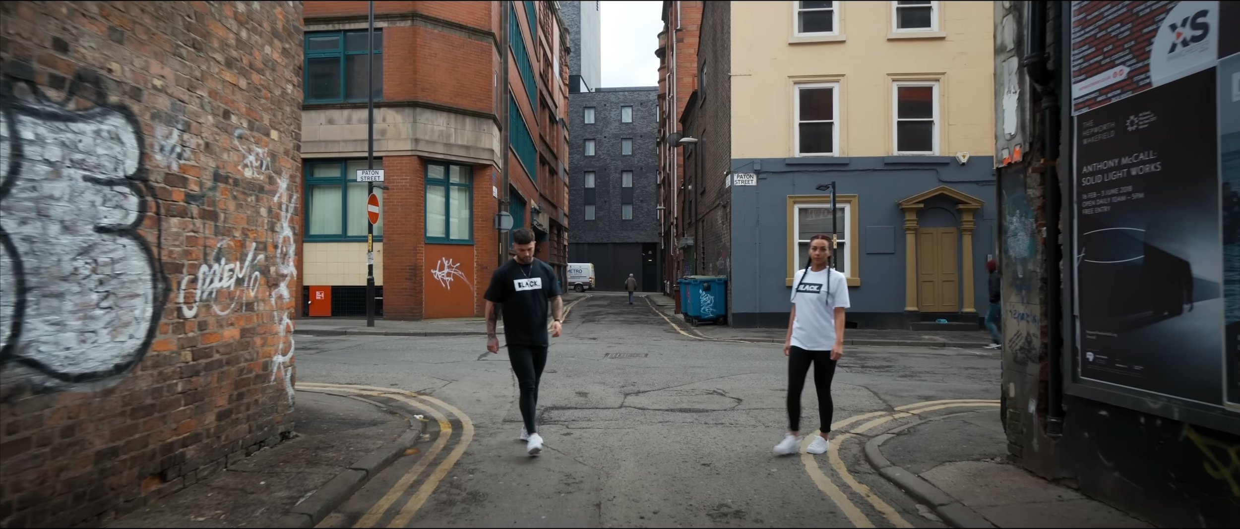
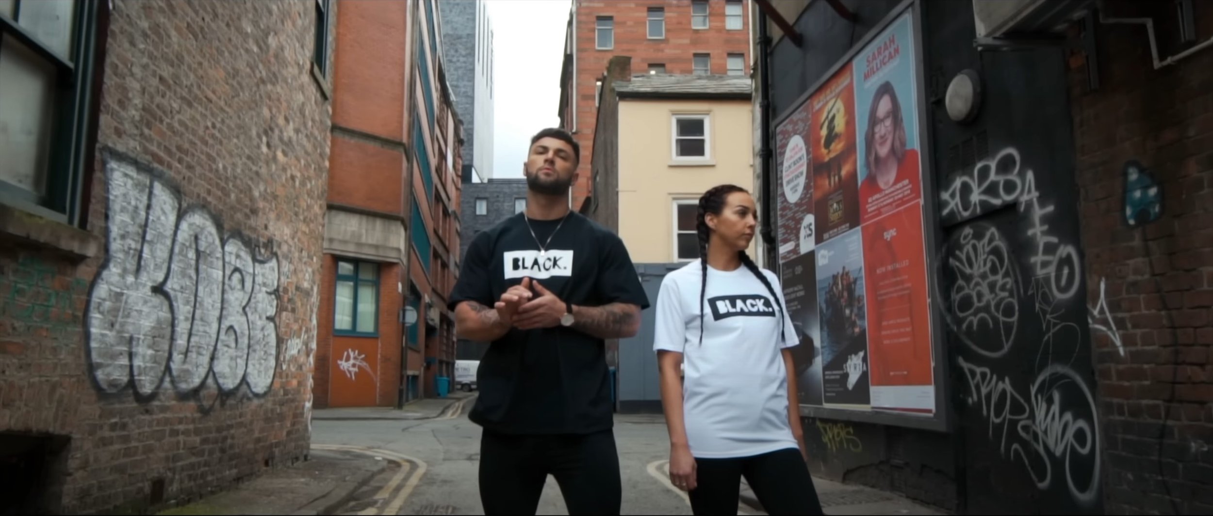
Production Planning
The Background Of My Production: -
In groups at the start of year we created a Mock-Up clothing promotional video and when we were shooting, I wasn’t personally happy with the shot types, angles and movements used in the original video, especially the editing. So I thought I’d re-record the idea again, but have my own take on it with my own music which I have picked and my take on the filming. I am using the same model again as I thought that initially worked with what we were doing. This time I have had a t shirt printed for the production as well which will give this production some context and purpose.
Storyboard
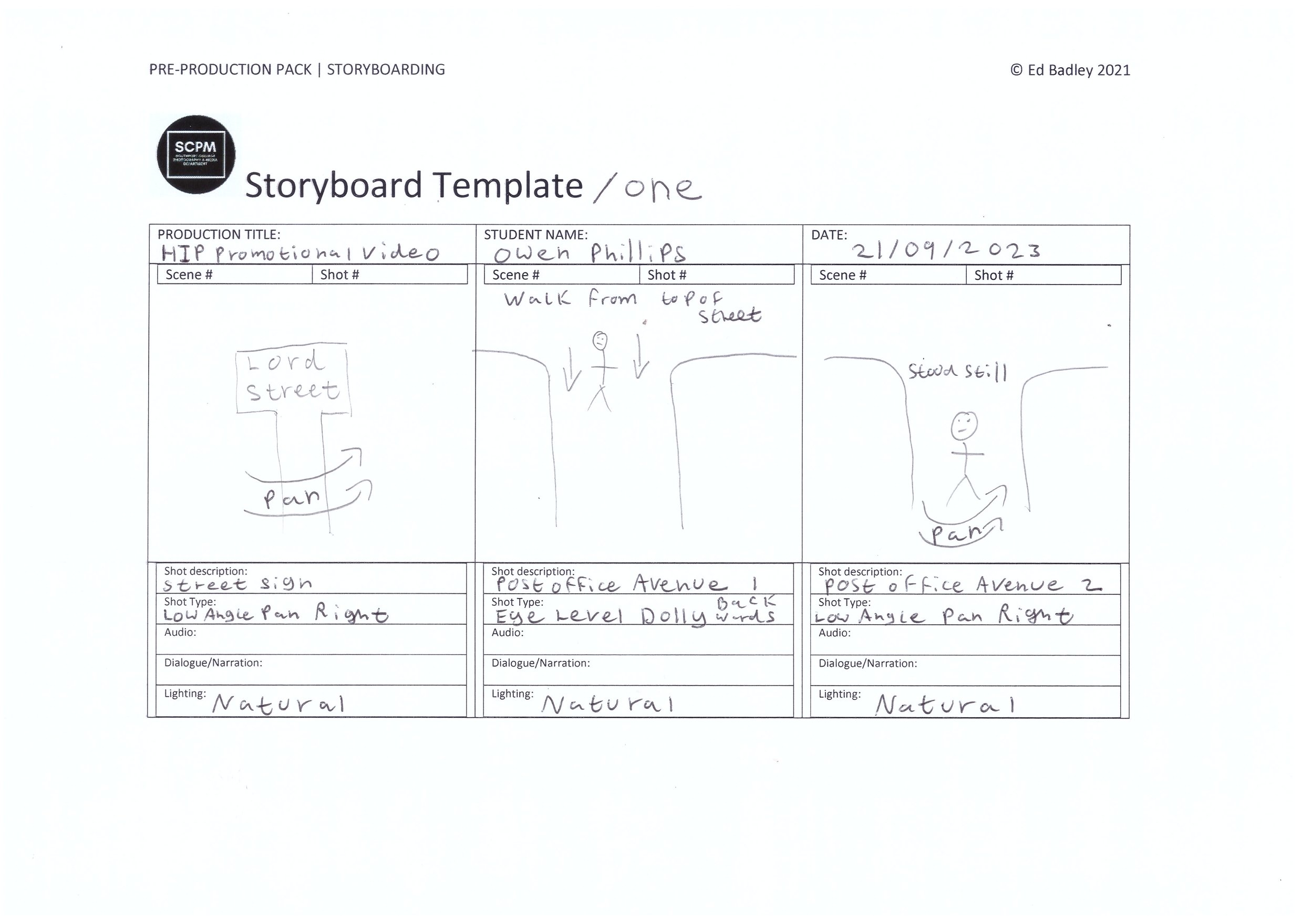
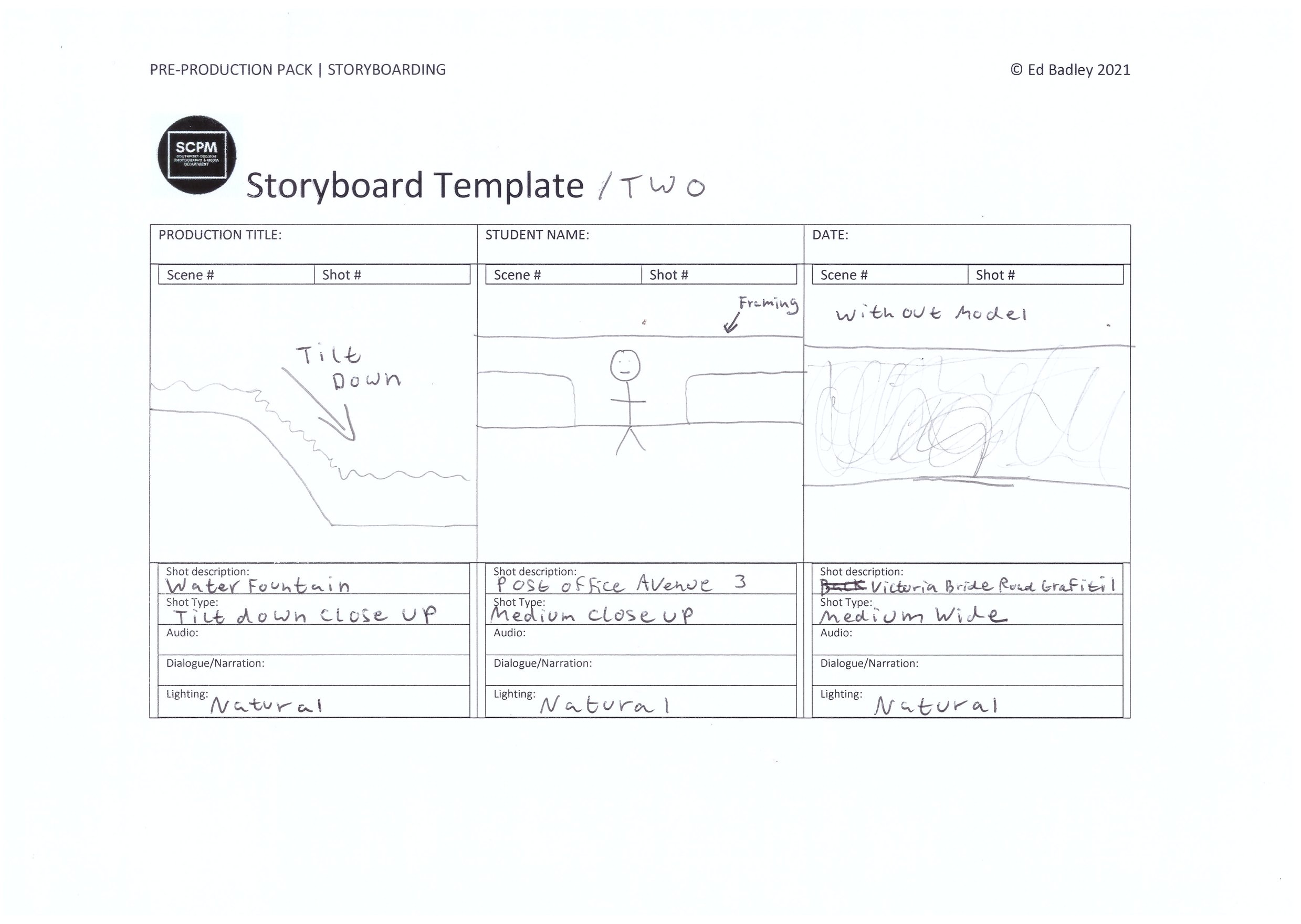
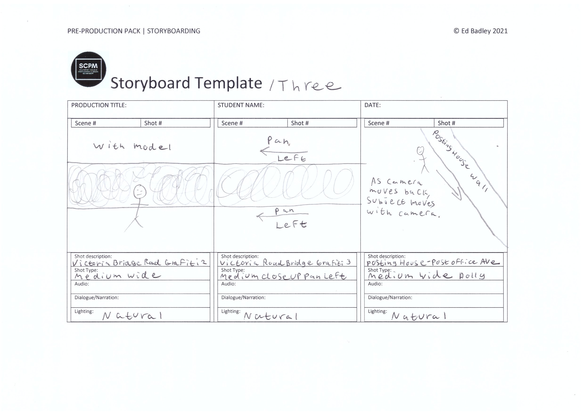
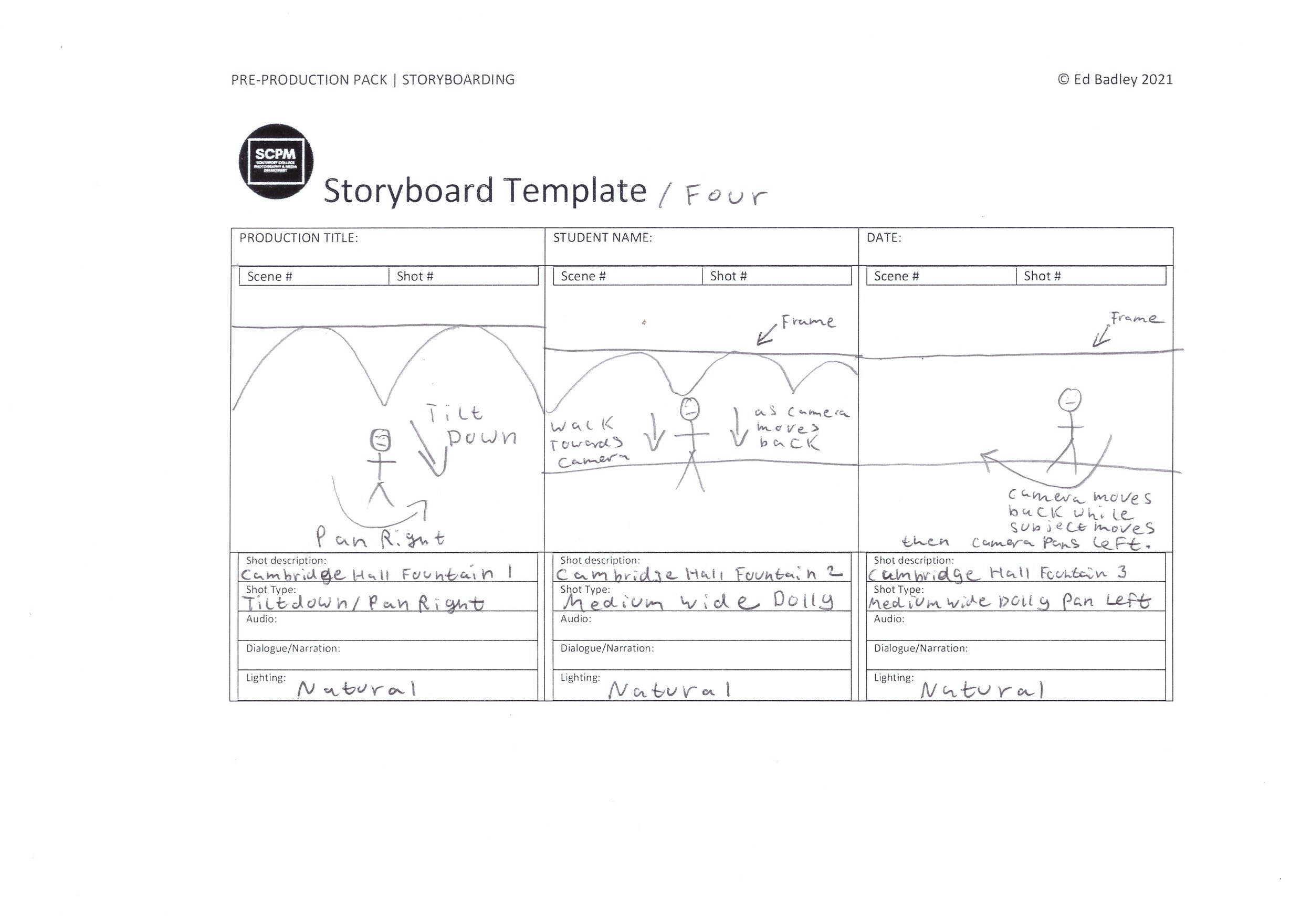
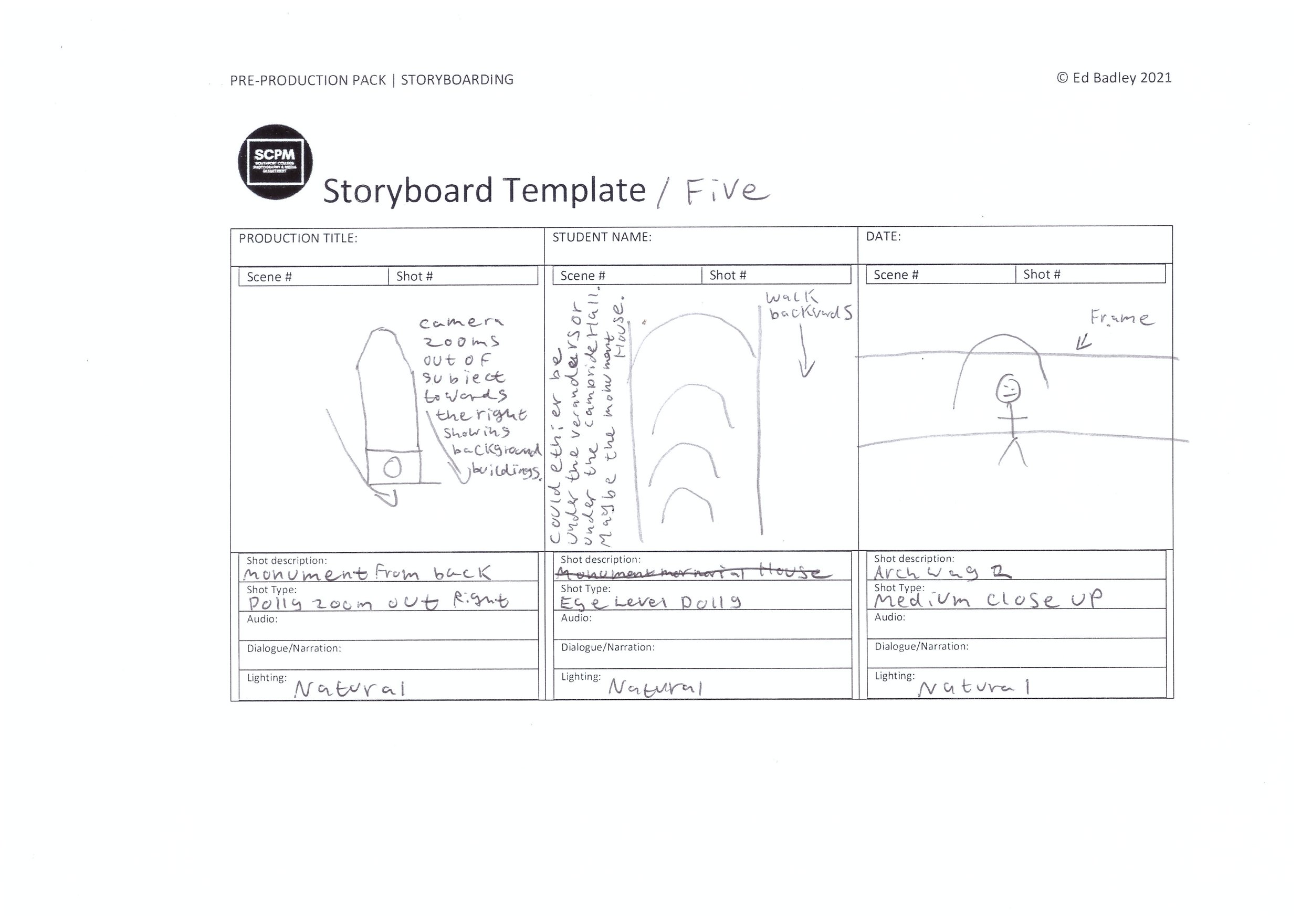
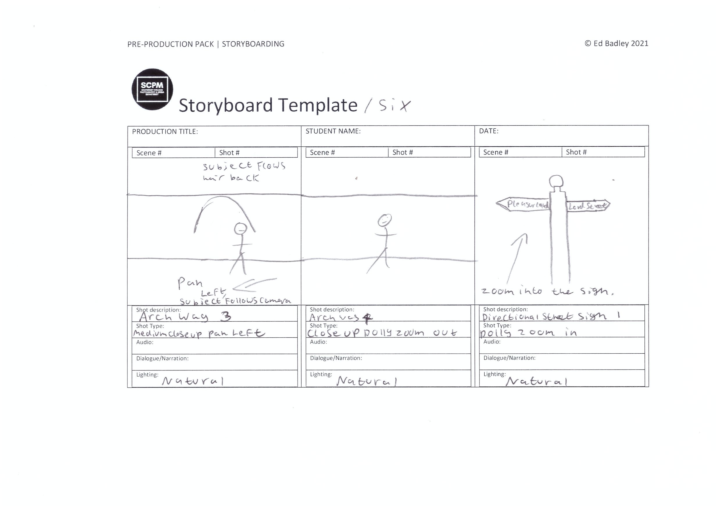
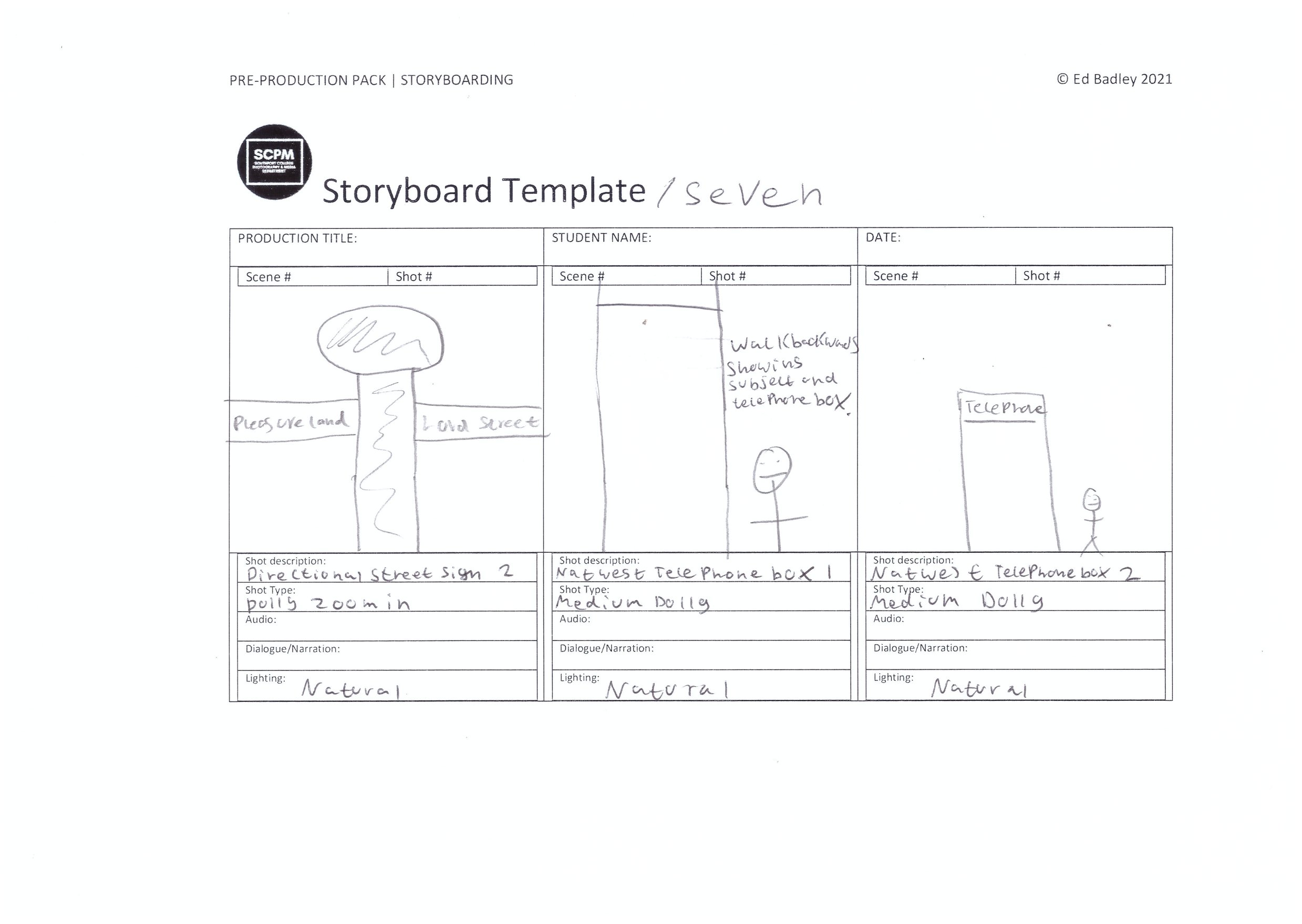
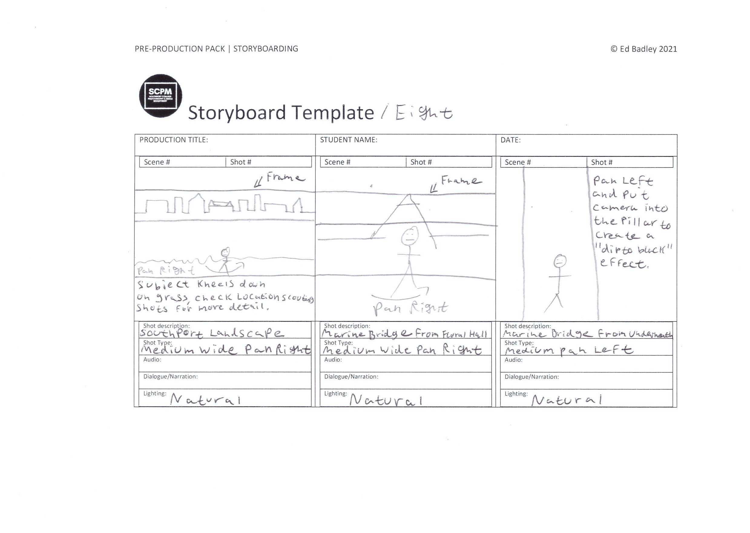
For this project, I have used the storyboard boxes as a drawn shot list to help me with the kind of shots I want to film in this production, If I film loads then I can pick out the best shots I want to use and this means I have plenty enough shots to cut down to the 45 seconds of footage which is required by the brief, nothing longer.
Shot List
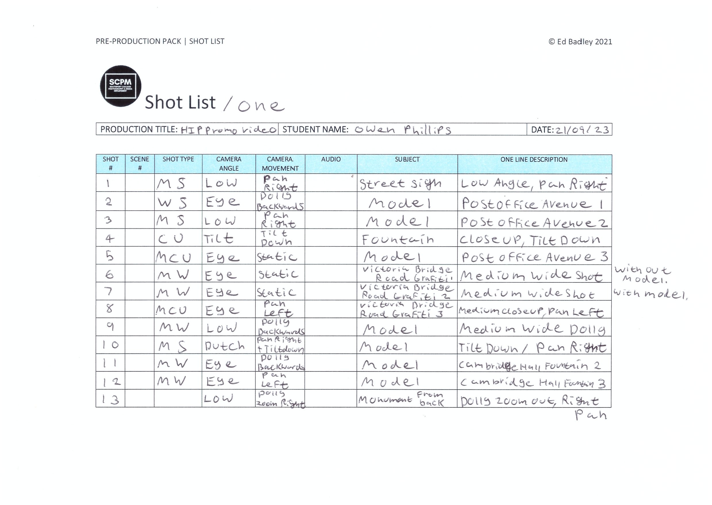
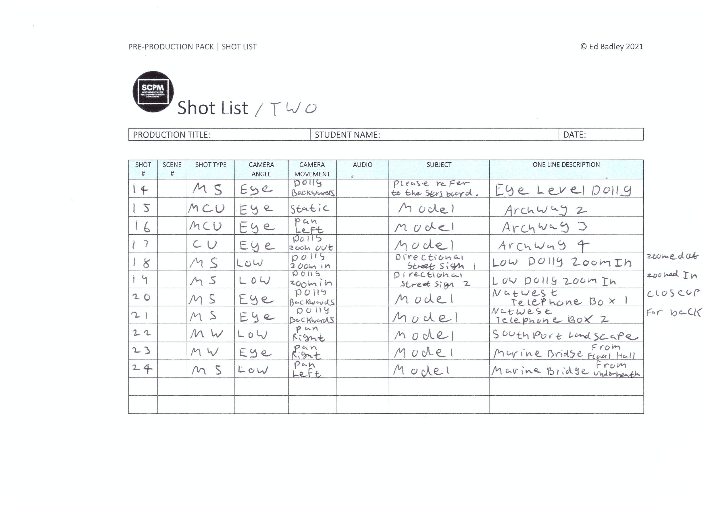
Location Scouting
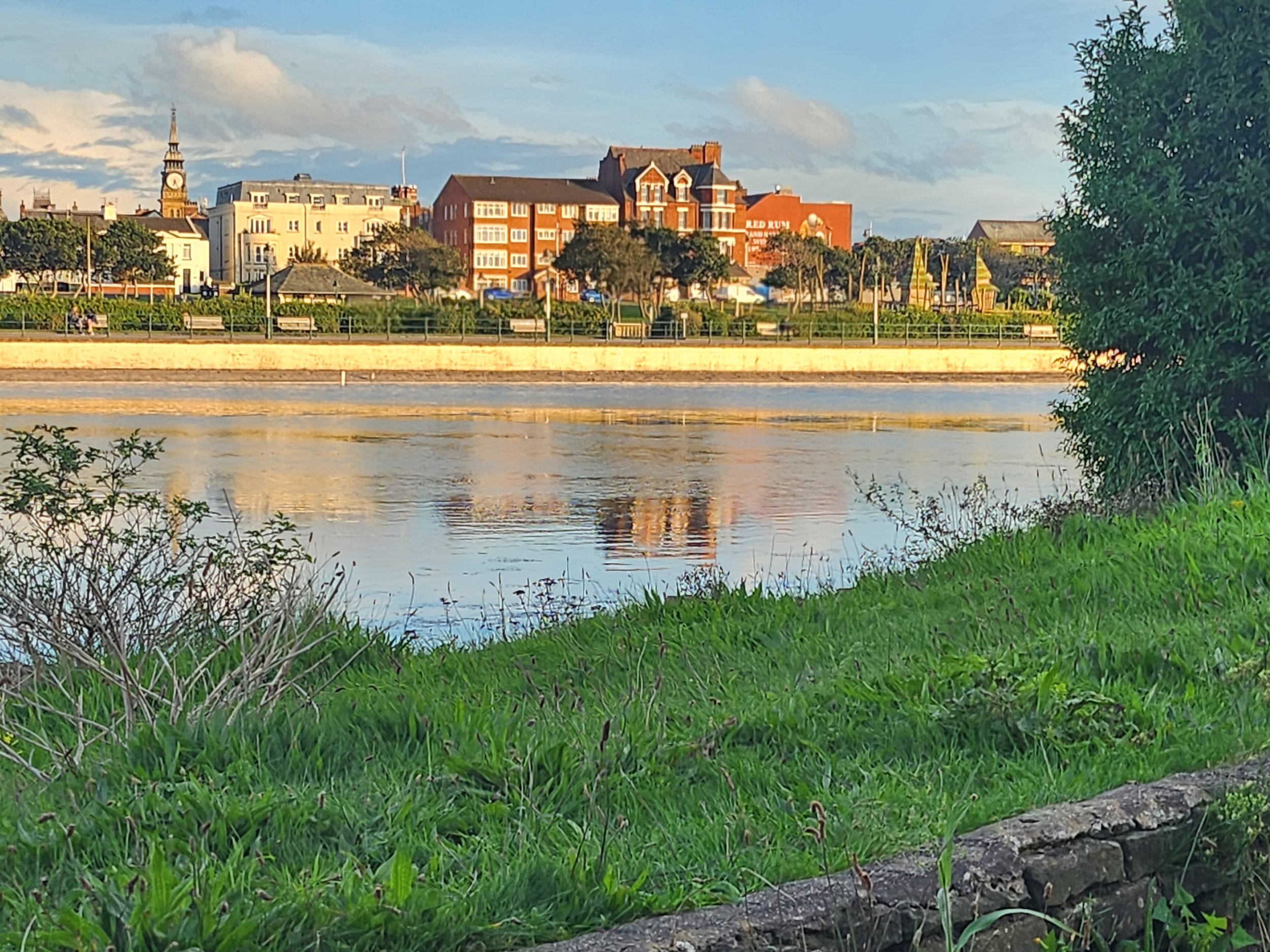
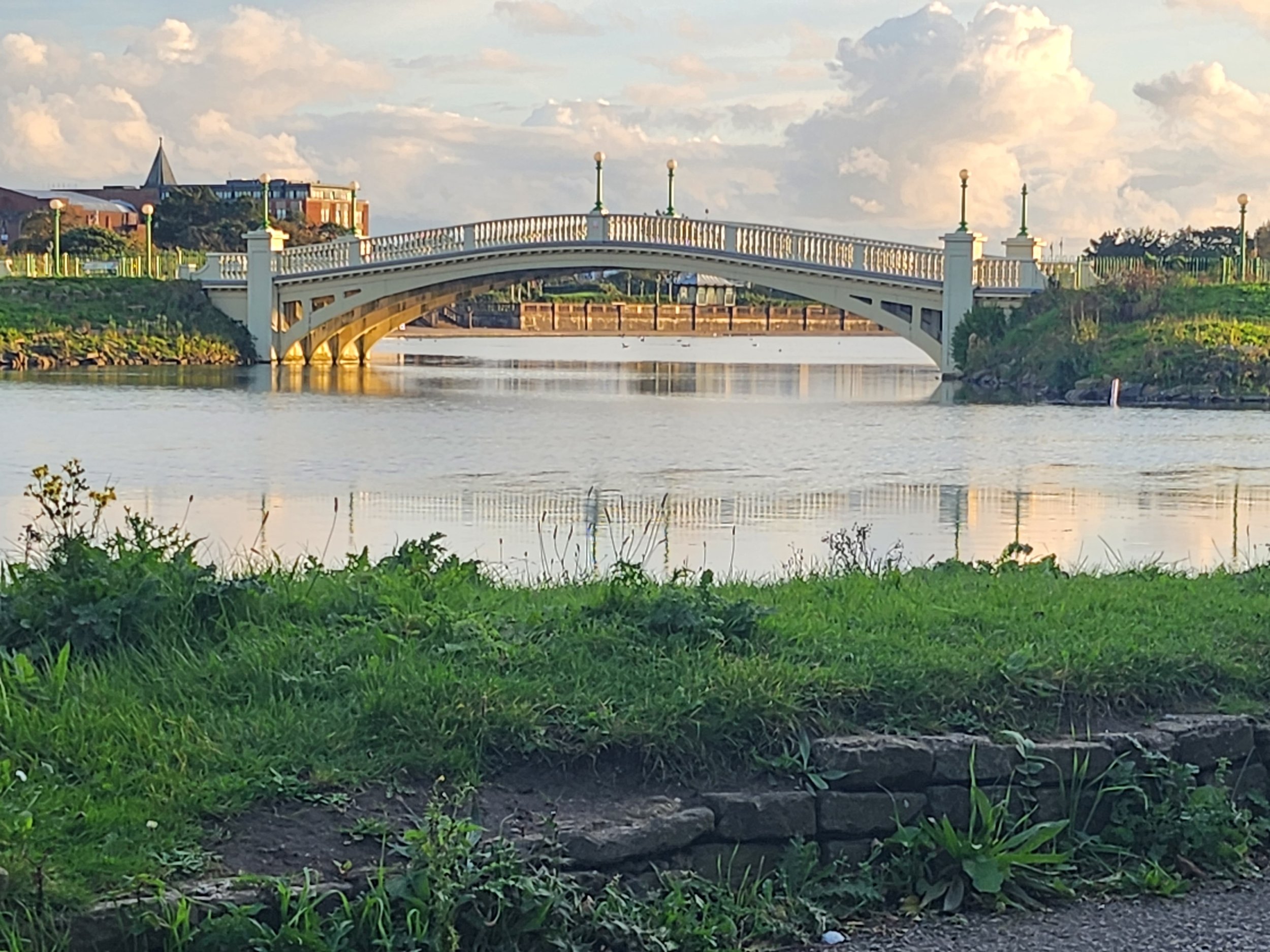

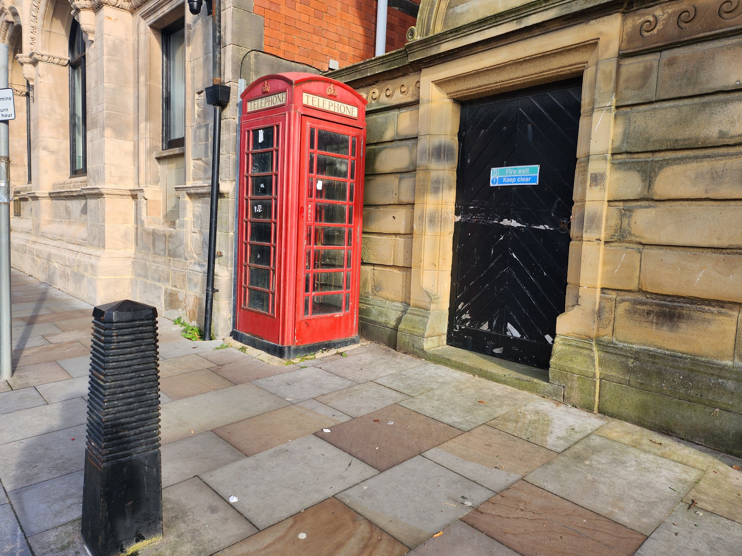
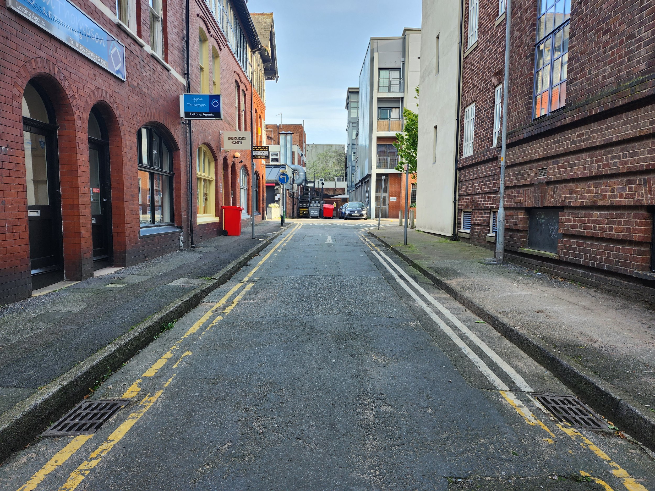
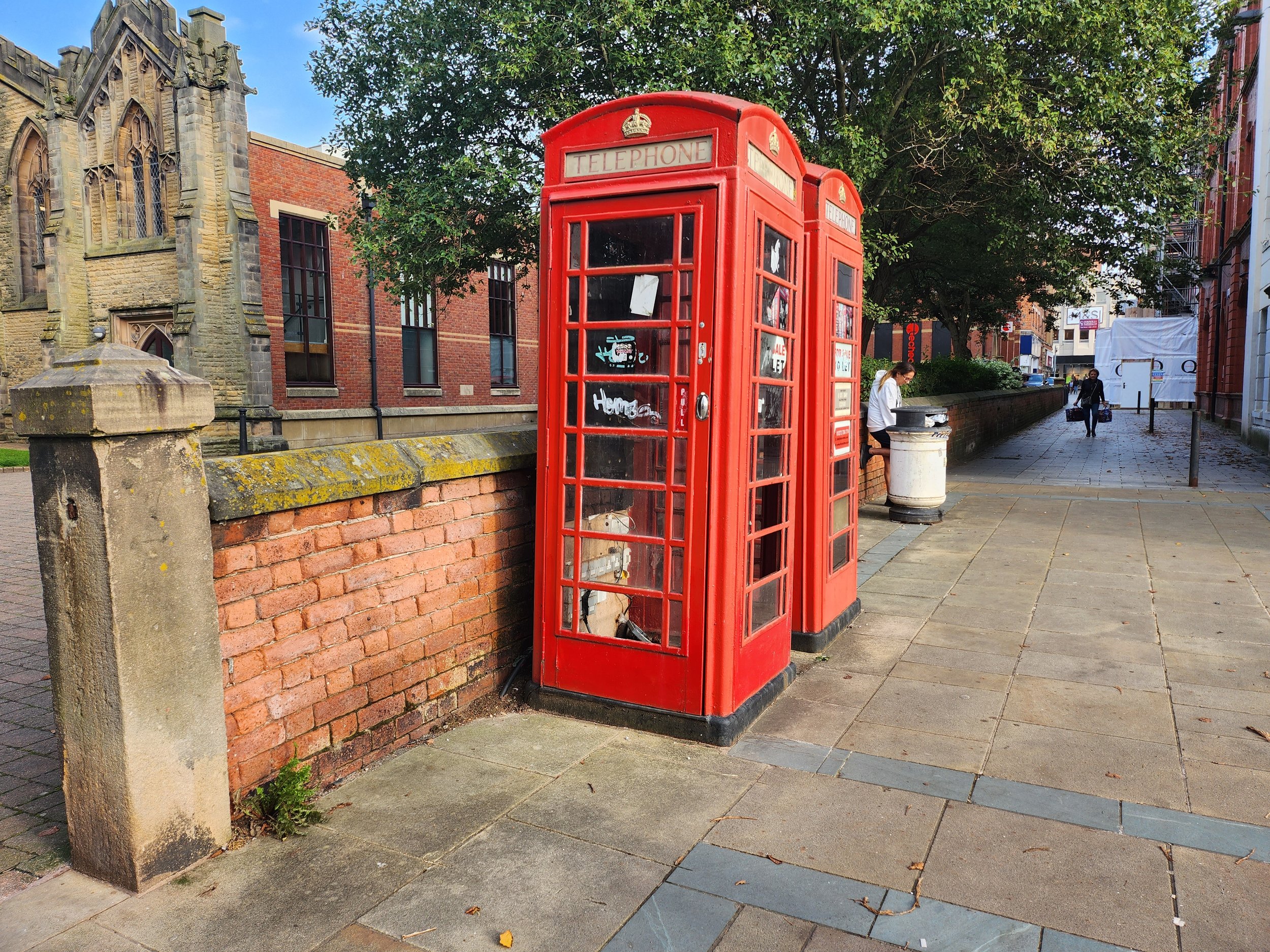
These are all the locations for shooting this promotional video. I have labelled all the images corresponding to the storyboard and shot list to show the locations in which I will be filming. I have also doubled up on some of the shots just in case one location doesn’t fit in with what I am wanting to make. For context, “Shot 11 - Storyboard 3”, the archways in the background, especially underneath them maybe used for “Shot 15 - Storyboard 5“
Practical Considerations
Weekly Production Schedule: -
 Weekly Production Schedule - 2nd
to 8th October 2023
Weekly Production Schedule - 2nd
to 8th October 2023
|
|
MONDAY |
TUESDAY |
WEDNESDAY |
THURSDAY |
FRIDAY |
SATURDAY |
SUNDAY |
|
TIME(S) |
9:00am - 12:05pm |
9:00am -12:05pm |
2:25pm – 3:55pm |
12:50pm – 3:55pm |
6pm – 9pm |
3pm – 6pm |
N/A |
|
LOCATION(S) |
Southport Town Centre |
Home |
College – Photography Studio |
Home |
Home |
Home |
N/A |
|
SCENE(S) |
All Scenes |
N/A |
Magazine Scenes |
N/A |
N/A |
N/A |
N/A |
|
EQUIPMENT NEEDED |
Lumix GH5 Zihyun Crane Plus Tripod |
Computer Premier Pro |
Nikon DT700 |
Computer Premier Pro |
Computer |
Computer |
N/A |
|
PEOPLE NEEDED |
Emily Morris |
N/A |
Emily Morris |
N/A |
N/A |
N/A |
N/A |
|
COSTUME/ PROPS/MAKE-UP |
HIP Clothing T-Shirt |
N/A |
HIP Clothing T-Shirt |
N/A |
N/A |
N/A |
N/A |
|
SPECIFIC CONSIDERATIONS |
Film Day |
Editing Stage – First Cut |
Photography Shoot |
Editing Stage – Final Cut |
Blog Work |
Blog Work |
Completion Day |
Model Release Agreement: -
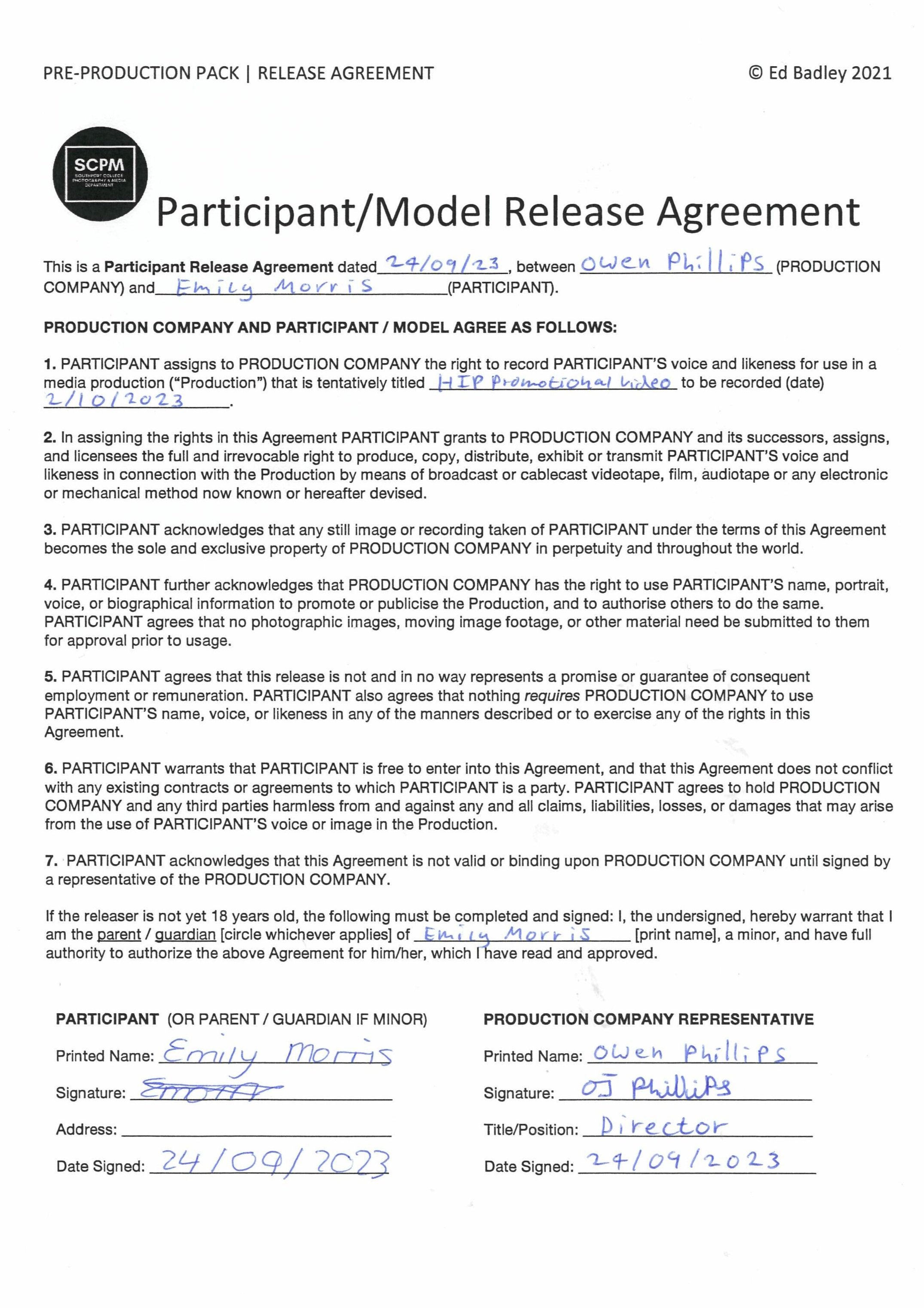
The change of colour of the logo in Canva: -

For the T-Shirt which I was getting made for the shoot, I wanted to change the colours for the logo, something a little bit less boring them a black logo on a white background, So I changed the colour to a black background with a yellow background. I’ve always loved this type of colour scheme since I digitalised my Dad’s garage logo (which is now a trade mark I registered) So I thought it would work for this logo and it did.
The HIP T-Shirt
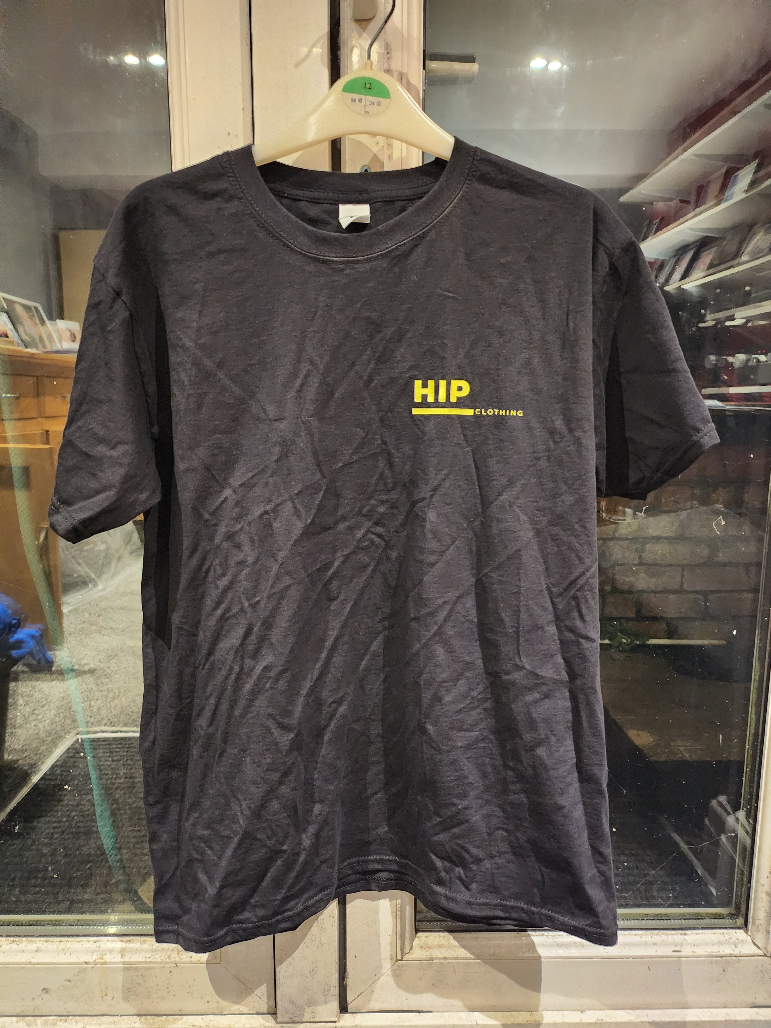
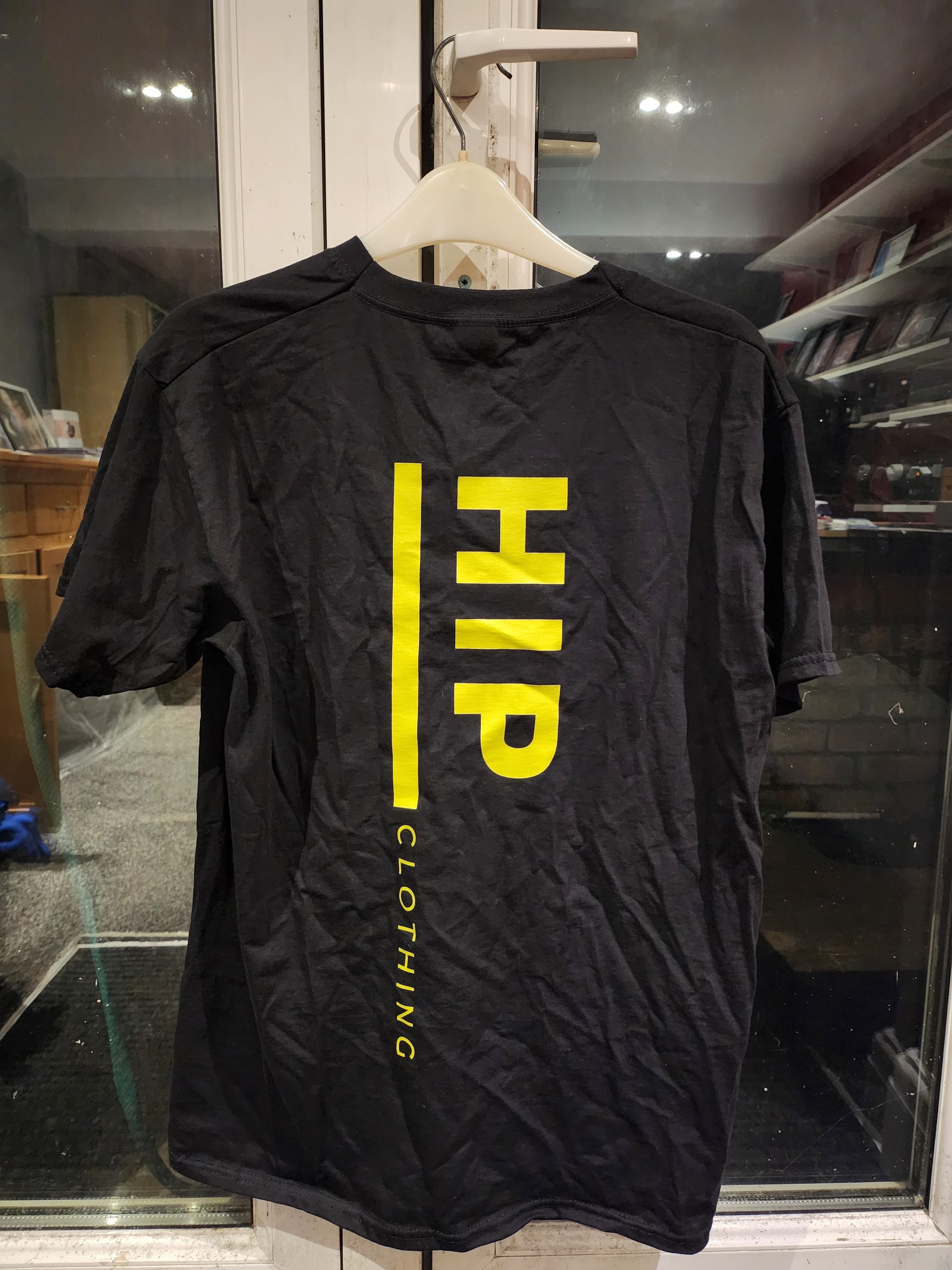
What issues and problems did I encounter during filming and how did I resolve them?
One of the biggest issues I encountered during filming was the weather on the day of filming. It was borderline in terms of if it was going to rain and it did for a few minutes but we managed to push through and get all the clips I wanted. Another problem I encountered with it raining was that I couldn’t do all the location shots I wanted to do, for example the Southport Landscape on the Marine Lake; it would of been too wet to sit down on the grass hence why I didn’t do that part. So I instead filmed some filler shots outside of Christ Church.
Post-Production & Presentation - Video Stills & Editing
Premier Pro Timeline: -

As you can see in the timeline below, the clips that I have used below with no special effects used, so it is purely clips cut in line with the beat to create a sense of pace throughout the video. I have only added a “film dissolve” transition at the beginning and end for a fade in and out effects rather then a “cut to black” transition. I have added at the end of the video my final magazine cover and the logo of the fashion company as well, that was specified in the brief to do. Catchy copyright free background music was added, I have made my own cut by shortening the track by cutting it and dragging it together using the audio transition “constant power” to transfer from one cut of the track to the other without the audio dipping in and out when transferring from track to track. I have also used the audio transition “exponential fade” at the end of the video which fades out the audio, it is also inline with the fade out of the video.
The audio used in the fashion promotional video: -
Presentation
HIP Promotional Video: -
The Final Selection of My Favourite Photographs: -

HIP Promotional Magazine: -


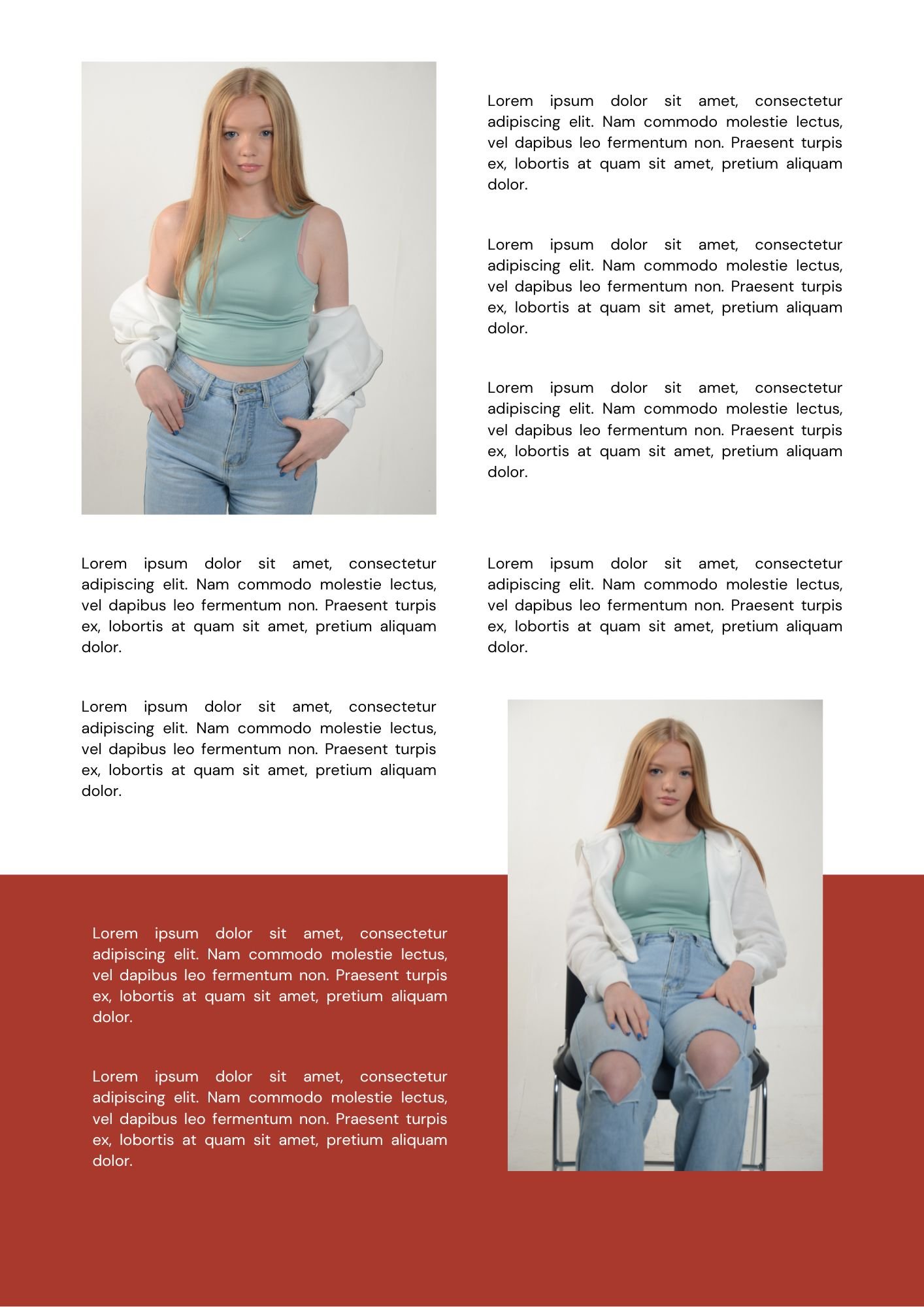
“This is a Virtual Magazine in the Form of a Slideshow”
HIP Instagram Page: -
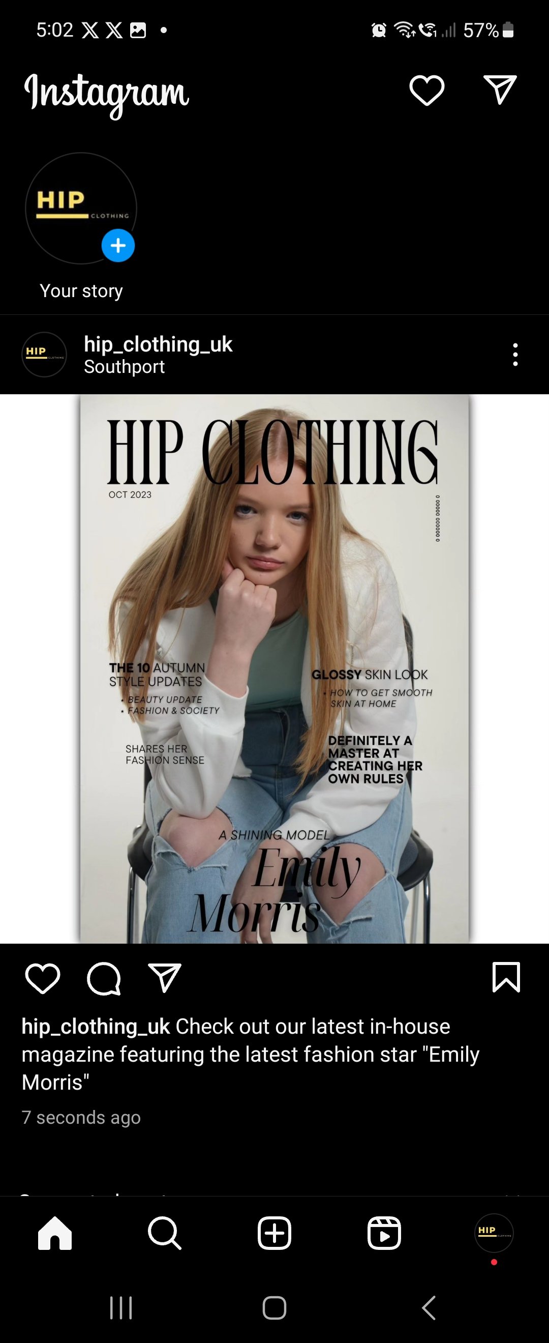
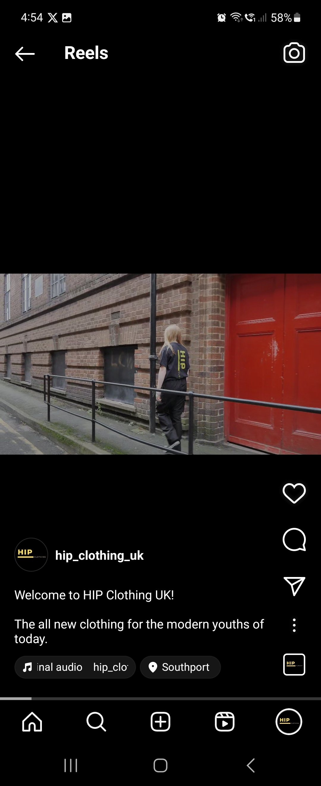
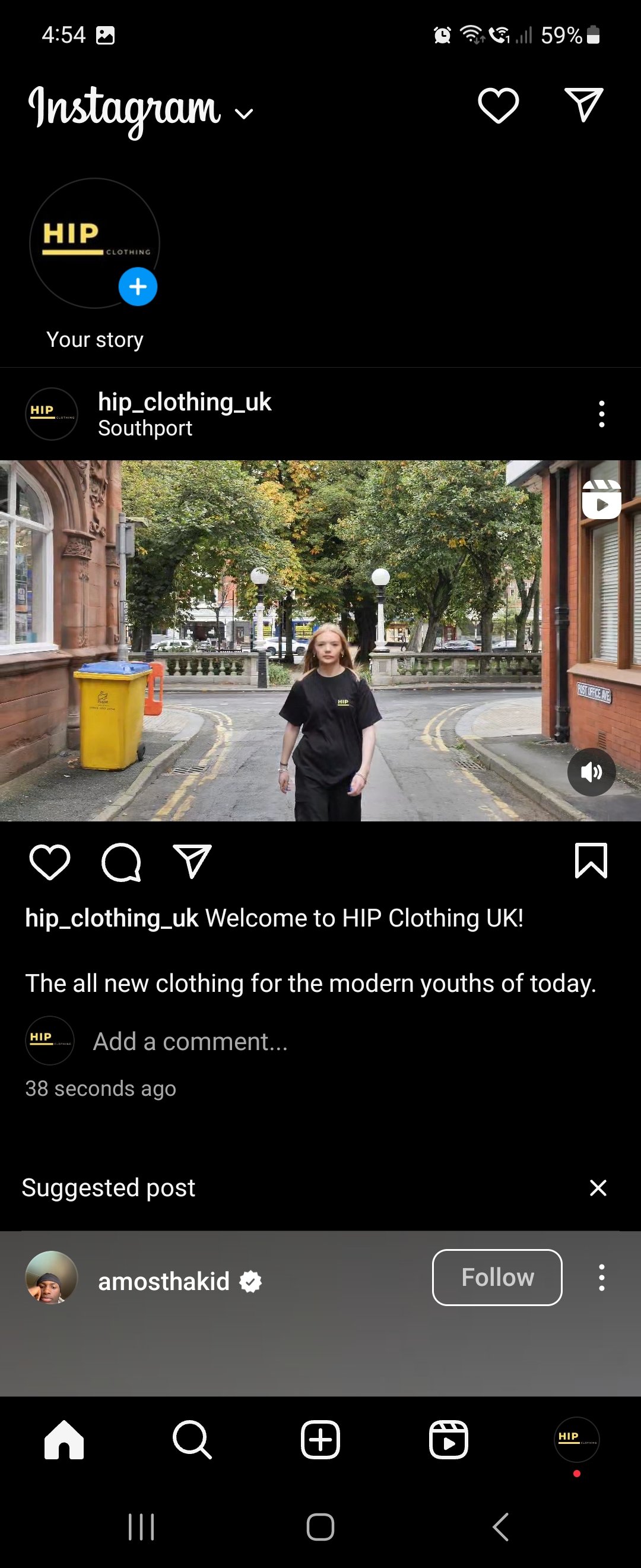
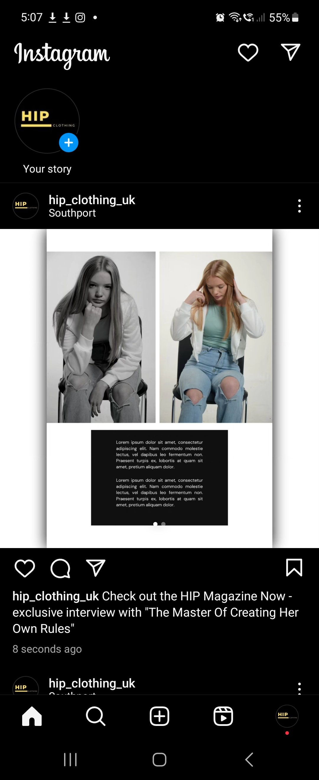
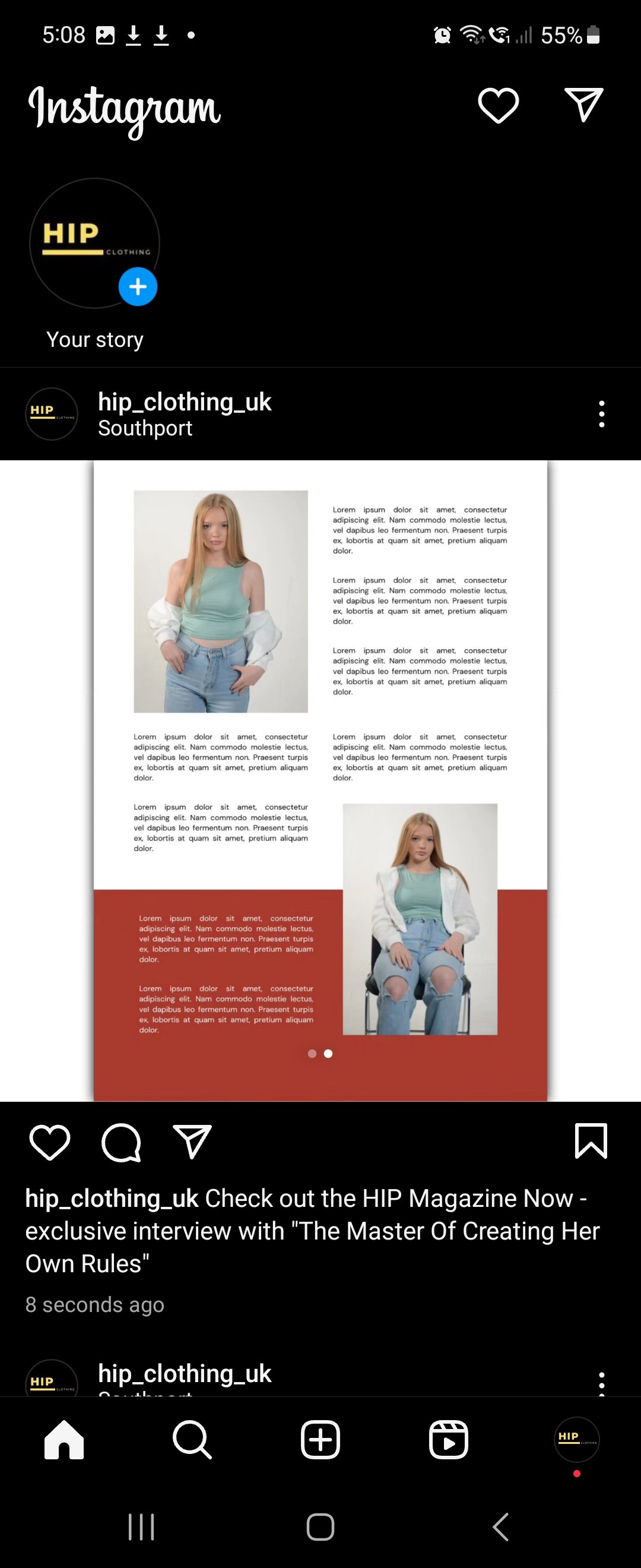
Evaluation & Reflection
Annotate three strengths and three weaknesses of your final images / video promotion assignment. What went well and what could you do to adapt the work produced to improve and develop it?
For the film side, I thought the planning is probably the strongest part of this production as I knew what I was going to film, and it was alterable if necessary. The choice of locations in Southport is a strength because I wanted an urban type of atmosphere for the shoot that worked with the type of video I wanted to create. The editing style I went for with cut the video to the track while the model walks was something I was experimenting with throughout and it took me a few tries to make it work and this leads me onto my weaknesses for this production, some of the cuts in my final production were miss timed by a few seconds. The next weakness is that the sped-up parts went on for far too long and should have been cut and put some more B-Roll in there from different locations and as I never filmed lots of B-Roll shots, I should have pulled the film back into editing for another final cut and re-recorded some more B-Roll shots. But in an ideal world with another week or so I would have done that but due to the project needed to be handed tomorrow as I am writing this, I don’t have the time to pull it back and re-edit.
For the photography side, the strongest point was the lighting in the studio was set up correctly, it was High Key lighting used which creates minimal shadows with low contrast but makes the frame bright using soft lighting. The next strength is the poses used and this improved my communication skills for directing the model as well because it was poor before, and this has gained my confidence to talk more often in the studio. This leads me onto my weaknesses, one of them was we should have had a chance of outfit for the model as it was the same outfit used throughout the shoot and magazine. I also think different camera angles should have been used as it seemed to be the same medium shot or close shots used throughout the shoot.
What experiments and exploration did you do? How did it affect the development of your project?
For the film side, I was experimenting with the editing side of the film because I tried editing the video to the music, for example I cut the video to the track while my model was walking. As I have reflected as a weakness in the production, I missed timed cuts in the video.
For the photography side, I was learning how to direct my model in the studio for the type of pose I wanted them to do, and I found that as one of the hardest things as I didn’t know what to say. But now as I have experimented in the studio with somebody, I am comfortable to be around, which means my communication skills should have improved for next time.
What do you now understand about the e-commerce fashion media industry? What did you find out?
I understand that a lot of different factors go into the making of the fashion media industry with the rise of online shop and the fact that a lot of marketing goes into creating the online shop with out they are advertising a specific type of product or how they use a famous person as a focal point to sell their clothes which is another huge thing in this industry currently. In the photography terms I found out that they use mostly studio work to sell their clothes as on location shots is really distracting, this leads me onto the most common lighting technique they use is High Key lighting.
Authentication Document
